Bar Diagrams for Problem Solving.
Create event management bar charts with Bar Graphs Solution
A bar chart is also known to be called as a “bar graph”. This type of chart, or graph, can be always created with a professional ConceptDraw DIAGRAM diagramming and drawing software, in order to represent some kind of so called “grouped data” which is one type of all known ones of “categorical data”. Categorical data is simply the type of the statistical data consisting of the categorical variables, but sometimes also of data that has been converted into that exact form. The mentioned data is usually represented with help of the rectangular bars on the bar diagram, having the lengths proportional to the values which they represent. The bars are usually mentioned within such graph in a vertical or in a horizontal way. Sometimes, the vertical bar charts can be called as the “line graphs”.
Thus, knowing that the bar graph is a chart that uses vertical or horizontal bars for showing the comparisons among different categories, you can always make your own great looking chart from a scratch using nothing else, but ConceptDraw DIAGRAM bar diagramming software illustrating the specific categories being compared on one axis of your chart as well as representing a discrete value on the other axis. Some of the bar graphs are used for presenting bars clustered in groups of over one.
Many of the sources consider William Playfair to be the one inventing the “bar chart”. The reason of it was that his graph named “Exports and Imports of Scotland to and from different parts for one Year from Christmas 1780 to Christmas 1781” from “The Commercial and Political Atlas” he created was the very first bar chart in history. At the same time, the diagrams of the velocity of a constantly accelerating object against time were published in so called “The Latitude of Forms” about 300 years known to be "proto bar charts”.
Bar charts are known to be scaled the way all the data fit on the chart, having the bars on the chart arranged in any needed order. Those bar charts, which are arranged from the highest to the lowest incidence are known to be called as “Pareto charts”. Usually, the bars which are used for showing frequency, are arranged in chronological sequence.
Bar graphs simply provide a visual presentation of the categorical data, as it was mentioned before, and this categorical data is simply a grouping of data into the discrete groups (for example, age group, months of the year, shoe sizes, etc.). The categories illustrated on the bar diagrams tend to be qualitative, appearing along the horizontal axis in a column bar chart, having the height of the bar corresponding to the value of each of the categories.
Bar diagrams are known to be different types. Thus, a so called “grouped bar chart” can be created with a usage of two or more bars for each of the categorical groups. The mentioned bars in such grouped bar chart are usually illustrated using the different colours in order to represent the particular groupings.
As an example of grouped bar chart we can mention the one created by some business owner having three stores making his grouped bar chart using different coloured bars for representing each of the stores. On such chart, he might use the horizontal axis for showing the months of the year and the vertical one for showing the revenue.
Bar graphs can be also used for more complex comparisons of data. Apart from the mentioned grouped bar charts, the stacked bar charts can take place, with help of which it is always simpler to represent completely different groups on top of each other. The height of the bar in this case can show the combined result of the groups. Such stacked bar charts are widely used, but they are not so helpful for illustrating the datasets with some groups of the negative values, and so grouped bar chart is better in such case as they present any given information in the same order in each of the grouping, when stacked bar diagrams are used for presenting the information in the same sequence on each bar. Bar charts are popular in very many different spheres of business activity. Thus, you can create as many as needed working as an event manager in the application of project management. Developing as well as creating different events (for example, conferences, festivals, ceremonies, formal parties, conventions or concerts) it is much more convenient to mention lots of data needed to be taken into consideration with help of such bar charts, or bar diagrams.
Example 1. Software for create Bar Charts, Graphs and Diagrams
Event management itself involves studying the brand, identifying the target audience of each company event managers work for, devising the event concepts as well as coordinating all the technical aspects before the event takes place itself.
Thus, in the process of coordinating and planning the event, it is always better to use only the professional tools for arranging all the things and people who intend to take a participation in the mentioned event. ConceptDraw DIAGRAM software can be useful for planning the budgeting of event, its scheduling, mentioning the site with the description of where people will be located, coordinating transportation as well as parking for all the guests in a way of creating the needed maps and plans, arranging the décor by making the floor plans within ConceptDraw DIAGRAM software as well as making the emergency plans using the needed solutions from ConceptDraw STORE.
Working in any industry, for charitable organization or interest group, you can always plan your events with ConceptDraw DIAGRAM diagramming and drawing software in order to market your company, build the business relationships, raise money for your company or celebrate the achievements.
Free Download Bar Chart Software and View All Examples
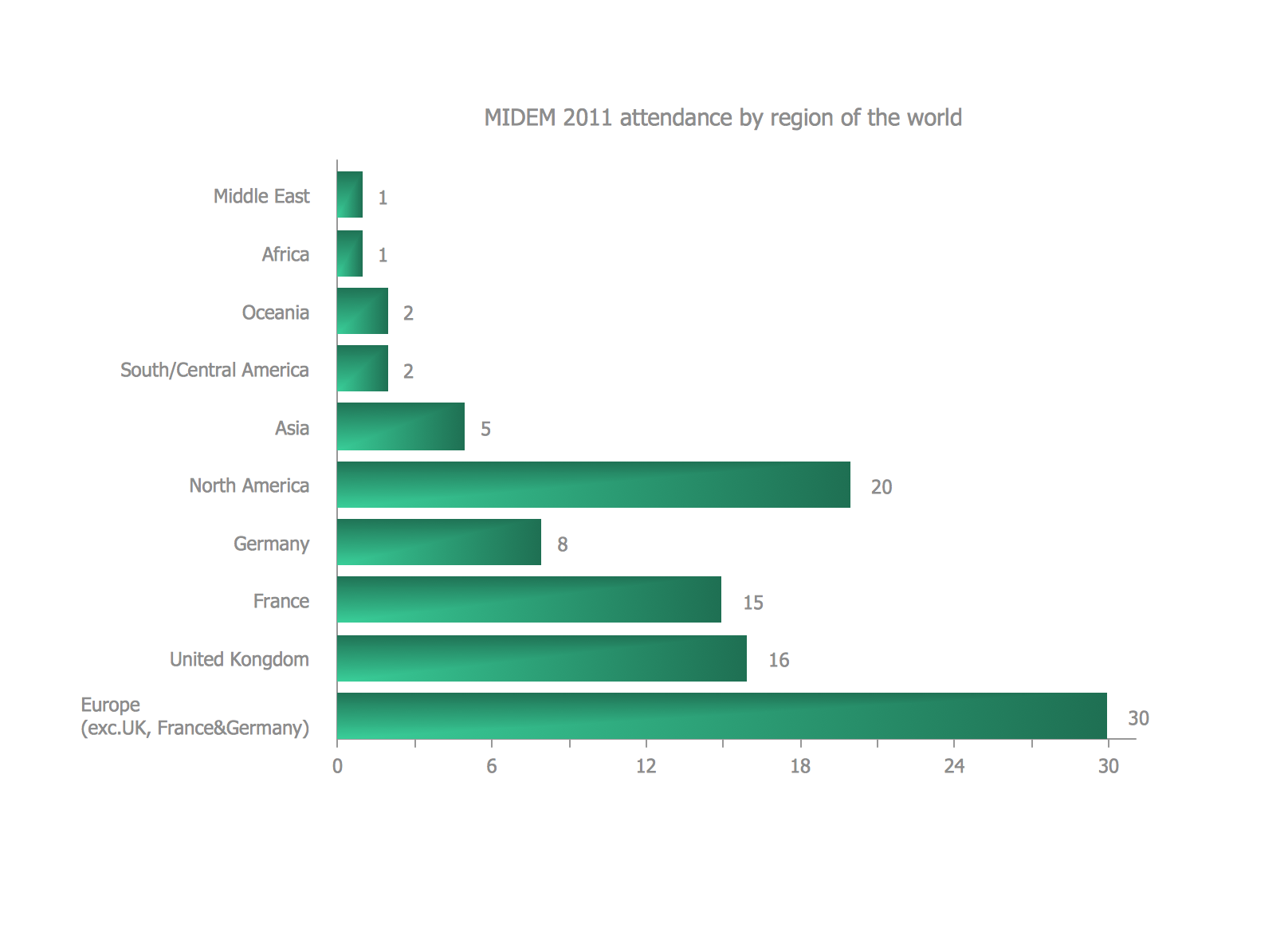
Example 2. Bar Diagrams for Problem Solving — Event management bar charts
The organised trade show named Midem has been the leading international business event for the music ecosystem since 1967. The example of the bar chart illustrated on this page shows how many organizations attended it in 2011, mentioning the countries they come from.
See Also:
- Line Chart Examples
- Pie Chart Examples
- Scatter Chart Examples
- Pyramid Chart Examples
- Column Chart Examples
