This site uses cookies. By continuing to browse the ConceptDraw site you are agreeing to our Use of Site Cookies.

Flowchart design. Flowchart symbols, shapes, stencils and icons

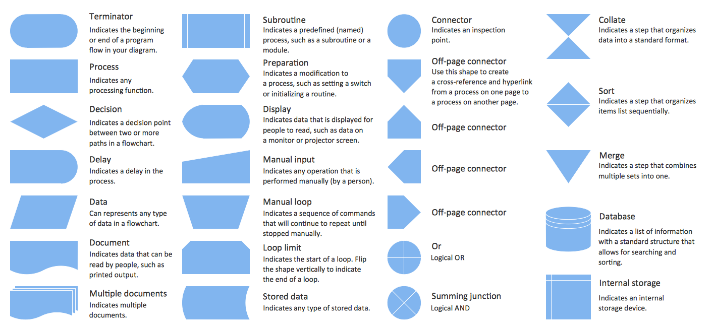
A flowchart is a type of diagram which represents an algorithm, process or workflow, displays the steps as boxes of various kinds and depicts their order by connecting them with arrows. Any business graphic document will be more colorful and understandable if will use professional-looking and visual diagrams and flowcharts. Flowchart design gives versatile presenting and explaining of the process. ConceptDraw PRO flowchart software enhanced with Flowcharts solution helps effectively make Flowchart Design. Use of predesigned flowchart symbols and bright color palette offers a fresh view and favorably distinguishes the flowcharts designed in ConceptDraw PRO from the black and white flowcharts on a paper. Preferably to use no more than three or four colors and apply identical for the same shape types. The best flowchart design can be achieved by starting with Flowchart template, or any of suitable ready examples or samples offered in ConceptDraw STORE, open one of them and enter the proper text into each Flowchart shape. Each symbol of the flowchart has a definition that can't be changed. This means that all flowcharts shapes can be grouped in according to their meaning. Users with ConceptDraw PRO flowchart software can style groups of symbols with close definitions by color sets chosen from complementary palette. Almost all workflows can be depicted as a flowchart. Colored diagrams are more light for perception of the certain information, this is part of flowchart design. Bright colors need to be used in the key points of Decision symbols, to focus attention on their importance for whole process flow.
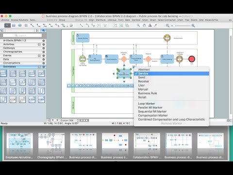
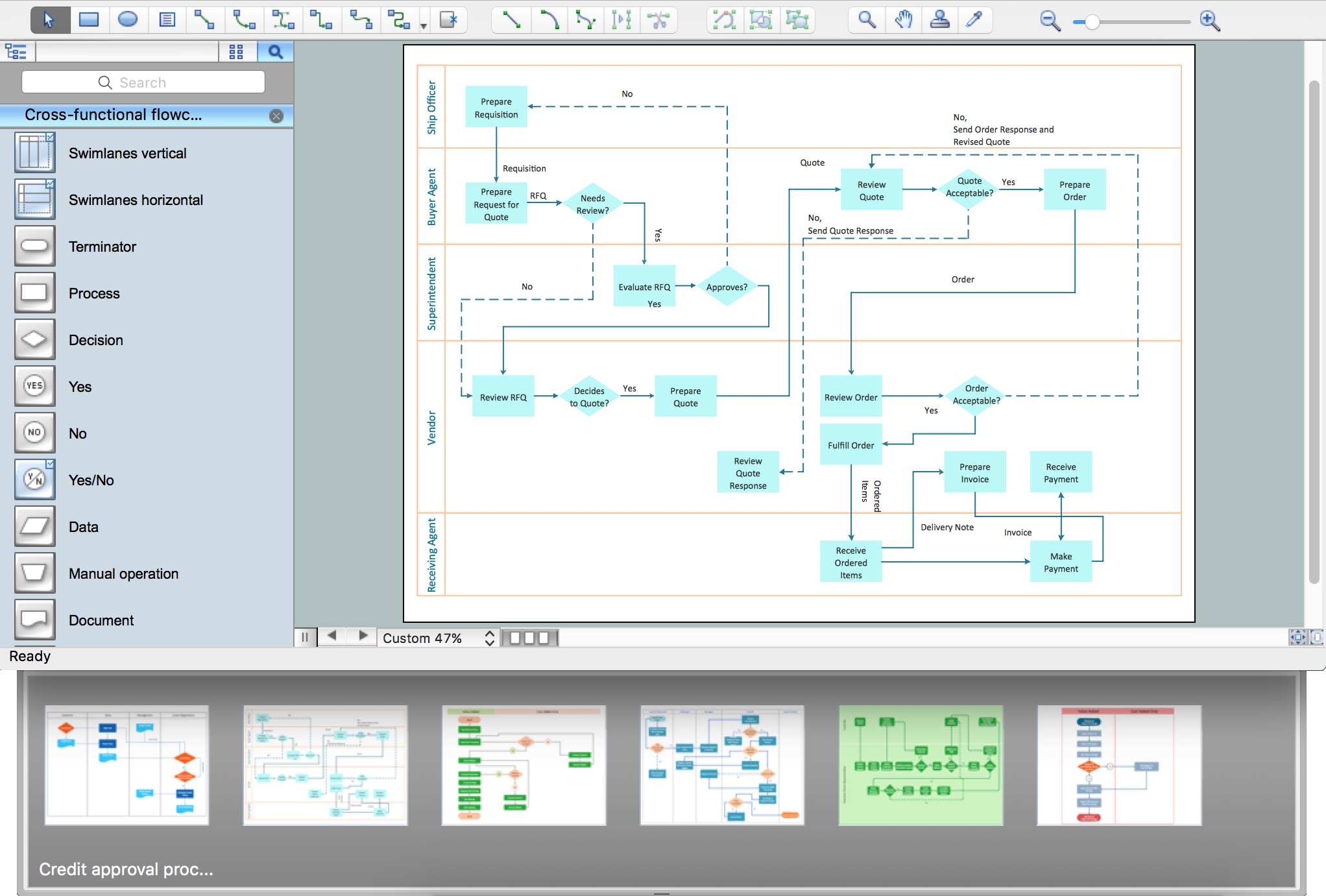
Business Process Modeling with ConceptDraw
Business Process Modeling with ConceptDraw "Business Process Diagrams" Solution
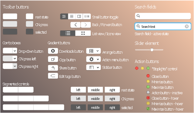
The vector stencils library "Toolbar control elements" contains 42 toolbar graphical control elements.
Use this tool bar control element UI icon set to design graphic user interface (GUI) of your software application for OS X 10.10 Yosemite Apple Mac operating system.
The example "Toolbar control elements - Vector stencils library" was created using the ConceptDraw PRO diagramming and vector drawing software extended with the Mac OS User Interface solution from the Software Development area of ConceptDraw Solution Park.
Drop-down button
Drop-down button, tool bar drop-down button,
Drop-down button - ON press left
Drop-down button - ON press left, tool bar drop-down button,
Drop-down button - ON press right
Drop-down button - ON press right, tool bar drop-down button,
Tool bar button
Tool bar button, tool bar button,
Tool bar button - ON press
Tool bar button - ON press, tool bar button,
Tool bar button - selected
Tool bar button - selected, tool bar button,
Left segment
Left segment, segmented button control,
Left segment - ON press
Left segment - ON press, segmented button control,
Left segment - selected
Left segment - selected, segmented button control,
Middle segment
Middle segment, segmented button control,
Middle segment - ON press
Middle segment - ON press, segmented button control,
Middle segment - selected
Middle segment - selected, segmented button control,
Right segment
Right segment, segmented button control,
Right segment - ON press
Right segment - ON press, segmented button control,
Right segment - selected
Right segment - selected, segmented button control,
Segmented control - 2 buttons
Segmented control - 2 buttons, segmented control, segmented button control,
Segmented control - 3 buttons
Segmented control - 3 buttons, segmented control, segmented button control,
Segmented control - 4 buttons
Segmented control - 4 buttons, segmented control, segmented button control,
Small button toggle
Small button toggle, small button toggle,
Back - Forward button
Back - Forward button, button 4  drop down, back forward button,
List/Icons view control
List/Icons view control, list-icons view,
Arrange button
Arrange button, shape, arrange button, gradient button,
Action menu
Action menu, shape, settings, action menu button,
Downloads button
Downloads button, downloads button, gradient button,
Copy button
Copy button, copy button, gradient button,
Share button
Share button, share button, gradient button,
Edit tags button
Edit tags button, edit tags button, gradient button,
Sidebar button
Sidebar button, sidebar button, gradient button, shape,
Slider element
Slider element, slider element,
Tool bar button 2
Tool bar button 2, tool bar button,
Tool bar button 2 - ON press
Tool bar button 2 - ON press, tool bar button,
Tool bar button 2 - selected
Tool bar button 2 - selected, tool bar button,
Search field
Search field, search field,
Search field - active
Search field - active, search field,
"Stoplights" control
Close button
Close button, action button,
Minimize button
Minimize button, action button,
Maximize button
Maximize button, action button,
Close button - hover
Close button - hover, action button,
Minimize button - hover
Minimize button - hover, action button,
Maximize button - hover
Maximize button - hover, action button,
Action button - inactive
Action button - inactive, action button,

Process Flowchart

The main reason of using Process Flowchart or PFD is to show relations between major parts of the system. Process Flowcharts are used in process engineering and chemical industry where there is a requirement of depicting relationships between major components only and not include minor parts. Process Flowcharts for single unit or multiple units differ in their structure and implementation. ConceptDraw PRO is Professional business process mapping software for making Process flowcharts, Process flow diagram, Workflow diagram, flowcharts and technical illustrations for business documents and also comprehensive visio for mac application. Easier define and document basic work and data flows, financial, production and quality management processes to increase efficiency of your business with ConcepDraw PRO. Business process mapping software with Flowchart Maker ConceptDraw PRO includes extensive drawing tools, rich examples and templates, process flowchart symbols and shape libraries, smart connectors that allow you create the flowcharts of complex processes, process flow diagrams, procedures and information exchange. Process Flowchart Solution is project management workflow tools which is part ConceptDraw Project marketing project management software. Drawing charts, diagrams, and network layouts has long been the monopoly of Microsoft Visio, making Mac users to struggle when needing such visio alternative like visio for mac, it requires only to view features, make a minor edit to, or print a diagram or chart. Thankfully to MS Visio alternative like ConceptDraw PRO software, this is cross-platform charting and business process management tool, now visio alternative for making sort of visio diagram is not a problem anymore however many people still name it business process visio tools.
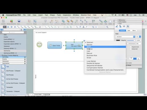
How To Create a Process Flow Chart (business process modelling techniques)
The vector stencils library "MS Windows Vista user interface" contains 76 MS Windows Vista design elements.
Use it for designing Microsoft ribbon graphic user interface (GUI) of software for computers with MS Windows Vista OS in the ConceptDraw PRO diagramming and vector drawing software extended with the Graphic User Interface solution from the Software Development area of ConceptDraw Solution Park.
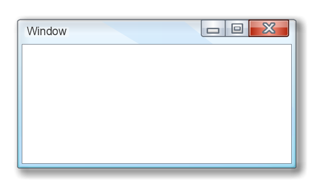
Window
Window, window,
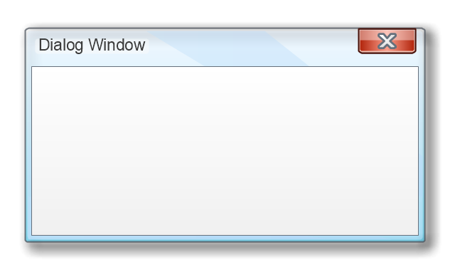
Dialog Window
Dialog Window, dialog window,
Empty Window
Empty Window , empty window ,
Field
Field, field,
Horizontal Scrollbar
Horizontal Scrollbar, horizontal scrollbar,
Vertical Scrollbar
Vertical Scrollbar, vertical scrollbar,
Window Buttons
Window Buttons , window buttons ,
Window Buttons
Window Buttons, window buttons ,
Window Button 1
Window Button 1, window button,
Window Button 2
Window Button 2, window button,
Window Button 3
Window Button 3, window button,
Window Button 4
Window Button 4, window button,
Navigation
Navigation, navigation,
Menu Bar
Menu Bar, menu bar,
Gradient Menu Bar
Gradient Menu Bar, menu bar,
Drop-down Menu
Drop-down Menu, drop-down menu,
Button
Button, button,
Toolbar Pannel
Toolbar Pannel, toolbar pannel,
Tool Button
Tool Button, tool button,
Primary Toolbar
Primary Toolbar, primary toolbar,
Toolbar 1
Toolbar 1, toolbar,
Toolbar 2
Toolbar 2, toolbar,
Customizable Tollbar
Customizable Tollbar, toolbar,
Tab View
Tab View , tab view ,
List View
List View, list view,
Text Field
Text Field, text field,
Vertical Separator
Vertical Separator,
Horizontal Separator
Horizontal Separator,
Group Box
Group Box , group box ,
Text Label
Text Label,
Link
Link,
Line Edit
Line Edit, line edit,
Search
Search, search,
Search with Button
Search with Button , search, button,
Spin Box
Spin Box , spin box ,
Combo-box
Combo-box, combo-box,
Editable Combo-box
Editable Combo-box, combo-box,
Editable List Box
Editable List Box, list box ,
List Box
List Box, list box,
Single-selection List
Single-selection List, single-selection list,
Multiple-selection List
Multiple-selection List, multiple-selection list,
Check Box
Check Box, check box,
Radio Button
Radio Button, radio button,
Check box group
Check box group, check box group,
Radio Buttons Group
Radio Buttons Group, radio buttons group,
Progress Bar
Progress Bar , progress bar,
Modal Progress Bar
Modal Progress Bar, modal, progress bar,
Vertical Slider with Ticks
Vertical Slider with Ticks, slider, ticks,
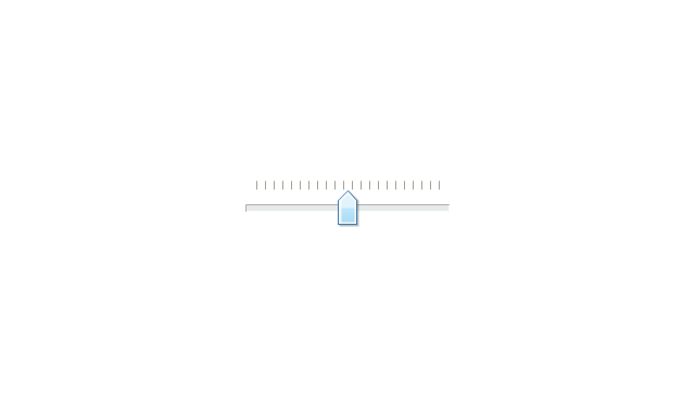
Horizontal Slider with Ticks
Horizontal Slider with Ticks, slider, ticks,
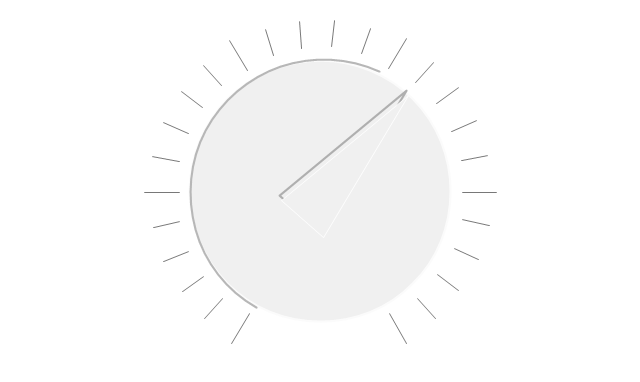
Dial
Dial , dial,
Catalogue Tree
Catalogue Tree, catalogue tree,
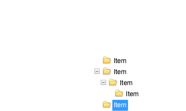
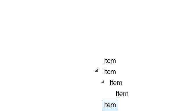
Tree View 1
Tree View 1, tree view,
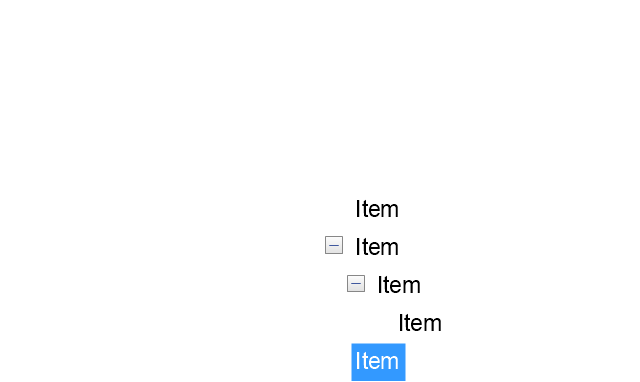
Tree View 2
Tree View 2, tree view,
Vertical Spacer
Vertical Spacer,
Horizontal Spacer
Horizontal Spacer,
Chevron 1
Chevron 1, chevron,
Arrow 1
Arrow 1, arrow,
Arrow 2
Arrow 2, arrow,
Plus/Minus Control
Plus/Minus Control, plus, minus, control,
Rotating Triangle
Rotating Triangle, rotating triangle,
Chevron 3
Chevron 3, chevron,
Chevron 2
Chevron 2, chevron,
Normal Select Cursor
Normal Select Cursor, select cursor,
Link Select Cursor
Link Select Cursor, select cursor, link,
Text Select Cursor
Text Select Cursor, select cursor, text,
Working in Background Pointer
Working in Background  Pointer, background pointer,
Busy Pointer
Busy Pointer, busy pointer,
Unavailable Cursor
Unavailable Cursor, unavailable cursor,
Precision Select Cursor
Precision Select Cursor, precision, select cursor,
Error Icon
Error Icon, error icon,
Warning Icon
Warning Icon, warning icon,
Information Icon
Information Icon, information icon,
Question Mark Icon
Question Mark Icon, question mark icon,
Balloon
Balloon, balloon,
Tooltip/Infotip
Tooltip/Infotip, tooltip, infotip,
Calendar
Calendar, calendar,
The vector stencils library "Progressive disclosure controls" contains 12 icons of Windows 8 progressive disclosure controls.
Use it to design graphic user interface (GUI) prototypes of your software applications for Windows 8.
"With a progressive disclosure control, users can show or hide additional information including data, options, or commands. Progressive disclosure promotes simplicity by focusing on the essential, yet revealing additional detail as needed. ...
Chevrons show or hide the remaining items in completely or partially hidden content. Usually the items are shown in place, but they can also be shown in a pop-up menu. When in place, the item stays expanded until the user collapses it. ...
Arrows show a pop-up command menu. The item stays expanded until the user makes a selection or clicks anywhere.
If the arrow button is an independent control, it receives input focus and is activated with the space bar. If the arrow button has a parent control, the parent receives input focus and the arrow is activated with Alt+down arrow and Alt+up arrow keys, as with the drop-down list control. ...
Plus and minus controls expand or collapse to show container content in place when navigating through a hierarchy. The item stays expanded until the user collapses it. Although these look like buttons, their behavior is in-place.
The associated object receives input focus. The plus is activated with the right arrow key, and the minus with the left arrow key. ...
Rotating triangles show or hide additional information in place for an individual item. They are also used to expand containers. The item stays expanded until the user collapses it.
The associated object receives input focus. The collapsed (right-pointing) triangle is activated with the right arrow key, and the expanded (downward-pointing) triangle with the left arrow key. ...
Like chevrons, additional information is shown or hidden in place. The item stays expanded until the user collapses it. Unlike chevrons, the glyphs have a graphical representation of the action, typically with an arrow indicating what will happen. ... Preview arrows are best reserved for situations where a standard chevron doesn't adequately communicate the control's behavior, such as when the disclosure is complex or there is more than one type of disclosure." [msdn.microsoft.com/ en-us/ library/ windows/ desktop/ dn742409%28v=vs.85%29.aspx]
The icons example "Progressive disclosure controls - Vector stencils library" was created using the ConceptDraw PRO diagramming and vector drawing software extended with the Windows 8 User Interface solution from the Software Development area of ConceptDraw Solution Park.
Single chevron control - down
Single chevron control - down, progressive disclosure controls,
Single chevron control - up
Single chevron control - up, progressive disclosure controls,
Double chevron control - back
Double chevron control - back, progressive disclosure controls,
Double chevron control - forward
Double chevron control - forward, progressive disclosure controls,
Arrow control button - down
Arrow control button - down, arrow control,
Arrow control button - right
Arrow control button - right, arrow control,
Arrow control - down
Arrow control - down, arrow control,
Arrow control - right
Arrow control - right, arrow control,
Plus control
Plus control, progressive disclosure controls, plus control, expand,
Minus control
Minus control, progressive disclosure controls, minus control, collapse,
Rotating triangle - expand
Rotating triangle - expand, progressive disclosure controls, triangle control,
Rotating triangle - collapse
Rotating triangle - collapse, progressive disclosure controls, triangle control,

graphical user interface, UI patterns, GUI interface iPhone User Interface

graphical user interface, UI patterns, GUI interface
iPhone User Interface solution extends ConceptDraw PRO v10 software with templates, samples and libraries with large quantity of vector stencils of graphical user interface elements, Apps icons, UI patterns for designing and prototyping of the iOS applic
The vector stencils library "Controls" contains 53 icons of Windows 8 controls.
Use it to design graphic user interface (GUI) prototypes of your software applications for Windows 8.
"A graphical control element or widget is an element of interaction in a graphical user interface (GUI), such as a button or a scroll bar. Controls are software components that a computer user interacts with through direct manipulation to read or edit information about an application. ...
Each widget facilitates a specific type of user-computer interaction, and appears as a visible part of the application's GUI as defined by the theme and rendered by the rendering engine. The theme makes all graphical control elements adhere to a unified aesthetic design and creates a sense of overall cohesion. Some widgets support interaction with the user, for example labels, buttons, and check boxes. Others act as containers that group the widgets added to them, for example windows, panels, and tabs." [Graphical control element. Wikipedia]
The design elements example "Controls - Vector stencils library" was created using the ConceptDraw PRO diagramming and vector drawing software extended with the Windows 8 User Interface solution from the Software Development area of ConceptDraw Solution Park.
Balloon
Balloon, balloon,
Check box - checked
Check box - checked, check box,
Check box - unchecked
Check box - unchecked, check box,
Radio button - selected
Radio button - selected, radio button,
Radio button
Radio button, radio button,
Group box
Group box, group box,
Standard command button
Standard command button, standard command button,
Default command button
Default command button, default command button,
Link
Link, link,
Command link - selected
Command link - selected, command link,
Command link
Command link, command link,
Command link
Command link, command link,
Command link 2
Command link 2, command link,
Drop-down button with text box
Drop-down button with text box, drop-down button,
Drop-down button with text box - selected
Drop-down button with text box - selected, drop-down button, text box,
Drop-down list
Drop-down list, drop-down list,
List item
List item, list item,
List item - selected
List item - selected, list item,
Drop-down button with text box 2
Drop-down button with text box 2, drop-down button, text box,
Drop-down list 2
Drop-down list 2, drop-down list,
Drop-down button
Drop-down button, drop-down button,
Drop-down button - selected
Drop-down button - selected, drop-down button,
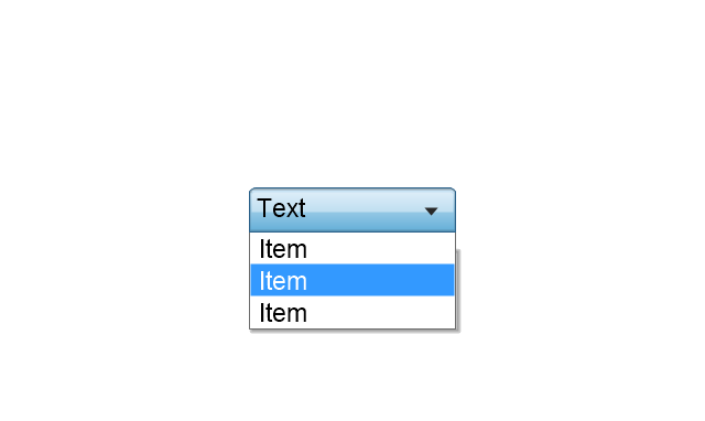
Combo box
Combo box, list item, drop-down list, drop-down button, combo box,
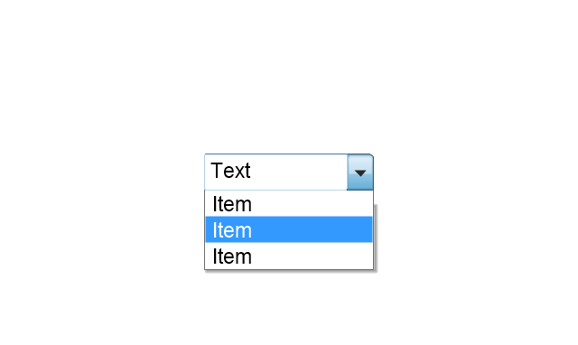
Combo box 2
Combo box 2, list item, drop-down list, drop-down button, text box, drop-down button, combo box,
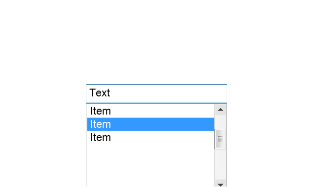
Combo box with scroller
Combo box with scroller, scroller, list item, drop-down list, drop-down button, text box, drop-down button, combo box,
List box
List box, list item, list box, drop-down list,
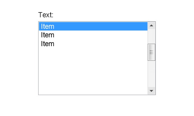
List box with scrollbar
List box with scrollbar, scroller, list item, list box, drop-down list,
List view
List view, scroller, list view, drop-down list,
Vertical scroller
Vertical scroller, scroller,
Horizontal scroller
Horizontal scroller, scroller,
Notification
Notification, notification, balloon,
Options button
Options button, options button,
Close button
Close button, close button,
Text label
Text label, text label,
Progress bar
Progress bar, progress bar,
Search box
Search box, search symbol, search box,
Search symbol
Search symbol, search symbol,
Spin control
Spin control, spin control,
Slider - 5 intervals
Slider - 5 intervals, slider,
Slider - 10 intervals
Slider - 10 intervals, slider,
Status bar
Status bar, status bar,
Start button
Start button, start button,
Status bar with Start button
Status bar with Start button, status bar, Start button, status bar, start button,
Viewed window
Viewed window, window state,
Current window state
Current window state, current window state,
Tab control
Tab control, tab control,
Tab control - selected
Tab control - selected, tab control,
Tab view page
Tab view page, tab view,
Tab view
Tab view, tab view, tab control,
Text box
Text box, text box,
Text box label
Text box label, text box label,
Tooltip
Tooltip, tooltip,
Infotip
Infotip, infotip,
The vector stencils library "Toolbar control elements" contains 42 toolbar graphical control elements.
Use this toolbar control element UI icon set to design graphic user interface (GUI) of your software application for OS X 10.10 Yosemite Apple Mac operating system.
"A graphical control element or widget is an element of interaction in a graphical user interface (GUI), such as a button or a scroll bar. Controls are software components that a computer user interacts with through direct manipulation to read or edit information about an application. ...
Each widget facilitates a specific type of user-computer interaction, and appears as a visible part of the application's GUI as defined by the theme and rendered by the rendering engine. The theme makes all graphical control elements adhere to a unified aesthetic design and creates a sense of overall cohesion. Some widgets support interaction with the user, for example labels, buttons, and check boxes. Others act as containers that group the widgets added to them, for example windows, panels, and tabs." [Graphical control element. Wikipedia]
The icons example "Design elements - Toolbar control elements" was created using the ConceptDraw PRO diagramming and vector drawing software extended with the Mac OS User Interface solution from the Software Development area of ConceptDraw Solution Park.
Toolbar graphical control elements
Toolbar graphical control elements, tool bar drop-down button, tool bar button, small button toggle, slider element, sidebar button, share button, shape, settings, segmented control, segmented button control, search field, list-icons view, edit tags button, downloads button, gradient button, copy button, button 4  drop down, back forward button, arrange button, action buttons, stoplights control, action button,
The vector stencils library "iPhone interface" contains 119 iPhone UI design elements.
Use it for development of graphic user interface (GUI) for iPhone software applications in the ConceptDraw PRO diagramming and vector drawing software extended with the Graphic User Interface solution from the Software Development area of ConceptDraw Solution Park.
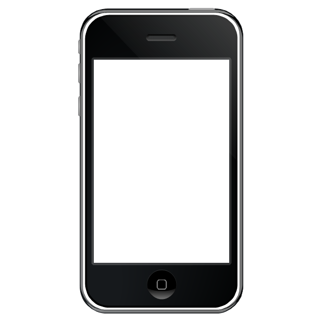
iPhone case
iPhone case, iPhone case,
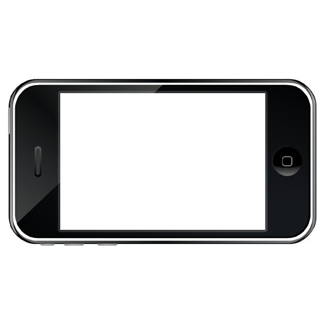
iPhone case, horizontal
iPhone case, horizontal, iPhone case,
Display
Display, display,
Screen
Screen, screen,
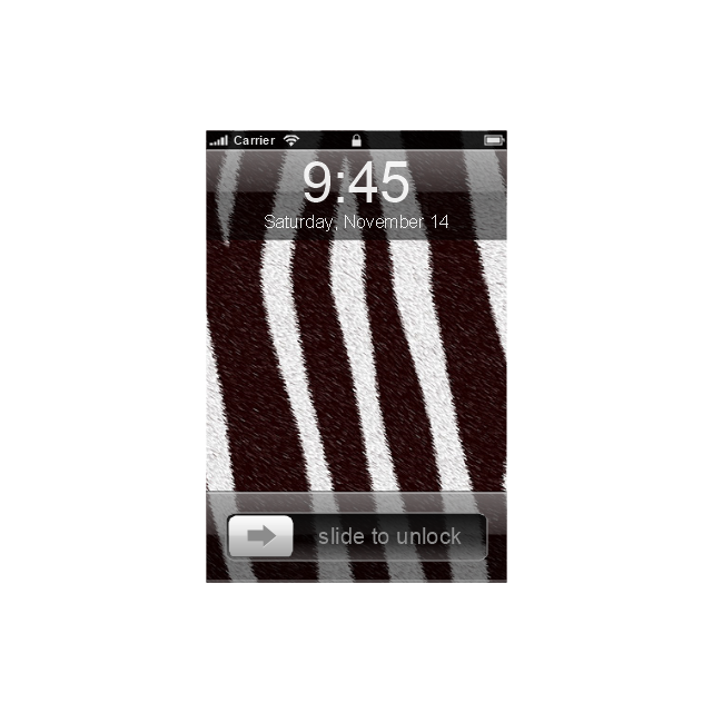
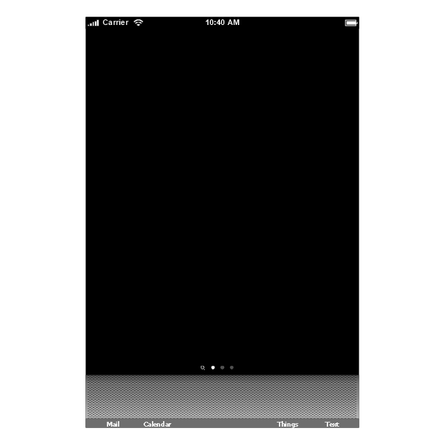
Home screen
Home screen, home screen,
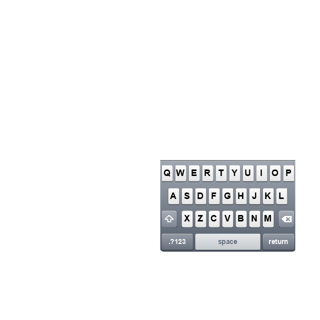
Keypad control
Keypad control, keypad, keypad control,
Status bar
Status bar, status bar,
Navigation bar
Navigation bar, navigation bar,
Navigation bar with buttons
Navigation bar with buttons, navigation bar,
Navigation bar with controls
Navigation bar with controls, navigation bar,
Navigation bar with controls
Navigation bar with controls, navigation bar,
Navigation bar with buttons, horizontal
Navigation bar with buttons, horizontal, navigation bar,
Navigation bar with controls, horizontal
Navigation bar with controls, horizontal, navigation bar,
Modal view
Modal view, modal view,
Search bar
Search bar, search bar,
Text field 1
Text field 1, text field,
Text field 2
Text field 2, text field,
Text field, varying
Text field, varying, text field,
Table row
Table row, table view row,
Table view row
Table view row, table view row,
Table view (simple list)
Table view (simple list), table view, list,
Table view (with header)
Table view (with header), table view with header, indexed list,
Action list
Action list, action list, grouped list, table,
Control button
Control button, control button,
Navigational control button
Navigational control button, navigational control button,
Add button
Add button, add button, plus button,
Navigation toolbar
Navigation toolbar, navigation toolbar, toolbar,
Tab bar
Tab bar, tab bar,
Action sheet
Action sheet, action sheet,
Choice button
Choice button, choice button,
Rounded rectangle button
Rounded rectangle button, rounded rectangle button,
Keyboard control
Keyboard control, keyboard,
Keyboard literal button
Keyboard literal button, keyboard literal button,
Keyboard button, pressed
Keyboard button, pressed, keyboard button pressed,
Keyboard label button
Keyboard label button, keyboard label button,
Selection frame 1
Selection frame 1, selection frame,
Selection frame 2
Selection frame 2, selection frame,
Loupe
Loupe, loupe,
Message box 1
Message box 1, message box,
Message box 2
Message box 2, message box,
Progress view
Progress view, progress view,
Progress view
Progress view, progress view,
Progress view
Progress view, progress view,
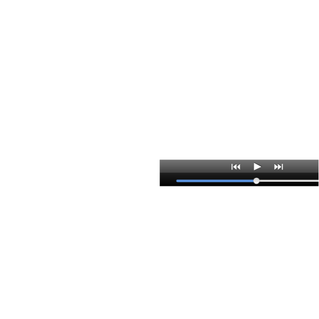
Player control
Player control, player,
Label button
Label button, label button,
Back button
Back button, back button,
Forward button
Forward button, forward button,
Option button
Option button, option button,
Checkbox
Checkbox, checkbox,
Radio button
Radio button, radio button,
Alert
Alert, alert,
Two-button alert
Two-button alert, alert,
Two-button alert (v 3.0)
Two-button alert (v 3.0), alert,
Up-Down control
Up-Down control, up-down, stepper,
Segmented control
Segmented control, segmented control,
Segmented control
Segmented control, segmented control,
Segmented control
Segmented control, segmented control,
Segmented control
Segmented control, segmented control,
Pop-up menu button
Pop-up menu button, pop-up menu button,
Popup menu
Popup menu, pop-up menu, segmented control,
Clock, white
Clock, white, clock,
Clock, black
Clock, black, clock,
Clock application table
Clock application table,
Date and time picker (1/2 parts)
Date and time picker (1/2 parts), date and time picker,
Date and time picker (3 parts)
Date and time picker (3 parts), date and time picker,
Date and time picker (4 parts)
Date and time picker (4 parts), date and time picker,
Date and time picker (v 3.0)
Date and time picker (v 3.0), date and time picker,
Switch control
Switch control, switch,
System button
System button, system button,
Reply button
Reply button, reply button,
Organize button
Organize button, organize,
Remove button
Remove button, remove,
Refresh button
Refresh button, refresh,
Play button
Play button, play,
FastForward button
FastForward button, fastforward,
Pause button
Pause button, pause,
Rewind button
Rewind button, rewind,
Backward icon
Backward icon, backward,
Forward icon
Forward icon, forward,
Share button
Share button, share,
Camera button
Camera button, camera,
Compose button
Compose button, compose,
Bookmarks button
Bookmarks button, bookmarks,
Search button
Search button, search,
Add button
Add button, add,
Trash button
Trash button, trash,
Bookmarks tab icon
Bookmarks tab icon, bookmarks tab icon,
Contacts tab icon
Contacts tab icon, contacts tab icon,
Downloads tab icon
Downloads tab icon, downloads tab icon,
Favorites tab icon
Favorites tab icon, favorites tab icon, featured, top rated ,
Featured tab icon
Featured tab icon, featured tab icon,
History tab icon
History tab icon, history tab icon,
MostRecent tab icon
MostRecent tab icon, most recent tab icon,
MostViewed tab icon
MostViewed tab icon, most viewed tab icon,
Search tab icon
Search tab icon, search tab icon,
More tab icon
More tab icon, more tab icon,
SMS tab icon
SMS tab icon, sms tab icon,
Mail tab icon
Mail tab icon, mail tab icon,
Charts tab icon
Charts tab icon, charts tab icon,
World clock tab icon
World clock tab icon, world clock tab icon,
Alarm tab icon
Alarm tab icon, alarm tab icon,
Stopwatch tab icon
Stopwatch tab icon, stopwatch tab icon,
Timer tab icon
Timer tab icon, timer tab icon,
Badge
Badge, badge,
Delete button control
Delete button control , delete,
Checkmark
Checkmark, checkmark badge,
Delete button
Delete button, delete button,
Insert
Insert, row insert, plus, add,
Disclosure indicator
Disclosure indicator, disclosure indicator,
Clear button
Clear button, clear, delete badge,
Bookmarks badge
Bookmarks badge, bookmarks,
Badge with varying width 1
Badge with varying width 1, badge,
Badge with varying width 2
Badge with varying width 2, badge,
Badge with varying width 3
Badge with varying width 3,
Activity indicator
Activity indicator, activity indicator,
Network activity indicator
Network activity indicator, network activity indicator,
Page control
Page control, page control, page indicator,
Search badge
Search badge, search,
Slider
Slider, slider,
The vector stencils library "MS Windows Vista user interface" contains 76 MS Windows Vista design elements.
Use it for designing Microsoft ribbon graphic user interface (GUI) of software for computers with MS Windows Vista OS in the ConceptDraw PRO diagramming and vector drawing software extended with the Graphic User Interface solution from the Software Development area of ConceptDraw Solution Park.
Window
Window, window,
Dialog Window
Dialog Window, dialog window,
Empty Window
Empty Window , empty window ,
Field
Field, field,
Horizontal Scrollbar
Horizontal Scrollbar, horizontal scrollbar,
Vertical Scrollbar
Vertical Scrollbar, vertical scrollbar,
Window Buttons
Window Buttons , window buttons ,
Window Buttons
Window Buttons, window buttons ,
Window Button 1
Window Button 1, window button,
Window Button 2
Window Button 2, window button,
Window Button 3
Window Button 3, window button,
Window Button 4
Window Button 4, window button,
Navigation
Navigation, navigation,
Menu Bar
Menu Bar, menu bar,
Gradient Menu Bar
Gradient Menu Bar, menu bar,
Drop-down Menu
Drop-down Menu, drop-down menu,
Button
Button, button,
Toolbar Pannel
Toolbar Pannel, toolbar pannel,
Tool Button
Tool Button, tool button,
Primary Toolbar
Primary Toolbar, primary toolbar,
Toolbar 1
Toolbar 1, toolbar,
Toolbar 2
Toolbar 2, toolbar,
Customizable Tollbar
Customizable Tollbar, toolbar,
Tab View
Tab View , tab view ,
List View
List View, list view,
Text Field
Text Field, text field,
Vertical Separator
Vertical Separator,
Horizontal Separator
Horizontal Separator,
Group Box
Group Box , group box ,
Text Label
Text Label,
Link
Link,
Line Edit
Line Edit, line edit,
Search
Search, search,
Search with Button
Search with Button , search, button,
Spin Box
Spin Box , spin box ,
Combo-box
Combo-box, combo-box,
Editable Combo-box
Editable Combo-box, combo-box,
Editable List Box
Editable List Box, list box ,
List Box
List Box, list box,
Single-selection List
Single-selection List, single-selection list,
Multiple-selection List
Multiple-selection List, multiple-selection list,
Check Box
Check Box, check box,
Radio Button
Radio Button, radio button,
Check box group
Check box group, check box group,
Radio Buttons Group
Radio Buttons Group, radio buttons group,
Progress Bar
Progress Bar , progress bar,
Modal Progress Bar
Modal Progress Bar, modal, progress bar,
Vertical Slider with Ticks
Vertical Slider with Ticks, slider, ticks,
Horizontal Slider with Ticks
Horizontal Slider with Ticks, slider, ticks,
Dial
Dial , dial,
Catalogue Tree
Catalogue Tree, catalogue tree,
Tree View 1
Tree View 1, tree view,
Tree View 2
Tree View 2, tree view,
Vertical Spacer
Vertical Spacer,
Horizontal Spacer
Horizontal Spacer,
Chevron 1
Chevron 1, chevron,
Arrow 1
Arrow 1, arrow,
Arrow 2
Arrow 2, arrow,
Plus/Minus Control
Plus/Minus Control, plus, minus, control,
Rotating Triangle
Rotating Triangle, rotating triangle,
Chevron 3
Chevron 3, chevron,
Chevron 2
Chevron 2, chevron,
Normal Select Cursor
Normal Select Cursor, select cursor,
Link Select Cursor
Link Select Cursor, select cursor, link,
Text Select Cursor
Text Select Cursor, select cursor, text,
Working in Background Pointer
Working in Background  Pointer, background pointer,
Busy Pointer
Busy Pointer, busy pointer,
Unavailable Cursor
Unavailable Cursor, unavailable cursor,
Precision Select Cursor
Precision Select Cursor, precision, select cursor,
Error Icon
Error Icon, error icon,
Warning Icon
Warning Icon, warning icon,
Information Icon
Information Icon, information icon,
Question Mark Icon
Question Mark Icon, question mark icon,
Balloon
Balloon, balloon,
Tooltip/Infotip
Tooltip/Infotip, tooltip, infotip,
Calendar
Calendar, calendar,
The vector stencils library "Glyph icons" contains 38 glyph and symbol UI icons. Use this glyph UI icon set to design graphic user interface (GUI) of your software application for OS X 10.10 Yosemite Apple Mac operating system.
The example "Glyph icons - Vector stencils library" was created using the ConceptDraw PRO diagramming and vector drawing software extended with the Mac OS User Interface solution from the Software Development area of ConceptDraw Solution Park.
Check mark grey
Check mark grey, check mark grey,
Check mark black
Check mark black, check mark black,
Submenu indicator
Submenu indicator, submenu indicator,
Command glyph
Command glyph, command glyph,
Add glyph
Add glyph, add glyph,
Delete glyph
Delete glyph, delete glyph,
Drag vertical glyph
Drag vertical glyph, drag vertical glyph,
Drag horizontal glyph
Drag horizontal glyph, drag horizontal glyph,
Expand corner
Expand corner, expand corner,
Collapse up icon
Collapse up icon, collapse up,
Collapse down icon
Collapse down icon, collapse down,
Settings icon
Settings icon, settings icon,
Chevron
Chevron, chevron,
Up-down arrows
Up-down arrows, arrows,
Divider
Divider, divider,
Up arrow
Up arrow, up arrow,
Delete key
Delete key, delete key,
Key control
Key control, key control,
Search icon
Search icon, search icon,
Search icon 2
Search icon 2, search icon,
All My Files icon
All My Files icon, All my files icon, sidebar icon,
AirDrop icon
AirDrop icon, AirDrop icon, sidebar icon,
iCloud icon
iCloud icon, iCloud icon, sidebar icon,
Applications icon
Applications icon, Applications icon, sidebar icon,
Documents icon
Documents icon, documents icon, sidebar icon,
Downloads icon
Downloads icon, downloads icon, sidebar icon,
Desktop icon
Desktop icon, desktop icon, sidebar icon,
Tag - red
Tag - red, tag,
Tag - orange
Tag - orange, tag,
Tag - yellow
Tag - yellow, tag,
Tag - green
Tag - green, tag,
Tag - blue
Tag - blue, tag,
Tag - purple
Tag - purple, tag,
Tag - gray
Tag - gray, tag,
All tags
All tags, all tags glyph, tag,
Apple icon
Apple icon, Apple icon, Mac OS icon,
Disclosure triangle
Disclosure triangle, disclosure triangle,
Refresh
Refresh, refresh icon,
The vector stencils library "iPhone interface" contains 119 iPhone UI design elements.
Use it for development of graphic user interface (GUI) for iPhone software applications in the ConceptDraw PRO diagramming and vector drawing software extended with the Graphic User Interface solution from the Software Development area of ConceptDraw Solution Park.
iPhone case
iPhone case, iPhone case,
iPhone case, horizontal
iPhone case, horizontal, iPhone case,
Display
Display, display,
Screen
Screen, screen,
Home screen
Home screen, home screen,
Keypad control
Keypad control, keypad, keypad control,
Status bar
Status bar, status bar,
Navigation bar
Navigation bar, navigation bar,
Navigation bar with buttons
Navigation bar with buttons, navigation bar,
Navigation bar with controls
Navigation bar with controls, navigation bar,
Navigation bar with controls
Navigation bar with controls, navigation bar,
Navigation bar with buttons, horizontal
Navigation bar with buttons, horizontal, navigation bar,
Navigation bar with controls, horizontal
Navigation bar with controls, horizontal, navigation bar,
Modal view
Modal view, modal view,
Search bar
Search bar, search bar,
Text field 1
Text field 1, text field,
Text field 2
Text field 2, text field,
Text field, varying
Text field, varying, text field,
Table row
Table row, table view row,
Table view row
Table view row, table view row,
Table view (simple list)
Table view (simple list), table view, list,
Table view (with header)
Table view (with header), table view with header, indexed list,
Action list
Action list, action list, grouped list, table,
Control button
Control button, control button,
Navigational control button
Navigational control button, navigational control button,
Add button
Add button, add button, plus button,
Navigation toolbar
Navigation toolbar, navigation toolbar, toolbar,
Tab bar
Tab bar, tab bar,
Action sheet
Action sheet, action sheet,
Choice button
Choice button, choice button,
Rounded rectangle button
Rounded rectangle button, rounded rectangle button,
Keyboard control
Keyboard control, keyboard,
Keyboard literal button
Keyboard literal button, keyboard literal button,
Keyboard button, pressed
Keyboard button, pressed, keyboard button pressed,
Keyboard label button
Keyboard label button, keyboard label button,
Selection frame 1
Selection frame 1, selection frame,
Selection frame 2
Selection frame 2, selection frame,
Loupe
Loupe, loupe,
Message box 1
Message box 1, message box,
Message box 2
Message box 2, message box,
Progress view
Progress view, progress view,
Progress view
Progress view, progress view,
Progress view
Progress view, progress view,
Player control
Player control, player,
Label button
Label button, label button,
Back button
Back button, back button,
Forward button
Forward button, forward button,
Option button
Option button, option button,
Checkbox
Checkbox, checkbox,
Radio button
Radio button, radio button,
Alert
Alert, alert,
Two-button alert
Two-button alert, alert,
Two-button alert (v 3.0)
Two-button alert (v 3.0), alert,
Up-Down control
Up-Down control, up-down, stepper,
Segmented control
Segmented control, segmented control,
Segmented control
Segmented control, segmented control,
Segmented control
Segmented control, segmented control,
Segmented control
Segmented control, segmented control,
Pop-up menu button
Pop-up menu button, pop-up menu button,
Popup menu
Popup menu, pop-up menu, segmented control,
Clock, white
Clock, white, clock,
Clock, black
Clock, black, clock,
Clock application table
Clock application table,
Date and time picker (1/2 parts)
Date and time picker (1/2 parts), date and time picker,
Date and time picker (3 parts)
Date and time picker (3 parts), date and time picker,
Date and time picker (4 parts)
Date and time picker (4 parts), date and time picker,
Date and time picker (v 3.0)
Date and time picker (v 3.0), date and time picker,
Switch control
Switch control, switch,
System button
System button, system button,
Reply button
Reply button, reply button,
Organize button
Organize button, organize,
Remove button
Remove button, remove,
Refresh button
Refresh button, refresh,
Play button
Play button, play,
FastForward button
FastForward button, fastforward,
Pause button
Pause button, pause,
Rewind button
Rewind button, rewind,
Backward icon
Backward icon, backward,
Forward icon
Forward icon, forward,
Share button
Share button, share,
Camera button
Camera button, camera,
Compose button
Compose button, compose,
Bookmarks button
Bookmarks button, bookmarks,
Search button
Search button, search,
Add button
Add button, add,
Trash button
Trash button, trash,
Bookmarks tab icon
Bookmarks tab icon, bookmarks tab icon,
Contacts tab icon
Contacts tab icon, contacts tab icon,
Downloads tab icon
Downloads tab icon, downloads tab icon,
Favorites tab icon
Favorites tab icon, favorites tab icon, featured, top rated ,
Featured tab icon
Featured tab icon, featured tab icon,
History tab icon
History tab icon, history tab icon,
MostRecent tab icon
MostRecent tab icon, most recent tab icon,
MostViewed tab icon
MostViewed tab icon, most viewed tab icon,
Search tab icon
Search tab icon, search tab icon,
More tab icon
More tab icon, more tab icon,
SMS tab icon
SMS tab icon, sms tab icon,
Mail tab icon
Mail tab icon, mail tab icon,
Charts tab icon
Charts tab icon, charts tab icon,
World clock tab icon
World clock tab icon, world clock tab icon,
Alarm tab icon
Alarm tab icon, alarm tab icon,
Stopwatch tab icon
Stopwatch tab icon, stopwatch tab icon,
Timer tab icon
Timer tab icon, timer tab icon,
Badge
Badge, badge,
Delete button control
Delete button control , delete,
Checkmark
Checkmark, checkmark badge,
Delete button
Delete button, delete button,
Insert
Insert, row insert, plus, add,
Disclosure indicator
Disclosure indicator, disclosure indicator,
Clear button
Clear button, clear, delete badge,
Bookmarks badge
Bookmarks badge, bookmarks,
Badge with varying width 1
Badge with varying width 1, badge,
Badge with varying width 2
Badge with varying width 2, badge,
Badge with varying width 3
Badge with varying width 3,
Activity indicator
Activity indicator, activity indicator,
Network activity indicator
Network activity indicator, network activity indicator,
Page control
Page control, page control, page indicator,
Search badge
Search badge, search,
Slider
Slider, slider,

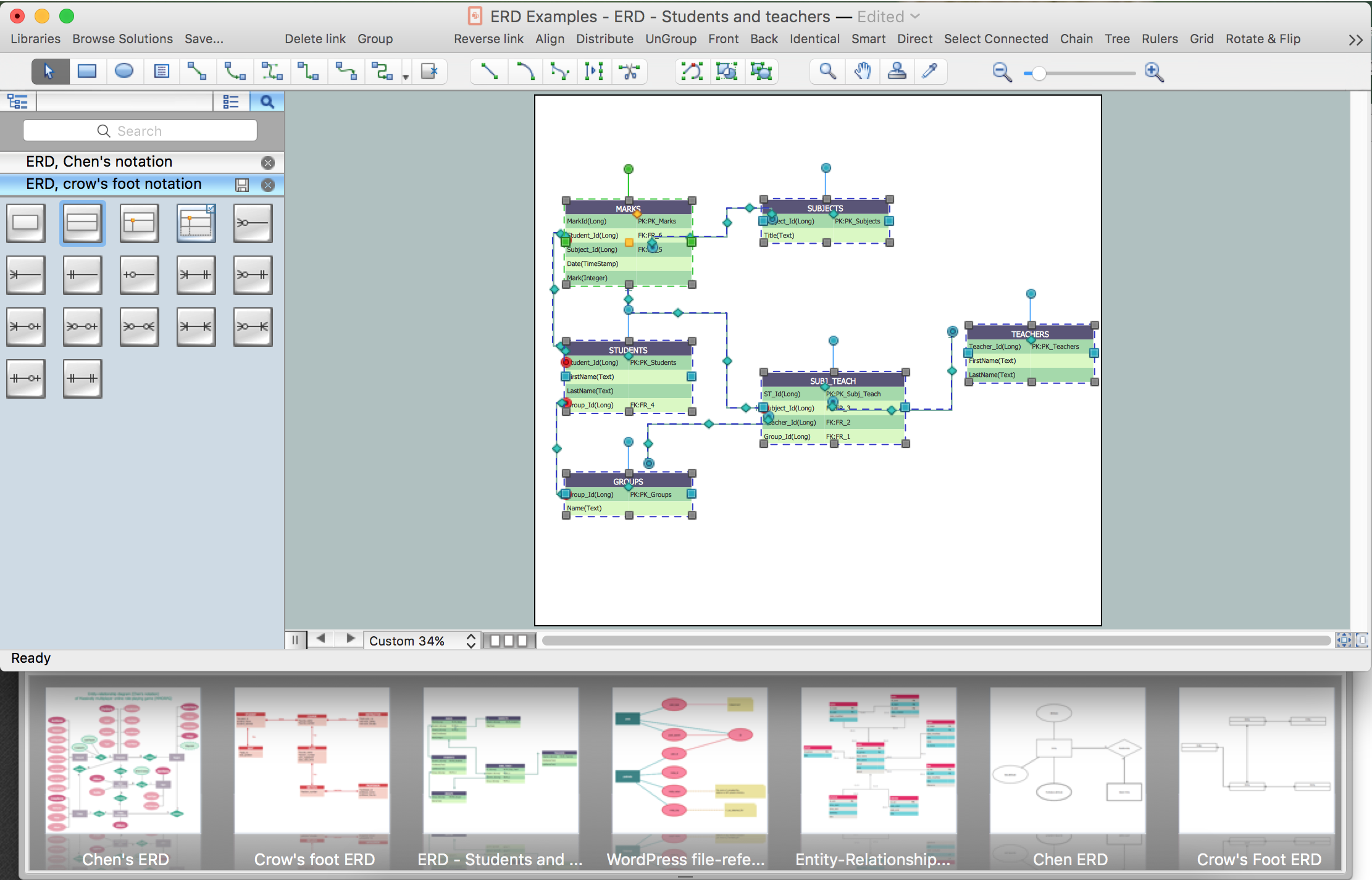
Developing Entity Relationship Diagrams

When you need to visually represent the structure of relational database, Entity relationship diagram (ERD) is a type of diagram for that case. Most entity-relationship diagrams can be built with objects from Flowchart solution or ERD Solution which contains inbuilt templates. Follow these steps to create your own custom ERD diagram. Don't be frightened if it looks complex, ConceptDraw PRO makes it easy to create an ERD, and hundreds of other diagrams, in minutes.
The vector stencils library "iPhone interface" contains 119 iPhone UI design elements.
Use it for development of graphic user interface (GUI) for iPhone software applications in the ConceptDraw PRO diagramming and vector drawing software extended with the Graphic User Interface solution from the Software Development area of ConceptDraw Solution Park.
iPhone case
iPhone case, iPhone case,
iPhone case, horizontal
iPhone case, horizontal, iPhone case,
Display
Display, display,
Screen
Screen, screen,
Home screen
Home screen, home screen,
Keypad control
Keypad control, keypad, keypad control,
Status bar
Status bar, status bar,
Navigation bar
Navigation bar, navigation bar,
Navigation bar with buttons
Navigation bar with buttons, navigation bar,
Navigation bar with controls
Navigation bar with controls, navigation bar,
Navigation bar with controls
Navigation bar with controls, navigation bar,
Navigation bar with buttons, horizontal
Navigation bar with buttons, horizontal, navigation bar,
Navigation bar with controls, horizontal
Navigation bar with controls, horizontal, navigation bar,
Modal view
Modal view, modal view,
Search bar
Search bar, search bar,
Text field 1
Text field 1, text field,
Text field 2
Text field 2, text field,
Text field, varying
Text field, varying, text field,
Table row
Table row, table view row,
Table view row
Table view row, table view row,
Table view (simple list)
Table view (simple list), table view, list,
Table view (with header)
Table view (with header), table view with header, indexed list,
Action list
Action list, action list, grouped list, table,
Control button
Control button, control button,
Navigational control button
Navigational control button, navigational control button,
Add button
Add button, add button, plus button,
Navigation toolbar
Navigation toolbar, navigation toolbar, toolbar,
Tab bar
Tab bar, tab bar,
Action sheet
Action sheet, action sheet,
Choice button
Choice button, choice button,
Rounded rectangle button
Rounded rectangle button, rounded rectangle button,
Keyboard control
Keyboard control, keyboard,
Keyboard literal button
Keyboard literal button, keyboard literal button,
Keyboard button, pressed
Keyboard button, pressed, keyboard button pressed,
Keyboard label button
Keyboard label button, keyboard label button,
Selection frame 1
Selection frame 1, selection frame,
Selection frame 2
Selection frame 2, selection frame,
Loupe
Loupe, loupe,
Message box 1
Message box 1, message box,
Message box 2
Message box 2, message box,
Progress view
Progress view, progress view,
Progress view
Progress view, progress view,
Progress view
Progress view, progress view,
Player control
Player control, player,
Label button
Label button, label button,
Back button
Back button, back button,
Forward button
Forward button, forward button,
Option button
Option button, option button,
Checkbox
Checkbox, checkbox,
Radio button
Radio button, radio button,
Alert
Alert, alert,
Two-button alert
Two-button alert, alert,
Two-button alert (v 3.0)
Two-button alert (v 3.0), alert,
Up-Down control
Up-Down control, up-down, stepper,
Segmented control
Segmented control, segmented control,
Segmented control
Segmented control, segmented control,
Segmented control
Segmented control, segmented control,
Segmented control
Segmented control, segmented control,
Pop-up menu button
Pop-up menu button, pop-up menu button,
Popup menu
Popup menu, pop-up menu, segmented control,
Clock, white
Clock, white, clock,
Clock, black
Clock, black, clock,
Clock application table
Clock application table,
Date and time picker (1/2 parts)
Date and time picker (1/2 parts), date and time picker,
Date and time picker (3 parts)
Date and time picker (3 parts), date and time picker,
Date and time picker (4 parts)
Date and time picker (4 parts), date and time picker,
Date and time picker (v 3.0)
Date and time picker (v 3.0), date and time picker,
Switch control
Switch control, switch,
System button
System button, system button,
Reply button
Reply button, reply button,
Organize button
Organize button, organize,
Remove button
Remove button, remove,
Refresh button
Refresh button, refresh,
Play button
Play button, play,
FastForward button
FastForward button, fastforward,
Pause button
Pause button, pause,
Rewind button
Rewind button, rewind,
Backward icon
Backward icon, backward,
Forward icon
Forward icon, forward,
Share button
Share button, share,
Camera button
Camera button, camera,
Compose button
Compose button, compose,
Bookmarks button
Bookmarks button, bookmarks,
Search button
Search button, search,
Add button
Add button, add,
Trash button
Trash button, trash,
Bookmarks tab icon
Bookmarks tab icon, bookmarks tab icon,
Contacts tab icon
Contacts tab icon, contacts tab icon,
Downloads tab icon
Downloads tab icon, downloads tab icon,
Favorites tab icon
Favorites tab icon, favorites tab icon, featured, top rated ,
Featured tab icon
Featured tab icon, featured tab icon,
History tab icon
History tab icon, history tab icon,
MostRecent tab icon
MostRecent tab icon, most recent tab icon,
MostViewed tab icon
MostViewed tab icon, most viewed tab icon,
Search tab icon
Search tab icon, search tab icon,
More tab icon
More tab icon, more tab icon,
SMS tab icon
SMS tab icon, sms tab icon,
Mail tab icon
Mail tab icon, mail tab icon,
Charts tab icon
Charts tab icon, charts tab icon,
World clock tab icon
World clock tab icon, world clock tab icon,
Alarm tab icon
Alarm tab icon, alarm tab icon,
Stopwatch tab icon
Stopwatch tab icon, stopwatch tab icon,
Timer tab icon
Timer tab icon, timer tab icon,
Badge
Badge, badge,
Delete button control
Delete button control , delete,
Checkmark
Checkmark, checkmark badge,
Delete button
Delete button, delete button,
Insert
Insert, row insert, plus, add,
Disclosure indicator
Disclosure indicator, disclosure indicator,
Clear button
Clear button, clear, delete badge,
Bookmarks badge
Bookmarks badge, bookmarks,
Badge with varying width 1
Badge with varying width 1, badge,
Badge with varying width 2
Badge with varying width 2, badge,
Badge with varying width 3
Badge with varying width 3,
Activity indicator
Activity indicator, activity indicator,
Network activity indicator
Network activity indicator, network activity indicator,
Page control
Page control, page control, page indicator,
Search badge
Search badge, search,
Slider
Slider, slider,

wireframe tools, wireframing, wire frame, website wireframe, interface design, wireframe examples Website Wireframe

wireframe tools, wireframing, wire frame, website wireframe, interface design, wireframe examples
The innovative Website Wireframe solution enhances the ConceptDraw PRO v10 functionality with newest wireframe tools, libraries with variety of predesigned icons, symbols, buttons, graphics, forms, boxes, and many other vector elements, templates and professionally designed samples, which make it the best wireframing software. Website Wireframe solution gives you significant advantages when designing and maintaining websites, creating skeletal and content-free depictions of website structure, making website prototypes and planning the content arrangement before committing to design, also speeds up the processes of sketching, producing and sharing wireframe examples of website style and interface design.