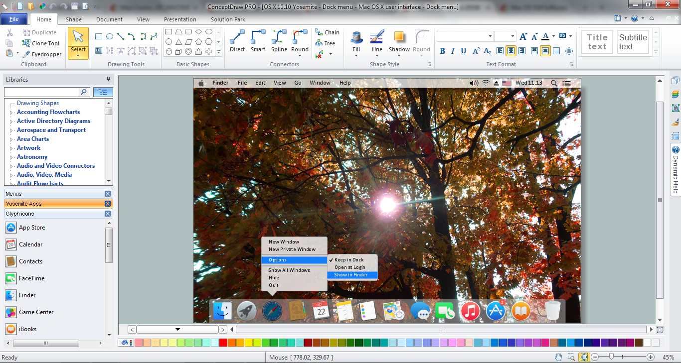
The vector stencils library "Glyph icons" contains 38 glyph and symbol UI icons. Use this glyph UI icon set to design graphic user interface (GUI) of your software application for OS X 10.10 Yosemite Apple Mac operating system.
The example "Glyph icons - Vector stencils library" was created using the ConceptDraw PRO diagramming and vector drawing software extended with the Mac OS User Interface solution from the Software Development area of ConceptDraw Solution Park.
The example "Glyph icons - Vector stencils library" was created using the ConceptDraw PRO diagramming and vector drawing software extended with the Mac OS User Interface solution from the Software Development area of ConceptDraw Solution Park.
The vector stencils library "Glyph icons" contains 38 glyph and symbol UI icons.
Use this glyph UI icon set to design graphic user interface (GUI) of your software application for OS X 10.10 Yosemite Apple Mac operating system.
"In typography, a glyph is an elemental symbol within an agreed set of symbols, intended to represent a readable character for the purposes of writing and thereby expressing thoughts, ideas and concepts. As such, glyphs are considered to be unique marks that collectively add up to the spelling of a word, or otherwise contribute to a specific meaning of what is written, with that meaning dependent on cultural and social usage." [Glyph. Wikipedia]
The symbols example "Design elements - Glyph icons" was created using the ConceptDraw PRO diagramming and vector drawing software extended with the Mac OS User Interface solution from the Software Development area of ConceptDraw Solution Park.
 Mac OS X User Interface
Mac OS User Interface solution extends ConceptDraw PRO gui software with templates, samples and Mac OS user interface design examples, and large quantity of libraries with variety of vector stencils for designing the OS X 10.10 Yosemite user interfaces.
Mac OS GUI Software
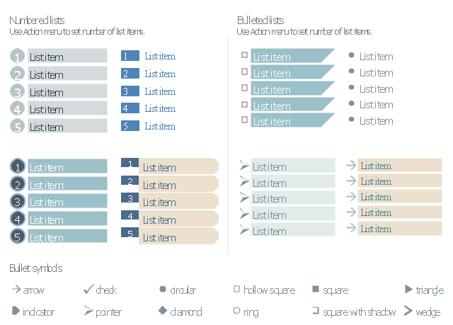
ConceptDraw PRO diagramming and vector drawing software extended with Mac OS User Interface Solution from the Software Development area is a powerful Mac OS GUI SoftwareThe vector stencils library "Management list blocks" contains 20 list block shapes: numbered list, bulleted list, bullets.
Use these list elements to design your management infograms.
"In typography, a bullet is a typographical symbol or glyph used to introduce items in a list. ...
The bullet symbol may take any of a variety of shapes, such as circular, square, diamond, arrow, etc. ...
Bullets are most often used in technical writing, reference works, notes and presentations. ...
Bulleted items – known as "bullet points" – may be short phrases, single sentences, or of paragraph length. Bulleted items are not usually terminated with a full stop if they are not complete sentences, although it is not rare to terminate every item except the last one with a semicolon, and terminate the last item with a full stop. It is correct to terminate a bullet point with a full stop if the text within that item consists of one 'full' sentence or more." [Bullet (typography). Wikipedia]
The shapes example "Design elements - Management list blocks" was created using the ConceptDraw PRO diagramming and vector drawing software extended with the Management Infographics solition from the area "Business Infographics" in ConceptDraw Solution Park.
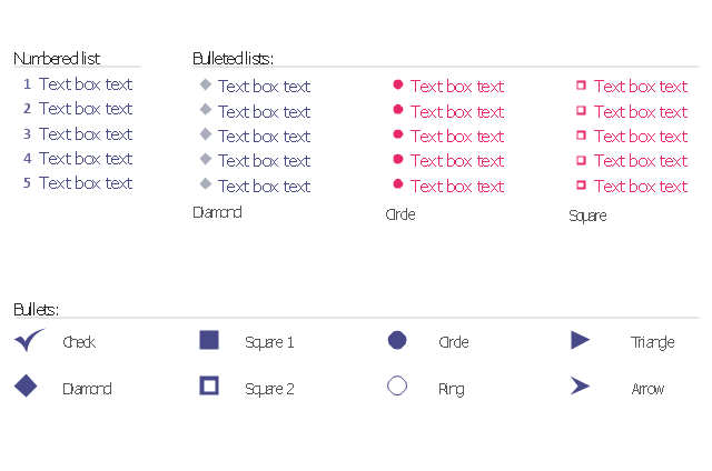
The vector stencils library "Bulleted and numbered lists" contains 12 elements of bulleted and numbered lists, and bullets for creating typography infographics.
"In typography, a bullet ( • ) is a typographical symbol or glyph used to introduce items in a list. ... The bullet symbol may take any of a variety of shapes, such as circular, square, diamond, arrow, etc., and typical word processor software offer a wide selection of shapes and colours. Several regular symbols are conventionally used in ASCII-only text or another environments where bullet characters are not available, such as * (asterisk), - (hyphen), . (period), and even o (lowercase O). Of course, when writing by hand, bullets may be drawn in any style. Historically, the index symbol was popular for similar uses." [Bullet (typography). Wikipedia]
The example "Design elements - Bulleted and numbered lists" was created using the ConceptDraw PRO diagramming and vector drawing software extended with the Typography Infographics solition from the area "What is infographics" in ConceptDraw Solution Park.
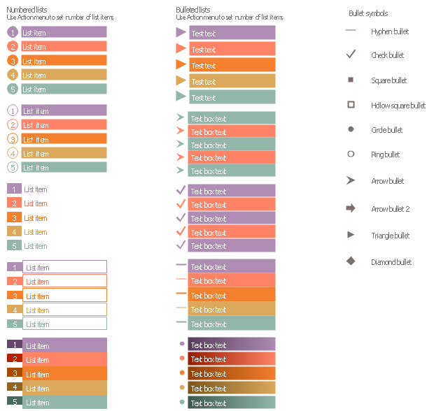
The vector stencils library "List blocks" contains 20 numbered list elements, bulleted list elements and bullet symbols for creating marketing infograms.
"In typography, a bullet ( • ) is a typographical symbol or glyph used to introduce items in a list. ...
The bullet symbol may take any of a variety of shapes, such as circular, square, diamond, arrow, etc., and typical word processor software offer a wide selection of shapes and colours. ...
Bullets are most often used in technical writing, reference works, notes and presentations." [Bullet (typography). Wikipedia]
The shapes example "Design elements - List blocks" was created using the ConceptDraw PRO diagramming and vector drawing software extended with the Marketing Infographics solition from the area "Business Infographics" in ConceptDraw Solution Park.
The vector stencils library "Wireframe grid" contains 7 web page layout design patterns.
Use these grids to position content and widgets on your web pages using the ConceptDraw PRO diagramming and vector drawing software.
"In graphic design, a grid is a structure (usually two-dimensional) made up of a series of intersecting straight (vertical, horizontal, and angular) or curved guide lines used to structure content. The grid serves as an armature on which a designer can organize graphic elements (images, glyphs, paragraphs) in a rational, easy to absorb manner. A grid can be used to organize graphic elements in relation to a page, in relation to other graphic elements on the page, or relation to other parts of the same graphic element or shape. ...
While grid systems have seen significant use in print media, interest from web developers has only recently seen a resurgence. Website design frameworks producing HTML and CSS had existed for a while before newer frameworks popularised the use of grid-based layouts. Some grid systems specify fixed-width elements with pixels, and some are 'fluid', meaning that they call for page element sizing to be in relative units like percentages, rather than absolute units like pixels or points." [en.wikipedia.org/ wiki/ Grid_ (graphic_ design)]
The webpage layout patterns example "Design elements - Wireframe grid" is included in the Website Wireframe solution from the Software Development area of ConceptDraw Solution Park.
The vector stencils library "Progressive disclosure controls" contains 12 icons of Windows 8 progressive disclosure controls.
Use it to design graphic user interface (GUI) prototypes of your software applications for Windows 8.
"With a progressive disclosure control, users can show or hide additional information including data, options, or commands. Progressive disclosure promotes simplicity by focusing on the essential, yet revealing additional detail as needed. ...
Chevrons show or hide the remaining items in completely or partially hidden content. Usually the items are shown in place, but they can also be shown in a pop-up menu. When in place, the item stays expanded until the user collapses it. ...
Arrows show a pop-up command menu. The item stays expanded until the user makes a selection or clicks anywhere.
If the arrow button is an independent control, it receives input focus and is activated with the space bar. If the arrow button has a parent control, the parent receives input focus and the arrow is activated with Alt+down arrow and Alt+up arrow keys, as with the drop-down list control. ...
Plus and minus controls expand or collapse to show container content in place when navigating through a hierarchy. The item stays expanded until the user collapses it. Although these look like buttons, their behavior is in-place.
The associated object receives input focus. The plus is activated with the right arrow key, and the minus with the left arrow key. ...
Rotating triangles show or hide additional information in place for an individual item. They are also used to expand containers. The item stays expanded until the user collapses it.
The associated object receives input focus. The collapsed (right-pointing) triangle is activated with the right arrow key, and the expanded (downward-pointing) triangle with the left arrow key. ...
Like chevrons, additional information is shown or hidden in place. The item stays expanded until the user collapses it. Unlike chevrons, the glyphs have a graphical representation of the action, typically with an arrow indicating what will happen. ... Preview arrows are best reserved for situations where a standard chevron doesn't adequately communicate the control's behavior, such as when the disclosure is complex or there is more than one type of disclosure." [msdn.microsoft.com/ en-us/ library/ windows/ desktop/ dn742409%28v=vs.85%29.aspx]
The icons example "Progressive disclosure controls - Vector stencils library" was created using the ConceptDraw PRO diagramming and vector drawing software extended with the Windows 8 User Interface solution from the Software Development area of ConceptDraw Solution Park.
- Glyph icons - Vector stencils library | Flowchart Examples and ...
- Glyph icons - Vector stencils library
- Glyph icons - Vector stencils library | App icons - Vector stencils ...
- Glyph icons - Vector stencils library | Window elements - Vector ...
- Glyph icons - Vector stencils library | Cisco Network Design. Cisco ...
- Design elements - Glyph icons
- Glyph icons - Vector stencils library | Glyphicon Setting Icon
- Glyph icons - Vector stencils library | Design elements - Glyph icons ...
- Design elements - Cloud round icons | Glyph icons - Vector stencils ...
- Glyph icons - Vector stencils library | Glyphicon Setting
- Glyph icons - Vector stencils library | ConceptDraw Solution Park ...
- Glyph icons
- Glyph icons - Vector stencils library | iPhone OS (iOS) graphic user ...
- Southern constellations (45-90 degrees) - Vector stencils library ...
- Circular arrows diagrams - Vector stencils library | Glyph icons ...
- HR arrows - Vector stencils library | Sales arrows - Vector stencils ...
- Flowchart design. Flowchart symbols, shapes, stencils and icons ...
- Downloading the Old Versions of ConceptDraw Products ...
- iPhone User Interface | Android GUI | How To Draw an iPhone ...
- Design elements - Bulleted and numbered lists | Design elements ...
