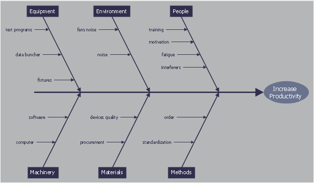
This cause and effect diagram sample was redesigned from the Wikimedia Commons file: Ursache Wirkung Diagramm Beispiel.png. [commons.wikimedia.org/ wiki/ File:Ursache_ Wirkung_ Diagramm_ Beispiel.png]
This file is licensed under the Creative Commons Attribution-Share Alike 3.0 Unported license. [creativecommons.org/ licenses/ by-sa/ 3.0/ deed.en]
"Productivity is the ratio of output to inputs in production; it is an average measure of the efficiency of production. Efficiency of production means production’s capability to create incomes which is measured by the formula real output value minus real input value.
Productivity is a crucial factor in production performance of firms and nations. Increasing national productivity can raise living standards because more real income improves people's ability to purchase goods and services, enjoy leisure, improve housing and education and contribute to social and environmental programs. Productivity growth also helps businesses to be more profitable." [Productivity. Wikipedia]
The fishbone diagram example "Increase in productivity" was created using the ConceptDraw PRO diagramming and vector drawing software extended with the Fishbone Diagrams solution from the Management area of ConceptDraw Solution Park.
Ishikawa diagram
Process Flowchart

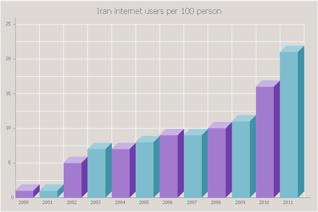
The 3D vertical bar graph sample shows the Iran internet users per 100 person from 2000 to 2011. It was designed on the base of the Commons Wikimedia file: Iran internet users per 100 person.png.
[commons.wikimedia.org/ wiki/ File:Iran_ internet_ users_ per_ 100_ person.png]
This file is licensed under the Creative Commons Attribution-Share Alike 3.0 Unported license. [creativecommons.org/ licenses/ by-sa/ 3.0/ deed.en]
The data source is World Bank: [data.worldbank.org/ country/ iran-islamic-republic]
"In 1993 Iran became the second country in the Middle East to be connected to the Internet, and since then the government has made significant efforts to improve the nation's ICT infrastructure. Iran's national Internet connectivity infrastructure is based on two major networks: the public switched telephone network (PSTN) and the public data network. The PSTN provides a connection for end-users to Internet service providers (ISPs) over mostly digital lines and supports modem-based connections. The Data Communication Company of Iran (DCI), a subsidiary of TCI, operates the public data network." [Internet in Iran. Wikipedia]
The 3D column chart example "Iran internet users per 100 person" was created using the ConceptDraw PRO diagramming and vector drawing software extended with the Bar Graphs solution from the Graphs and Charts area of ConceptDraw Solution Park.
3D Column chart
Helpful in all stages of quality management

Business Productivity - Marketing

How to Draw a Good Diagram of a Business Workflow?

Tools and Software to Improve Your Workflow

Business Graphics Software
Dashboard Software
Reporting & Data Visualization

Data Visualization Software Solutions

Sales Teams are Inherently Competitive
Sales Dashboards for Your Company

Business Intelligence Dashboard Software

- Cause and effect diagram - Increase in productivity | Total Quality ...
- Cause and effect diagram - Increase in productivity | Fishbone ...
- Cause and effect diagram - Increase in productivity | Home area ...
- Telephone Logo Png
- Cause and effect diagram - Increase in productivity | The Best ...
- Culture Presentation Vector Png
- Fishbone diagram - Bad coffee | Cause and effect diagram ...
- Png Standard Classroom Floor Plan
- User Png
- Value Stream Mapping Examples Produc
- Furniture Plan View Png
- McKinsey 7S framework - Bubble diagram | Websites interlinking to ...
- Logistic Truck Vector Png
- Goods And Services Png
- Cubicle Png
- Sample Of Social Mapping In Png
- Flow Process Chart Example Png
- Data Visualization Software Solutions | Sales Dashboard Template ...
- Value Stream Mapping Symbols
- Png Furniture Top View Free