"The distribution of wealth is a comparison of the wealth of various members or groups in a society. It differs from the distribution of income in that it looks at the distribution of ownership of the assets in a society, rather than the current income of members of that society." [Distribution of wealth. Wikipedia]
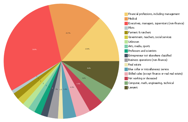
This pie chart sample was redesigned from the Wikimedia Commons file: Percentage of the top 1% wage earners in the United States by occupation (pie chart).svg.
[commons.wikimedia.org/ wiki/ File:Percentage_ of_ the_ top_ 1%25_ wage_ earners_ in_ the_ United_ States_ by_ occupation_ (pie_ chart).svg]
This file is licensed under the Creative Commons Attribution-Share Alike 3.0 Unported license. [creativecommons.org/ licenses/ by-sa/ 3.0/ deed.en]
This graph shows the make up of the top one percent of United States wage earners, grouped by occupation. Data for this graph is sourced from the November 2010 report written by Jon Bakija, Adam Cole, and Bradley T. Heim titled "Jobs and Income Growth of Top Earners and the Causes of Changing Income Inequality: Evidence from U.S. Tax Return Data", column "2005" in table 2, titled "Percentage of primary taxpayers in top one percent of the distribution of income (excluding capital gains) that are in each occupation", on page 50.
The pie chart example "Percentage of the top 1% wage earners in the US by occupation" was created using the ConceptDraw PRO diagramming and vector drawing software extended with the Pie Charts solutiton of the Graphs and Charts area in ConceptDraw Solution Park.
- Sector diagram - Template | Sector weightings - Exploded pie chart ...
- How to Draw the Different Types of Pie Charts | Percentage Pie ...
- Sector diagram - Template | How To Create Onion Diagram | Pie ...
- Exploded pie chart
- How to Draw the Different Types of Pie Charts | Pie Chart Software ...
- Donut Chart Templates | Donut chart - Template | Pie Chart ...
- How to Draw the Different Types of Pie Charts | Percentage of the ...
- Frequency distribution charts - Vector stencils library | Histogram ...
- Pie Chart Examples and Templates | Process Flowchart | Basic ...
- Process Flowchart | Program to Make Flow Chart | Basic ...
- How to Draw an Organization Chart | How to Draw an ...
- Process Flowchart | Activity on Node Network Diagramming Tool ...
- Chart Examples | Sales Growth. Bar Graphs Example | Chart ...
- Target and Circular Diagrams | Content marketing cycle - Ring chart ...
- Bar Diagrams for Problem Solving. Create manufacturing and ...
- Basic Flowchart Symbols and Meaning | Innovation life cycle - Arrow ...
- Sales KPIs - Performance dashboard | Sales geographically ...
- Competitive feature comparison matrix chart - Digital scouting cameras
- Biology | Biology Illustration | Catabolism schematic - Biochemical ...
- Circle Diagram And Solution
