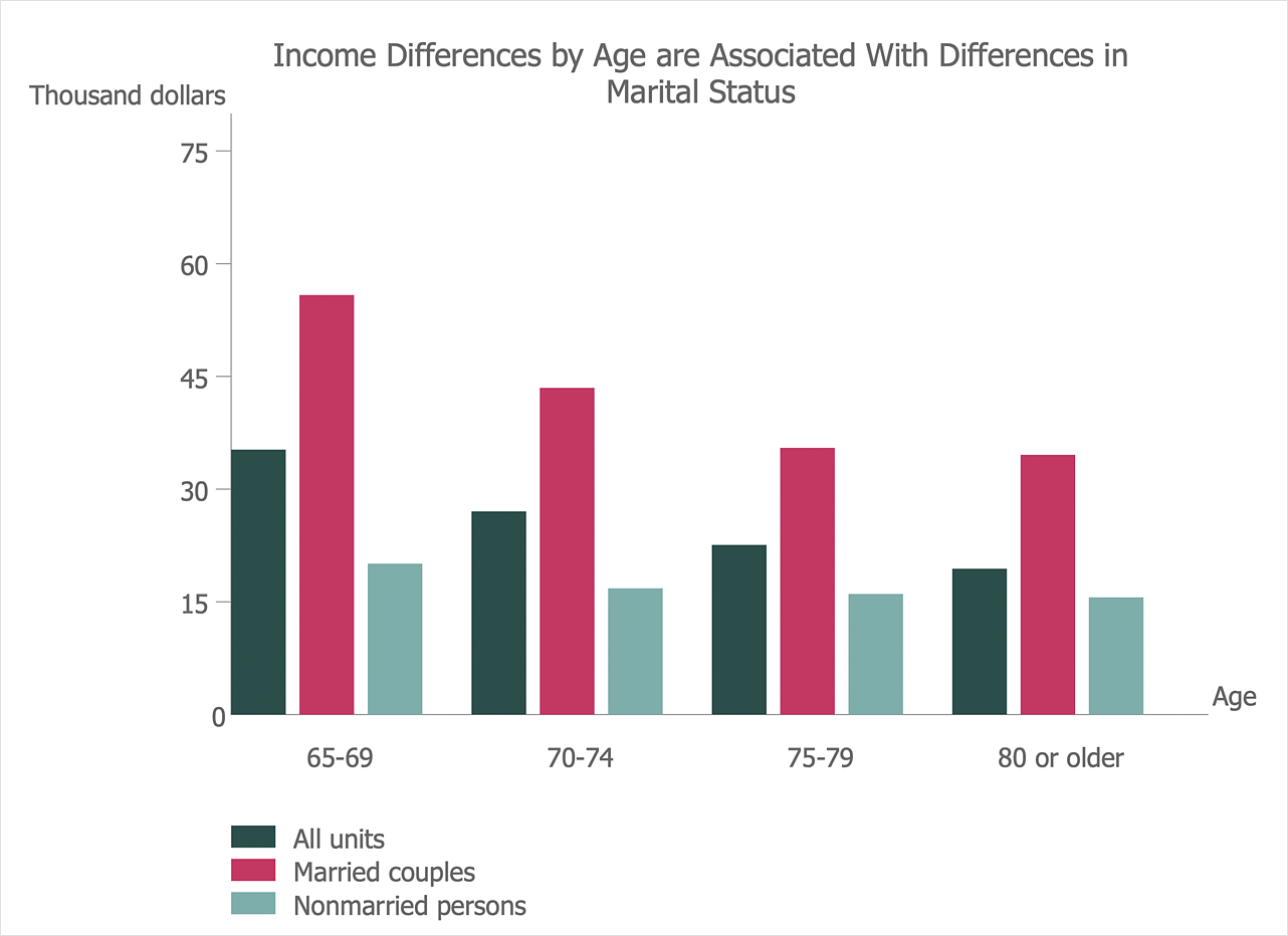
When you need to show graphically a comparisons between data categories, you can use a bar graph - a chart that uses horizontal or vertical bars to show comparisons among categories. A vertical bar chart is called a column chart. The ability to create a Bar chart is provided by the Bar Graphs solution.
You can create a Bar chart using:
- Vertical bar chart shapes
- 3D bar chart shapes
- Cylindrical bar chart shapes
- Double bar chart shape
- Horizontal bar chart shape
Vertical bar chart, 3D bar chart and Cylindrical bar chart
- Drag and drop chart shape from the library to your document.
- To make changes in your chart use the Action menu commands. To open the menu select an object and click the
 button in the upper right corner of the object.

- To change value in a bar, select it and type the new value.

- To add or change chart caption select a bar chart and simply start typing.
- To change orientation of a category labels under horizontal axis use Action menu command Inclined/Horizontal labels.
- To move category labels up and down select the bar chart and use control dot in the bottom right corner of the shape.

- To change bar width and space between bars select a bar chart and use control dot on the horizontal axis.
Double bar chart
- Drag and drop chart shape from the library to your document.
- To make changes in your chart use the Action menu commands.
- To change value in a bar, select it and type the new value.
- To change category color select it and use the Fill option provided in the Format panel.
- To set category names select a category and enter a new name.

- To change orientation of a category labels under horizontal axis use Action menu command Inclined/Horizontal labels.
- To move category labels up and down select the bar chart and use control dot in the bottom right corner of the shape.
- To change bar width and space between bars select a bar chart and use control dot on the horizontal axis.
Horizontal bar chart
- Drag and drop chart shape from the library to your document.
- To make changes in your chart use the Action menu commands.
- To change value in a bar, select it in the table and type the new value.
- Use the table to change Categories or Series labels.

Result: It is useful to use a Bar chart to present data changes over a period of time or highlighting comparisons in the data.


 Business-specific Drawings