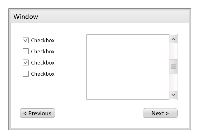
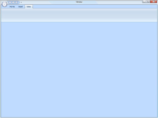
Use this template to prototype and design the Windows graphic user interface.
"In human–computer interaction, WIMP stands for "windows, icons, menus, pointer", denoting a style of interaction using these elements of the user interface. ... Other expansions are sometimes used, substituting "mouse" and "mice" or "pull-down menu" and "pointing", for menus and pointer, respectively. ...
In a WIMP system:
(1) A window runs a self-contained program, isolated from other programs that (if in a multi-program operating system) run at the same time in other windows.
(2) An icon acts as a shortcut to an action the computer performs (e.g., execute a program or task).
(3) A menu is a text or icon-based selection system that selects and executes programs or tasks.
(4) The pointer is an onscreen symbol that represents movement of a physical device that the user controls to select icons, data elements, etc.
(5) cut, copy, and paste.
This style of system improves human–computer interaction (HCI) by emulating real-world interactions and providing better ease of use for non-technical people - both novice and power users. Users can carry skill at a standardized interface from one application to another.
Due to the nature of the WIMP system, simple commands can be chained together to undertake a group of commands that would have taken several lines of command line instructions." [WIMP (computing). Wikipedia]
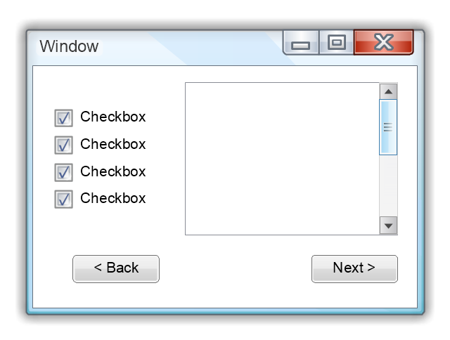
The Windows Vista graphic user interface template for the ConceptDraw PRO diagramming and vector drawing software is included in the Graphic User Interface solution from the Software Development area of ConceptDraw Solution Park.
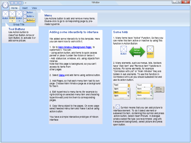
"In computing, a ribbon is a set of toolbars placed on several tabs. Microsoft products released since 2007 have introduced a form of modular ribbon as their main interface, where large tabbed toolbars, filled with graphical buttons and other controls, are grouped by functionality. Such ribbons use tabs to expose different sets of controls, eliminating the need for many parallel toolbars. Contextual tabs are tabs that appear only when the user needs them. For instance, in a word processor, an image-related tab may appear when the user selects an image in a document, allowing the user to interact with that image.
The usage of the term ribbon dates from the 1980s and was originally used as a synonym for what is now more commonly known as a (non-tabbed) toolbar. However, in 2007, Microsoft Office 2007 used the term to refer to its own implementation of tabbed toolbars bearing heterogeneous controls, which Microsoft calls "The Fluent UI". Thus, Microsoft popularized the term with a new meaning, although similar tabbed layouts of controls had existed in previous software from other vendors. The new design was intended to alleviate the problem of users not finding or knowing of the existence of available features in the Office suite." [Ribbon (computing). Wikipedia]
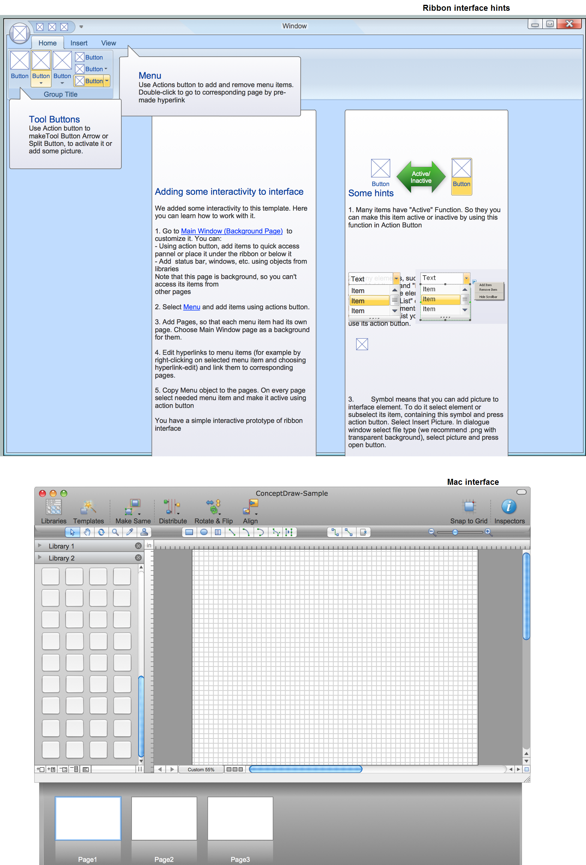
The example "Microsoft Windows ribbon interface hints" was created using the ConceptDraw PRO diagramming and vector drawing software extended with the Graphic User Interface solution from the Software Development area of ConceptDraw Solution Park.
 Software Development
This solution extends ConceptDraw PRO v9.4 and helps to accelerate and simplify software development and design by allowing you to draw UML diagrams and prototype Windows and Mac OS user interfaces.
 Graphic User Interface
Graphic User Interface solution extends ConceptDraw PRO software with templates, samples and libraries of vector stencils for design of the GUI prototypes and diagrams for Windows, Mac OS and iOS software.
GUI Prototyping with ConceptDraw PRO
All about prototyping. GUI Prototyping with ConceptDraw. Download prototyping software.How to Draw Business Process Diagrams with RapidDraw Interface
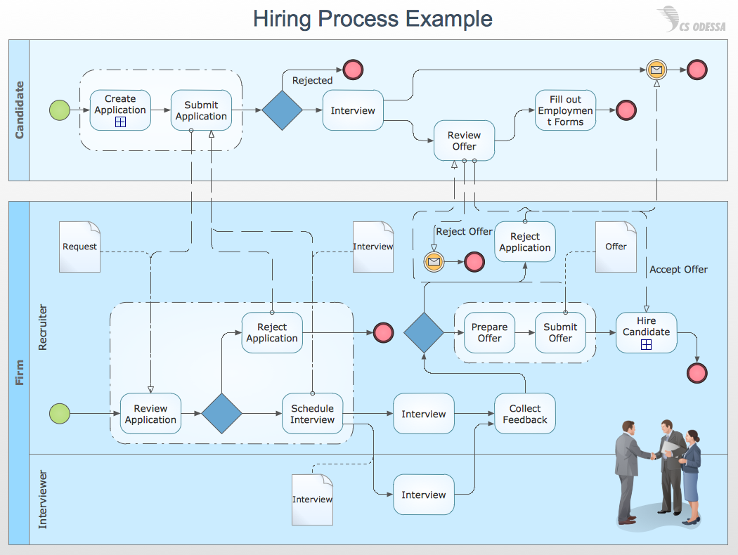
Business Process Modeling Notation (BPMN) is a set of standard symbols that allow you to create a graphical view of a business process. The symbols were developed to help users develop standard, unified structure of processes, and any messages shared between these processes."Designing the visual composition and temporal behavior of GUI is an important part of software application programming in the area of human-computer interaction. Its goal is to enhance the efficiency and ease of use for the underlying logical design of a stored program, a design discipline known as usability. Methods of user-centered design are used to ensure that the visual language introduced in the design is well tailored to the tasks.
The visible graphical interface features of an application are sometimes referred to as "chrome" or "Gui" (Goo-ee). Typically, the user interacts with information by manipulating visual widgets that allow for interactions appropriate to the kind of data they hold. The widgets of a well-designed interface are selected to support the actions necessary to achieve the goals of the user. A model-view-controller allows for a flexible structure in which the interface is independent from and indirectly linked to application functionality, so the GUI can be easily customized. This allows the user to select or design a different skin at will, and eases the designer's work to change the interface as the user needs evolve. Good user interface design relates to the user, not the system architecture.
Large widgets, such as windows, usually provide a frame or container for the main presentation content such as a web page, email message or drawing. Smaller ones usually act as a user-input tool." [Graphical user interface. Wikipedia]
The example "ConceptDraw graphic user interface (Mac)" was created using the ConceptDraw PRO diagramming and vector drawing software extended with the Graphic User Interface solution from the Software Development area of ConceptDraw Solution Park.
"Smaller mobile devices such as PDAs and smartphones typically use the WIMP elements with different unifying metaphors, due to constraints in space and available input devices. Applications for which WIMP is not well suited may use newer interaction techniques, collectively named as post-WIMP user interfaces.
As of 2011, some touch-screen-based operating systems such as Apple's iOS (iPhone) and Android use the class of GUIs named post-WIMP. These support styles of interaction using more than one finger in contact with a display, which allows actions such as pinching and rotating, which are unsupported by one pointer and mouse." [Graphical user interface. Wikipedia]
"In computing post-WIMP comprises work on user interfaces, mostly graphical user interfaces, which attempt to go beyond the paradigm of windows, icons, menus and a pointing device, i.e. WIMP interfaces. ...
However WIMP interfaces are not optimal for working with complex tasks such as computer-aided design, working on large amounts of data simultaneously, or interactive games. WIMPs are usually pixel-hungry, so given limited screen real estate they can distract attention from the task at hand. Thus, custom interfaces can better encapsulate workspaces, actions, and objects for specific complex tasks. Applications for which WIMP is not well suited include those requiring continuous input signals, showing 3D models, or simply portraying an interaction for which there is no defined standard widget.
Interfaces based on these considerations, now called "post-WIMP", have made their way to the general public. Examples include the interface of the classic MP3 player iPod and a bank's automated teller machine screen." [Post-WIMP. Wikipedia]
The example "iPhone OS (iOS) graphic user interface (GUI) - Activity indicator view" was created using the ConceptDraw PRO diagramming and vector drawing software extended with the Graphic User Interface solution from the Software Development area of ConceptDraw Solution Park.
Use this template to prototype and design the wireframe graphic user interface (GUI).
"A website wireframe, also known as a page schematic or screen blueprint, is a visual guide that represents the skeletal framework of a website. Wireframes are created for the purpose of arranging elements to best accomplish a particular purpose. The purpose is usually being informed by a business objective and a creative idea. The wireframe depicts the page layout or arrangement of the website’s content, including interface elements and navigational systems, and how they work together. The wireframe usually lacks typographic style, color, or graphics, since the main focus lies in functionality, behavior, and priority of content. In other words, it focuses on what a screen does, not what it looks like. Wireframes can be pencil drawings or sketches on a whiteboard, or they can be produced by means of a broad array of free or commercial software applications. Wireframes are generally created by business analysts, user experience designers, developers, visual designers and other roles with expertise in interaction design, information architecture and user research.
Wireframes focus on:
(1) The kinds of information displayed.
(2) The range of functions available.
(3) The relative priorities of the information and functions.
(4) The rules for displaying certain kinds of information.
(5) The effect of different scenarios on the display.
The website wireframe connects the underlying conceptual structure, or information architecture, to the surface, or visual design of the website. Wireframes help establish functionality, and the relationships between different screen templates of a website. An iterative process, creating wireframes is an effective way to make rapid prototypes of pages, while measuring the practicality of a design concept. Wireframing typically begins between “high-level structural work - like flowcharts or site maps - and screen designs.” Within the process of building a website, wireframing is where thinking becomes tangible.
Aside from websites, wireframes are utilized for the prototyping of mobile sites, computer applications, or other screen-based products that involve human-computer interaction." [Website wireframe. Wikipedia]
The wireframe GUI template for the ConceptDraw PRO diagramming and vector drawing software is included in the Graphic User Interface solution from the Software Development area of ConceptDraw Solution Park.
- GUI Prototyping with ConceptDraw PRO | Windows Vista graphic ...
- GUI Prototyping with ConceptDraw PRO | Graphic User Interface ...
- GUI Prototyping with ConceptDraw PRO | Graphic User Interface ...
- Mac OS X Lion user graphic interface (GUI) template | Software ...
- Software Development | Mac OS X Lion user graphic interface (GUI ...
- graphic user interface (GUI)
- Graphic User Interface
- Graphic User Interface | Software Development | - Conceptdraw.com
- iPhone OS (iOS) graphic user interface (GUI) - Activity indicator view ...
- Graphic User Interface | Martin ERD Diagram | Office - Design ...
- Mac OS X Lion user graphic interface (GUI) template | Graphic User ...
- iPhone OS (iOS) graphic user interface (GUI) - Standby mode ...
- iPhone OS (iOS) graphic user interface (GUI) - Template | Graphic ...
- iPhone OS (iOS) graphic user interface (GUI) - SMS application ...
- Graphic User Interface | GUI Prototyping with ConceptDraw PRO ...
- Mac OS X Lion user interface template | GUI Prototyping with ...
- Fishbone Diagram | Entity-Relationship Diagram (ERD) | Graphic ...
- Graphic User Interface
- iPhone OS (iOS) graphic user interface (GUI) - Template | iPhone ...
- iPhone OS (iOS) graphic user interface (GUI) - Standby mode ...
.png--diagram-flowchart-example.png)
-graphic-user-interface-(gui)---activity-indicator-view.png--diagram-flowchart-example.png)
