- Electric and Telecom Plans Free
- Fire and Emergency Plans Free
- Floor Plans Free
- Plant Layout Plans Free
- School and Training Plans Free
- Seating Plans Free
- Security and Access Plans Free
- Site Plans Free
- Sport Field Plans Free
- Business Process Diagrams Free
- Business Process Mapping Free
- Classic Business Process Modeling Free
- Cross-Functional Flowcharts Free
- Event-driven Process Chain Diagrams Free
- IDEF Business Process Diagrams Free
- Logistics Flow Charts Free
- Workflow Diagrams Free
- ConceptDraw Dashboard for Facebook Free
- Mind Map Exchange Free
- MindTweet Free
- Note Exchange Free
- Project Exchange Free
- Social Media Response Free
- Active Directory Diagrams Free
- AWS Architecture Diagrams Free
- Azure Architecture Free
- Cisco Network Diagrams Free
- Cisco Networking Free
- Cloud Computing Diagrams Free
- Computer Network Diagrams Free
- Google Cloud Platform Free
- Interactive Voice Response Diagrams Free
- Network Layout Floor Plans Free
- Network Security Diagrams Free
- Rack Diagrams Free
- Telecommunication Network Diagrams Free
- Vehicular Networking Free
- Wireless Networks Free
- Comparison Dashboard Free
- Composition Dashboard Free
- Correlation Dashboard Free
- Frequency Distribution Dashboard Free
- Meter Dashboard Free
- Spatial Dashboard Free
- Status Dashboard Free
- Time Series Dashboard Free
- Basic Circle-Spoke Diagrams Free
- Basic Circular Arrows Diagrams Free
- Basic Venn Diagrams Free
- Block Diagrams Free
- Concept Maps Free
- Family Tree Free
- Flowcharts Free
- Basic Area Charts Free
- Basic Bar Graphs Free
- Basic Divided Bar Diagrams Free
- Basic Histograms Free
- Basic Line Graphs Free
- Basic Picture Graphs Free
- Basic Pie Charts Free
- Basic Scatter Diagrams Free
- Aerospace and Transport Free
- Artwork Free
- Audio, Video, Media Free
- Business and Finance Free
- Computers and Communications Free
- Holiday Free
- Manufacturing and Maintenance Free
- Nature Free
- People Free
- Presentation Clipart Free
- Safety and Security Free
- Analog Electronics Free
- Audio and Video Connectors Free
- Basic Circuit Diagrams Free
- Chemical and Process Engineering Free
- Digital Electronics Free
- Electrical Engineering Free
- Electron Tube Circuits Free
- Electronic Block Diagrams Free
- Fault Tree Analysis Diagrams Free
- GHS Hazard Pictograms Free
- Home Automation and Wiring Free
- Mechanical Engineering Free
- One-line Diagrams Free
- Power Сircuits Free
- Specification and Description Language (SDL) Free
- Telecom and AV Circuits Free
- Transport Hazard Pictograms Free
- Data-driven Infographics Free
- Pictorial Infographics Free
- Spatial Infographics Free
- Typography Infographics Free
- Calendars Free
- Decision Making Free
- Enterprise Architecture Diagrams Free
- Fishbone Diagrams Free
- Organizational Charts Free
- Plan-Do-Check-Act (PDCA) Free
- Seven Management and Planning Tools Free
- SWOT and TOWS Matrix Diagrams Free
- Timeline Diagrams Free
- Australia Map Free
- Continent Maps Free
- Directional Maps Free
- Germany Map Free
- Metro Map Free
- UK Map Free
- USA Maps Free
- Customer Journey Mapping Free
- Marketing Diagrams Free
- Matrices Free
- Pyramid Diagrams Free
- Sales Dashboard Free
- Sales Flowcharts Free
- Target and Circular Diagrams Free
- Cash Flow Reports Free
- Current Activities Reports Free
- Custom Excel Report Free
- Knowledge Reports Free
- MINDMAP Reports Free
- Overview Reports Free
- PM Agile Free
- PM Dashboards Free
- PM Docs Free
- PM Easy Free
- PM Meetings Free
- PM Planning Free
- PM Presentations Free
- PM Response Free
- Resource Usage Reports Free
- Visual Reports Free
- House of Quality Free
- Quality Mind Map Free
- Total Quality Management TQM Diagrams Free
- Value Stream Mapping Free
- Astronomy Free
- Biology Free
- Chemistry Free
- Language Learning Free
- Mathematics Free
- Physics Free
- Piano Sheet Music Free
- Android User Interface Free
- Class Hierarchy Tree Free
- Data Flow Diagrams (DFD) Free
- DOM Tree Free
- Entity-Relationship Diagram (ERD) Free
- EXPRESS-G data Modeling Diagram Free
- IDEF0 Diagrams Free
- iPhone User Interface Free
- Jackson Structured Programming (JSP) Diagrams Free
- macOS User Interface Free
- Object-Role Modeling (ORM) Diagrams Free
- Rapid UML Free
- SYSML Free
- Website Wireframe Free
- Windows 10 User Interface Free
Economy Infographics
Graphical ways of displaying numerical data, principles, and specifics are widely used in economy, economic analysis, and statistics. Graphic images, various types of charts and diagrams, graphs, tables, and infographics have a great illustrative value; they are clear and intuitively understandable, and therefore popular in making reports, documentation, presentations, webpages, etc. The use of graphical methods in economics and statistics allows one to visually display economic phenomena, observation results, present statistical parameters, economic data and indicators and their quantitative changes, display the relationships between objects, structures and observed events, facilitating the generalization. Graphic visual aids facilitate data processing and analysis of economic phenomena, monitoring the dynamics of indicators, identifying the relationships and patterns between certain economic indicators and factors influencing them, allow one to quickly and visually monitor changes, detect periods of growth and fall, make predictions and the right decisions.
When building the economic infographics and diagrams, try to make them clear, expressive and simple. It is desirable to fit the information in one page for easy comprehension, to use a comfortable and readable scale, and do not forget to make your infographics accurate and pleasant, with important details highlighted in contrasting colors.
The Economy Infographics solution provides ConceptDraw DIAGRAM software with a large collection of vector icon libraries, drawing samples and infographic examples for quick and simple design of the high-value visuals: infographics, illustrations, presentations and diagrams about economics, markets and economic policy, business and finances, government and social institutions, production, distribution, and consumption of goods and services. Use it for fast and convenient design of the best infographics consisting of vector clipart along with text blocks and charts, economic diagrams and schemes illustrated with vector icons, economic activities designs, continent and country economic maps, economic presentations, market economy and economic system infographic charts, illustrations in economic articles, reports in mass media, and blog posts in social media.
The Economy Infographics solution is useful for a wide range of economists specialized in microeconomic and macroeconomic analysis, development world and international economics study, political economy, digital economy, specific markets studies, economic statistics and econometrics, computational and mathematical economics, financial economics and mathematical finance, also politicians specializing in economic, fiscal and monetary policy, corporate managers, marketing experts, and business analysts, journalists and bloggers focusing on economy, educators and students studying economics, politics and business administration, management, marketing, business analysis, and many other people to communicate visually the economic information. It is a valuable tool for economy journalists and bloggers commenting economic events and processes in the media and social networks, and it can be equally useful for commercial companies, economic and financial government organizations, universities and educational institutions, economic and political media information.
-
Buy this solution $25 -
Solution Requirements - This solution requires the following products to be installed:
ConceptDraw DIAGRAM v18 - This solution requires the following products to be installed:
-
Compatibility - Sonoma (14), Sonoma (15)
MS Windows 10, 11 - Sonoma (14), Sonoma (15)
-
Support for this Solution -
Helpdesk
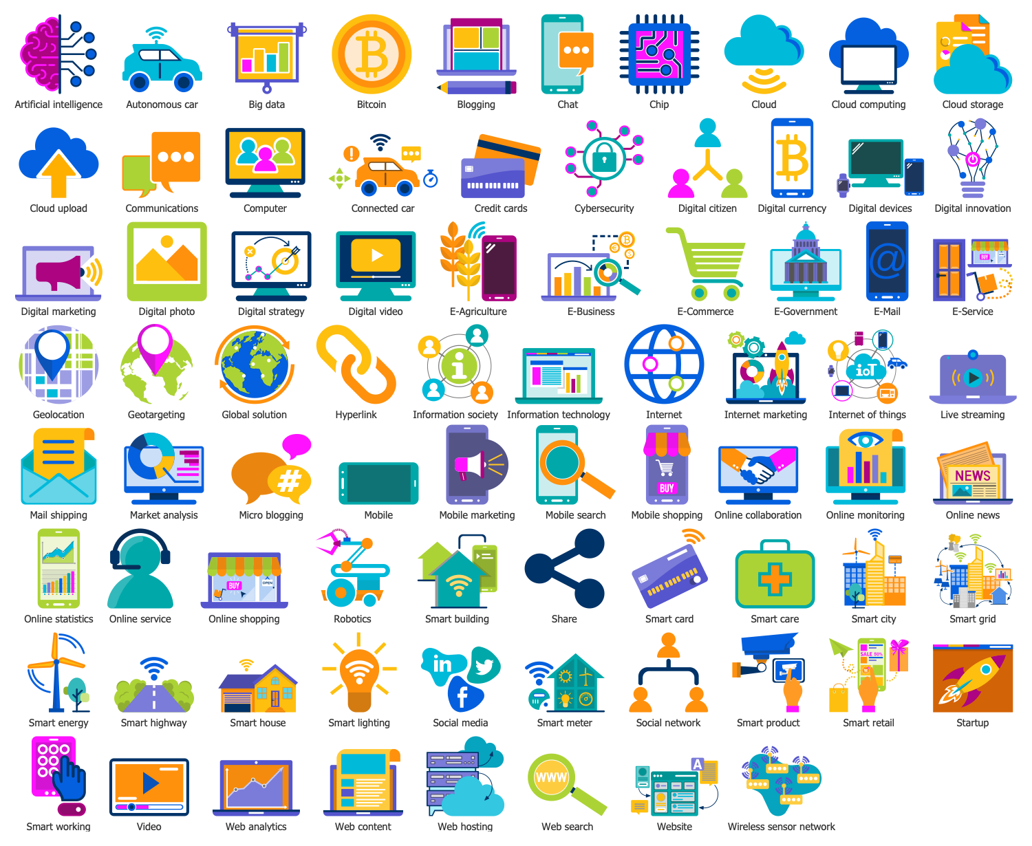
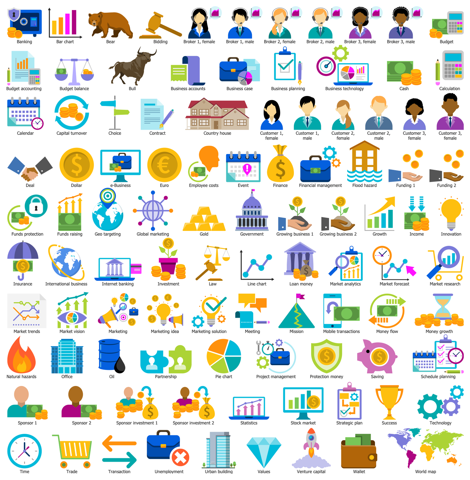
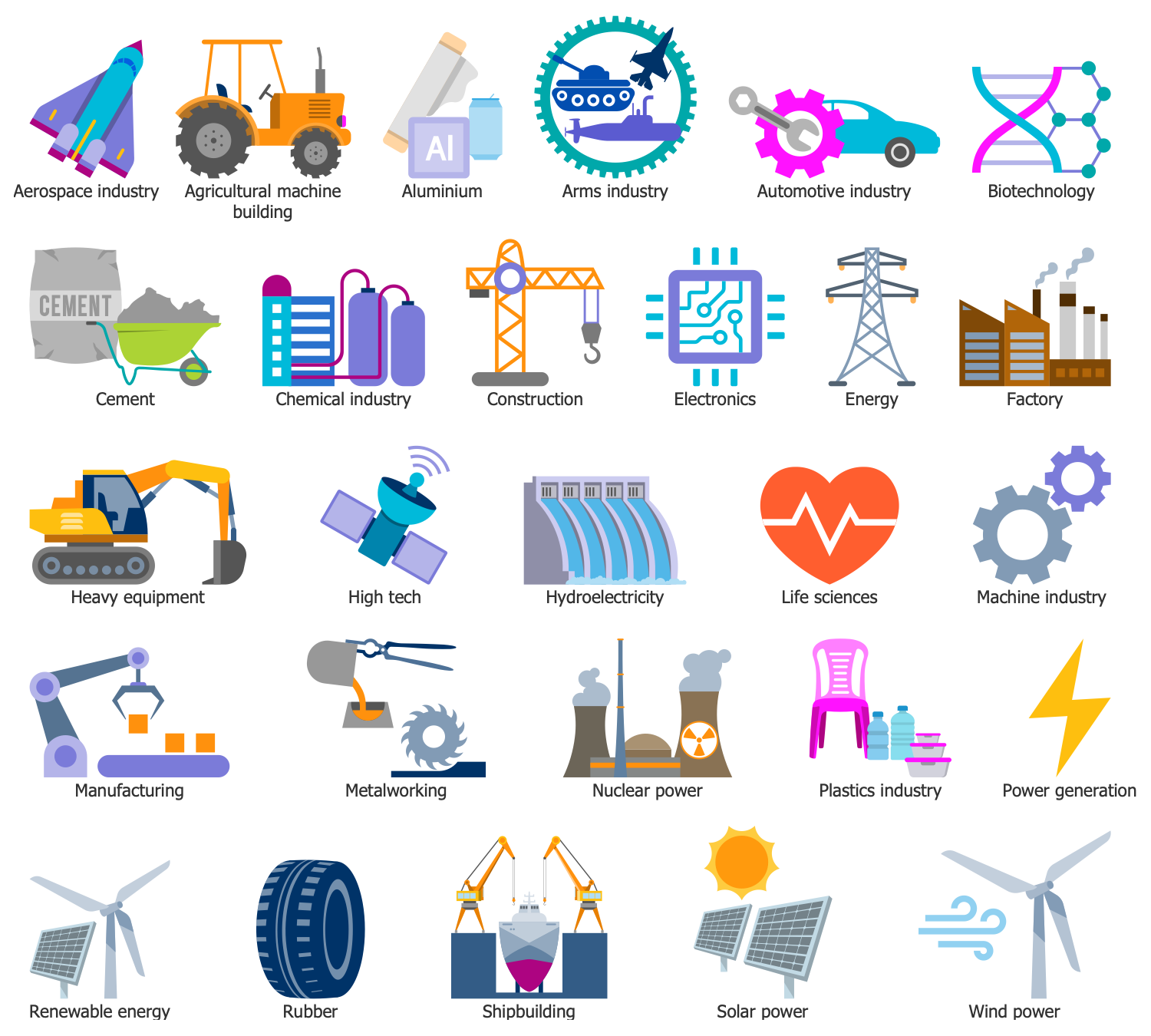
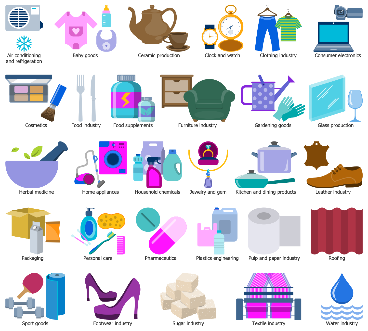
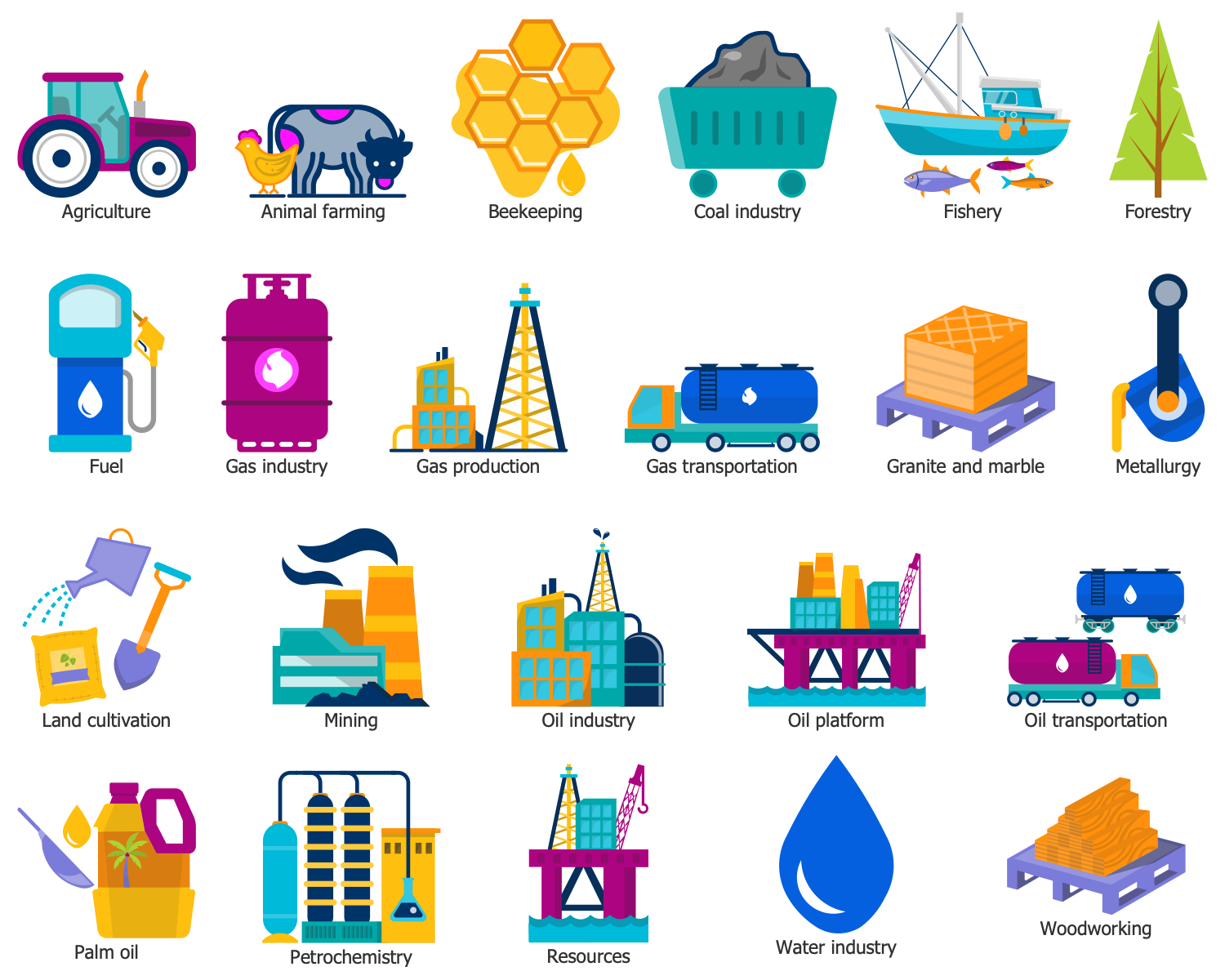
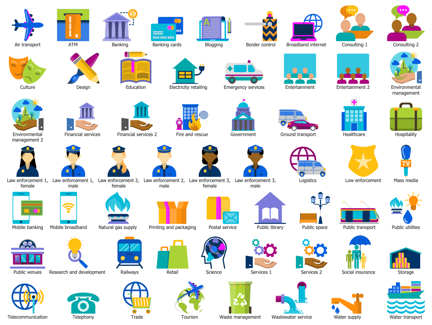
There are 6 stencil libraries containing 316 vector objects and 10 examples in the Economy Infographics solution.
Design Elements — Digital Economy
Design Elements — Economy
Design Elements — Heavy Industry
Design Elements — Light Industry
Design Elements — Raw Materials
Design Elements — Services
Economy Infographics Examples
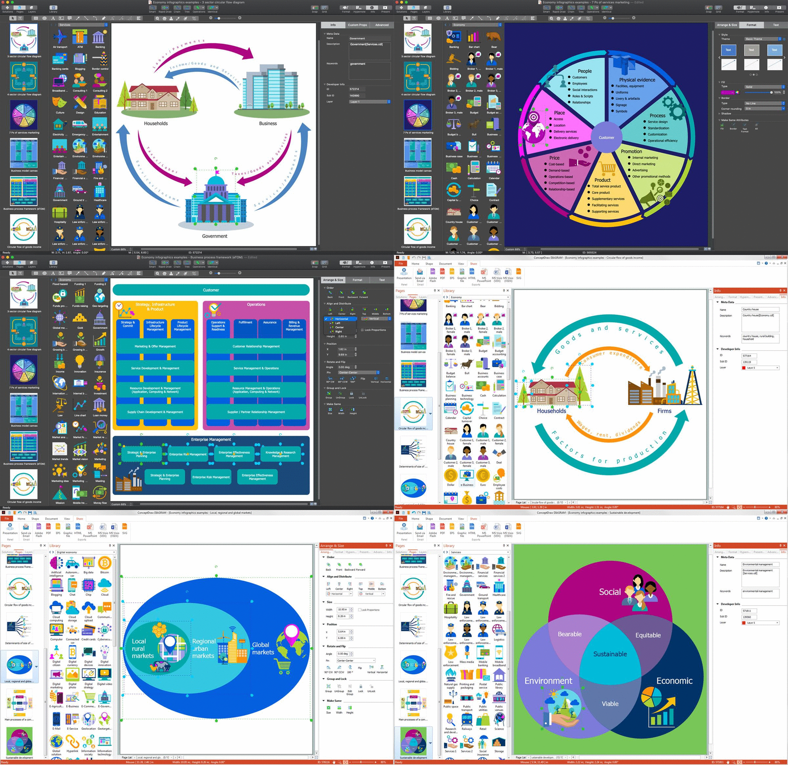
There are a few samples that you see on this page which were created in the ConceptDraw DIAGRAM application by using the Economy Infographics solution. Some of the solution's capabilities as well as the professional results which you can achieve are all demonstrated here on this page.
All source documents are vector graphic documents which are always available for modifying, reviewing and/or converting to many different formats, such as MS PowerPoint, PDF file, MS Visio, and many other graphic ones from the ConceptDraw Solution Park or ConceptDraw STORE. The Economy Infographics solution is available to all ConceptDraw DIAGRAM users to get installed and used while working in the ConceptDraw DIAGRAM charting and drawing software.
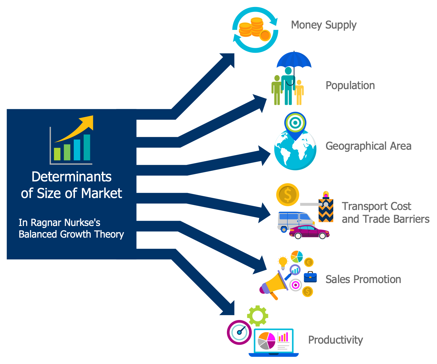
Example 1: Determinants of Size of Market
This diagram was created in ConceptDraw DIAGRAM using the combination of libraries from the Economy Infographics Solution. An experienced user spent 10 minutes creating this sample.
This sample illustrates the determinants of the size of market designated in Ragnar Nurkse's balanced growth theory: money supply, population, geographical area, transport cost and trade barriers, sales promotion, and productivity. This theory is based on the opinion that the expanding of the market size is crucial for increasing the motivation for making investments and as a result the fighting with poverty. Nurkse argued that the increase of money supply can't be applied to the underdeveloped countries because it will cause an inflation, it is also incorrect that a large population implies a large market. He proved that there was no correlation between the geographical area of the country and its market size. As for the transport cost and trade barriers, they are major obstacles for promotion the international cooperation in exporting and importing, so the removal of customs duties will reduce transport costs, the prices will fall and the demand will grow accompanying with country's development. The sales promotion and advertising techniques aren't effective at the macroeconomic level, in Nurkse's opinion, while the increase in productivity leads to economic development and growth.
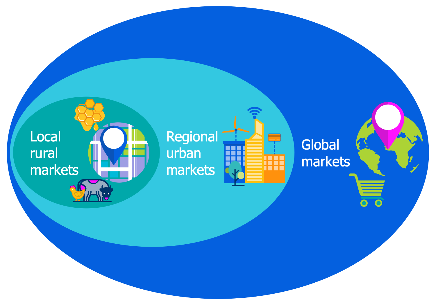
Example 2: Local Regional and Global Markets
This diagram was created in ConceptDraw DIAGRAM using the combination of libraries from the Economy Infographics Solution. An experienced user spent 10 minutes creating this sample.
This infographic sample represents the relationships between the local rural markets, regional urban markets, and global markets for organic products. The local rural markets of most developing countries provide mainly the staple food and rotation crops with little or no organic premium and are the most engaged for the organic farmers. The regional urban markets offer fresh products to urban centers, where one can find good prices for organic vegetables and fresh fruits of high quality. The global markets are occupied with exporting the products with formal certification, organic and fairtrade premium, and are the major possibility of setting the high prices and obtaining the great profits. But there are many nuances here, the requirements for products on the global markets are also the highest and the products must be competitive in order to obtain success. That's why it is recommended to sell products in different markets and not a single product, but different products in parallel.
Example 3: Main Processes of a Company
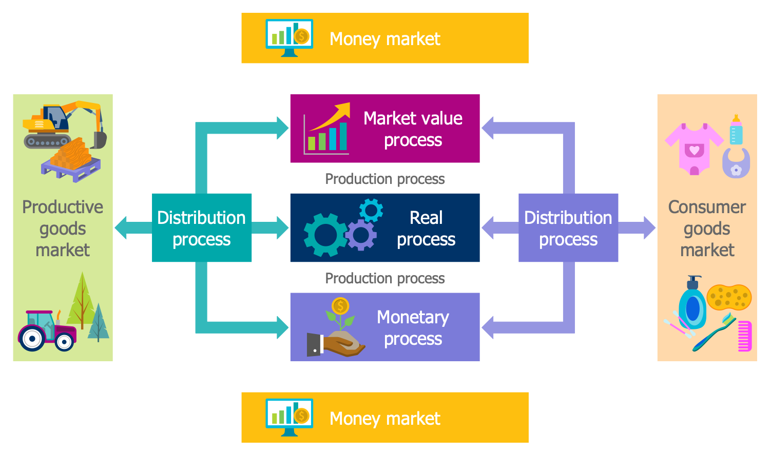
This diagram was created in ConceptDraw DIAGRAM using the combination of libraries from the Economy Infographics Solution. An experienced user spent 10 minutes creating this sample.
This piece of infographics illustrates the main processes that are realized within a company. The real process, production process, distribution process, market value process, and monetary process are defined among them. Each of these processes has its own goals, logic, theory, and key figures. Any company is unique and its processes can be allocated in different ways, but the listed ones are the main for each company and in addition to them may be some others. The production process, real process and distribution process occur simultaneously. The production process contains the production of goods, their distribution between different markets and income distribution as well. According to the diagram the distribution to the productive goods market and consumer goods market is carried out. The monetary process includes all questions connected with the business financing. The market value process is a process during which the market value of the company in the investment markets is determined. Any of ConceptDraw’s infographics examples can be used as a good start for your own infographics.
Example 4: 3 Sector Circular Flow Diagram
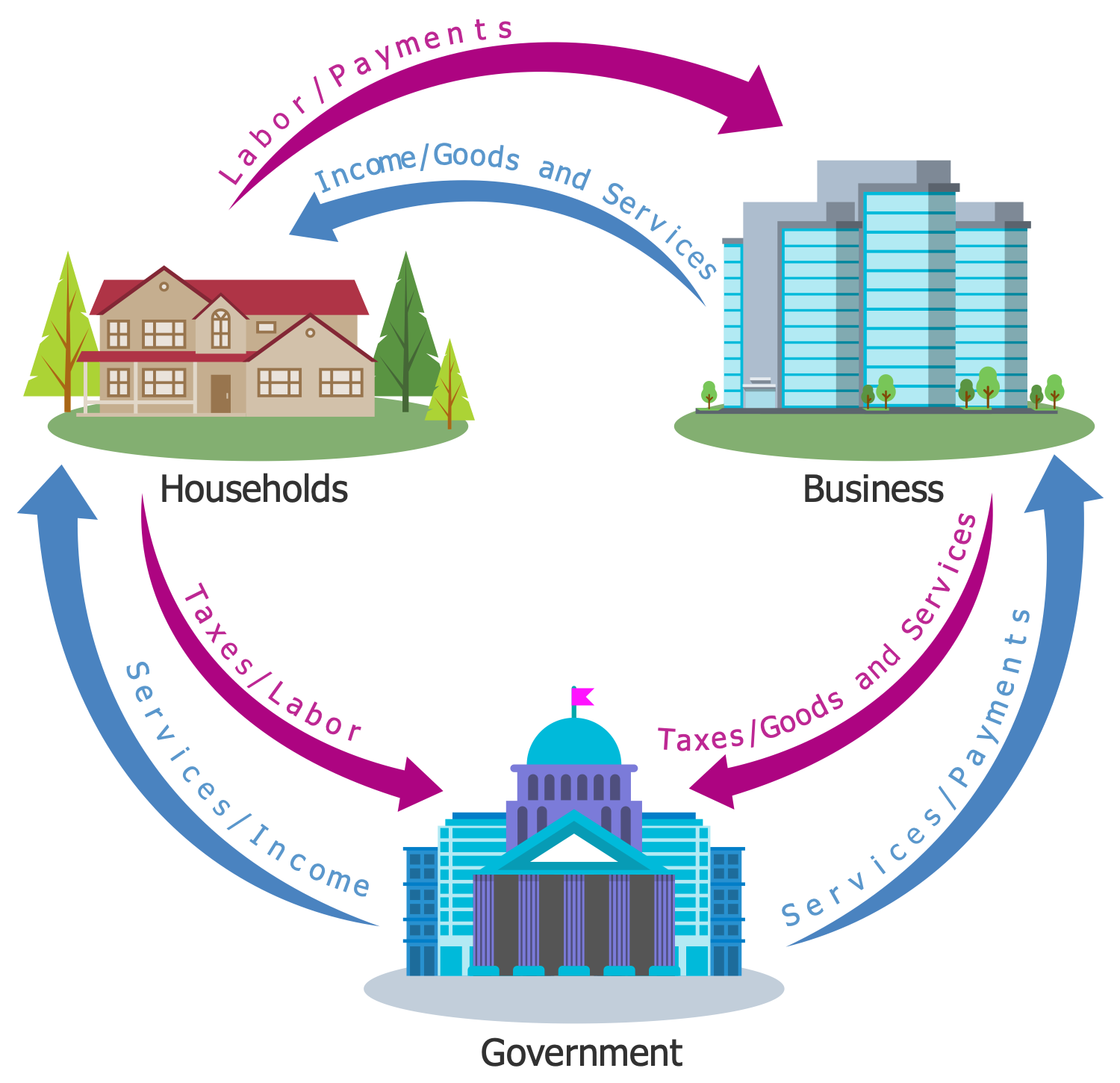
This diagram was created in ConceptDraw DIAGRAM using the combination of libraries from the Economy Infographics Solution. An experienced user spent 10 minutes creating this sample.
This Economy infographic represents the three-sector circular flow of income model. The economy consists of three sectors: households, business, and government. You can observe the flows from the households and business to the government in the form of taxes, labor, goods, and services. And the opposite flow because the income that the government receives flows to business and households in the form of services and payments of different kinds (subsidies, purchases of goods, transfers, etc.). Thus, each payment has a corresponding revenue and each flow of money has a corresponding flow of goods and services in the opposite direction. In this way the circular flow is formed, in which the summary expenditure of the economy is approximately equal to its summary income. The flow of income, goods, and services from the business to households and vice versa the flow of payments and labor from the households to business exists and is depicted in the diagram.
Example 5: 4 Sector Circular Flow Diagram
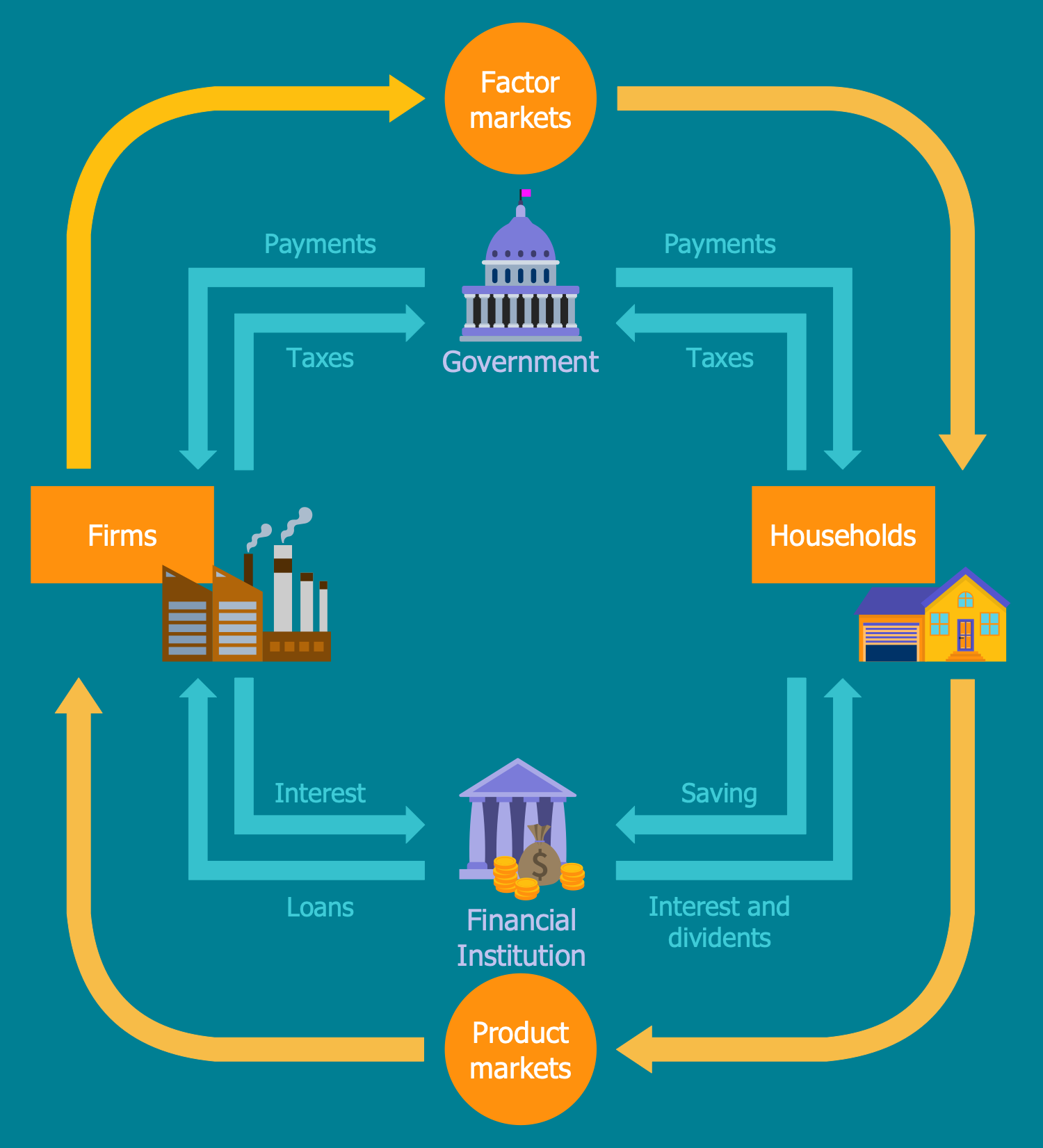
This diagram was created in ConceptDraw DIAGRAM using the combination of libraries from the Economy Infographics Solution. An experienced user spent 10 minutes creating this sample.
This Economy infographic represents the four-sector circular flow model. These are the households, firms, government, and financial sector. The government sector includes the economic activities of local, state and federal governments; the financial sector consists of the banks and other financial institutions, including the non-bank intermediaries that are occupied in borrowing and lending. Tax flows to the government come from firms and households; opposing flows to these sectors are represented by payments. The flows from the households and firms also come to the financial institution and the flows of loans, interest, and dividends come in the opposite direction. So, while the lending is equal to the borrowing, this circular flow will continue indefinitely. The residuals from each market are the savings entered into the capital market and invested in firms and government sector. The circular flow between the factor market and product market is highlighted in this diagram. Use Economy Infographics solution and ConceptDraw DIAGRAM to design the best infographics in a few minutes.
Example 6: 7 Ps of Services Marketing
This diagram was created in ConceptDraw DIAGRAM using the combination of libraries from the Economy Infographics Solution. An experienced user spent 10 minutes creating this sample.
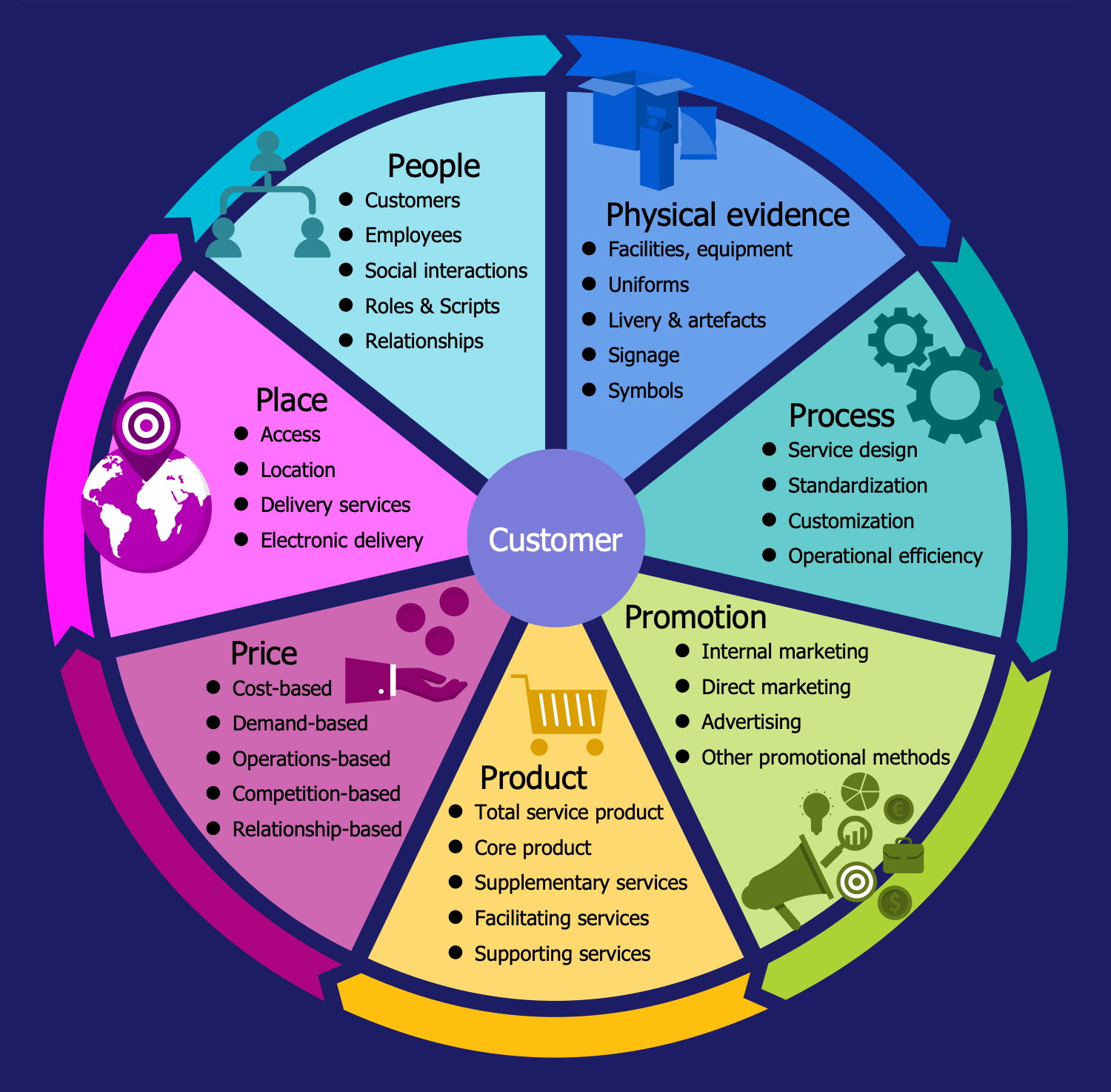
This Economy infographic depicts one of the foundation concepts in marketing — the 7 Ps for the services marketing, which is used to implement the company's marketing objectives in the target market and allocates the seven components Product, Price, Place, People, Physical evidence, Process, and Promotion as the basic ones. The 7 Ps is an extension of a well-known 4 Ps model and more applicable to the services marketing because the services market significantly differs from the products market and required special marketing activities. The representation of this concept also includes all elements comprising each component. Thus, for the product is significant its type: total service, core product, supplementary service, facilitating service, or supporting service; the price can be the cost-based, demand-based, operations-based, competition-based, relationship-based; as for the place the main factors are the access, location, delivery services, or electronic delivery; the people group includes customers, employees, social interactions, roles, scripts, relationships; the physical evidence is represented by the facilities, equipment, uniforms, livery, artifacts, signage, and symbols; the process supposes the service design, standardization, customization, operational efficiency; the promotion includes internal marketing, direct marketing, advertising, and other promotional methods.
Example 7: Business Model Canvas
This diagram was created in ConceptDraw DIAGRAM using the combination of libraries from the Economy Infographics Solution. An experienced user spent 10 minutes creating this sample.
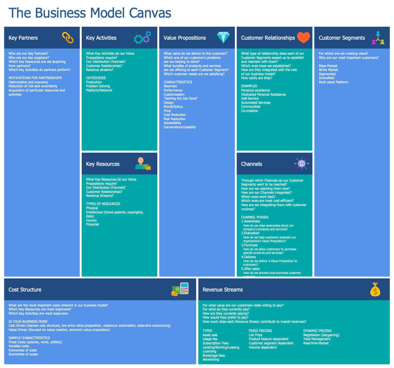
This sample illustrates the canvas of Alexander Osterwalder’s business model, which includes nine building components that depict the organization’s steps towards value creation. These components cover the fundamental areas of any business: customer segments, value propositions, channels, customer relationships, revenue streams, key resources, key activities, key partners, cost structure. All components are represented at their own boxes in the diagram and represent the main questions. It is considered the value, bundles of products and services that are delivered to customers, the customers and their problems that can be solved, the correspondence of proposals to the needs, the cost-efficient channels through which the customer segments are reached, the preferable types of established relationships with customers, their cost and integration with the rest business model, the customers’ preferences for the payment, the most important things that need to be done to construct the working business model, key partners and suppliers, key activities, key resources required to create the value propositions, distribution channels, customer relationships, revenue streams, and many other questions.
Example 8: Business Process Framework eTOM
This diagram was created in ConceptDraw DIAGRAM using the combination of libraries from the Economy Infographics Solution. An experienced user spent 10 minutes creating this sample.
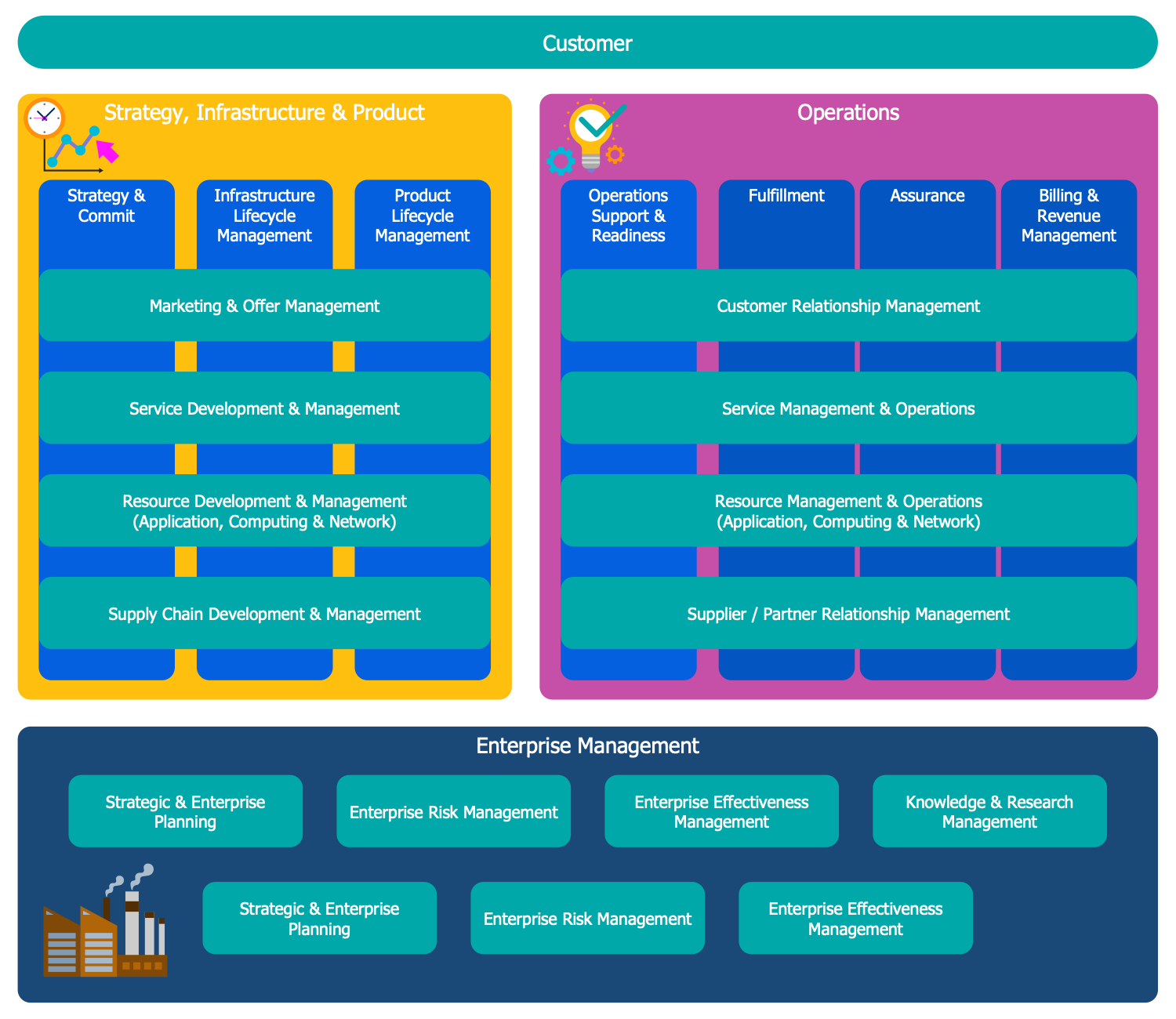
This Economy infographic sample represents the overview of the Business Process Framework (eTOM), the key elements and eTOM processes of Level 0. The business architecture and business processes have a great value today and the interest for this field dramatically grows from year to year, as well as its development. This model framework describes the required business processes of service providers and how they interact with each other. It is a standard maintained by the TM Forum that is an association for service providers and suppliers in the telecommunications and entertainment industries, so it is the main standard used in the telecommunications industry. The Business Process Framework (eTOM) became known in 2010 when the first handbooks in this business architecture were published. This economy infographic represents the information in a detailed but simple view and is visually structured, you can observe three main blocks, the first one represents the strategy, infrastructure, and product, the second includes the operations and the third describes the enterprise management.
Example 9: Circular Flow of Goods Income
This diagram was created in ConceptDraw DIAGRAM using the combination of libraries from the Economy Infographics Solution. An experienced user spent 10 minutes creating this sample.
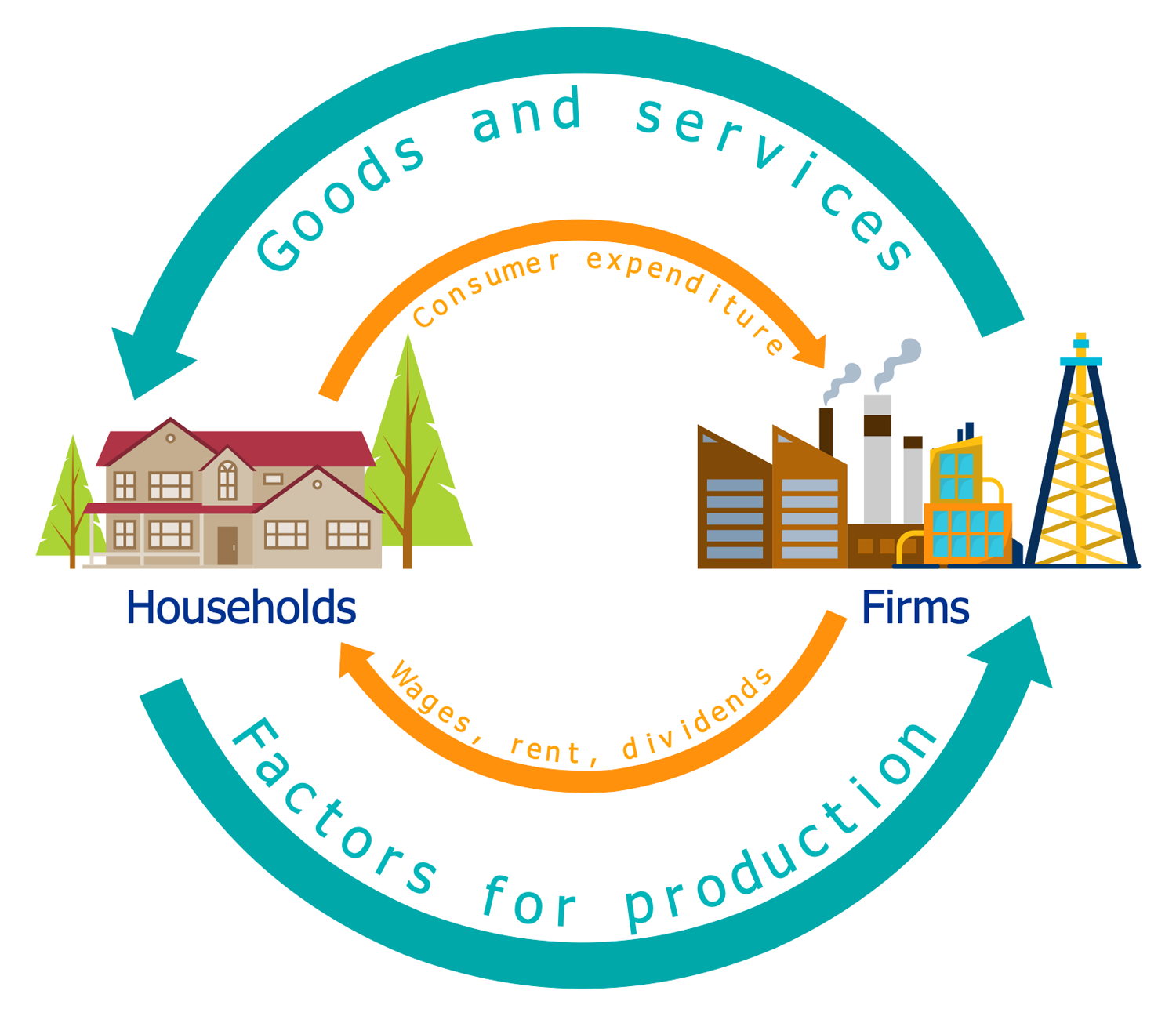
This Economy Infographics sample represents the circular flow of goods income and expenditure. The two-directional interactions between the households and firms are represented, the interdependence of the flows that occur in the economy from the goods' production and the income generated from that production. This basic diagram provides a better understanding of the market economy as a whole considering it as consisting only from the businesses and individuals, at this the last ones ensure the labor that enables the businesses to produce different goods and provide services. The blue arrows in the diagram represent these activities — flows of goods and services, and factors for production. Along with them the monetary flows also occur, the individuals realize the labor activity in exchange for payment of businesses. This payment is the individuals' income that is in its turn spent on the goods and services produced by businesses. These opposite flows of consumer expenditure and wages, rent, and dividends are represented by orange arrows in the diagram.
Example 10: Sustainable Development
This diagram was created in ConceptDraw DIAGRAM using the combination of libraries from the Economy Infographics Solution. An experienced user spent 10 minutes creating this sample.
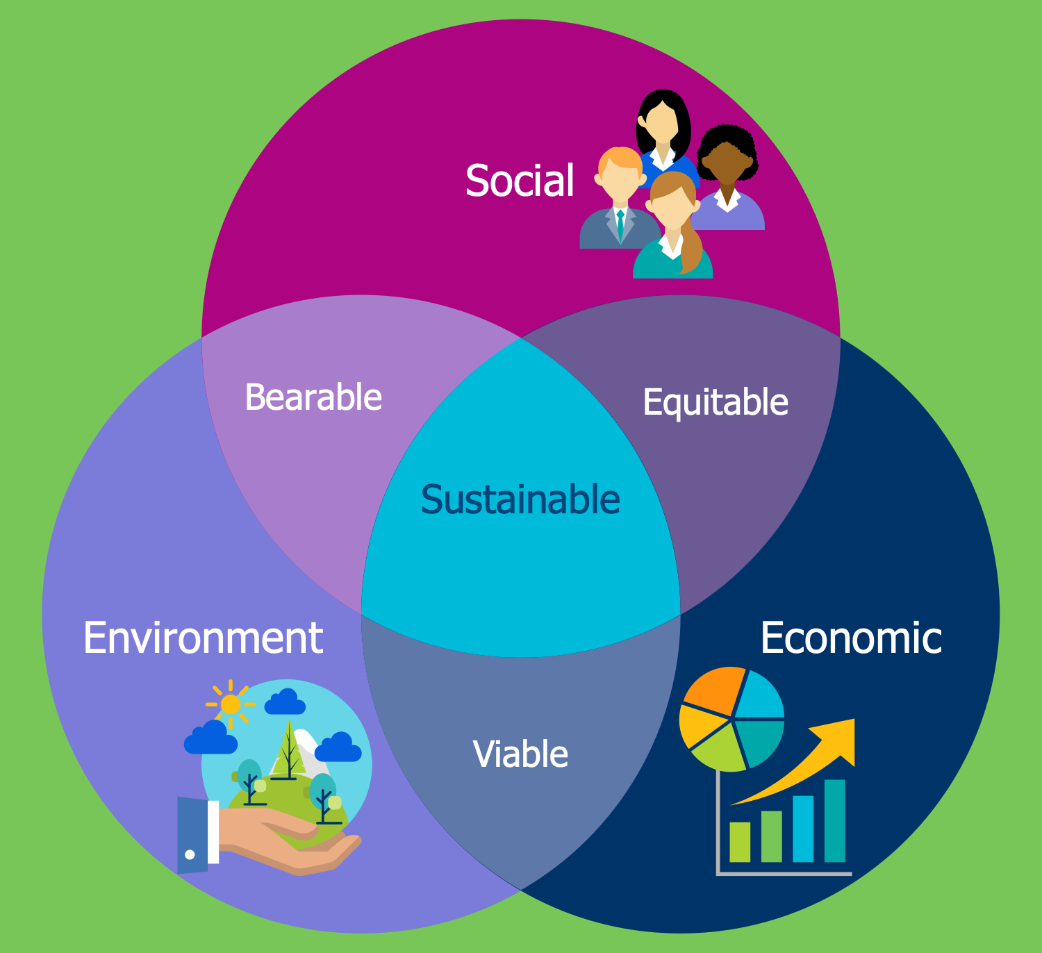
This Economy infographic sample is dedicated to sustainable development at the confluence of three constituent parts, such as environment, economy, and society. The sustainable development is a process of economic and social change in which the exploitation of natural resources, the direction of investment, the personal development, the orientation of scientific and technological development, and other changes are aligned and strengthen the current and future capacity to meet human needs and desires. This concept is directed on the ensuring the quality of life of people, achieving the human development, economic system development, and social development at the saving the integrity and stability of the natural system for future generations, saving its ability to provide the natural resources so that future generations can also meet their needs. The represented sustainable development three-sphere structure was offered by the economist Rene Passet in 1979. Each sphere is visually colored in the diagram making it colorful, bright and attractive.
Inside
What I Need to Get Started
After ConceptDraw DIAGRAM is installed, the Economy Infographics solution can be purchased either from the Business Infographics area of ConceptDraw STORE itself or from our online store. Thus, you will be able to use the Economy Infographics solution straight after.
How to install
First of all, make sure that both ConceptDraw STORE and ConceptDraw DIAGRAM applications are downloaded and installed on your computer. Next, install the Economy Infographics solution from the ConceptDraw STORE to use it in the ConceptDraw DIAGRAM application.
Start using
Start using the Economy Infographics solution to make the professionally looking illustrations by adding the design elements taken from the stencil libraries and editing the pre-made examples that can be found there.
