- Electric and Telecom Plans Free
- Fire and Emergency Plans Free
- Floor Plans Free
- Plant Layout Plans Free
- School and Training Plans Free
- Seating Plans Free
- Security and Access Plans Free
- Site Plans Free
- Sport Field Plans Free
- Business Process Diagrams Free
- Business Process Mapping Free
- Classic Business Process Modeling Free
- Cross-Functional Flowcharts Free
- Event-driven Process Chain Diagrams Free
- IDEF Business Process Diagrams Free
- Logistics Flow Charts Free
- Workflow Diagrams Free
- ConceptDraw Dashboard for Facebook Free
- Mind Map Exchange Free
- MindTweet Free
- Note Exchange Free
- Project Exchange Free
- Social Media Response Free
- Active Directory Diagrams Free
- AWS Architecture Diagrams Free
- Azure Architecture Free
- Cisco Network Diagrams Free
- Cisco Networking Free
- Cloud Computing Diagrams Free
- Computer Network Diagrams Free
- Google Cloud Platform Free
- Interactive Voice Response Diagrams Free
- Network Layout Floor Plans Free
- Network Security Diagrams Free
- Rack Diagrams Free
- Telecommunication Network Diagrams Free
- Vehicular Networking Free
- Wireless Networks Free
- Comparison Dashboard Free
- Composition Dashboard Free
- Correlation Dashboard Free
- Frequency Distribution Dashboard Free
- Meter Dashboard Free
- Spatial Dashboard Free
- Status Dashboard Free
- Time Series Dashboard Free
- Basic Circle-Spoke Diagrams Free
- Basic Circular Arrows Diagrams Free
- Basic Venn Diagrams Free
- Block Diagrams Free
- Concept Maps Free
- Family Tree Free
- Flowcharts Free
- Basic Area Charts Free
- Basic Bar Graphs Free
- Basic Divided Bar Diagrams Free
- Basic Histograms Free
- Basic Line Graphs Free
- Basic Picture Graphs Free
- Basic Pie Charts Free
- Basic Scatter Diagrams Free
- Aerospace and Transport Free
- Artwork Free
- Audio, Video, Media Free
- Business and Finance Free
- Computers and Communications Free
- Holiday Free
- Manufacturing and Maintenance Free
- Nature Free
- People Free
- Presentation Clipart Free
- Safety and Security Free
- Analog Electronics Free
- Audio and Video Connectors Free
- Basic Circuit Diagrams Free
- Chemical and Process Engineering Free
- Digital Electronics Free
- Electrical Engineering Free
- Electron Tube Circuits Free
- Electronic Block Diagrams Free
- Fault Tree Analysis Diagrams Free
- GHS Hazard Pictograms Free
- Home Automation and Wiring Free
- Mechanical Engineering Free
- One-line Diagrams Free
- Power Сircuits Free
- Specification and Description Language (SDL) Free
- Telecom and AV Circuits Free
- Transport Hazard Pictograms Free
- Data-driven Infographics Free
- Pictorial Infographics Free
- Spatial Infographics Free
- Typography Infographics Free
- Calendars Free
- Decision Making Free
- Enterprise Architecture Diagrams Free
- Fishbone Diagrams Free
- Organizational Charts Free
- Plan-Do-Check-Act (PDCA) Free
- Seven Management and Planning Tools Free
- SWOT and TOWS Matrix Diagrams Free
- Timeline Diagrams Free
- Australia Map Free
- Continent Maps Free
- Directional Maps Free
- Germany Map Free
- Metro Map Free
- UK Map Free
- USA Maps Free
- Customer Journey Mapping Free
- Marketing Diagrams Free
- Matrices Free
- Pyramid Diagrams Free
- Sales Dashboard Free
- Sales Flowcharts Free
- Target and Circular Diagrams Free
- Cash Flow Reports Free
- Current Activities Reports Free
- Custom Excel Report Free
- Knowledge Reports Free
- MINDMAP Reports Free
- Overview Reports Free
- PM Agile Free
- PM Dashboards Free
- PM Docs Free
- PM Easy Free
- PM Meetings Free
- PM Planning Free
- PM Presentations Free
- PM Response Free
- Resource Usage Reports Free
- Visual Reports Free
- House of Quality Free
- Quality Mind Map Free
- Total Quality Management TQM Diagrams Free
- Value Stream Mapping Free
- Astronomy Free
- Biology Free
- Chemistry Free
- Language Learning Free
- Mathematics Free
- Physics Free
- Piano Sheet Music Free
- Android User Interface Free
- Class Hierarchy Tree Free
- Data Flow Diagrams (DFD) Free
- DOM Tree Free
- Entity-Relationship Diagram (ERD) Free
- EXPRESS-G data Modeling Diagram Free
- IDEF0 Diagrams Free
- iPhone User Interface Free
- Jackson Structured Programming (JSP) Diagrams Free
- macOS User Interface Free
- Object-Role Modeling (ORM) Diagrams Free
- Rapid UML Free
- SYSML Free
- Website Wireframe Free
- Windows 10 User Interface Free
Picture Graphs
How does visualization affect your audience’s perception of your chart? How to make a perfect diagram from the point of perception? The answer to all these questions lies in the use of a fact that a person thinks by images and actively constructs visual analogies. That is why the use of pictures and vivid images on the charts is approved, welcomed and works quite effective for the success.
What is a Picture Graph? A Picture Graph (Image Chart, Pictorial Chart) is a type of a Bar Graph, which visualizes data and represents values in various categories using the pictures, symbols, pictograms, and clipart. Taking into consideration that the Bar Chart perfectly displays the dynamics of changes over time, the additional supplying it with pictures gives only the benefits. At the same time, you need to choose pictures and clipart according to the visual analogy, so for the chart related to the finances, it is logical to use the images of money or golden coins, when displaying data on the growth of population is usually associated with a human's clipart, etc.
Picture Graphs are a valuable visual tool, which lets one summarize and visually represent information, and statistical data. They are great in demonstrating comparisons between the categories and help people more easily perceive of complex information using pictures of graphs, to extract and to remember faster the key points.
The use of colorful and visually appealing pictures distinguishes the Picture Graphs from the run-of-the-mill Bar Charts, making them more attractive and easily to remember. And, as a rule, they are very widely used and are popular. For a long time to this day, they have been successfully used in statistics, marketing, management, business, economics, manufacturing, and other fields.
The Picture Graphs Solution extends the capabilities of ConceptDraw DIAGRAM with the quick-start templates, samples, and a library of professionally developed vector stencils for designing attractive, colorful and remembered Picture Graphs on any thematic.
-
Buy this solution $40 -
Solution Requirements - This solution requires the following products to be installed:
ConceptDraw DIAGRAM v18 - This solution requires the following products to be installed:
-
Compatibility - Sonoma (14), Sonoma (15)
MS Windows 10, 11 - Sonoma (14), Sonoma (15)
-
Support for this Solution -
Helpdesk
There is 1 library containing 35 objects in the Picture Graphs solution.
Design Elements — Picture Graphs

Related News:
CS Odessa Announces Additions to Powerful Graphs and Charts Area in ConceptDraw Solution ParkExamples
There are a few samples that you see on this page which were created in the ConceptDraw DIAGRAM application by using the Picture Graphs solution. Some of the solution's capabilities as well as the professional results which you can achieve are all demonstrated here on this page.
All source documents are vector graphic documents which are always available for modifying, reviewing and/or converting to many different formats, such as MS PowerPoint, PDF file, MS Visio, and many other graphic ones from the ConceptDraw Solution Park or ConceptDraw STORE. The Picture Graphs solution is available to all ConceptDraw DIAGRAM users to get installed and used while working in the ConceptDraw DIAGRAM diagramming and drawing software.
Template: Picture Graph
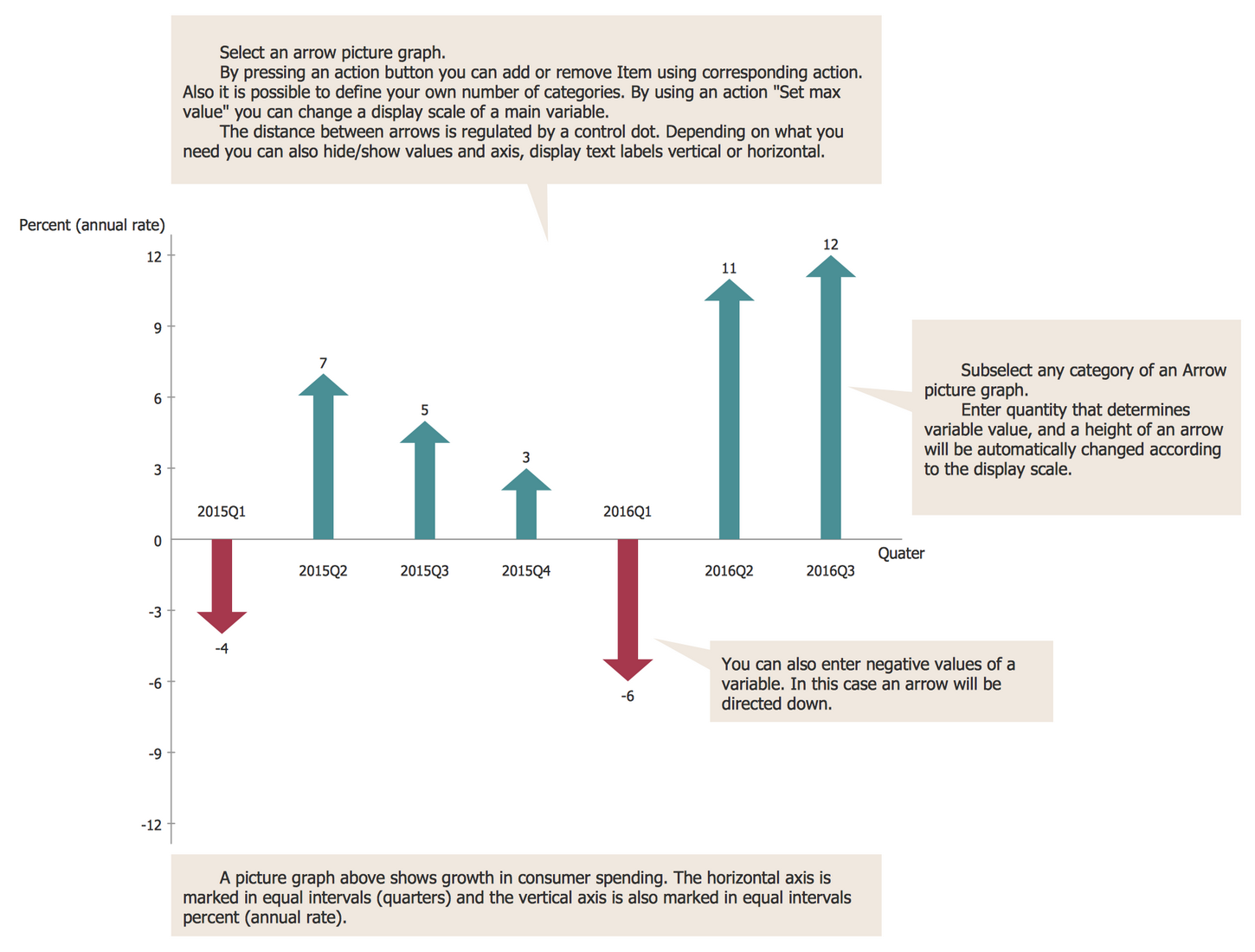
This Picture Graph template is an essential assistant in drawing your own Picture Charts in ConceptDraw DIAGRAM software. It lets one easily visualize numerical data using symbols and pictograms. Being modified with the help of suitable commands from the object's Action button menu and improved with other pictorial objects and clipart from the ConceptDraw DIAGRAM libraries, it will be turned to an amazing chart or exceptional scaled picture graph. The use of corresponding commands from the Action menu lets you define your own number of categories, change a display scale of the main variable (set max value), regulate the distance between arrows by a control dot, hide/show values and axis, display text labels vertical or horizontal. Select and enter the value for the desired category and the height of an arrow will be automatically changed according to the display scale. In the case of negative values, the corresponding arrows will be directed down. This sample uses the arrows pictures, other objects from the solution's library will help you design Picture Graphs on any thematic.
Example 1: Picture Graph — Barrie Population
This example was created in ConceptDraw DIAGRAM using the Picture Graphs Library from the Picture Graphs Solution. An experienced user spent 5 minutes creating this sample.
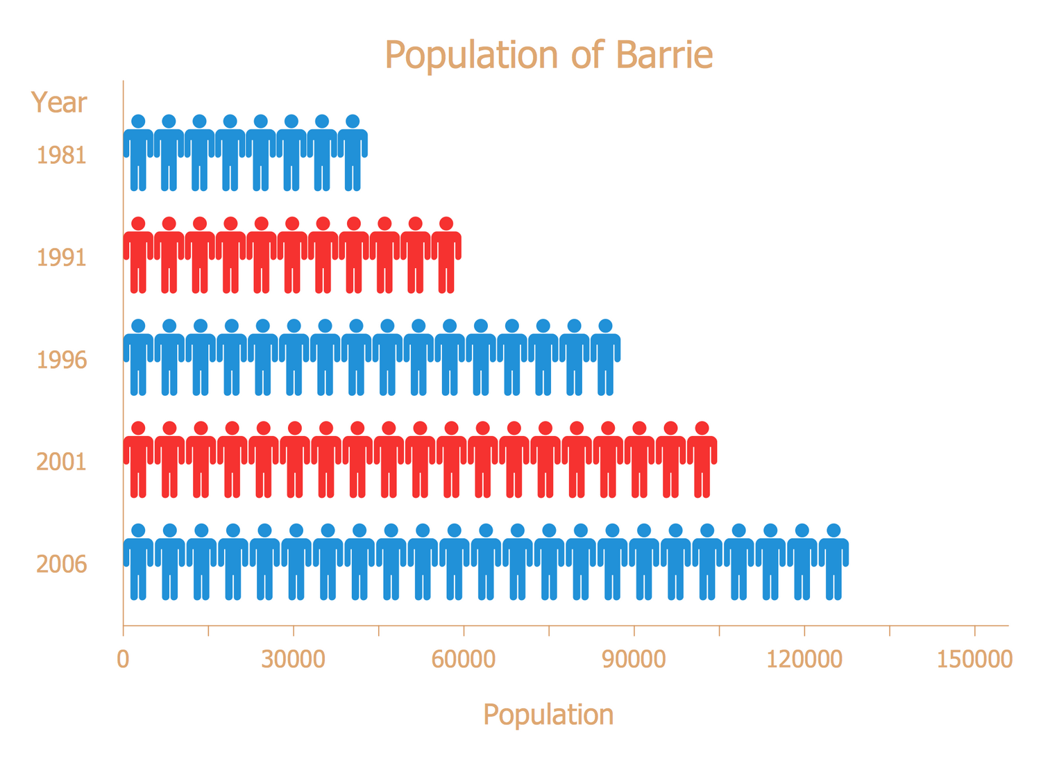
Pictures and images are easy for understanding and remembering, so they are ideal for presentation and explaining information. This Picture Graph shows the growth of the population of Barrie city that is located in Central Ontario near Lake Simcoe, Canada. The city lies in an industrialized and densely populated region and is also quite populated. The considered period is from 1981 to 2006. One can observe the gradual and steady growth. Thus, if in 1981 the population of Barrie was 45,000 people, then in 2006 their number attained about 130,000. The choice of human pictures for this chart is non-random and ideally suits the considered thematic, and besides the use of pictures lets one make the chart more visual than a usual line graph. The alternating of red and blue colors allows additional highlighting of the difference in quantities in neighboring years. If required, the chart can be easily prolonged with data to nowadays.
Example 2: Picture Graph — Production of Biofuels
This example was created in ConceptDraw DIAGRAM using the Picture Graphs Library from the Picture Graphs Solution. An experienced user spent 5 minutes creating this sample.
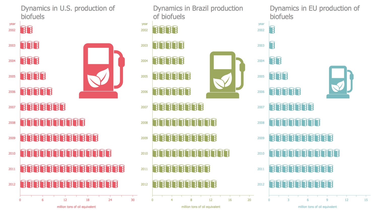
This Picture Bar Graph sample illustrates dynamics in the production of biofuel in different countries and lets you visually compare the values. It was constructed on the base of the "Production of biofuels.jpg" file from the Wikimedia Commons. The represented information is incredibly useful for the companies that produce oil and for those who sells it, it lets one identify the most promising regions and areas requiring development, and gives one the possibility to compare at-a-glance the current performance with ones in previous years. It is relevant information because the popularity of biofuel grows, its production and use are quite widespread now. It is an ecological fuel produced from the plants or different kinds of wastes (agricultural, commercial, domestic, industrial) through the modern biological processes such as anaerobic digestion, agriculture, conversions of biomass (thermal, chemical, or biochemical). There are considered U.S., Brazil, and EU countries in a decade period from 2002 to 2012.
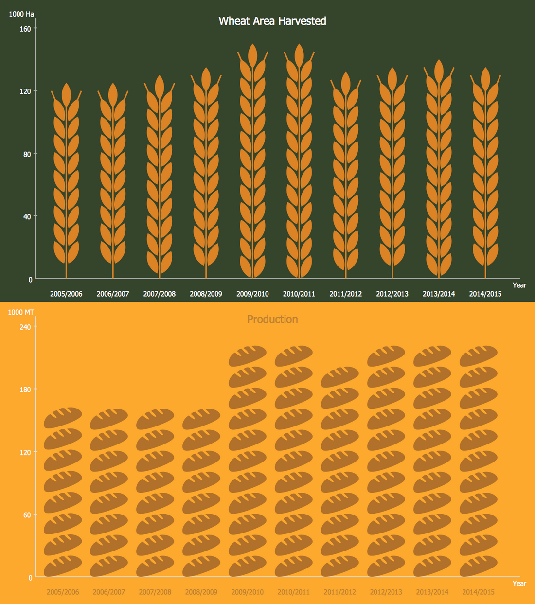
Example 3: Picture Graph — Peru Wheat Area and Production
This example was created in ConceptDraw DIAGRAM using the Picture Graphs Library from the Picture Graphs Solution. An experienced user spent 15 minutes creating this sample.
Wheat is a minor crop in Peru, its production is limited by country's geographic placement at the height of 2,800 to 3,500 meters above sea level, natural and economic conditions. However, the production is developed and the values grow. What is a Picture Graph? This sample is a Picture Graph, it is based on data from the Foreign Agricultural Service website, the U.S. Department of Agriculture (USDA) and shows two Picture Bar Graphs illustrating the area of harvested wheat and production in Peru from 2006 to 2015 years. You can note the periods of max crop capacity of the wheat in 2009/2019 and 2010/2011. The relative stability is traced at Peru's wheat harvest and production in the last years. The wheat ear and bread pictures are well-chosen from the ConceptDraw DIAGRAM libraries for the design of this diagram and fully convey the discussed thematic. Track the changes in the wheat area harvest in the following years and mark them on this chart in seconds.
Example 4: Picture Graph — Average Energy Prices for Manufacturers
This example was created in ConceptDraw DIAGRAM using the Picture Graphs Library from the Picture Graphs Solution. An experienced user spent 10 minutes creating this sample.
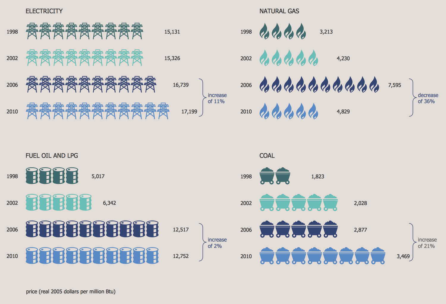
This Picture Graph example depicts the average energy prices for manufacturers in 1998-2010, and precisely for the electricity, natural gas, coal, fuel oil and LPG. The sample is based on data from the article "Cost of Natural Gas Used in Manufacturing Sector Has Fallen" published on the website of the U.S. Energy Information Administration (EIA). The average prices for 1998, 2002, 2006, and 2010 are represented separately for each of these four groups. One can note the periods of stability, increasing and decreasing the values, including the slow changes and dramatic spikes. Thus, from 2006 to 2010 in three groups from the represented ones (electricity, coal, fuel oil and LPG) is highlighted the increase in varying degrees from 2% to 21%, while for the natural gas at the same period is observed the decrease of 36%. The use of picture symbols makes this statistical diagram more lively. Pay attention to the pictures of graphs, each group uses the own type of pictures to illustrate it.
Example 5: Unemployment Rates of Persons 25 Years Old and Over
This example was created in ConceptDraw DIAGRAM using the Picture Graphs Library from the Picture Graphs Solution. An experienced user spent 10 minutes creating this sample.
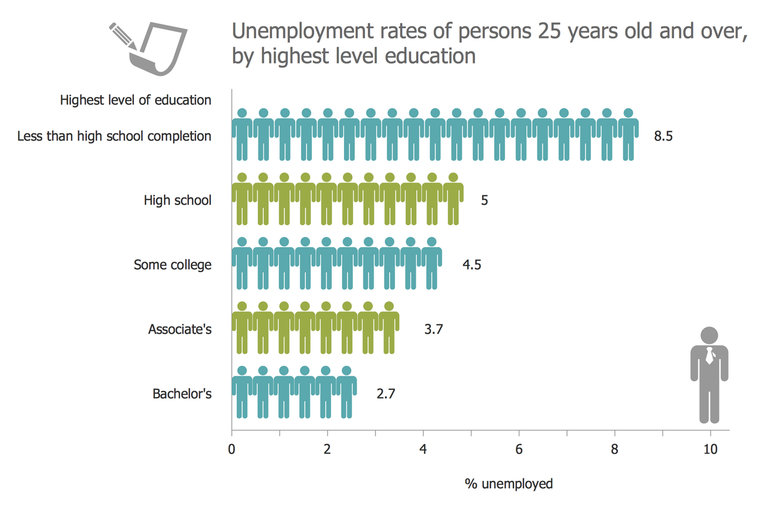
This illustrative Picture Graph sample demonstrates the information for unemployment among people of 25 years old and over in the U.S. in 2004, according to their level of education. It was designed on the base of data from the U.S. National Center for Education Statistics website. There are represented the values of unemployment rates in a chosen age category for the following levels of education: bachelor, associate, some college, high school, less than high school completion, and the highest level of education. The x-axis represents the percentage of unemployed people. The high unemployment rate is usually observed over the periods of recession in economics. According to this graph, the highest level of unemployment is recorded among people with less than high school completion level of education, the least percent has the group with bachelor's education. Keep the harmony between the color style of your chart and used clipart, to achieve the best effect.
Example 6: Picture Graph — Academic Costs for Residents, 2015-16
This example was created in ConceptDraw DIAGRAM using the Picture Graphs Library from the Picture Graphs Solution. An experienced user spent 10 minutes creating this sample.
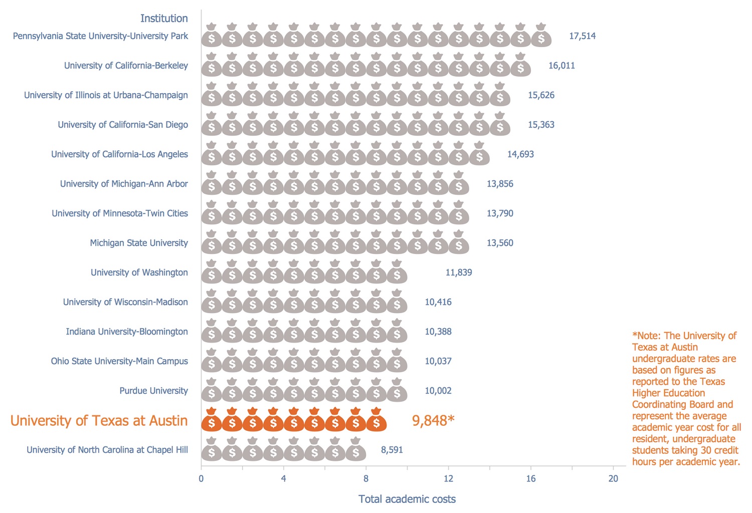
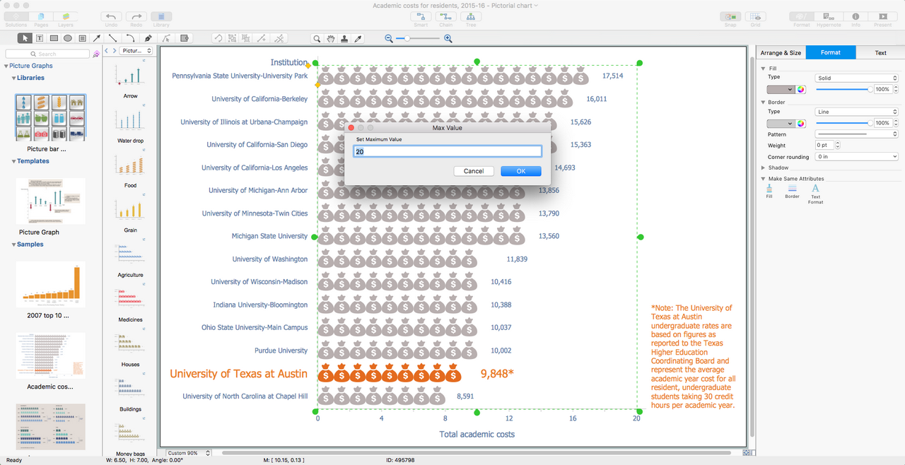
This Pictorial Chart sample represents the total academic costs for the residents in different U.S. high education institutions per year. The sample reflects data for the 2015-2016 learning year and is based on the diagram "Compare UT Tuition" taken from the official website of the University of Texas at Austin. There are represented the values for the 15 major universities. One can note that the University of Texas at Austin ranked second place when compared to other represented universities and the education in it cost 9,848 $ per year in 2015. These undergraduate rates are based on figures as reported to the Texas Higher Education Coordinating Board and represent the average academic year cost for all undergraduate students that are residents and take 30 credit hours per academic year. The most expensive is the Pennsylvania State University-University Park (17,514 $ per year) and the cheapest one is the University of North Carolina at Chapel Hill. Each student and its parents can use this chart to be well informed and choose the university on their own budget.
Example 7: Picture Graph — Cities with the Most Skyscrapers
This example was created in ConceptDraw DIAGRAM using the Picture Graphs Library from the Picture Graphs Solution. An experienced user spent 10 minutes creating this sample.
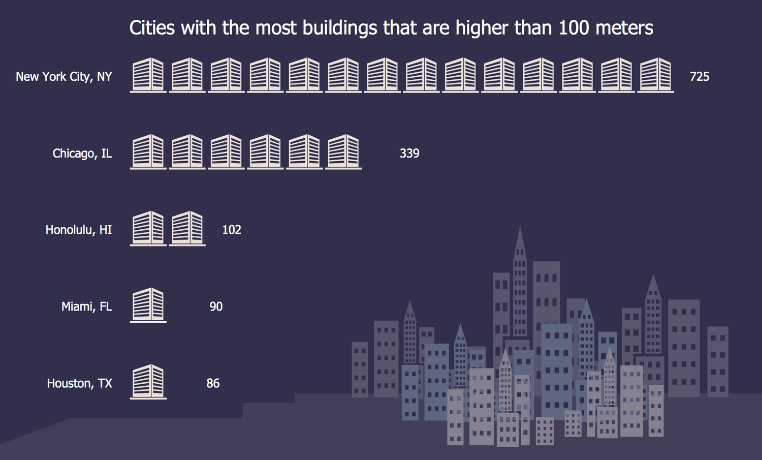
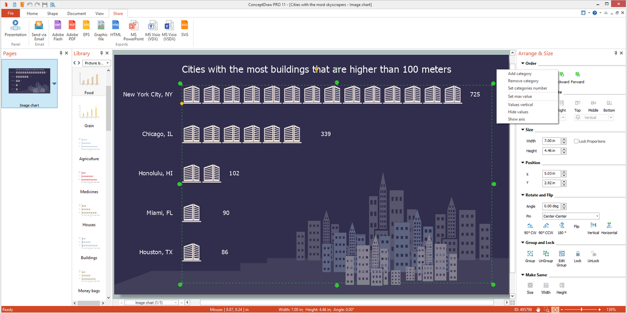
This Picture Bar Graph sample demonstrates statistics on the cities with the most quantity of buildings that are incredibly tall, higher than 100 meters. The buildings higher than 50 m and having over 10 floors are named skyscrapers or high-rises and can be used for different purposes, as the residential, commercial or office. This sample was constructed on the base of data from the "Cities" infographic published on the npr.org website and narrates that New York, Chicago, Honolulu, Miami, and Houston are the U.S. cities with the most skyscrapers. At this the New York is a winner in their quantity, there are counted 725 skyscrapers there, while within Chicago are built 339 high-rises, in Honolulu their quantity counts 102 buildings, in Miami are 90 buildings of this type, and the smallest quantity is situated in Houston. The background with buildings clipart decorates this chart very aptly and fully corresponds to the discussed thematic.
Example 8: Picture Graph — Computer and Internet Use at Home Over Time
This example was created in ConceptDraw DIAGRAM using the Picture Graphs Library from the Picture Graphs Solution. An experienced user spent 10 minutes creating this sample.
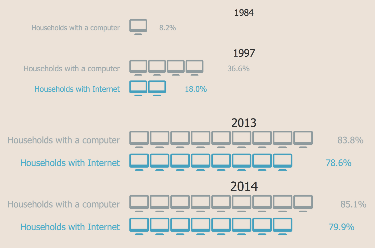
This Picture Bar Graph sample describes data on the use of computer and Internet at home from 1984 to 2014. It was designed using statistics from the website of the United States Census Bureau (USCB). It is absolutely and clearly visible that the households with a computer counted 8,2% in 1984 and there was no one with the Internet among them at that time. From 1997 the Internet appears on 18% of the households’ computers, the total quantity of which attains 36,6%. By 2013 the situation dramatically changes and we have 83,8% of households with a computer and 78,6% with the Internet. In 2014 the numbers slightly increase and there are noted 85,1% of households with a computer and 79.9% with the Internet. Being prolonged to nowadays the diagram can depict even more grandiose data because at the moment the Internet is incredibly widespread everywhere and every day its popularity becomes higher.
Example 9: Picture Graph — Manufacturing in America
This example was created in ConceptDraw DIAGRAM using the Picture Graphs Library from the Picture Graphs Solution. An experienced user spent 10 minutes creating this sample.
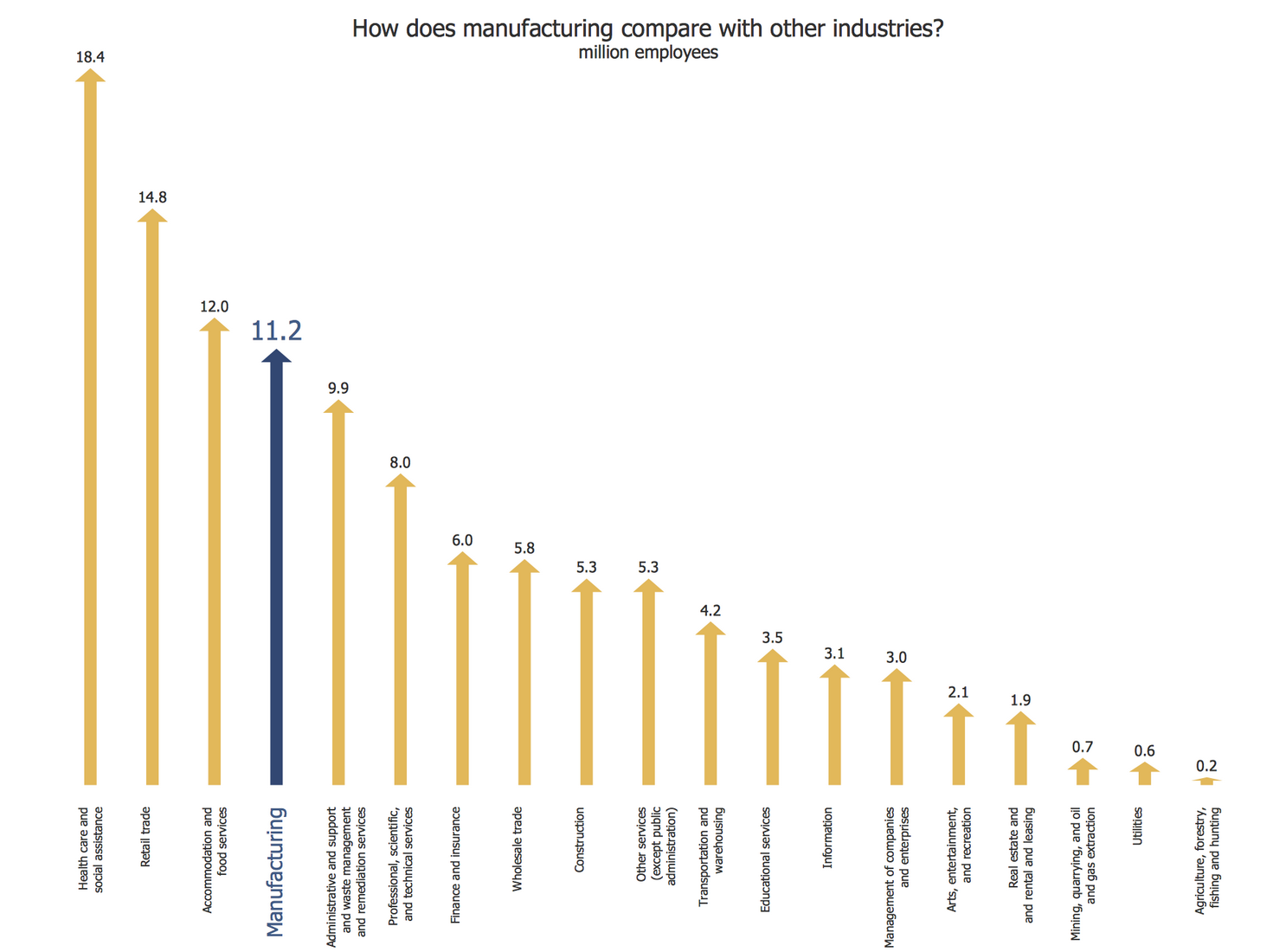
This Picture Graph sample demonstrates the comparing of manufacturing with other industries in the U.S. It was constructed on the base of data from the U.S. Census Bureau website. The values are represented in millions of employees. The manufacturing comprises 11,2 million employees and occupies the fourth place after the health care and social assistance (18,4 million), retail trade (14,8 million), accommodation and food services (12 million). The fields with lower values are represented at the right in this diagram by the administrative and support and waste management and remediation services (9,9 million), professional, scientific and technical services (8 million), finance and insurance (6 million), wholesale trade (5,8 million), construction (5,3 million), other services (except public administration) (5,3 million), transportation and warehousing (4,2 million), educational services (3,5 million), information (3,1 million), management of companies and enterprises (3 million), arts, entertainment and recreation (2,1 million), real estate and rental and leasing (1,9 million), mining, quarrying, and oil and gas extraction (0,7 million), utilities (0,6 million), agriculture, forestry, hunting and fishing (0,2 million).
Example 10: Regional Population Growth from 2010 to 2016
This example was created in ConceptDraw DIAGRAM using the Picture Graphs Library from the Picture Graphs Solution. An experienced user spent 5 minutes creating this sample.
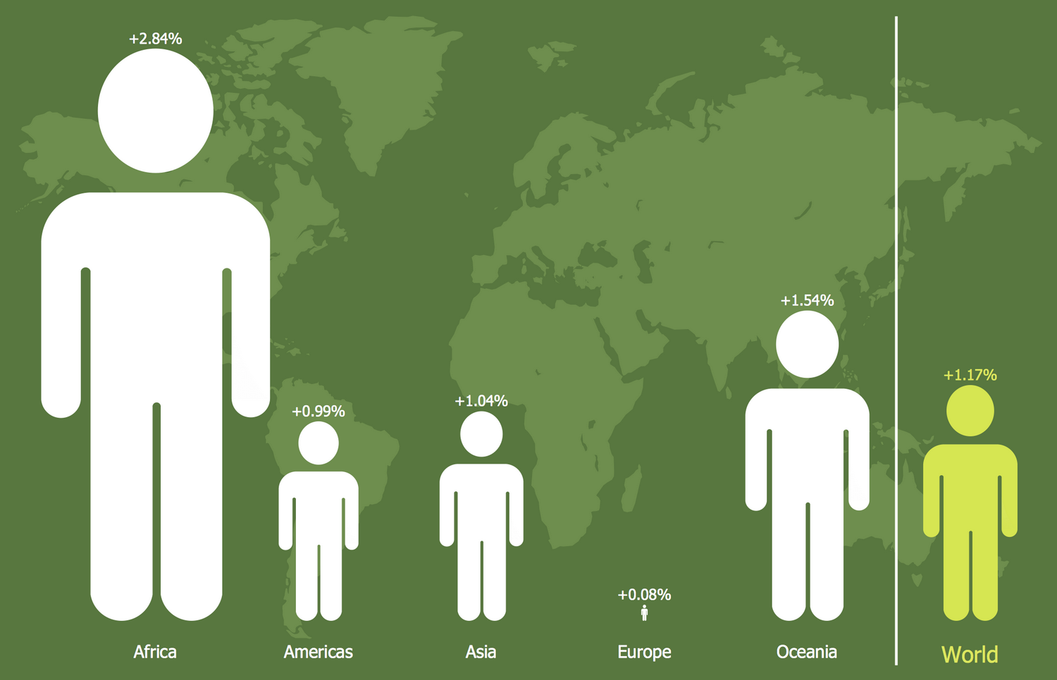
This Picture Bar Graph sample is dedicated to the research of population geography that is a field allowing tracking how the nature of places influences the people's growth, distribution, and composition. The sample was designed on the base of data from the Wikipedia article List of continents by population and depicts the regional population growth from 2010 to 2016. Such regions as Africa, America, Asia, Europe, and Oceania are considered in this diagram. Each of them is visually represented by a human pictogram and includes the value per annum growth rate in 2010-2016. The separately at the right side is represented the world’s per annum growth rate value that amounts +1,17% and the corresponding human pictogram is highlighted with a yellow color. The world's map is taken as the background for this diagram. This choice isn't random, choose carefully the background for your infographics and diagrams and reflect the main thematic with their help.
Inside
What I Need to Get Started
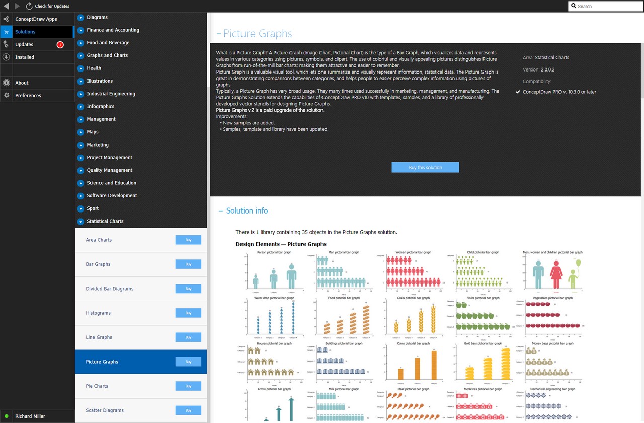
After ConceptDraw DIAGRAM is installed, the Picture Graphs solution can be purchased either from the Graphs and Charts area of ConceptDraw STORE itself or from our online store. Thus, you will be able to use the Picture Graphs solution straight after.
How to install
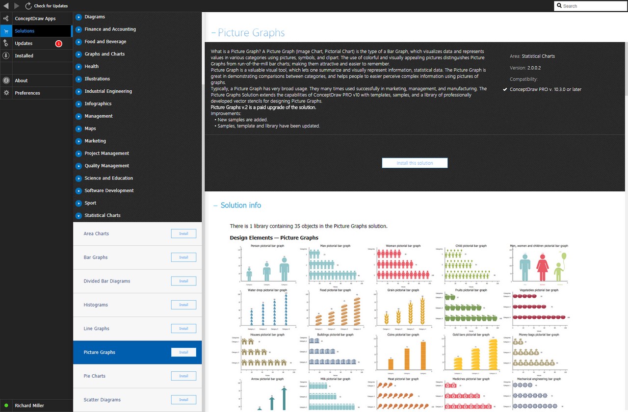
First of all, make sure that both ConceptDraw STORE and ConceptDraw DIAGRAM applications are downloaded and installed on your computer. Next, install the Picture Graphs solution from the ConceptDraw STORE to use it in the ConceptDraw DIAGRAM application.
Start Using
Start using the Picture Graphs solution to make the professionally looking numerical data by adding the design elements taken from the stencil libraries and editing the pre-made examples that can be found there.
