- Electric and Telecom Plans Free
- Fire and Emergency Plans Free
- Floor Plans Free
- Plant Layout Plans Free
- School and Training Plans Free
- Seating Plans Free
- Security and Access Plans Free
- Site Plans Free
- Sport Field Plans Free
- Business Process Diagrams Free
- Business Process Mapping Free
- Classic Business Process Modeling Free
- Cross-Functional Flowcharts Free
- Event-driven Process Chain Diagrams Free
- IDEF Business Process Diagrams Free
- Logistics Flow Charts Free
- Workflow Diagrams Free
- ConceptDraw Dashboard for Facebook Free
- Mind Map Exchange Free
- MindTweet Free
- Note Exchange Free
- Project Exchange Free
- Social Media Response Free
- Active Directory Diagrams Free
- AWS Architecture Diagrams Free
- Azure Architecture Free
- Cisco Network Diagrams Free
- Cisco Networking Free
- Cloud Computing Diagrams Free
- Computer Network Diagrams Free
- Google Cloud Platform Free
- Interactive Voice Response Diagrams Free
- Network Layout Floor Plans Free
- Network Security Diagrams Free
- Rack Diagrams Free
- Telecommunication Network Diagrams Free
- Vehicular Networking Free
- Wireless Networks Free
- Comparison Dashboard Free
- Composition Dashboard Free
- Correlation Dashboard Free
- Frequency Distribution Dashboard Free
- Meter Dashboard Free
- Spatial Dashboard Free
- Status Dashboard Free
- Time Series Dashboard Free
- Basic Circle-Spoke Diagrams Free
- Basic Circular Arrows Diagrams Free
- Basic Venn Diagrams Free
- Block Diagrams Free
- Concept Maps Free
- Family Tree Free
- Flowcharts Free
- Basic Area Charts Free
- Basic Bar Graphs Free
- Basic Divided Bar Diagrams Free
- Basic Histograms Free
- Basic Line Graphs Free
- Basic Picture Graphs Free
- Basic Pie Charts Free
- Basic Scatter Diagrams Free
- Aerospace and Transport Free
- Artwork Free
- Audio, Video, Media Free
- Business and Finance Free
- Computers and Communications Free
- Holiday Free
- Manufacturing and Maintenance Free
- Nature Free
- People Free
- Presentation Clipart Free
- Safety and Security Free
- Analog Electronics Free
- Audio and Video Connectors Free
- Basic Circuit Diagrams Free
- Chemical and Process Engineering Free
- Digital Electronics Free
- Electrical Engineering Free
- Electron Tube Circuits Free
- Electronic Block Diagrams Free
- Fault Tree Analysis Diagrams Free
- GHS Hazard Pictograms Free
- Home Automation and Wiring Free
- Mechanical Engineering Free
- One-line Diagrams Free
- Power Сircuits Free
- Specification and Description Language (SDL) Free
- Telecom and AV Circuits Free
- Transport Hazard Pictograms Free
- Data-driven Infographics Free
- Pictorial Infographics Free
- Spatial Infographics Free
- Typography Infographics Free
- Calendars Free
- Decision Making Free
- Enterprise Architecture Diagrams Free
- Fishbone Diagrams Free
- Organizational Charts Free
- Plan-Do-Check-Act (PDCA) Free
- Seven Management and Planning Tools Free
- SWOT and TOWS Matrix Diagrams Free
- Timeline Diagrams Free
- Australia Map Free
- Continent Maps Free
- Directional Maps Free
- Germany Map Free
- Metro Map Free
- UK Map Free
- USA Maps Free
- Customer Journey Mapping Free
- Marketing Diagrams Free
- Matrices Free
- Pyramid Diagrams Free
- Sales Dashboard Free
- Sales Flowcharts Free
- Target and Circular Diagrams Free
- Cash Flow Reports Free
- Current Activities Reports Free
- Custom Excel Report Free
- Knowledge Reports Free
- MINDMAP Reports Free
- Overview Reports Free
- PM Agile Free
- PM Dashboards Free
- PM Docs Free
- PM Easy Free
- PM Meetings Free
- PM Personal Time Management Free
- PM Planning Free
- PM Presentations Free
- PM Response Free
- Resource Usage Reports Free
- Visual Reports Free
- House of Quality Free
- Quality Mind Map Free
- Total Quality Management TQM Diagrams Free
- Value Stream Mapping Free
- Astronomy Free
- Biology Free
- Chemistry Free
- Language Learning Free
- Mathematics Free
- Physics Free
- Piano Sheet Music Free
- Android User Interface Free
- Class Hierarchy Tree Free
- Data Flow Diagrams (DFD) Free
- DOM Tree Free
- Entity-Relationship Diagram (ERD) Free
- EXPRESS-G data Modeling Diagram Free
- IDEF0 Diagrams Free
- iPhone User Interface Free
- Jackson Structured Programming (JSP) Diagrams Free
- macOS User Interface Free
- Object-Role Modeling (ORM) Diagrams Free
- Rapid UML Free
- SYSML Free
- Website Wireframe Free
- Windows 10 User Interface Free
Business Intelligence Dashboard
Dashboards that represent crucial data related to organizational performance are an incredibly professional tool. A dashboard has the ability to graphically present in real-time selected key indicators that display changes based on current data. Dashboards are especially valuable in business and manufacturing situations. They allow one to display large amounts of information and data in a clear, compact, and easy to view format. The dashboard representation of vital data quickly shows changes in a company's performance.
The information displayed on the dashboard may reflect the performance of the entire enterprise or display certain information, such as website activity, call center analytics and other business processes in the company. Dashboards help executives, analysts, marketers, and specialists to quickly analyze the company’s current situation and identify any weaknesses. The dashboard makes it easy to compare different process conditions and make informed decisions on possible changes.
The Business Intelligence Dashboard solution extends the functionality of ConceptDraw DIAGRAM with exclusive tools for the creation of professional Business Intelligence Dashboards, Business Intelligence Graphics, Business Intelligence Charts and Maps of different kinds. The solution supplies ConceptDraw DIAGRAM software with many ready-to-use vector objects, samples, and quick-start templates. The Business Intelligence Dashboard makes it easy to design a BI Dashboard, BI Model, or Dynamic Chart to monitor company's performance. The dashboard solution makes it easy to track selected company indicators; to display and analyze key performance indicators, to evaluate the trends and consistencies of the processes occurring in a company.
The use of color allows one to make charts that have big impact. By combining dashboards of various kinds one can display important information that shows critical performance information. ConceptDraw DIAGRAM and Business Intelligence Dashboard make it easy to experiment and create displays that track important data.
After implementation, ConceptDraw DIAGRAM makes it easy to export the resulting dashboards to various formats, create business intelligence reports and presentations in one click. Dashboards can be easily printed directly from ConceptDraw DIAGRAM or displayed on a large display or screen. It is possible to present key performance metrics in documents, slide shows, presentations, and meetings.
-
Buy this solution $99 -
Solution Requirements - This solution requires the following products to be installed:
ConceptDraw DIAGRAM v18 - This solution requires the following products to be installed:
-
Compatibility - Sonoma (14), Sonoma (15)
MS Windows 10, 11 - Sonoma (14), Sonoma (15)
-
Support for this Solution -
Helpdesk
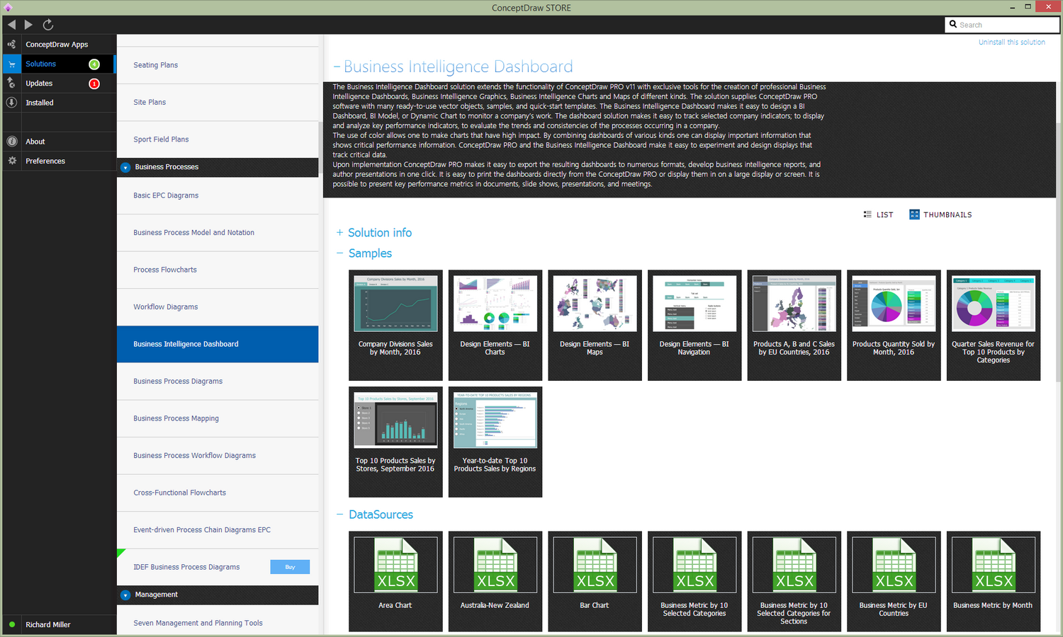
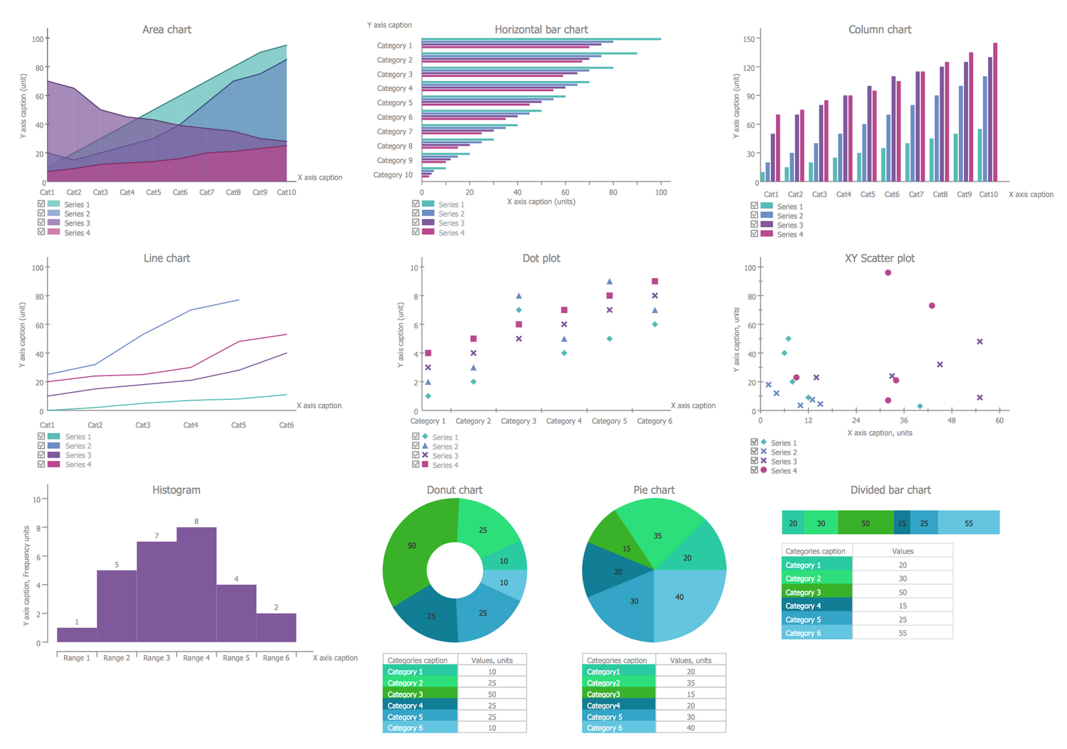
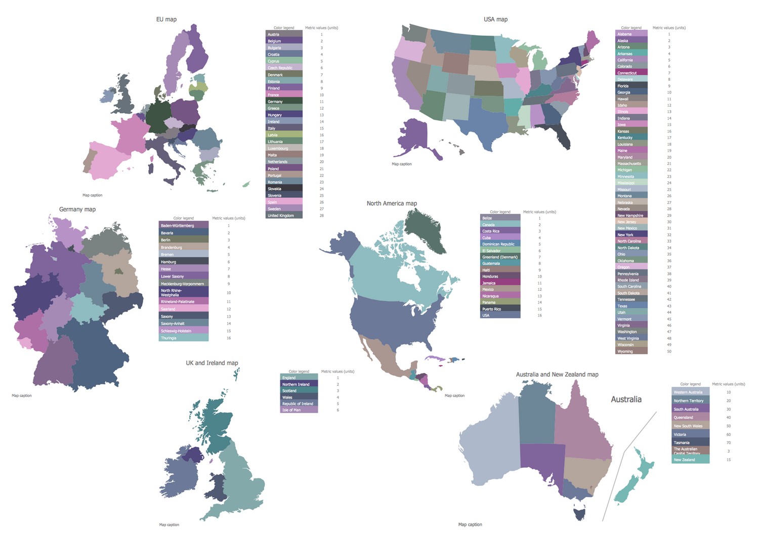
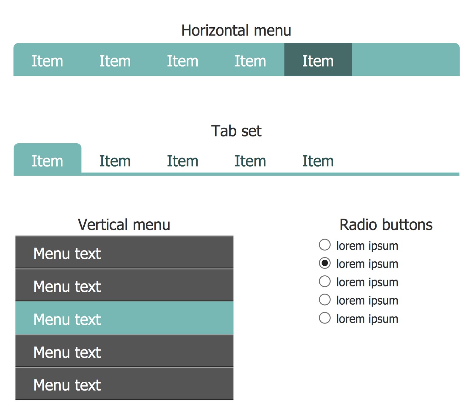
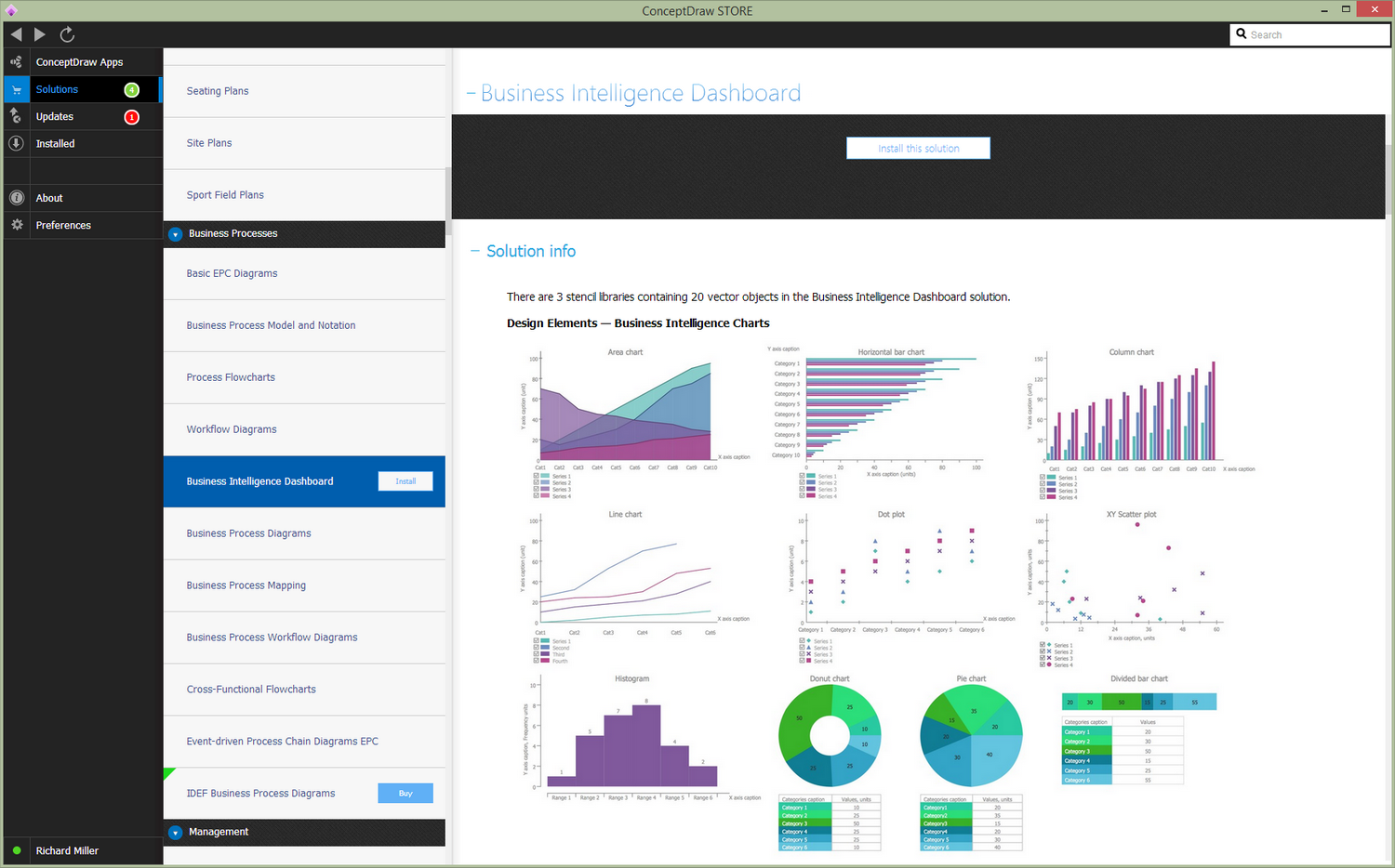
There are 3 stencil libraries containing 20 vector objects in the Business Intelligence Dashboard solution.
Design Elements — Business Intelligence Charts
Design Elements — Business Intelligence Maps
Design Elements — Business Intelligence Navigation
Related News:
Business Intelligence Dashboard Examples
There are a few samples that you see on this page which were created in the ConceptDraw DIAGRAM application by using the Business Intelligence Dashboard solution. Some of the solution's capabilities as well as the professional results which you can achieve are all demonstrated here on this page.
All source documents are vector graphic documents which are always available for modifying, reviewing and/or converting to many different formats, such as MS PowerPoint, PDF file, MS Visio, and many other graphic ones from the ConceptDraw Solution Park or ConceptDraw STORE. The Business Intelligence Dashboard solution is available to all ConceptDraw DIAGRAM users to get installed and used while working in the ConceptDraw DIAGRAM diagramming and drawing software.
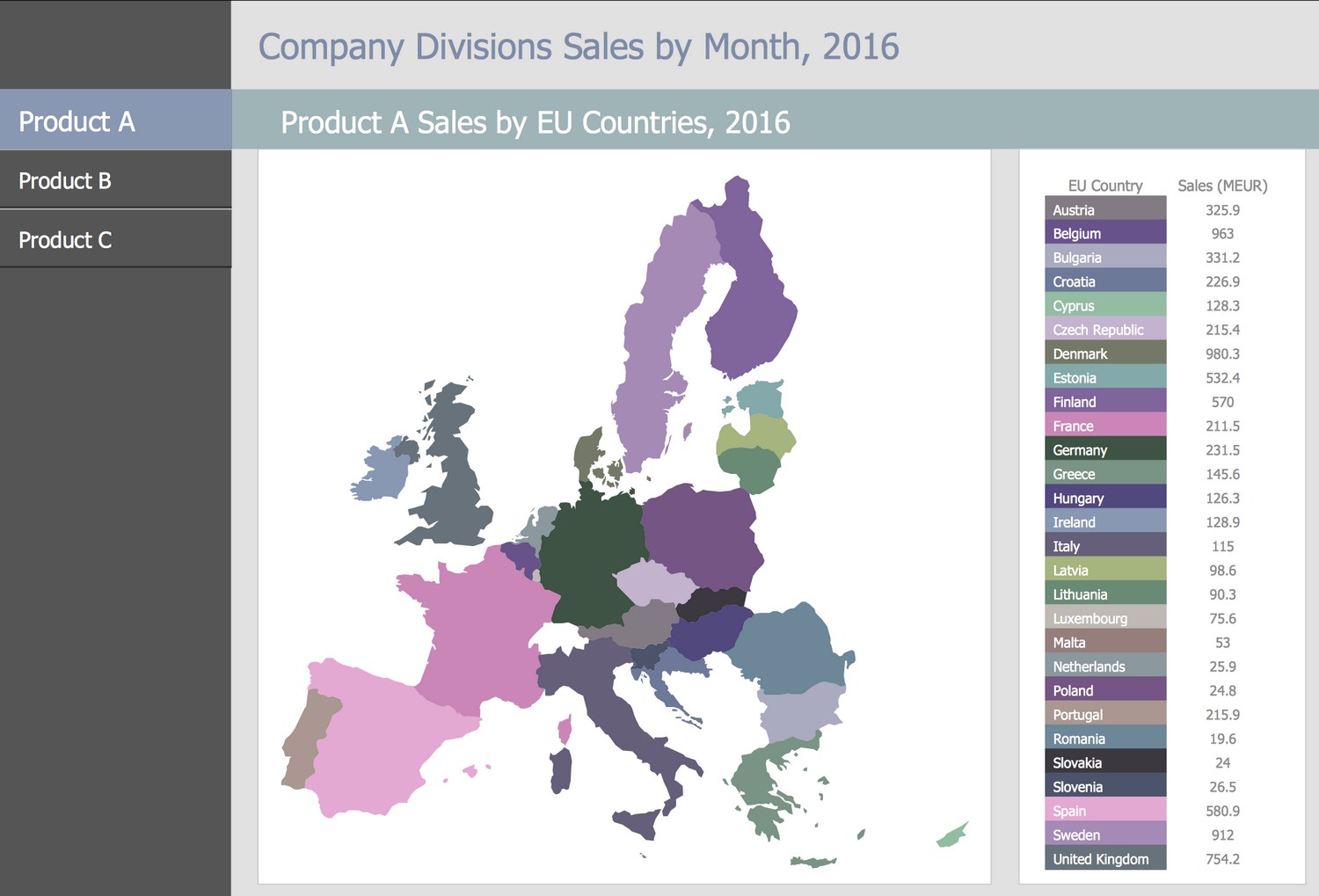
Example 1: Products A, B and C Sales by EU Countries, 2016
This diagram was created in ConceptDraw DIAGRAM using the libraries from the Business Intelligence Dashboard Solution. An experienced user spent 20 minutes creating this sample.
This Business Intelligence Map is an example of a thematic map dedicated to demonstrate the results of sales of three products A, B and C, which were sold by company divisions in different EU countries in 2016. The results are presented in Million Euros, sorted in alphabet order, and visually highlighted with varied colors. The precise and clear view of this diagram makes all conditions for convenient comparing values received for different countries, allowing tracking the countries with the highest and lowest values. Thematic maps are a special type of maps, which consider some specific theme or subject area, are often used to highlight spatial variation of one or several geographic distributions. The ConceptDraw's Business Intelligence Dashboard solution is perfect for designing BI model, illustrating the geographic distributions of data, company divisions sales for a selected period of time, and allows their visual comparing.
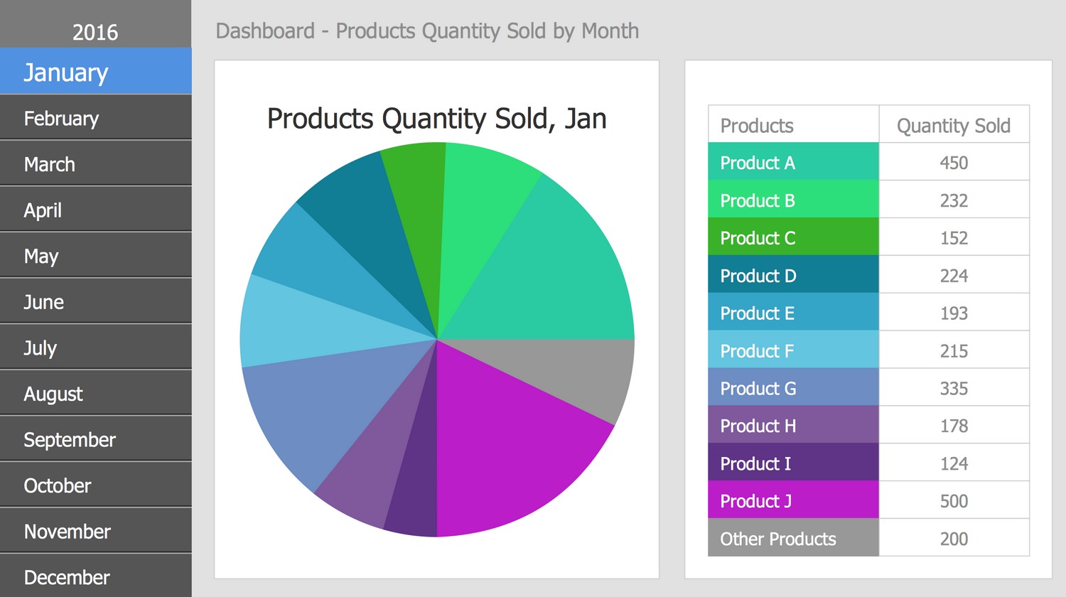
Example 2: Products Quantity Sold by Month, 2016
This diagram was created in ConceptDraw DIAGRAM using the libraries from the Business Intelligence Dashboard Solution. An experienced user spent 20 minutes creating this sample.
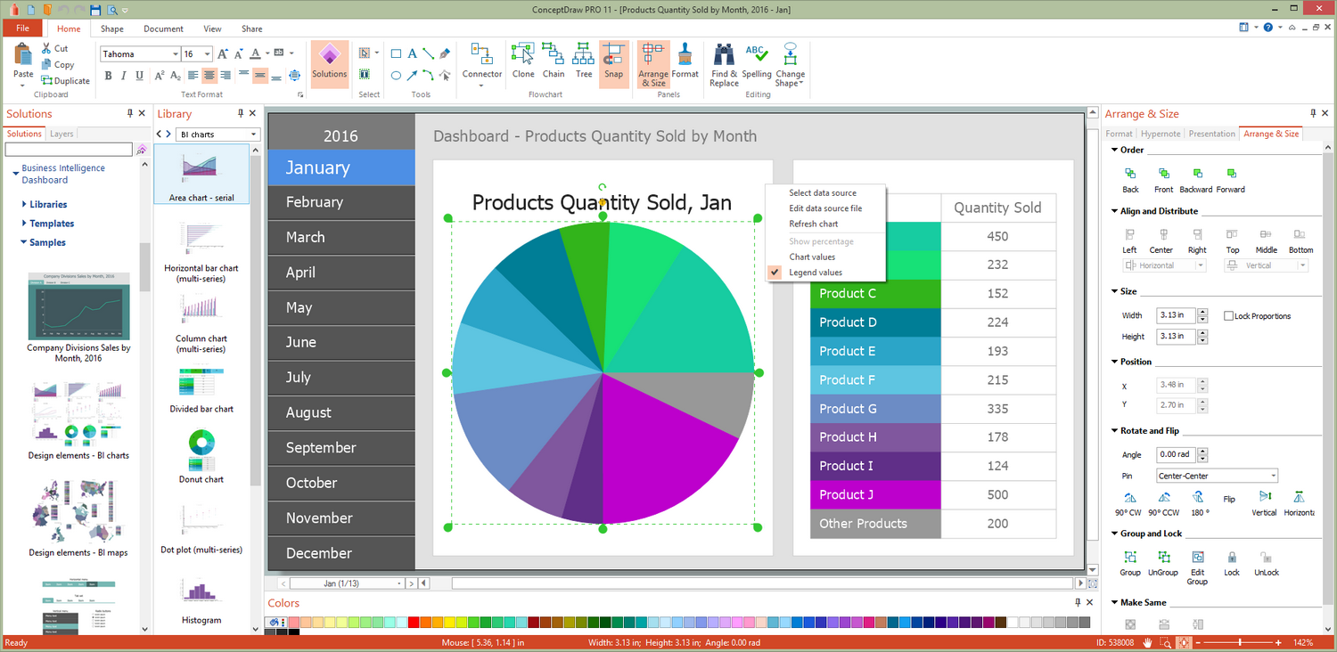
This Business Intelligence Dashboard uses a Pie Chart to show product sales volumes for each month in 2016. The sales volumes are indicated for the entire range of products manufactured and sold by the discussed company. Switch between months to keep track of how the picture changes — the values in the table and in the Pie chart also change accordingly. Being a circularly formed statistical graphic, a Pie chart is visually divided into slices, which illustrate a numerical proportion. It is achieved by constructing the slices with different angles and therefore the lengths of arcs. The arc length of each slice in a Pie chart is proportional to the part of the total amount that this slice represents. One can note that Pie charts are incredibly illustrative, that's why they are so popular in the business world. This diagram has a perfect view to be represented in business intelligence reports, presentations, and other official documents.
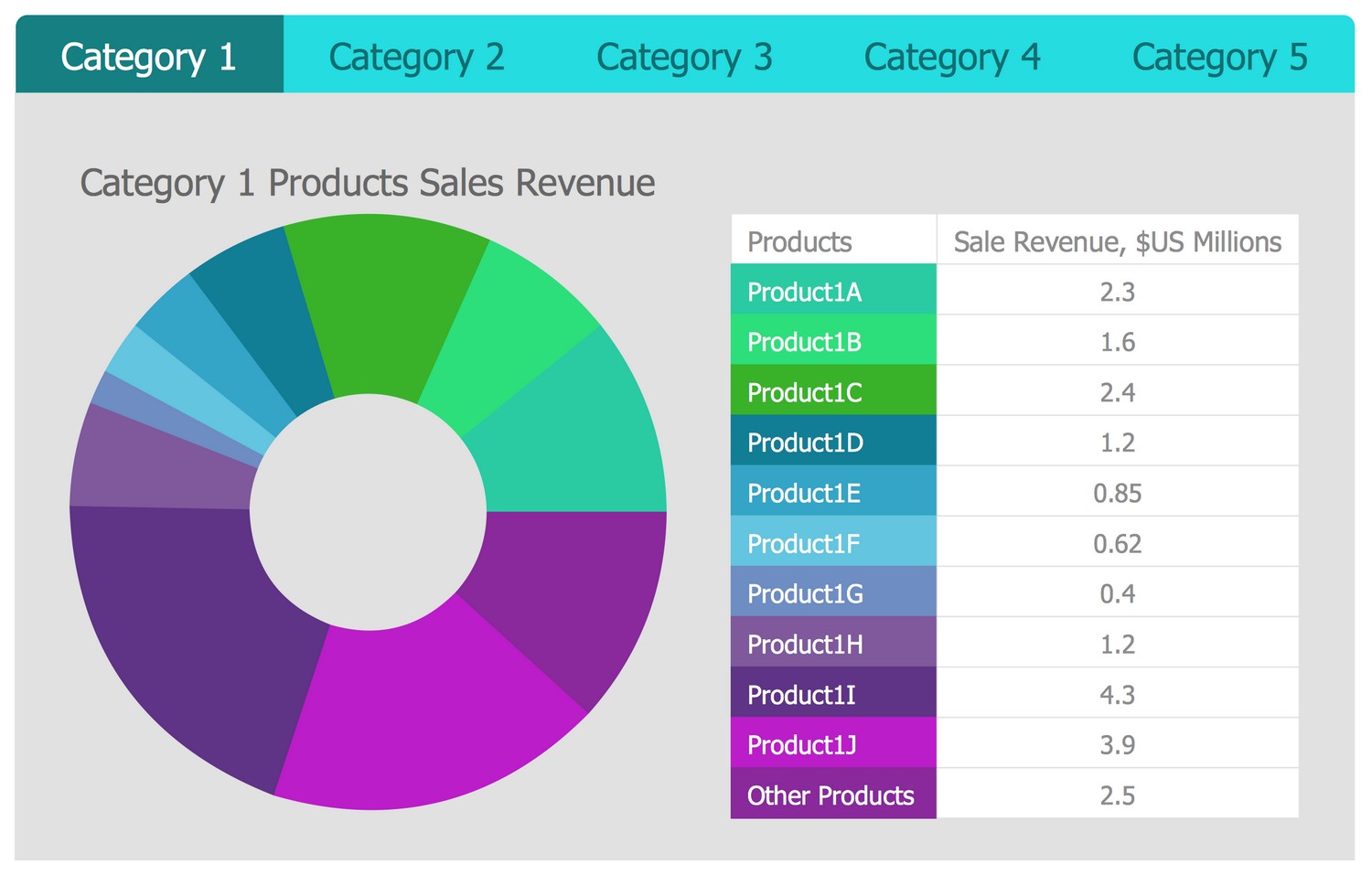
Example 3: Quarter Sales Revenue for Top 10 Products by Categories
This diagram was created in ConceptDraw DIAGRAM using the libraries from the Business Intelligence Dashboard Solution. An experienced user spent 15 minutes creating this sample.
This BI Chart sample illustrates the data on income from the sale of top 10 products using a Doughnut chart and table with a list of products and revenue from the sale of each one. The collected data correspond to the quarter. They are sorted by categories on the separated tabs and the Donut Chart is designed for each of them. Doughnut charts used in this dashboard are a kind of Pie charts without a filled center. The width of each sector of a chart corresponds to the proportional part of the sale revenue of this product in the total sales amount. The additional information about the data as a whole can be typed in a blank center of the diagram. Its own color is associated with each product, which visually emphasizes the differences. Currently, the values are hidden in a chart, but you can customize it and display the values in millions or percentages.
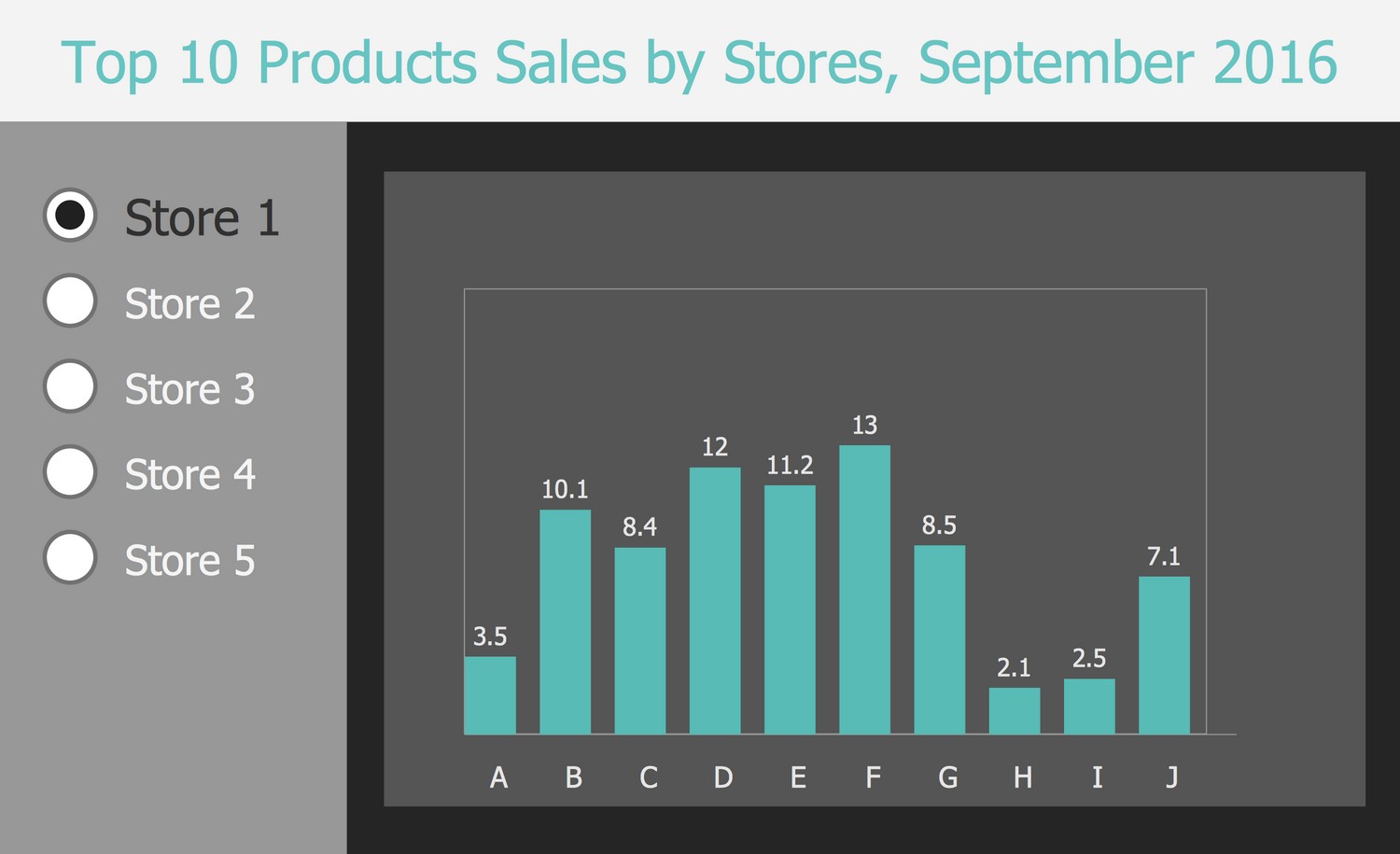
Example 4: Top 10 Products Sales by Stores, September 2016
This diagram was created in ConceptDraw DIAGRAM using the libraries from the Business Intelligence Dashboard Solution. An experienced user spent 15 minutes creating this sample.
This BI Dashboard uses a Vertical Bar Chart to show sales statistics for the top 10 products across five stores in September 2016. Check the desired store and just look at the height of the bars to immediately see the most popular products in this store. The highest one among the bars corresponds to the best one among the top products. Thus, you get a snapshot of customer preferences in each particular store and can get an idea of the best products to use this information in future purchases for the store. If you are a marketing specialist, these statistics will help you conclude which products from your assortment need additional advertising. It is convenient to present Bar Charts as separate data in the form of categorical data, when each bar is a representative of a certain group of products, as a rule, these are qualitative data.
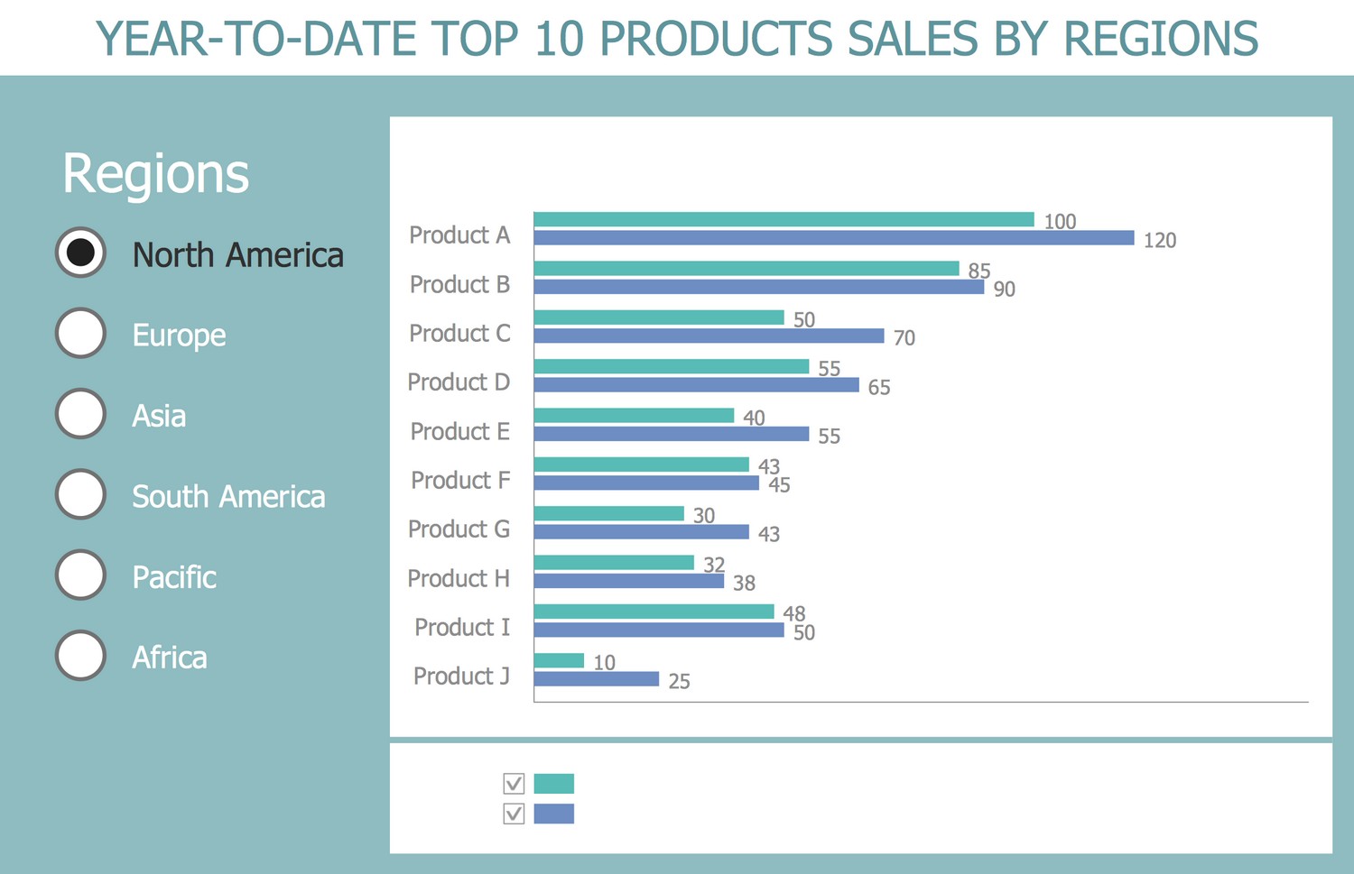
Example 5: Year-to-date Top 10 Products Sales by Regions
This diagram was created in ConceptDraw DIAGRAM using the libraries from the Business Intelligence Dashboard Solution. An experienced user spent 15 minutes creating this sample.
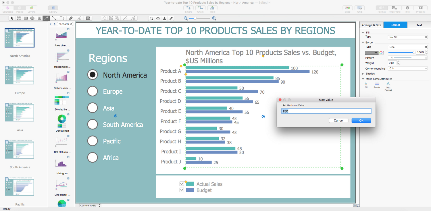
This Business Intelligence Dashboard sample shows the year-to-date sales of the top 10 products by regions using a form of Horizontal Bar Charts. Business analytics dashboards allow you to represent information about key performance indicators (KPIs) for a certain business process or other specific objectives. The use of the Horizontal Bar Chart in this sample is a good choice to demonstrate the sales of products by different categories, by regions in this example. The countries, departments, branches, or any other divisions according to your specificity can be taken as the categories as well. The use of several colors gives much more visibility, even if they are not contrasting and belong to the same color pattern. You can switch between the countries and compare results to choose the most prospective region or detect the regions required development efforts. Some parts of the diagram can be hidden or shown again at your request.
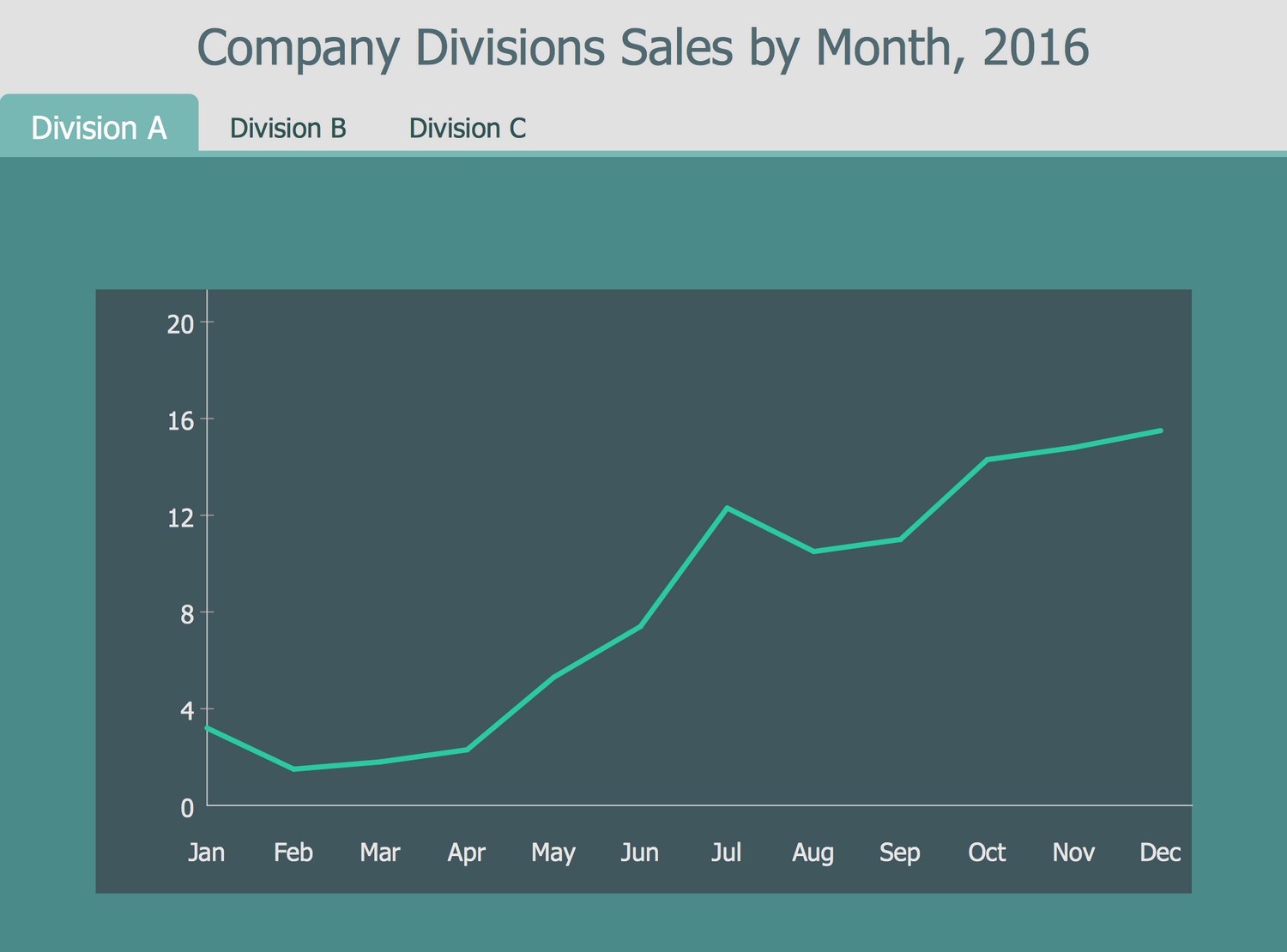
Example 6: Company Divisions Sales by Month, 2016
This diagram was created in ConceptDraw DIAGRAM using the libraries from the Business Intelligence Dashboard Solution. An experienced user spent 10 minutes creating this sample.
This Business Intelligence Dashboard sample shows the sales of the company divisions by months in 2016 using Time Series Line Charts, which are the charts designed as the Line charts and presenting the series of data points indexed in the time order. The points are successively and equally spaced in time in the Time Series Line Charts. The summarizing in one diagram information and sales data conducted by various departments of the same company is incredibly convenient for analytics, promotion and increasing the success of the company. Define the most successful division and make conclusions about key factors influencing its success to apply this model towards other divisions. ConceptDraw DIAGRAM provides convenient drawing capabilities and allows combining different kinds of diagrams within one dashboard. Three tabs are available in this dashboard and present different divisions A, B, C. You can switch between them to compare monthly sales results in 2016.
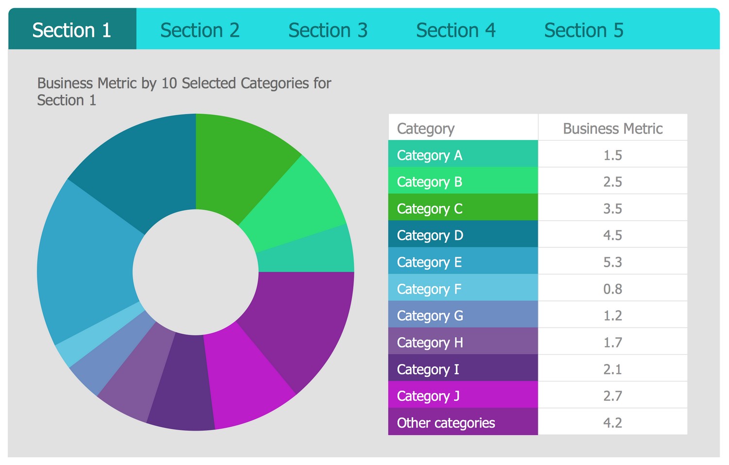
Template 1: Business Metric by 10 Selected Categories for 5 Sections
Performance metrics are used to determine the business behavior, organization's activities and performance. They measure how well the organization performs within a particular business context. As a rule, performance metrics are associated with each business process. The combination of different performance metrics offers a wide view of corporate success and allows indicating the business aspect that is critical for the success of a specific business. This Business Intelligence Dashboard template for ConceptDraw DIAGRAM software allows depicting business metrics in 10 categories for 5 sections. Use it to create Business Intelligence Dashboards with ConceptDraw DIAGRAM software in minutes. Fill the table with the names of your business categories and the values of business metrics, and the diagram will be automatically redrawn according to the entered data. The color spectrum can be also changed to the favorite one.
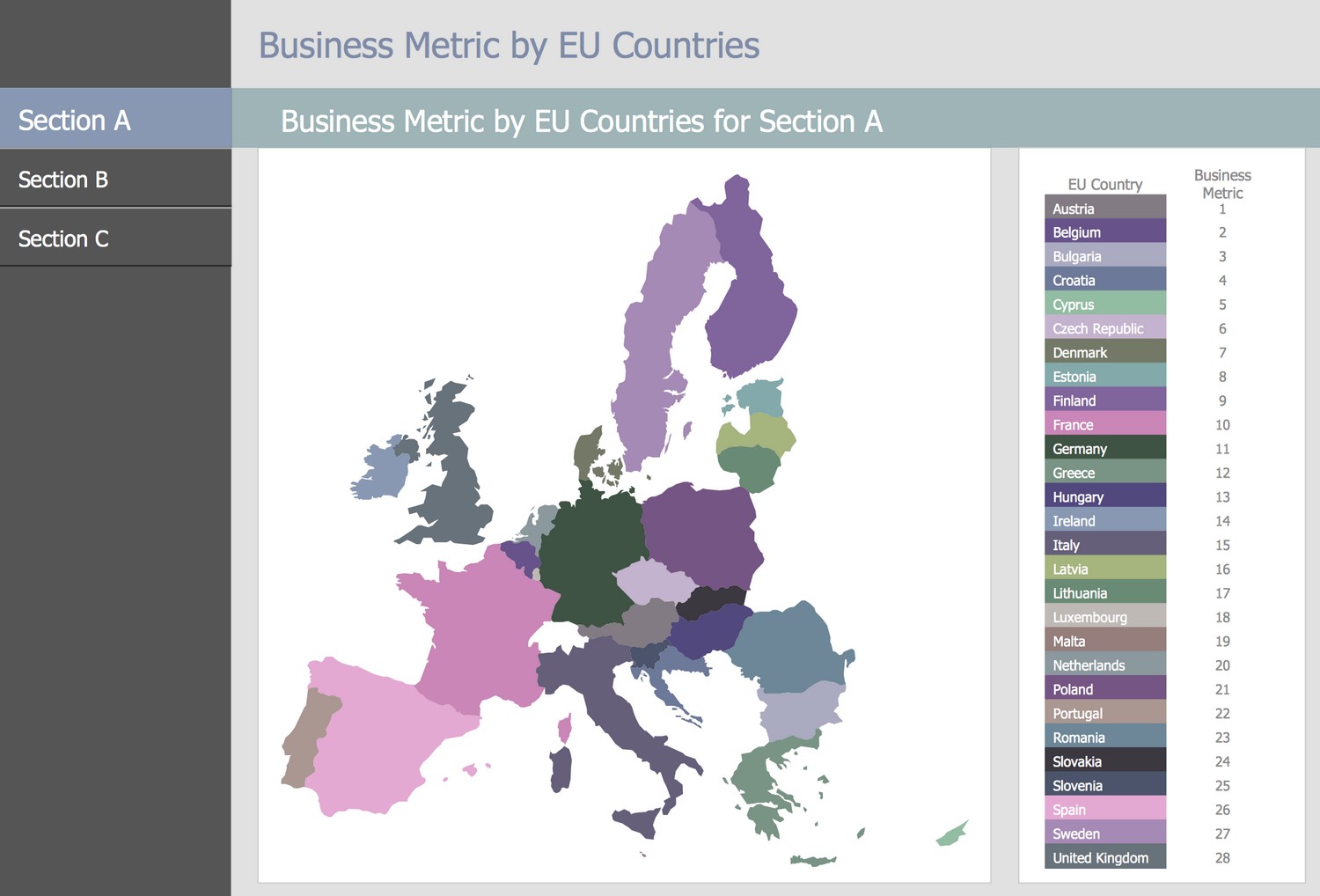
Template 2: Business Metric by EU Countries for 3 Sections
This Business Intelligence Dashboard template uses a thematic map to describe the business metrics by EU countries for 3 sections. It is a perfect basis for designing your BI dashboard in ConceptDraw DIAGRAM software. Simply add your data to the data source file, save it under the unique name, then open it from this template to update and visualize the data from your file. Now you can save your BI dashboard under a new name. If your data change, simple entering new ones into the source file allows you to update this dynamic chart and display the actual information in the dashboard. Using maps to visualize data from different regions, countries, cities, is the best choice. This is a visual way, which when using different colors becomes a powerful illustrative tool. Just one glance at this dashboard allows you to immediately catch all the information and focus on the main aspects.
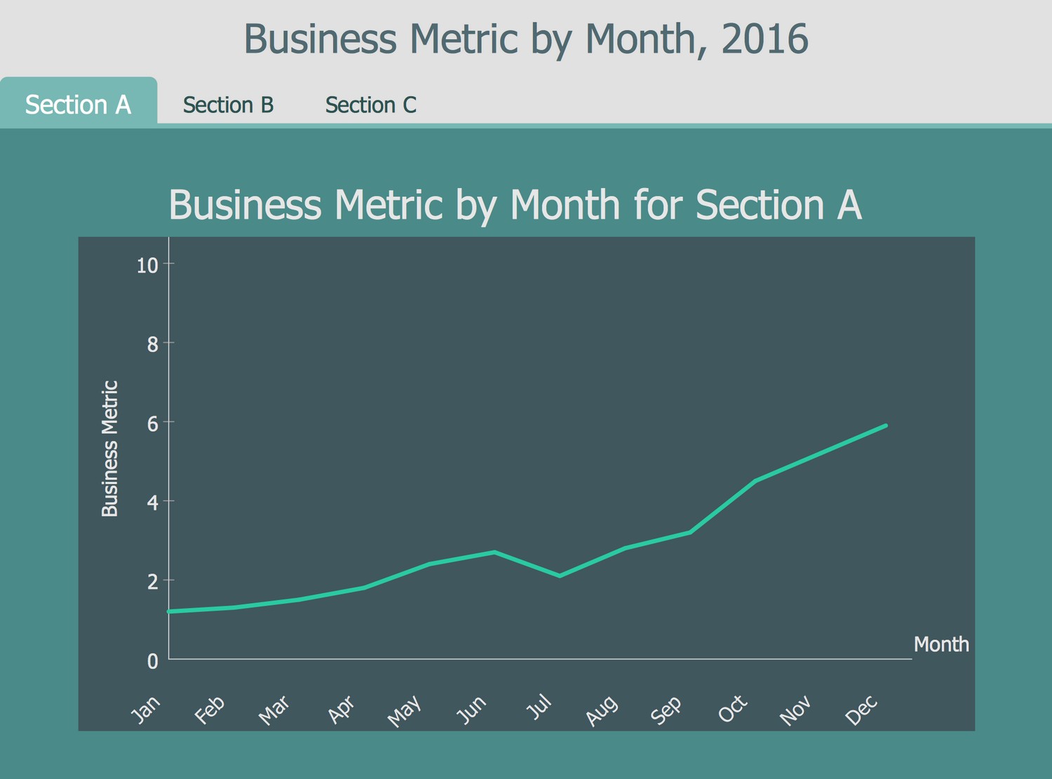
Template 3: Business Metric by Month, 2016 for 3 Sections
Business intelligence plays a key role in the strategic planning of any business company, measurement performance progress, achievement business goals, performing quantitative analysis and data sharing. The business intelligence solutions are useful for providing business intelligence by drawing visual Business Intelligence Graphic and dashboards. This BI Dashboard template is an essential assistant in representing the business metrics for 3 different sections by month. The Line Chart used in this dashboard is usual and intuitive for all, so it is the best choice to depict the business information and perform business analysis. This dashboard is suitable for use in documents of any type, in presentations, reports, and more. Enter your data at the file, use it as a source file in this dashboard and the Line chart will be redrawn in correspondence to it. If required, you can change the color style of the dashboard; for example, use the bright color for the Line chart.
Inside
What I Need to Get Started
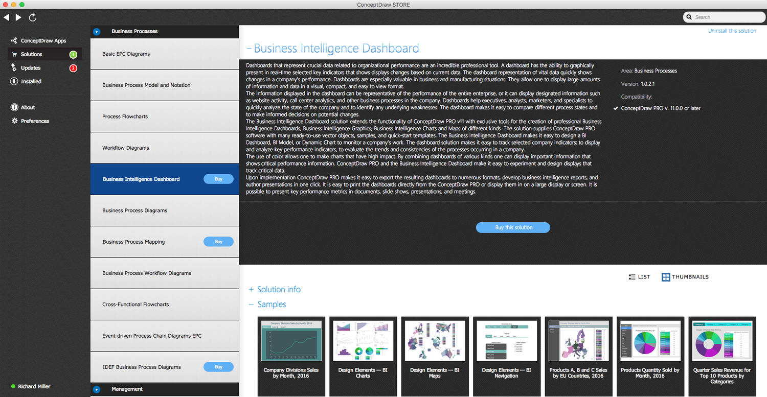
After ConceptDraw DIAGRAM is installed, the Business Intelligence Dashboard solution can be purchased either from the Business Processes area of ConceptDraw STORE itself or from our online store. Thus, you will be able to use the Business Intelligence Dashboard solution straight after.
How to install
First of all, make sure both ConceptDraw STORE and ConceptDraw DIAGRAM applications are downloaded and installed on your computer. Then, install the Business Intelligence Dashboard solution from the ConceptDraw STORE to use it in the ConceptDraw DIAGRAM application.
Start using
Start using the Business Intelligence Dashboard solution to make the professionally looking business processes diagrams by adding the design elements taken from the stencil libraries and editing the pre-made examples that can be found there.
