- Electric and Telecom Plans Free
- Fire and Emergency Plans Free
- Floor Plans Free
- Plant Layout Plans Free
- School and Training Plans Free
- Seating Plans Free
- Security and Access Plans Free
- Site Plans Free
- Sport Field Plans Free
- Cafe and Restaurant Floor Plans $25
- Gym and Spa Area Plans $49
- HVAC Plans $49
- Landscape & Garden $49
- Office Layout Plans $25
- Plumbing and Piping Plans $49
- Tilt and Turn Windows $25
- Agriculture Infographics $49
- Economy Infographics $25
- Education Infographics $25
- Energy Industry Infographics $25
- Financial Infographics $25
- Green Energy $25
- Management Infographics $25
- Marketing Infographics $25
- Oil and Gas $25
- Politics Infographics $25
- Business Process Diagrams Free
- Business Process Mapping Free
- Classic Business Process Modeling Free
- Cross-Functional Flowcharts Free
- Event-driven Process Chain Diagrams Free
- IDEF Business Process Diagrams Free
- Logistics Flow Charts Free
- Workflow Diagrams Free
- Business Intelligence Dashboard $99
- Business Process Workflow Diagrams $49
- Healthcare Management Workflow Diagrams $49
- Logistic Dashboard $49
- ConceptDraw Dashboard for Facebook Free
- Mind Map Exchange Free
- MindTweet Free
- Note Exchange Free
- Project Exchange Free
- Social Media Response Free
- Active Directory Diagrams Free
- AWS Architecture Diagrams Free
- Cisco Network Diagrams Free
- Cisco Networking Free
- Cloud Computing Diagrams Free
- Computer Network Diagrams Free
- Google Cloud Platform Free
- Interactive Voice Response Diagrams Free
- Network Layout Floor Plans Free
- Network Security Diagrams Free
- Rack Diagrams Free
- Telecommunication Network Diagrams Free
- Vehicular Networking Free
- Wireless Networks Free
- Comparison Dashboard Free
- Composition Dashboard Free
- Correlation Dashboard Free
- Frequency Distribution Dashboard Free
- Meter Dashboard Free
- Spatial Dashboard Free
- Status Dashboard Free
- Time Series Dashboard Free
- Basic Circle-Spoke Diagrams Free
- Basic Circular Arrows Diagrams Free
- Basic Venn Diagrams Free
- Block Diagrams Free
- Concept Maps Free
- Family Tree Free
- Flowcharts Free
- Basic Area Charts Free
- Basic Bar Graphs Free
- Basic Divided Bar Diagrams Free
- Basic Histograms Free
- Basic Line Graphs Free
- Basic Picture Graphs Free
- Basic Pie Charts Free
- Basic Scatter Diagrams Free
- Health Informatics Free
- Allergology $49
- Biomedicine $49
- Genogram $25
- Health Sciences $25
- Human Anatomy $25
- Medical Illustrations $25
- Medical Mycology $49
- Medical Virology $49
- Pharmacy Illustrations $25
- Aerospace and Transport Free
- Artwork Free
- Audio, Video, Media Free
- Business and Finance Free
- Computers and Communications Free
- Holiday Free
- Manufacturing and Maintenance Free
- Nature Free
- People Free
- Presentation Clipart Free
- Safety and Security Free
- Audio and Video Connectors Free
- Basic Circuit Diagrams Free
- Chemical and Process Engineering Free
- Digital Electronics Free
- Electrical Engineering Free
- Electron Tube Circuits Free
- Fault Tree Analysis Diagrams Free
- GHS Hazard Pictograms Free
- Home Automation and Wiring Free
- Mechanical Engineering Free
- Specification and Description Language (SDL) Free
- Transport Hazard Pictograms Free
- Data-driven Infographics Free
- Pictorial Infographics Free
- Spatial Infographics Free
- Typography Infographics Free
- Calendars Free
- Decision Making Free
- Enterprise Architecture Diagrams Free
- Fishbone Diagrams Free
- Organizational Charts Free
- Plan-Do-Check-Act (PDCA) Free
- Seven Management and Planning Tools Free
- SWOT and TOWS Matrix Diagrams Free
- Timeline Diagrams Free
- Business Diagrams $49
- Critical Infrastructure Sectors $35
- CRM Center Dashboard $49
- Environmental, Social, and Corporate Governance $25
- HR Dashboard $49
- HR Flowcharts $25
- Public Utilities $25
- Stakeholder Onion Diagrams $49
- Sustainable Development $25
- Australia Map Free
- Continent Maps Free
- Directional Maps Free
- Germany Map Free
- Metro Map Free
- UK Map Free
- USA Maps Free
- Customer Journey Mapping Free
- Marketing Diagrams Free
- Matrices Free
- Pyramid Diagrams Free
- Sales Dashboard Free
- Sales Flowcharts Free
- Target and Circular Diagrams Free
- Funnel Diagrams $25
- Business Diagrams Package $230
- Business Infographics Package $130
- Business Management Package $367
- Education Package $160
- Health Package $180
- Project Management Package $158
- Cash Flow Reports Free
- Current Activities Reports Free
- Custom Excel Report Free
- Knowledge Reports Free
- MINDMAP Reports Free
- Overview Reports Free
- PM Agile Free
- PM Dashboards Free
- PM Docs Free
- PM Easy Free
- PM Meetings Free
- PM Planning Free
- PM Presentations Free
- PM Response Free
- Resource Usage Reports Free
- Visual Reports Free
- Kanban Board $25
- MindMap Diagrams $99
- Project Diagrams $49
- House of Quality Free
- Quality Mind Map Free
- Total Quality Management TQM Diagrams Free
- Value Stream Mapping Free
- Seven Basic Tools of Quality $25
- Android User Interface Free
- Data Flow Diagrams (DFD) Free
- Entity-Relationship Diagram (ERD) Free
- EXPRESS-G data Modeling Diagram Free
- IDEF0 Diagrams Free
- iPhone User Interface Free
- Jackson Structured Programming (JSP) Diagrams Free
- macOS User Interface Free
- Object-Role Modeling (ORM) Diagrams Free
- Rapid UML Free
- SYSML Free
- Website Wireframe Free
- Windows 10 User Interface Free
- ATM UML Diagrams $25
Area Charts
An Area Chart (Area Graph) devised by William Playfair and first presented in his book “The Commercial and Political Atlas” in 1786, is a type of charts displaying graphically quantitative data. Taking as the base the Line chart similar to it, the Area Chart represents data as a series of points connected by the straight lines and depicts the differences in values by filling the area below them. Typically, the area between the axis and the constructed lines is filled with a color, hatching, or some texture for the best visuality. At this, often it is needed to represent the multiple attributes and it is convenient to do this on one chart with a goal to compare visually the areas corresponding to different parameters. Therefore, it is logical to construct several areas on one chart filling them differently.
The Area Charts are used to represent the absolute or relative values over a period of time, to display the cumulative totals over time using numbers or percentages, to depict the overall change in data over the time, to show the trends across the time among related attributes, to demonstrate the effect of metrics' overlay. They are effective when comparing two or more quantities, each series of data is typically represented with a different color and the use of objects' transparency is helpful for overlapped areas and allows showing the smaller areas hidden behind larger areas.
The Area Charts Solution for ConceptDraw DIAGRAM is a comprehensive set of drawing tools, examples, samples, template, and predesigned vector objects contained in a library. All this makes designing pictorial Area Charts easy, which perfectly suit for displaying statistical values, business indicators, income, ratings, population growth, and many other data in different areas. The library's objects allow you to construct both mono charts with one area and the charts with several areas, and to paint them in different colors for visual separation. Each ConceptDraw's Area Chart object is fully customizable and you can add or remove points, set the number of points and maximum value, hide or show values and axis on the diagram, the digital values are available for introduction manually. The use of Area Chart template lets you just enter the values in an also customizable table and receive at once the automatically depicted areas colored differently according to the legend.
-
Buy this solution $25 -
Solution Requirements - This solution requires the following products to be installed:
ConceptDraw DIAGRAM v18 - This solution requires the following products to be installed:
-
Compatibility - Sonoma (14), Sonoma (15)
MS Windows 10, 11 - Sonoma (14), Sonoma (15)
-
Support for this Solution -
Helpdesk
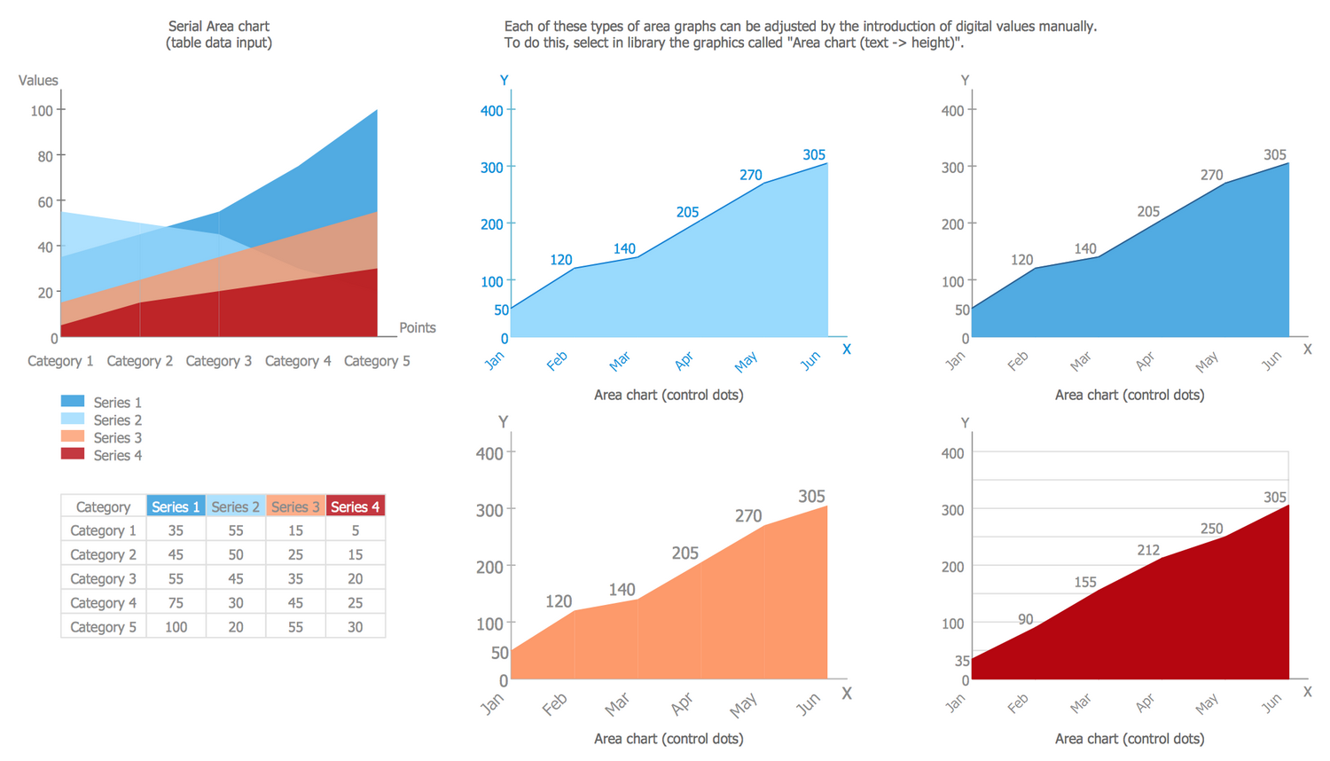
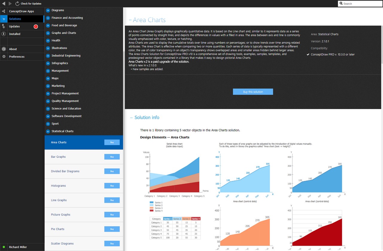
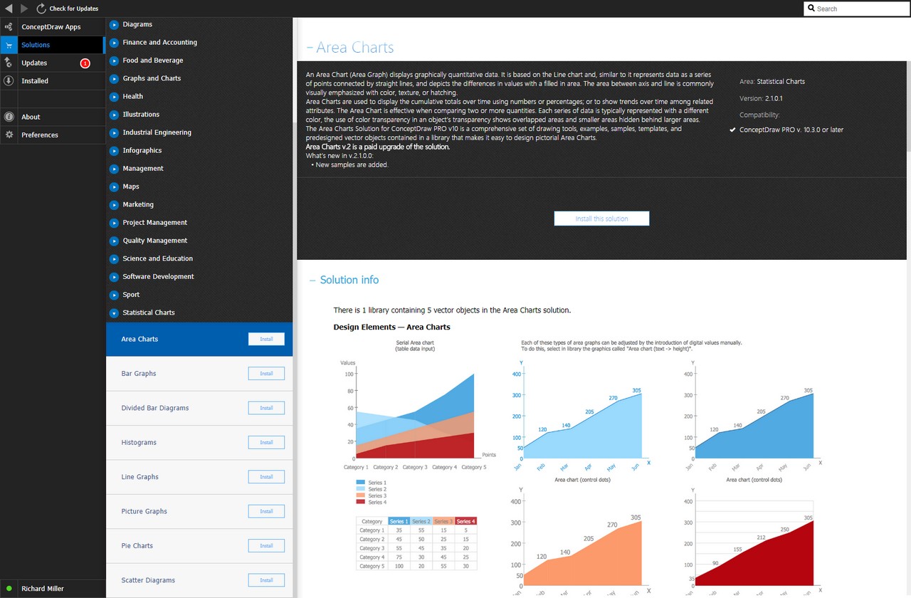
There is 1 library containing 5 vector objects in the Area Charts solution.
Design Elements — Area Charts
Related News:
CS Odessa Announces Additions to Powerful Graphs and Charts Area in ConceptDraw Solution ParkExamples
There are a few samples that you see on this page which were created in the ConceptDraw DIAGRAM application by using the Area Charts solution. Some of the solution's capabilities as well as the professional results which you can achieve are all demonstrated here on this page.
All source documents are vector graphic documents which are always available for modifying, reviewing and/or converting to many different formats, such as MS PowerPoint, PDF file, MS Visio, and many other graphic ones from the ConceptDraw Solution Park or ConceptDraw STORE. The Area Charts solution is available to all ConceptDraw DIAGRAM users to get installed and used while working in the ConceptDraw DIAGRAM diagramming and drawing software.
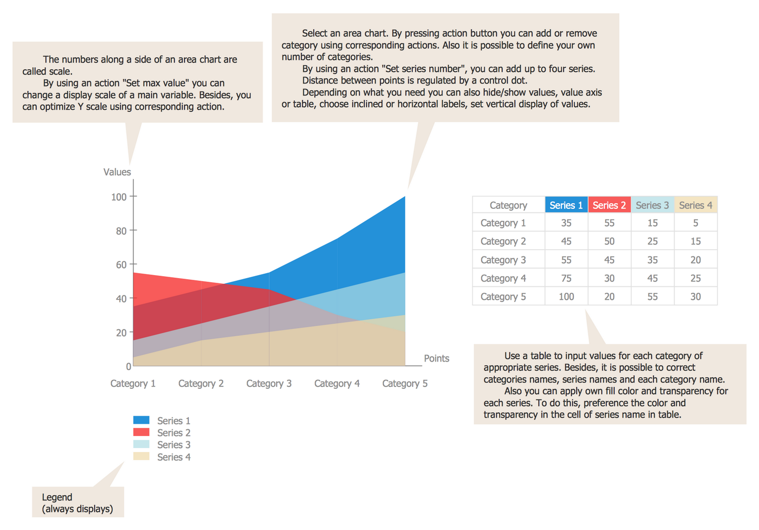
Template: Area Chart
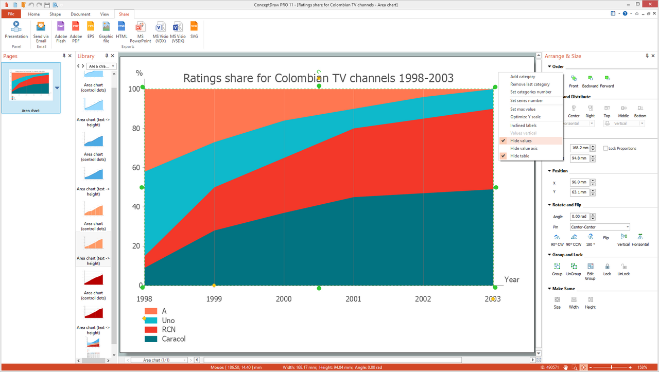
Quite often, selecting an appropriate diagram style is one of the hardest tasks of a job. To help with this selection process, ConceptDraw DIAGRAM has many templates to pick from. The templates of different types contain materials that will help you decide what to use for your specific diagramming application. This template is intended to represent several series that are visually separated by different colors, the correspondence of which is depicted at the legend. The data for each category and each series need to be entered to the table, then they are automatically depicted on the Area Chart. The table can be hidden and shown again from the object's menu if needed, as well as values and value axis can be hidden/shown. You can also add/remove the categories, set categories and series numbers, set max value, optimize Y scale, and show labels horizontally or inclined using the corresponding commands from the object's action menu.
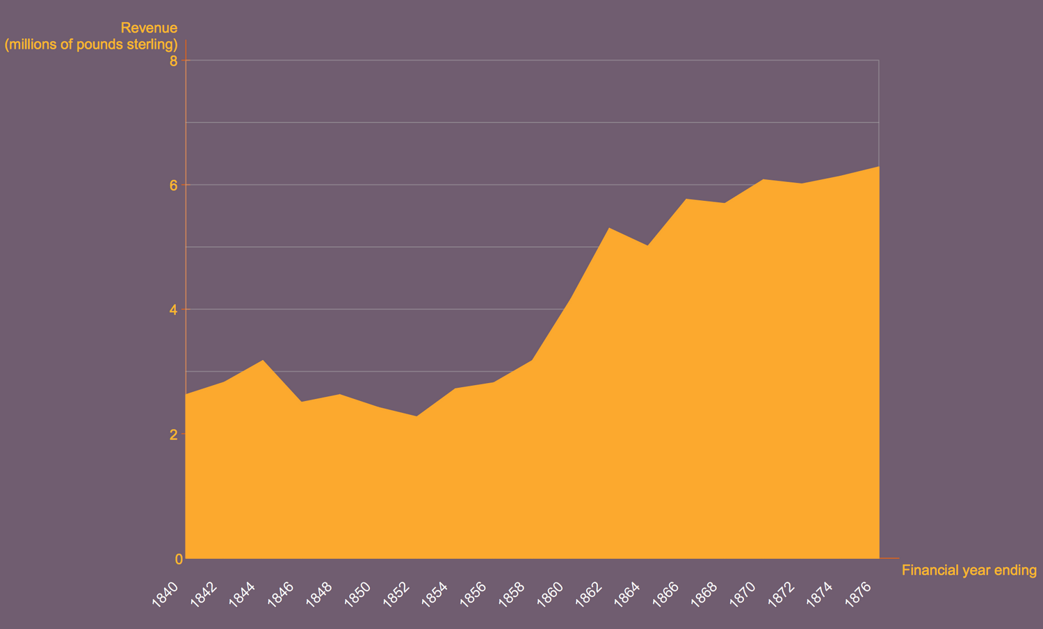
Example 1: British India Salt Revenue 1840-1877
This example was created in ConceptDraw DIAGRAM using the Area Charts Library from the Area Charts Solution. An experienced user spent 10 minutes creating this sample.
The unique illustrative capability of the Area Chart is helpful to visual and clear represent how the values change over time. This Area Chart shows the revenue of the British India Salt Company in period 1840-1877 including the inland and port taxes, and sale of government salt. It is based on the Wikimedia Commons file "British India salt revenue 1840-1877.png". Until 1858 the company was named the East India Salt Company, then it became the British India company. The vertical axis shows the revenue in millions of pounds sterling and the horizontal axis depicts the financial year ending. When the corresponding revenues for each second year from 1840 to 1877 were marked in the diagram and linked in a line graph, the area under the line graph was filled with a solid color – yellow color in this case. In some cases, the area can be filled by color with texture.
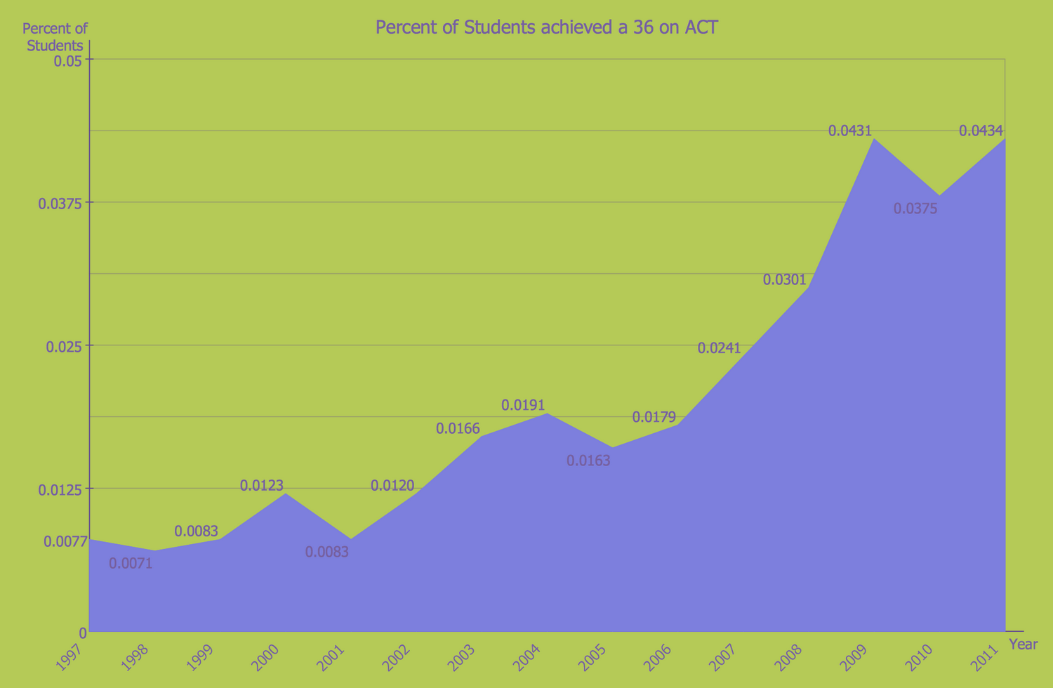
Example 2: Percentage of Students Achieved a 36 on ACT
This example was created in ConceptDraw DIAGRAM using the Area Charts Library from the Area Charts Solution. An experienced user spent 15 minutes creating this sample.
This Area Chart depicts the statistical percentage data about achievement by students the highest score 36 for the ACT (American College Testing) subject tests — English, mathematics, reading, and science reasoning, which are obligatory in the US for high school achievement and college admission. This sample was designed on the base of the Wikimedia Commons file "ACT-36-1997 to 2011.png". The data about results from 1997 to 2011 were collected and depicted in the diagram. The test on each subject from four ones is scored from 1 to 36, the composite score is calculated as an average score of all four tests. At the key points of the chart, you can see the percentage of students that achieved the top score 36 on the ACT in each year from 1997 to 2011 and it is easy to detect the years of the top result. These are 2009 and 2011 years when the result was the biggest and approximately equal – 0,0431 and 0,0434 correspondingly.
Example 3: Sochi 2014 Medal Count
This example was created in ConceptDraw DIAGRAM using the Area Charts Library from the Area Charts Solution. An experienced user spent 10 minutes creating this sample.
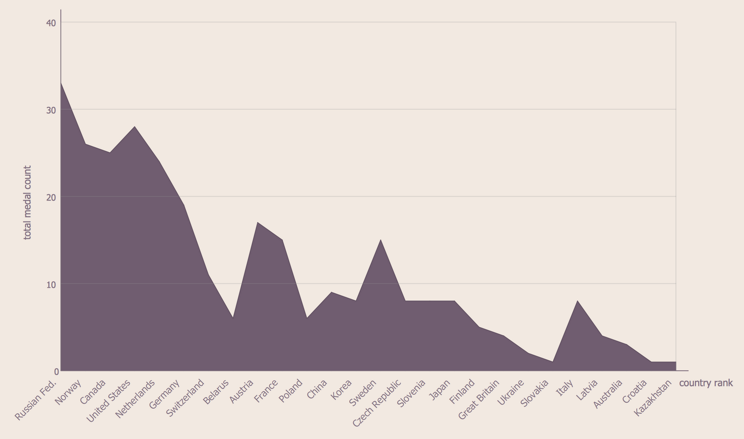
This Area Chart is devoted to famous international sporting competition Olympic Games, in particular, the 2014 Winter Olympics in Sochi, Russia, that was held from 7 to 23 February. 2,800 athletes representing 88 National Olympic Committees took part in this competition, in 15 sports and disciplines, and 98 events. The results of these Olympic Games are shown in the diagram. You can see the list of countries and quantity of gold, silver and bronze medals in total won by each of them. However, if you need more detail, the charts on achievement gold, silver, and bronze medals can be represented separately, one next to the other. According to the represented results, the Russian federation that was a host became the winner in the largest number of competitions, they got thirty-three medals — thirteen gold, eleven silver, and nine bronze. On the second place are the United States and Norway is on the third one.
Example 4: Outstanding Trends of Wastewater Treatment Plants
This example was created in ConceptDraw DIAGRAM using the Area Charts Library from the Area Charts solution. An experienced user spent 15 minutes creating this sample.
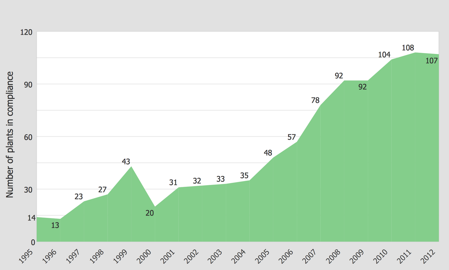
The problem of wastewater treatment from physical, chemical and biological contaminants is the primary for environment and ecology. This Area Diagram illustrates the outstanding trends in the field of wastewater treatment plants on the base of data from the website of the Washington State Department of Ecology. The sewage treatment is a process of removing different kinds of contaminants from wastewater, which includes physical, biological, and chemical processes. Its main goal is obtaining the environmentally safe fluid and solid waste stream suitable for disposal or even further reuse, processing the wastewater into drinking water using advanced modern technologies and equipment. The vertical axis in this chart depicts the numbers of plants in compliance, while the horizontal axis represents the regarded years from 1995 to 2012. Marking by points the quantities of plans for each year, linking them and filling the area under the received line, you receive a visual graph that lets one make conclusions and correctly develop this field of activity.
Example 5: US Food Supply of Macronutrients in Grams per Capita per Day
This example was created in ConceptDraw DIAGRAM using the Area Charts Library from the Area Charts Solution. An experienced user spent 10 minutes creating this sample.
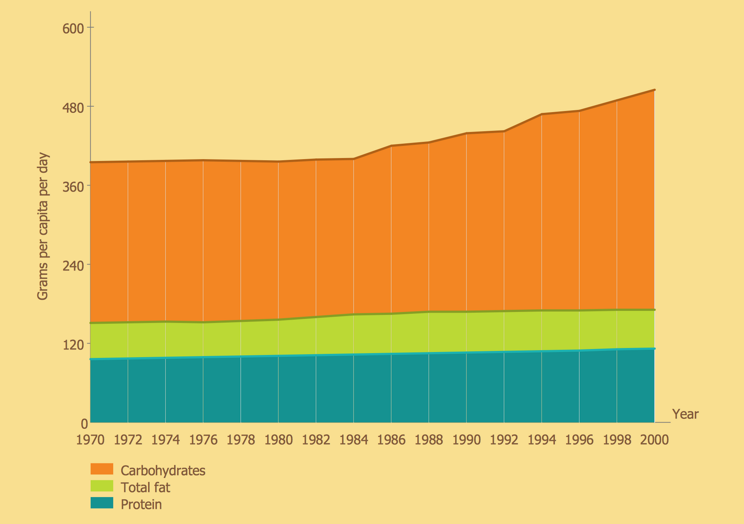
This Area Chart sample combines three Area graphs in one diagram. It contains data about food consumption in the United States for a period of 31 years (from 1970 to 2000) and shows the amount of protein, fat, and carbohydrate per person per day. The data were taken from US Center for Disease Control and Prevention (CDC) website and Roland Sturm's article about the childhood obesity, and the illustration was redesigned from the website of Food Consumption Data System, Economic Research Service of U. S. Department of Agriculture. The legend decrypts the correspondence of three main macronutrients to the colors used for them in this diagram, thus for the line depicting protein is used blue color, green for the fat, and orange for the carbohydrates. The vertical axis represents the grams of macronutrients per capita per day and on the horizontal axis are marked the years. The amount of protein and fat are almost constant throughout all the period. The amount of carbohydrates increases beginning from 1984 to 2000, until this period it is constant.
Example 6: Detroit People Mover Ridership
This example was created in ConceptDraw DIAGRAM using the Area Charts Library from the Area Charts Solution. An experienced user spent 10 minutes creating this sample.
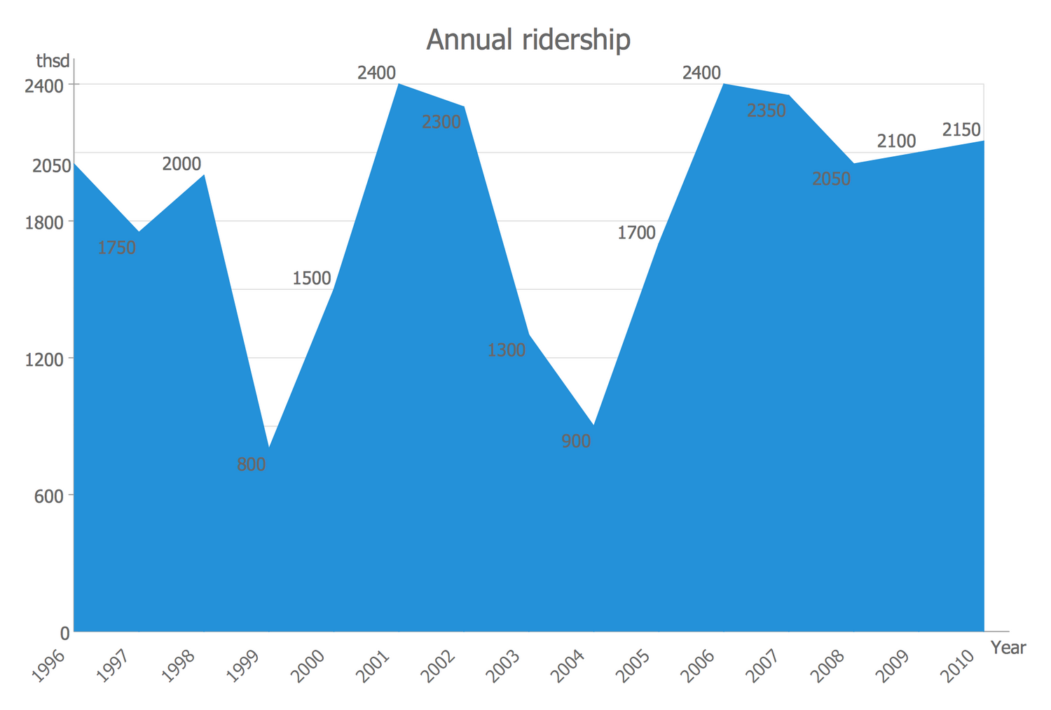
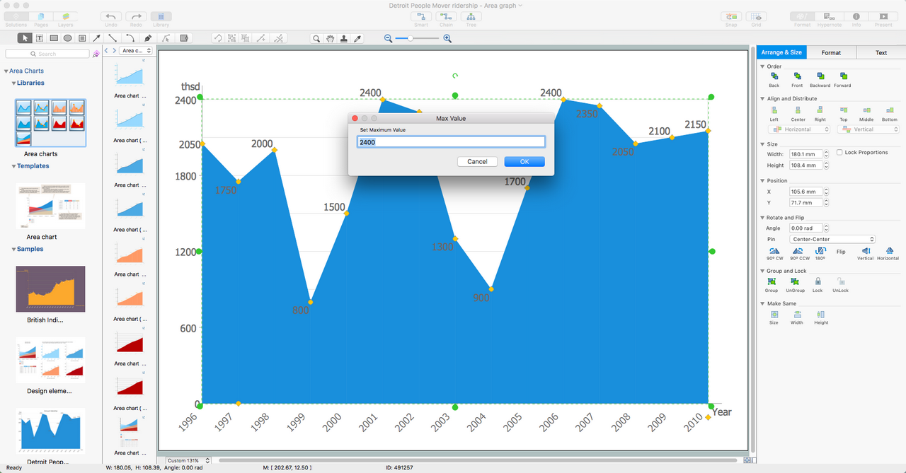
This Area Chart sample designed on the base of the "File DPMridership.jpg" Wikimedia Commons file illustrates the Annual ridership of the Detroit People Mover by years at the period from 1996 to 2010. The encircle single-track automated people mover system Detroit People Mover was built around Downtown Detroit in Michigan in 1987. This Area Chart visually depicts the spikes in annual ridership in 2001 and 2006 to 2400 thousand, and serious falls in 1999 and 2004 to 800 and 900 thousand correspondingly. The illustration and analysis of statistical data are quite important for developing any field of activity. They allow detecting the factors affecting the serious changes for the worse to eliminate them, as well as those ones that lead to success and to advance them. When designing your Area Charts, Surface Area Chart or Polar Area Chart in ConceptDraw DIAGRAM you are free in choosing the color style of your charts and can fully rely on your taste.
Example 7: US Census Population Graph from 1790
This example was created in ConceptDraw DIAGRAM using the Area Charts Library from the Area Charts Solution. An experienced user spent 10 minutes creating this sample.
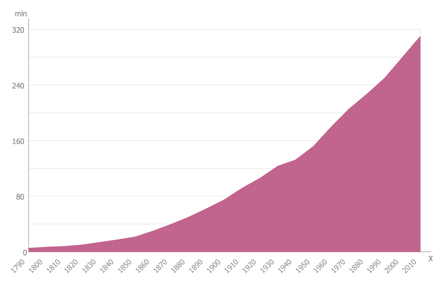
This Area Chart sample was designed on the base of the "US Census Population Graph from 1790.svg" Wikimedia Commons file and illustrates the growth of U.S. population in 1790-2010. The reference points were taken from the official United States Census data. The scale of years is divided itno the intervals equal to decades, the scale of the population is divided into intervals multiple to 80 million. We can observe fast and steady growth in the diagram. The similar Area Charts can be constructed for all US states separately and then compared with each other to track the tendency in each state. The diagram can be also prolonged to nowadays and it will be also growth because in 2016 the total resident population of United States was already 323 million that is bigger than approximately 310 million in 2010 according to the graph. While in 1790 there were only almost 4 million people in all US country.
Example 8: Progressive House Releases
This example was created in ConceptDraw DIAGRAM using the Area Charts Library from the Area Charts Solution. An experienced user spent 10 minutes creating this sample.
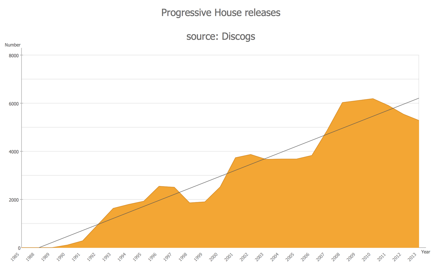
This Area Chart sample is dedicated to the progressive house releases per year as at 22 November 2014. It is based on the Wikimedia Commons file "Phdiscogs22Nov2014.jpg" including data collected by filtering the Progressive House by decade at the Discogs source. The progressive house is a subgenre of house music that appeared in the United Kingdom in the early 1990s. Being based on the natural progression of American and European house music of the late 1980s, it developed and became the popular style. Data from 1985 to 2013 are represented in the chart. The growth is steady and begins after 1989. The little more than 6000 is a top of the progressive house, reached in 2011. You can observe not only the Area Chart but the trend line through the entire graph is also included. If desired, hide a vertical axis to see just the general tendency without specifying the numbers.
Example 9: Ratings Share for Colombian TV Channels
This example was created in ConceptDraw DIAGRAM using the Area Charts Library from the Area Charts Solution. An experienced user spent 10 minutes creating this sample.
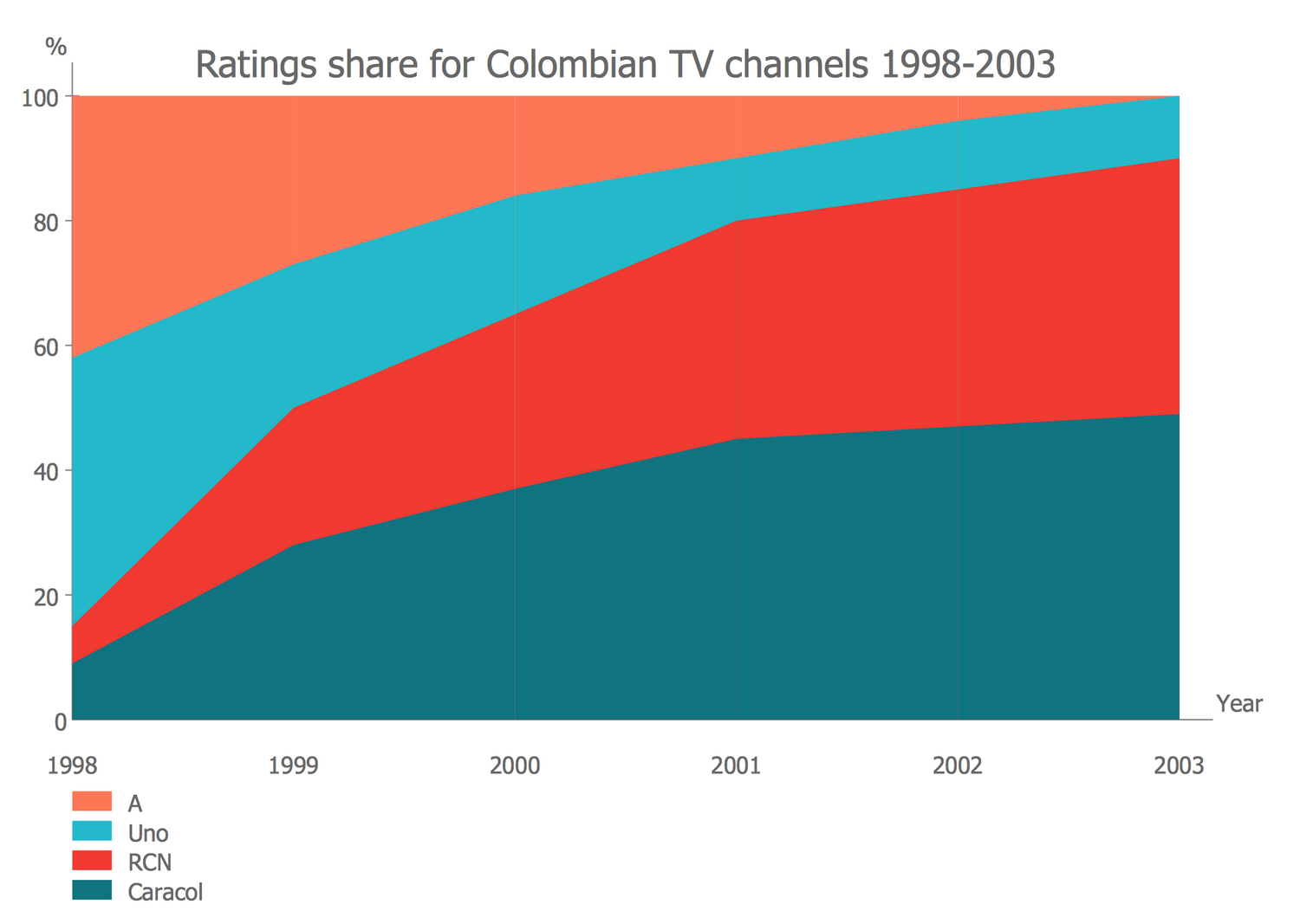
This Area Chart sample visually illustrates the ratings share for Columbian TV channels in 1998-2003 and was designed on the base of the Wikimedia Commons file "Ratings share for Colombian TV channels 1998-2003.png". Until 1998 Colombian television was a state monopoly. From 1998 exists several state-owned channels and several privately with national, regional or local coverage that broadcast different news, films, telenovelas, series, shows, etc. Four main Columbian networks are represented in this diagram, these are A, Uno, RCN, and Caracol. From year to year, the popularity of each of them changes under the influence of different factors. That's why the areas corresponding to different channels are colored uniquely in this diagram. It is convenient for the chart's perception and analysis. The chart is constructed on the base of the table with values, which is now hidden but can be shown again at any moment when the corresponding file will be opened at the application.
Example 10: US Correctional Population Timeline
This example was created in ConceptDraw DIAGRAM using the Area Charts Library from the Area Charts Solution. An experienced user spent 10 minutes creating this sample.
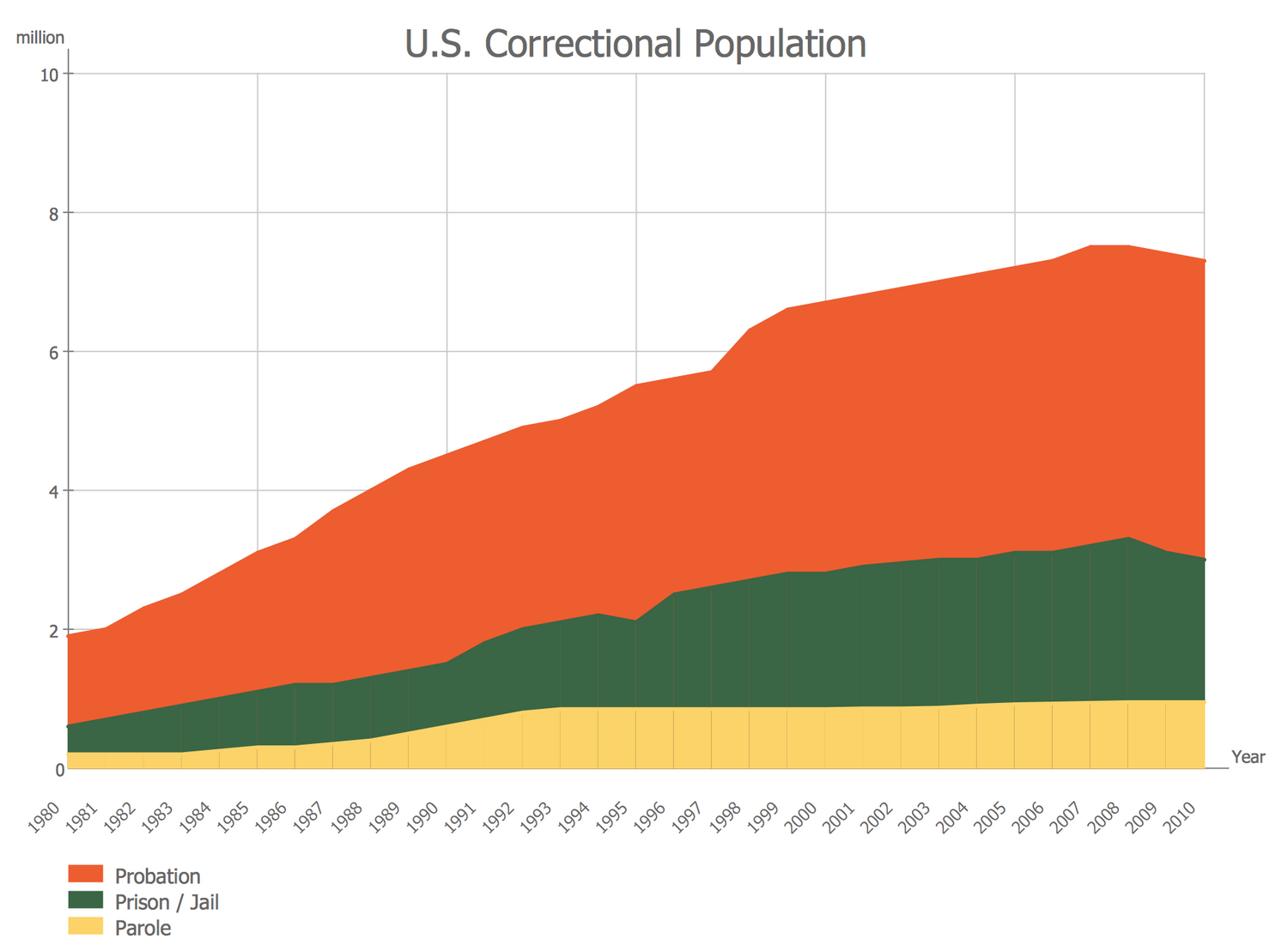
This Area Chart sample depicts statistics according to the correctional population of the United States. It is a timeline depicting quantities of people in the U.S. that were under adult correctional supervision from 1980 through 2013 for commission different offenses or felonies. The sample was designed on the base of the Wikimedia Commons file "US correctional population timeline.gif". There are separated those who were on probation, those who were in jail or prison, and who was on parole. The first group is depicted by red on the diagram, the second one by green, and the third one by yellow. The US has the largest number of prisoners in the world. According to the US Bureau of Justice Statistics (BJS) in 2013 0.91% of all adults were incarcerated in prisons. The peak was in 2008 when 7.46 million people were on probation, in jail or prison, or on parole. At this, the number of parole people kept approximately on one level from 1993 to 2013 including, in opposite to two other groups.
Inside
What I Need to Get Started
After ConceptDraw DIAGRAM is installed, the Area Charts solution can be purchased either from the Statistical Charts area of ConceptDraw STORE itself or from our online store. Thus, you will be able to use the Area Charts solution straight after.
How to install
First of all, make sure that both ConceptDraw STORE and ConceptDraw DIAGRAM applications are downloaded and installed on your computer. Next, install the Area Charts solution from the ConceptDraw STORE to use it in the ConceptDraw DIAGRAM application.
Start Using
Start using the Area Charts solution to make the professionally looking numerical data by adding the design elements taken from the stencil libraries and editing the pre-made examples that can be found there.
