- Electric and Telecom Plans Free
- Fire and Emergency Plans Free
- Floor Plans Free
- Plant Layout Plans Free
- School and Training Plans Free
- Seating Plans Free
- Security and Access Plans Free
- Site Plans Free
- Sport Field Plans Free
- Cafe and Restaurant Floor Plans $25
- Gym and Spa Area Plans $49
- HVAC Plans $49
- Landscape & Garden $49
- Office Layout Plans $25
- Plumbing and Piping Plans $49
- Reflected Ceiling Plans $49
- Tilt and Turn Windows $25
- Agriculture Infographics $49
- Economy Infographics $25
- Education Infographics $25
- Energy Industry Infographics $25
- Financial Infographics $25
- Green Energy $25
- Management Infographics $25
- Marketing Infographics $25
- Mass Media Infographics $25
- Oil and Gas $25
- Politics Infographics $25
- Travel Infographics $25
- Business Process Diagrams Free
- Business Process Mapping Free
- Classic Business Process Modeling Free
- Cross-Functional Flowcharts Free
- Event-driven Process Chain Diagrams Free
- IDEF Business Process Diagrams Free
- Logistics Flow Charts Free
- Workflow Diagrams Free
- Business Intelligence Dashboard $99
- Business Process Workflow Diagrams $49
- Healthcare Management Workflow Diagrams $49
- Logistic Dashboard $49
- ConceptDraw Dashboard for Facebook Free
- Mind Map Exchange Free
- MindTweet Free
- Note Exchange Free
- Project Exchange Free
- Social Media Response Free
- Active Directory Diagrams Free
- AWS Architecture Diagrams Free
- Azure Architecture Free
- Cisco Network Diagrams Free
- Cisco Networking Free
- Cloud Computing Diagrams Free
- Computer Network Diagrams Free
- Google Cloud Platform Free
- Interactive Voice Response Diagrams Free
- Network Layout Floor Plans Free
- Network Security Diagrams Free
- Rack Diagrams Free
- Telecommunication Network Diagrams Free
- Vehicular Networking Free
- Wireless Networks Free
- Internet of Things $30
- Comparison Dashboard Free
- Composition Dashboard Free
- Correlation Dashboard Free
- Frequency Distribution Dashboard Free
- Meter Dashboard Free
- Spatial Dashboard Free
- Status Dashboard Free
- Time Series Dashboard Free
- Basic Circle-Spoke Diagrams Free
- Basic Circular Arrows Diagrams Free
- Basic Venn Diagrams Free
- Block Diagrams Free
- Concept Maps Free
- Family Tree Free
- Flowcharts Free
- Basic Area Charts Free
- Basic Bar Graphs Free
- Basic Divided Bar Diagrams Free
- Basic Histograms Free
- Basic Line Graphs Free
- Basic Picture Graphs Free
- Basic Pie Charts Free
- Basic Scatter Diagrams Free
- Health Informatics Free
- Allergology $49
- Biomedicine $49
- Genogram $25
- Health Sciences $25
- Human Anatomy $25
- Immunology $49
- Medical Illustrations $25
- Medical Mycology $49
- Medical Virology $49
- Pharmacy Illustrations $25
- Aerospace and Transport Free
- Artwork Free
- Audio, Video, Media Free
- Business and Finance Free
- Computers and Communications Free
- Holiday Free
- Manufacturing and Maintenance Free
- Nature Free
- People Free
- Presentation Clipart Free
- Safety and Security Free
- Analog Electronics Free
- Audio and Video Connectors Free
- Basic Circuit Diagrams Free
- Chemical and Process Engineering Free
- Digital Electronics Free
- Electrical Engineering Free
- Electron Tube Circuits Free
- Electronic Block Diagrams Free
- Fault Tree Analysis Diagrams Free
- GHS Hazard Pictograms Free
- Home Automation and Wiring Free
- Mechanical Engineering Free
- One-line Diagrams Free
- Power Сircuits Free
- Specification and Description Language (SDL) Free
- Telecom and AV Circuits Free
- Transport Hazard Pictograms Free
- Data-driven Infographics Free
- Pictorial Infographics Free
- Spatial Infographics Free
- Typography Infographics Free
- Calendars Free
- Decision Making Free
- Enterprise Architecture Diagrams Free
- Fishbone Diagrams Free
- Organizational Charts Free
- Plan-Do-Check-Act (PDCA) Free
- Seven Management and Planning Tools Free
- SWOT and TOWS Matrix Diagrams Free
- Timeline Diagrams Free
- 25 Typical Orgcharts $25
- Business Diagrams $49
- Critical Infrastructure Sectors $35
- CRM Center Dashboard $49
- Environmental, Social, and Corporate Governance $25
- HR Dashboard $49
- HR Flowcharts $25
- Public Utilities $25
- Stakeholder Onion Diagrams $49
- Sustainable Development $25
- Australia Map Free
- Continent Maps Free
- Directional Maps Free
- Germany Map Free
- Metro Map Free
- UK Map Free
- USA Maps Free
- Customer Journey Mapping Free
- Marketing Diagrams Free
- Matrices Free
- Pyramid Diagrams Free
- Sales Dashboard Free
- Sales Flowcharts Free
- Target and Circular Diagrams Free
- Funnel Diagrams $25
- Business Diagrams Package $230
- Business Infographics Package $130
- Business Management Package $367
- Education Package $160
- Health Package $180
- Project Management Package $158
- Cash Flow Reports Free
- Current Activities Reports Free
- Custom Excel Report Free
- Knowledge Reports Free
- MINDMAP Reports Free
- Overview Reports Free
- PM Agile Free
- PM Dashboards Free
- PM Docs Free
- PM Easy Free
- PM Meetings Free
- PM Planning Free
- PM Presentations Free
- PM Response Free
- Resource Usage Reports Free
- Visual Reports Free
- Kanban Board $25
- MindMap Diagrams $99
- PM Mind Maps and Tables $25
- Project Diagrams $49
- Scrum Workflow $49
- House of Quality Free
- Quality Mind Map Free
- Total Quality Management TQM Diagrams Free
- Value Stream Mapping Free
- Seven Basic Tools of Quality $25
- Astronomy Free
- Biology Free
- Chemistry Free
- Language Learning Free
- Mathematics Free
- Physics Free
- Piano Sheet Music Free
- Android User Interface Free
- Class Hierarchy Tree Free
- Data Flow Diagrams (DFD) Free
- DOM Tree Free
- Entity-Relationship Diagram (ERD) Free
- EXPRESS-G data Modeling Diagram Free
- IDEF0 Diagrams Free
- iPhone User Interface Free
- Jackson Structured Programming (JSP) Diagrams Free
- macOS User Interface Free
- Object-Role Modeling (ORM) Diagrams Free
- Rapid UML Free
- SYSML Free
- Website Wireframe Free
- Windows 10 User Interface Free
- ATM UML Diagrams $25
Line Graphs
What is a Line Chart? The Line Chart or Line Graph is a basic type of diagram, which depicts information as a series of data points connected by the straight line segments. The Line Charts depict quantitative metrics and assist one in visualizing changes of data over time intervals. Visually, the Line Chart resembles the tops of a mountain range and this comparison is not accidental, because with the help of Line Charts you can really imagine a wide range of data or "mountains" of data in a graphical form, and make a lot of useful conclusions.
A Line Graph is used to show and compare two variables (independent or dependent), which can be plotted on a 2D graph to visually show how one variable is affected by another. The Line Charts are useful in displaying information or data that change continuously over the time. They allow one to predict effectively the results of data, which are not yet recorded, to self-regulate values of the main variable at each segment, and also to visualize data and results of experiments for reports and other documents. Line Graphs are used in mathematics, statistics, business, mass media, and many other fields.
With the help of a Line Chart there can be visualized the variations, dynamics, trends, relationships of various parameters, there can also be displayed the movement of currency in a specific period of time, the fluctuations in shares, also tracked the growth rate of the company, the ratio of profits and expenses, compared the values of key indicators in different time intervals, and correlated the time and distance. Several curves can be plotted on a single Line Graph, allowing you to compare visually the dynamics of different indicators or the same indicator in different industries, regions, branches, departments, etc. By contrasting two Line Charts, you can compare the sales of the company in a certain period of time in a matter of minutes, to analyze revenues and expenses, accounting balance, and other parameters, to track changes over a certain time interval.
How to draw a Line Graph with ease? The Line Graphs Solution extends the capabilities of ConceptDraw DIAGRAM with professionally designed templates, samples, and a library of vector stencils for drawing perfect Line Graphs. Turn your data into a Line Graph with ConceptDraw DIAGRAM software and use it in any document, presentation, report, share it with your team, etc. Building several curves on the same chart, it is recommended to paint them with different colors, this will allow to separate them visually from each other and will make it easier the data comparison. Choosing the colors yourself, you can give the personality and originality to your graphic, as well as to ensure the color matching of your graph to the color scheme of the document in which it will be used.
-
Buy this solution $25 -
Solution Requirements - This solution requires the following products to be installed:
ConceptDraw DIAGRAM v18 - This solution requires the following products to be installed:
-
Compatibility - Sonoma (14), Sonoma (15)
MS Windows 10, 11 - Sonoma (14), Sonoma (15)
-
Support for this Solution -
Helpdesk
There is 1 library containing 5 objects in the Line Graphs solution.
Design Elements — Line Graphs

Related News:
CS Odessa Announces Additions to Powerful Graphs and Charts Area in ConceptDraw Solution ParkExamples
There are a few samples that you see on this page which were created in the ConceptDraw DIAGRAM application by using the Line Graphs solution. Some of the solution's capabilities as well as the professional results which you can achieve are all demonstrated here on this page.
All source documents are vector graphic documents which are always available for modifying, reviewing and/or converting to many different formats, such as MS PowerPoint, PDF file, MS Visio, and many other graphic ones from the ConceptDraw Solution Park or ConceptDraw STORE. The Line Graphs solution is available to all ConceptDraw DIAGRAM users to get installed and used while working in the ConceptDraw DIAGRAM diagramming and drawing software.
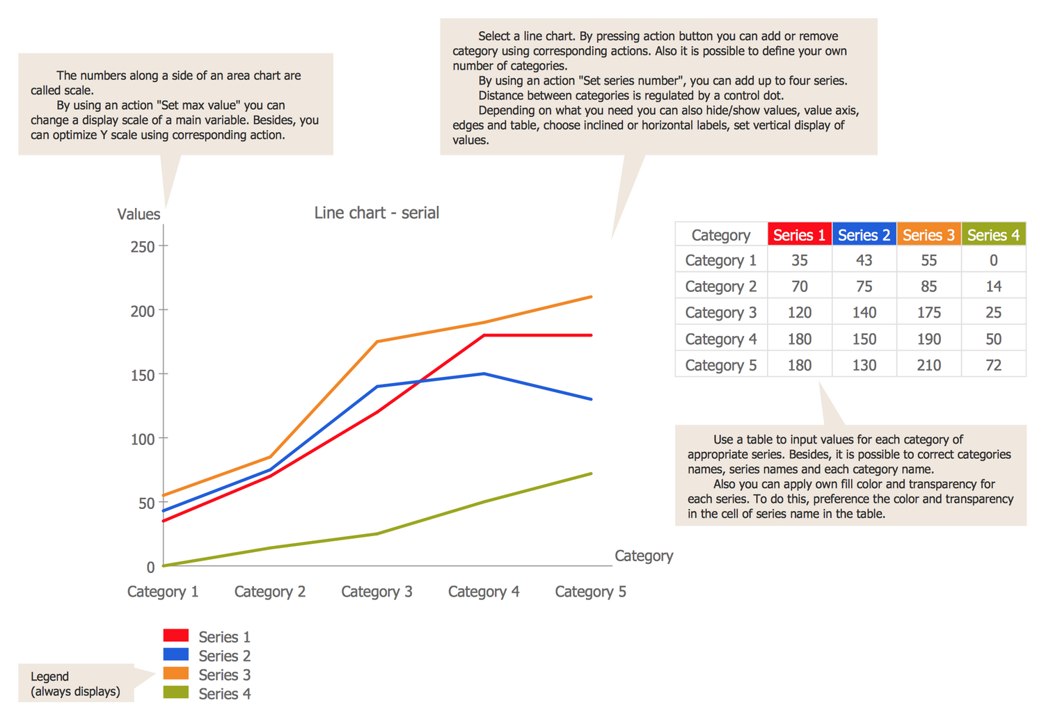
Template: Line Graph
This Line Chart template is ideal quick-start in drawing a Line Chart. Filling the table with new data will lead to automatic reflecting the changes on the chart, equally as the change of colors in the table’s head will be automatically applied for the chart and depicted at the legend. The Line Chart axes represent the categories and values. How to draw a Line Graph the most quickly? Type the names of categories and series. Use the table to input values for the categories of appropriate series. By using the “Set max value” action you can change a display scale of the main variable. The y scale can be also optimized using the corresponding action. The number of categories can be changed as well, it is possible to add or remove the categories. The use of the “Set series number” action allows adding up to four series. The distance between categories is regulated by a control dot. You are able to show or hide values, value axis, edges, and table, to choose inclined or horizontal labels, to set the vertical displaying of values.
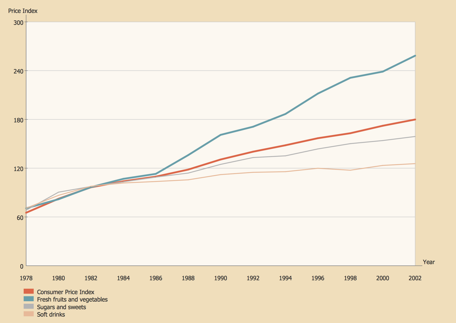
Example 1: Line Graph — Relative Price Changes
This example was created in ConceptDraw DIAGRAM using the Line Graphs Library from the Line Graphs Solution. An experienced user spent 10 minutes creating this sample.
This sample represents the Line Graphs of changes in prices depending on year for different groups of goods in a period from 1973 to 2002. There are represented the Line Graphs for the consumer price index, fresh fruits and vegetables, sugars and sweets, and soft drinks, and differed by colors. Varied coloring is applied for easy visual assessment and comparison of the dynamics with one look. This sample is based on the data from the website of the United States National Center for Chronic Disease Prevention and Health Promotion. You can observe the tendency of growing the prices on all considered groups of goods, at this on some goods it is significant growth. Thus, for fresh fruits and vegetables you can see the increase in the price index from 70 to 260, at this the critical point from that we notice the dramatic growth is in 1986. While for the soft drinks we have relative stability and growth is only from 70 to 130.
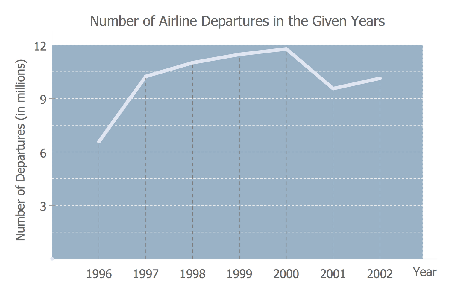
Example 2: Line Graph — Number of Airlines Departures in the Given Years
This example was created in ConceptDraw DIAGRAM using the Line Graphs library from the Line Graphs solution. An experienced user spent 5 minutes creating this sample.
What is a Line Chart? It is a type of chart that represents data as a series of points connected with a line. The Line Charts are incredibly helpful in various fields, including the social and economic sciences, they can be used to visually illustrate the economic principles and trends. This Line Chart depicts a period of seven years (1996-2002) and the corresponding statistical data on the number of airline departures for each of these years. It was designed on the base of Wikimedia Commons file "-6 time series.jpg" using the ready-made object from the Line Graphs library of the ConceptDraw's Line Graphs solution. The number of departures is represented in millions and you can see that it steadily grew from 1996 to 2000 when their maximum was achieved and counted 12 million, but after this, one can note the little decrease to a bit more 9 million in 2001 and about 10 million in 2002. In this way can be constructed the Line Graphs illustrating statistical data in arrivals, in departures for specific countries, specific airline companies, etc.
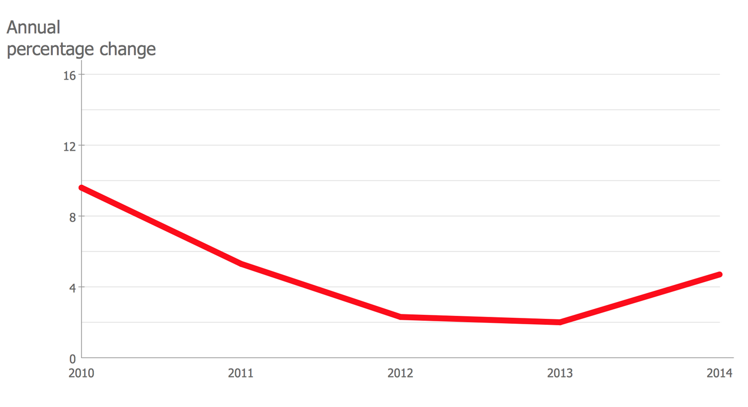
Example 3: Line Graph — France Export of Goods and Services
This example was created in ConceptDraw DIAGRAM using the Line Graphs Library from the Line Graphs Solution. An experienced user spent 5 minutes creating this sample.
This Line Graph is based on the data of the Ministry of Economy and Finance of France and demonstrates the data from the European Economic Forecast for the exporting of different goods and services by France. France is one of the largest exporters in the world that exports a wide variety of goods to neighboring European countries and other world countries. Among the exported goods are food and wines, chemicals, pharmaceuticals, aircrafts, industrial machinery, electronics, motor vehicles, iron and steel. Having this visual graph illustrating the annual percentage change you can note that according to the offered data the export of France decreased in a period from 2010 to 2013, the minimum in 2% was achieved in 2013. ConceptDraw DIAGRAM lets one design similar graphs for other countries in minutes and then visually compare them, as well as to make economical forecasts and supposes, to construct economical calendars, analyze statistics, etc.
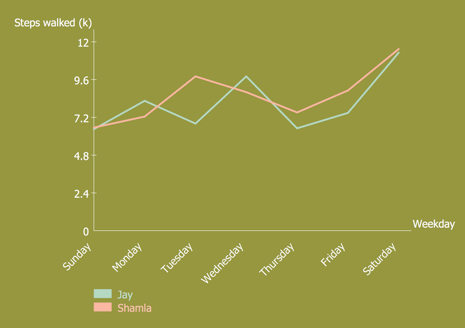
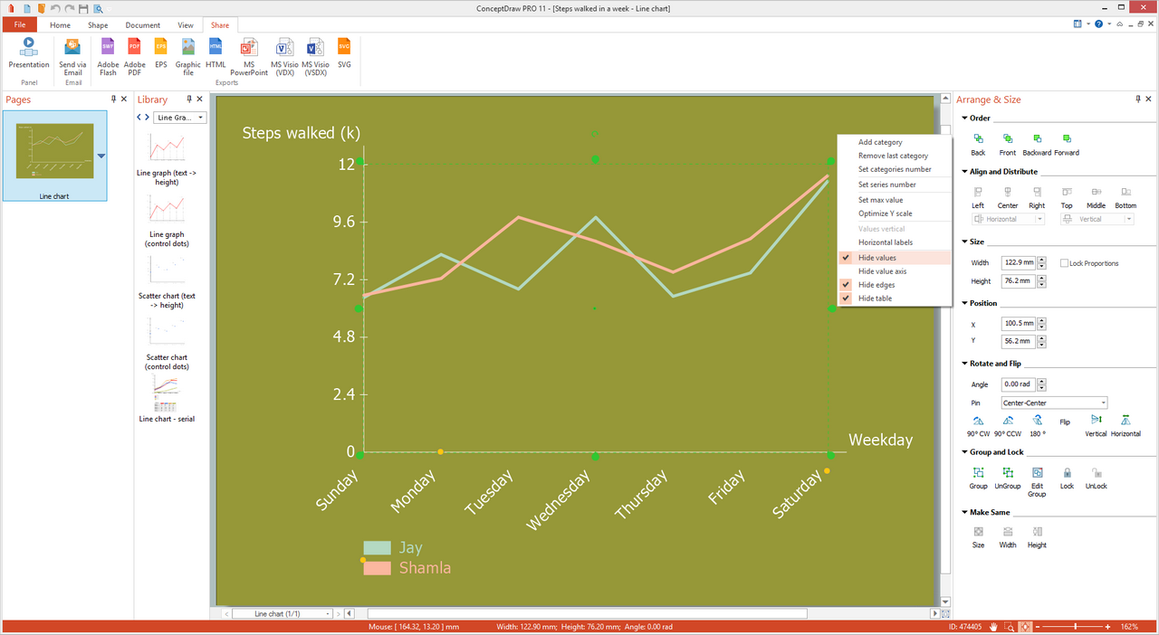
Example 4: Line Graph — Steps Walked in a Week
This example was created in ConceptDraw DIAGRAM using the Line Graphs Library from the Line Graphs Solution. An experienced user spent 10 minutes creating this sample.
This sample shows the steps walked in a week by two people and is constructed in the form of a Line Chart. It is based on the statistical data from the website of the Bureau of Labor Statistics, U.S. Department of Labor. The Shamla's line chart has a rose color, while Jay's chart uses a blue color. Varied colors are applied for additional visuality, especially on the segments that practically match and allow differing them. These Line Charts are a great way not only of visualizing but also of comparing data that might be otherwise quite difficult to do. They are much more useful and comprehensive than complex tables with a great number of values. Made with a khaki background, this Line Chart looks interesting and quite extraordinary, that is its undoubted advantage. You can make researches and construct a similar diagram for any number of people in ConceptDraw DIAGRAM, and don't be afraid to experiment with your charts' style!
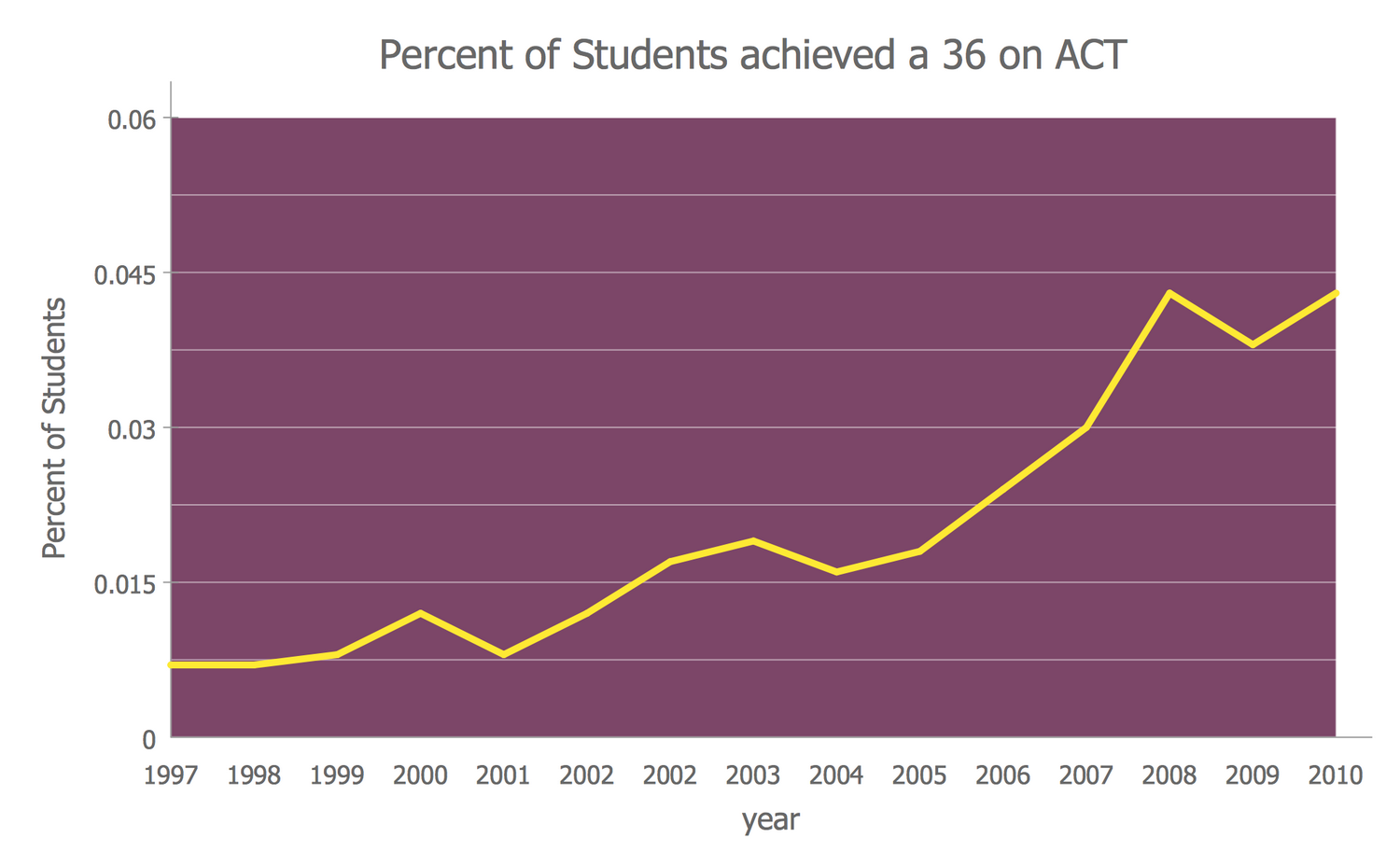
Example 5: Line Graph — Percent of Students a 36 on ACT
This example was created in ConceptDraw DIAGRAM using the Line Graphs library from the Line Graphs solution. An experienced user spent 5 minutes creating this sample.
This Line Graph sample represents the percent of students achieved a high score 36 on the ACT (American College Testing) that is a standardized test passed after high school and allowing evaluating pupils achievements, and giving an ability for college admissions in the United States. The sample is based on the file "ACT-36-1997 to 2011.png" published on the Wikimedia Commons. The data for the period from 1997 to 2011 are marked as points on this chart and connected with line segments. First intended in 1959 by Everett Franklin Lindquist, the ACT is passed by all US pupils and nowadays. It includes the tests in four main disciplines — English, Mathematics, Reading, and Science, each of them is scored individually on a scale of 1 to 36, at this the composite score is calculated as the whole number average of these four scores. Some colleges require also obligatory testing in Writing.
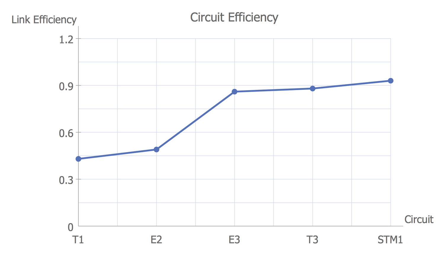
Example 6: Line Graph — Circuit Efficiency Erlang B
This example was created in ConceptDraw DIAGRAM using the Line Graphs library from the Line Graphs solution. An experienced user spent 5 minutes creating this sample.
This Line Graph sample illustrates the circuit efficiency for telecommunications. It was constructed on the base of the Wikimedia Commons file "Circuit efficiency Erlang B.png". Agner Krarup Erlang (1878 – 1929) was a famous Danish mathematician, engineer, statistician, scientist the first studying the problem of telephone networks, the founder of teletraffic engineering, and developer of the fundamentals of trunking theory dedicated to the aggregation of multiple user circuits into a single channel. It based his researches and works on the statistical nature of the arrival and the length of calls. The Erlang B formula lying at the base of this chart allows calculating the number of circuits required in a trunk based on the amount of traffic in Erlangs needed to cater the trunk and the Grade of Service. Today, the Erlang B formula is used to calculate the number of telephone lines needed for a call-center or mini ATS depending on the expected number of calls.
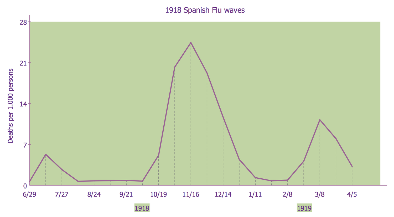
Example 7: Line Graph — 1918 Spanish Flu Waves
This example was created in ConceptDraw DIAGRAM using the Line Graphs library from the Line Graphs solution. An experienced user spent 5 minutes creating this sample.
This Line Graph sample demonstrates three flu pandemic waves, weekly combined influenza and pneumonia mortality in the United Kingdom, in 1918–1919. It was made on the base of the Wikimedia Commons file "1918 spanish flu waves.gif". The Spanish H1N1 influenza virus was one of the deadliest natural disasters in human history and claimed a huge number of human lives in 1918-1919. Its name the flu acquired because Spain was the first country where a strong outbreak of the disease appeared. Then this disease spread and struck the whole world, that is why the scale of the tragedy was so great — 550 million people or 29.5 % of the world's population, including remote Pacific islands and Arctic, were infected. The numbers of victims and deaths of this terrible tragedy per 1000 persons are marked in this Line Graph. The Line Charts are effective in demonstration and analyzing statistical data, tracking historical facts in different fields, including medicine.
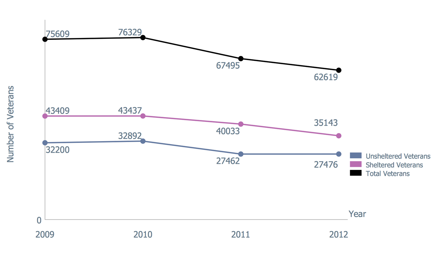
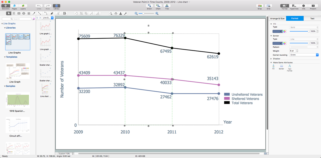
Example 8: Veteran Point in Time Counts in 2009-2012
This example was created in ConceptDraw DIAGRAM using the Line Graphs library from the Line Graphs solution. An experienced user spent 5 minutes creating this sample.
This Line Chart sample is based on the data from the U.S. Department of Veterans Affairs (VA) website and illustrates the number of sheltered and unsheltered homeless Veterans, and their totals during the annual Point in Time (PIT) from 2009 to 2012. The count was realized by the U.S. Department of Housing and Urban Development. Different colors were chosen for the Line Charts demonstrating unsheltered veterans, sheltered veterans, and total veterans. U.S. Department of Veterans Affairs protects the rights of veterans and provides the programs helping all Vets and their families to find homes. The ending of Veterans' homelessness is a top priority of VA and it is the goal that it realizes along with federal, state, and community partners. According to the chart, the actions of the VA are successful and the number of homeless veterans decreases every year. Moreover, this chart can be easily prolonged to nowadays to represent the current results.
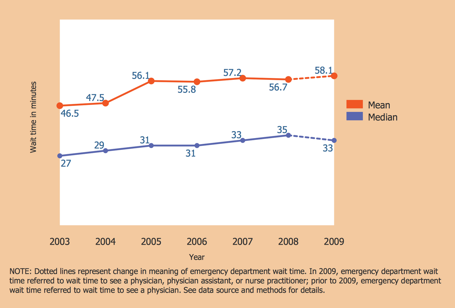
Example 9: Wait Time for Treatment in Hospital Emergency Department
This example was created in ConceptDraw DIAGRAM using the Line Graphs library from the Line Graphs solution. An experienced user spent 5 minutes creating this sample.
This Line Graph sample represents the mean and median wait time for treatment in the hospital emergency department. The chart is constructed for the United States and is based on the data collected for 2003–2009 and published on the website of the U.S. Department of Health & Human Services, National Center for Health Statistics, Centers for Disease Control and Prevention (CDC). The dotted lines represent the change in the meaning of emergency department wait time. Prior to 2009, the emergency department wait time referred to wait time to see a physician, while in 2009, the emergency department it referred to wait time to see a physician, physician assistant, or nurse practitioner; The mean wait time values are depicted by red color, for the median values is used blue. One can observe that the mean wait time increased from 46.5 minutes to 58.1 minutes in a reported period and the median time also increased from 27 minutes to 33.
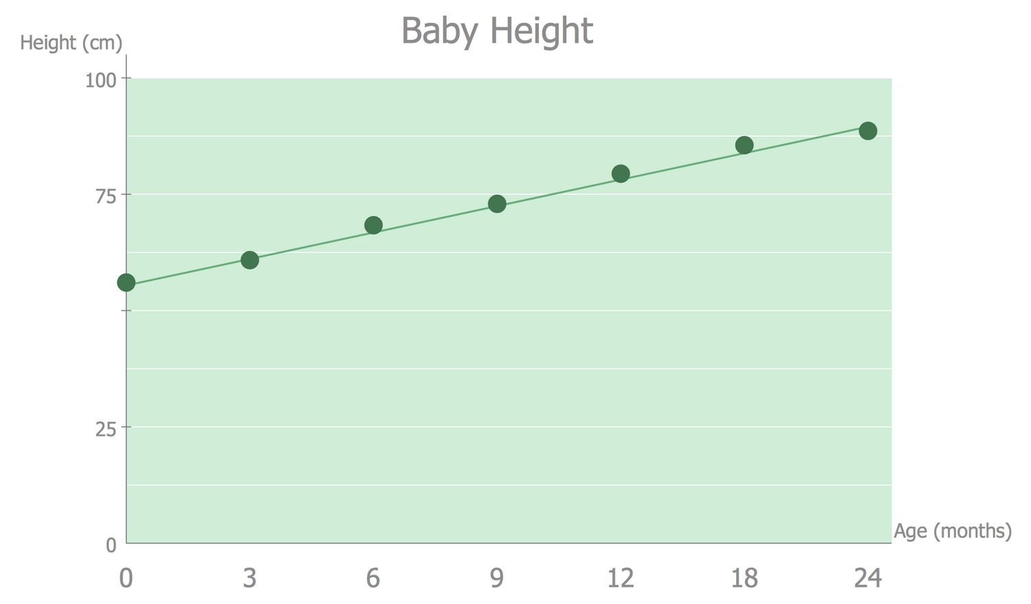
Example 10: Line Graph — Baby Height
This example was created in ConceptDraw DIAGRAM using the Line Graphs library from the Line Graphs solution. An experienced user spent 5 minutes creating this sample.
This Line Graph sample is dedicated to exploring the changes in baby height from birth to 24 months. It was constructed on the base of the Wikimedia Commons file "Babyheight.png". You can observe the straight-line graph illustrating the linear dependence of baby age to height beginning from the middle statistical newborn's height. At the same time, you can also observe the dots made in the course of actual weighings of the child, which at some moments slightly deviate from the main line, however, are within normal limits and do not cause concern, while the strong deviations of measurements from the Line chart may require attention. ConceptDraw DIAGRAM allows one to display the results of weighing any number of children from 0 to 24 months on this graph and to visually compare the values to identify differences, the cases of complete coincidence with the line graph, or vice versa significant deviations from it. For convenience, use a new color for each case.
Inside
What I Need to Get Started
After ConceptDraw DIAGRAM is installed, the Line Graphs solution can be purchased either from the Graphs and Charts area of ConceptDraw STORE itself or from our online store. Thus, you will be able to use the Line Graphs solution straight after.
How to install
First of all, make sure that both ConceptDraw STORE and ConceptDraw DIAGRAM applications are downloaded and installed on your computer. Next, install the Line Graphs solution from the ConceptDraw STORE to use it in the ConceptDraw DIAGRAM application.
Start Using
Start using the Line Graphs solution to make the professionally looking numerical data by adding the design elements taken from the stencil libraries and editing the pre-made examples that can be found there.
