- Electric and Telecom Plans Free
- Fire and Emergency Plans Free
- Floor Plans Free
- Plant Layout Plans Free
- School and Training Plans Free
- Seating Plans Free
- Security and Access Plans Free
- Site Plans Free
- Sport Field Plans Free
- Business Process Diagrams Free
- Business Process Mapping Free
- Classic Business Process Modeling Free
- Cross-Functional Flowcharts Free
- Event-driven Process Chain Diagrams Free
- IDEF Business Process Diagrams Free
- Logistics Flow Charts Free
- Workflow Diagrams Free
- ConceptDraw Dashboard for Facebook Free
- Mind Map Exchange Free
- MindTweet Free
- Note Exchange Free
- Project Exchange Free
- Social Media Response Free
- Active Directory Diagrams Free
- AWS Architecture Diagrams Free
- Azure Architecture Free
- Cisco Network Diagrams Free
- Cisco Networking Free
- Cloud Computing Diagrams Free
- Computer Network Diagrams Free
- Google Cloud Platform Free
- Interactive Voice Response Diagrams Free
- Network Layout Floor Plans Free
- Network Security Diagrams Free
- Rack Diagrams Free
- Telecommunication Network Diagrams Free
- Vehicular Networking Free
- Wireless Networks Free
- Comparison Dashboard Free
- Composition Dashboard Free
- Correlation Dashboard Free
- Frequency Distribution Dashboard Free
- Meter Dashboard Free
- Spatial Dashboard Free
- Status Dashboard Free
- Time Series Dashboard Free
- Basic Circle-Spoke Diagrams Free
- Basic Circular Arrows Diagrams Free
- Basic Venn Diagrams Free
- Block Diagrams Free
- Concept Maps Free
- Family Tree Free
- Flowcharts Free
- Basic Area Charts Free
- Basic Bar Graphs Free
- Basic Divided Bar Diagrams Free
- Basic Histograms Free
- Basic Line Graphs Free
- Basic Picture Graphs Free
- Basic Pie Charts Free
- Basic Scatter Diagrams Free
- Aerospace and Transport Free
- Artwork Free
- Audio, Video, Media Free
- Business and Finance Free
- Computers and Communications Free
- Holiday Free
- Manufacturing and Maintenance Free
- Nature Free
- People Free
- Presentation Clipart Free
- Safety and Security Free
- Analog Electronics Free
- Audio and Video Connectors Free
- Basic Circuit Diagrams Free
- Chemical and Process Engineering Free
- Digital Electronics Free
- Electrical Engineering Free
- Electron Tube Circuits Free
- Electronic Block Diagrams Free
- Fault Tree Analysis Diagrams Free
- GHS Hazard Pictograms Free
- Home Automation and Wiring Free
- Mechanical Engineering Free
- One-line Diagrams Free
- Power Сircuits Free
- Specification and Description Language (SDL) Free
- Telecom and AV Circuits Free
- Transport Hazard Pictograms Free
- Data-driven Infographics Free
- Pictorial Infographics Free
- Spatial Infographics Free
- Typography Infographics Free
- Calendars Free
- Decision Making Free
- Enterprise Architecture Diagrams Free
- Fishbone Diagrams Free
- Organizational Charts Free
- Plan-Do-Check-Act (PDCA) Free
- Seven Management and Planning Tools Free
- SWOT and TOWS Matrix Diagrams Free
- Timeline Diagrams Free
- Australia Map Free
- Continent Maps Free
- Directional Maps Free
- Germany Map Free
- Metro Map Free
- UK Map Free
- USA Maps Free
- Customer Journey Mapping Free
- Marketing Diagrams Free
- Matrices Free
- Pyramid Diagrams Free
- Sales Dashboard Free
- Sales Flowcharts Free
- Target and Circular Diagrams Free
- Cash Flow Reports Free
- Current Activities Reports Free
- Custom Excel Report Free
- Knowledge Reports Free
- MINDMAP Reports Free
- Overview Reports Free
- PM Agile Free
- PM Dashboards Free
- PM Docs Free
- PM Easy Free
- PM Meetings Free
- PM Planning Free
- PM Presentations Free
- PM Response Free
- Resource Usage Reports Free
- Visual Reports Free
- House of Quality Free
- Quality Mind Map Free
- Total Quality Management TQM Diagrams Free
- Value Stream Mapping Free
- Astronomy Free
- Biology Free
- Chemistry Free
- Language Learning Free
- Mathematics Free
- Physics Free
- Piano Sheet Music Free
- Android User Interface Free
- Class Hierarchy Tree Free
- Data Flow Diagrams (DFD) Free
- DOM Tree Free
- Entity-Relationship Diagram (ERD) Free
- EXPRESS-G data Modeling Diagram Free
- IDEF0 Diagrams Free
- iPhone User Interface Free
- Jackson Structured Programming (JSP) Diagrams Free
- macOS User Interface Free
- Object-Role Modeling (ORM) Diagrams Free
- Rapid UML Free
- SYSML Free
- Website Wireframe Free
- Windows 10 User Interface Free
PM Dashboards
The dashboards are a perfect visual tool and the best way of getting in one diagram the relevant key information about whole project status, its progress, and performance. The use of dashboards allows summarizing the project data and results of project realization, to focus the audience's attention on project’s key points, to evaluate the project's progress and success, to make correct tactical decisions, to compare the current indexes of progress with expected ones, to detect the possible problems and places requiring increased attention, where corrective actions need to be taken instantly. Besides, the dashboards of different kinds allow representing the radically different project’s aspects, to look at it from different perspectives, and are perfect for using when making exhaustive and visual reports, which enhance the quality and convenience of communication stakeholders within a project team, and so contribute to faster achievement the success in realization the company's projects.
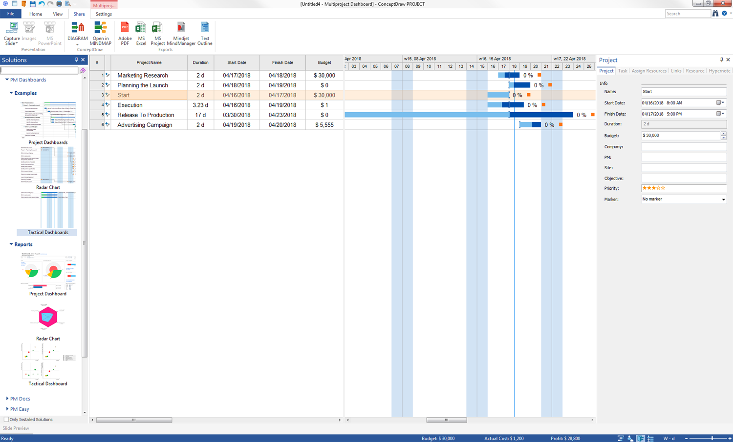
The PM Dashboards solution extends the management boundaries of ConceptDraw PROJECT and ConceptDraw DIAGRAM products with an ability to display clearly the identified key performance indicator (KPI) or the set of key performance indicators for specific project and to create dynamic information dashboards based on your project data. This solution provides you with a set of examples and ability to generate three types of visual dashboards reports in a form of ConceptDraw DIAGRAM documents Project Dashboard, Tactical Dashboard, and Radar Chart. By dynamically charting the project’s key performance indicators that are collected on one display, all project participants, project managers, team members, team leaders, stakeholders, and the entire organizations, for which this solution is intended, have access to the daily status of projects they are involved in. The PM Dashboards solution's reports visually demonstrate the changes to the budget status and clearly show the progress toward project’s objectives.
The PM Dashboards solution lets one transform the project data into visually attractive dashboards which update dynamically. In the PM Dashboards solution, we use ConceptDraw PROJECT to maintain the project data and ConceptDraw DIAGRAM for producing updated dashboards that are connected to live project data. The technology that enables constructing and updating the dashboards is our Live Object technology, contained within ConceptDraw DIAGRAM and allowing us to connect a complex object shape to an external data source so that dynamic updates happen from changes in the data. For the dashboard’s Live Objects, look in the “Business Dashboards” library.
-
Install this solution Free -
What I need to get started -
Solution Requirements - This solution requires the following products to be installed:
ConceptDraw PROJECT v15 ConceptDraw DIAGRAM v18 - This solution requires the following products to be installed:
-
Compatibility - Sonoma (14), Sonoma (15)
MS Windows 10, 11 - Sonoma (14), Sonoma (15)
-
Support for this Solution -
Helpdesk
Project Dashboard
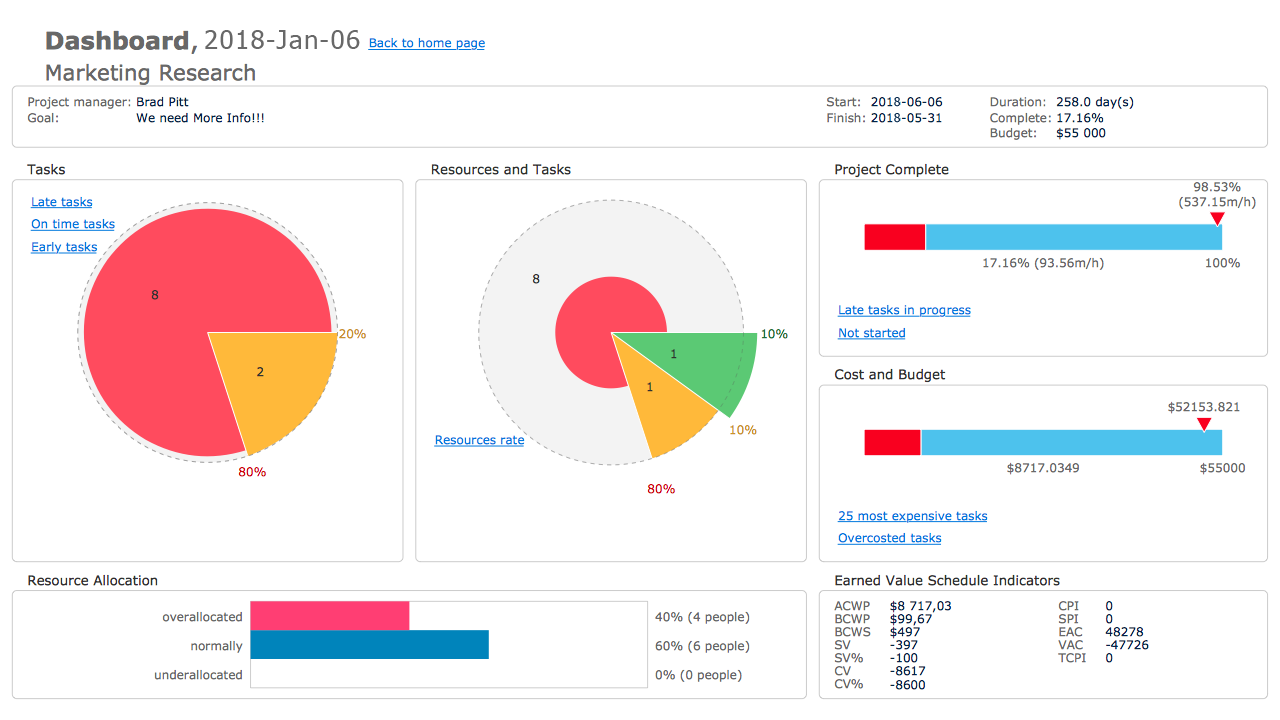
The “Project Dashboard” report generated for your project offers the ConceptDraw DIAGRAM document summarizing the information according to your project's state on one page, which is divided into several parts displaying general information about your project, the quantitative ratios of project tasks that are late, on time and early, the quantitative ratios of resources — overallocated, normally and underallocated, as well as late, early and on time resources with the help of visual key performance indicators. You can also find the bars depicting the data on project complete, costs and budget, the list of Earned Value Schedule Indicators calculated for your project, and links in additional graphical reports. The usage of several bright colours provides additional visual assistance in instantly recognizing whether everything is moving well in your project and in identification the problem areas. This report for a multiproject will contain the individual pages for each project and one page summarizing the information about all projects’ completes.
Tactical Dashboard
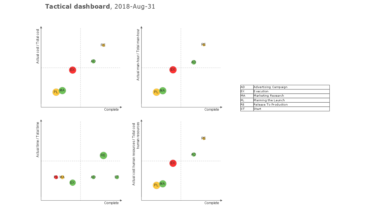
The “Tactical Dashboard” report created for your project represents the diagram in a ConceptDraw DIAGRAM format, which contains four positive quadrants in the Cartesian coordinate system and the table of explanation the abbreviations of names of projects from your multiproject. The graphs allow to visually compare the actual values and the total values of four main projects metrics: Cost, Time, Man-hour and Human Resources Cost. The X-axis corresponds to the project's Complete, the Y-axis depicts the relatively estimated completion of a project by defined indexes. The projects are displayed as circles in these graphs. Each circle's diameter and colour have great value, and let correspondingly reflect the absolute estimated completion by indicated index and result of the comparison the project Complete with relatively estimated completion: green colour corresponds to "ahead", red to "lag" and yellow to the projects going "in time". The circles' diameters are standardized to the biggest one. Look attentively at your Tactical Dashboard and notice: if the circles are yellow or green, decreased in diameters and placed lower, it is an evidence of a good result — your project is progressing well.
PM Dashboard — Radar Chart
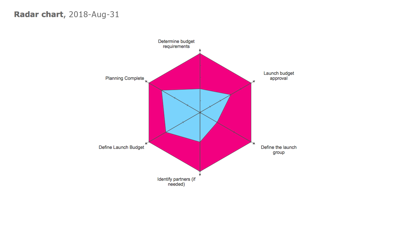
The “Radar Chart” report formed for your project offers in ConceptDraw DIAGRAM document the Radar or Spider Chart collecting the data from your project's Gantt Chart. It lets one compare in a visual and comprehensible form the multivariate data from your project and detect the degree of its completion. You can observe several axes, which radiate from the center, are placed on equal distance and correspond to the chains of linked project milestones, at this the number of marks on the axis equals to the number of milestones. The values corresponding to one variable from different datasets are connected to each other and form the polygons. The polygons' areas are filled with different colours making ideal conditions for visual comparison the data. Moreover, the ratio of these areas indicates the degree of project completion.
Example 1: Project Dashboards
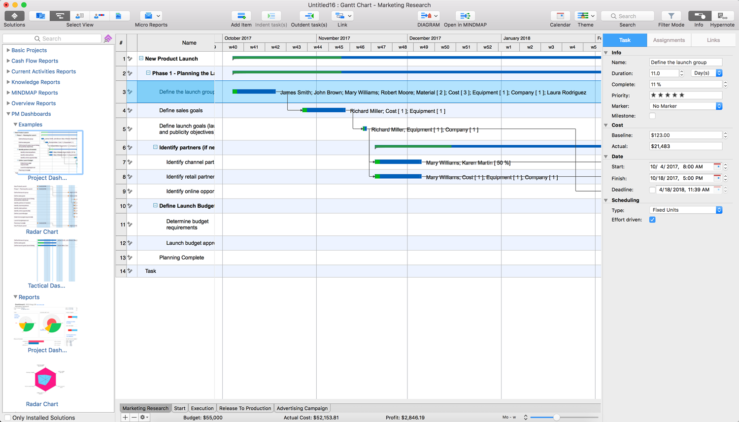
This project is an example of new product launch. The represented plan lists the tasks of the "Planning the Launch" phase, which are thought-out to the smallest details, among them the definition of launch group, sales and launch goals, the launch budget and budget requirements, and identification different partners and online opportunities. The planning completion is marked with a milestone at this project and on this Gantt Chart. Try to generate the Tactical Dashboards report for this example to observe the ConceptDraw PROJECT dashboards reporting capabilities.
Example 2: Radar Chart
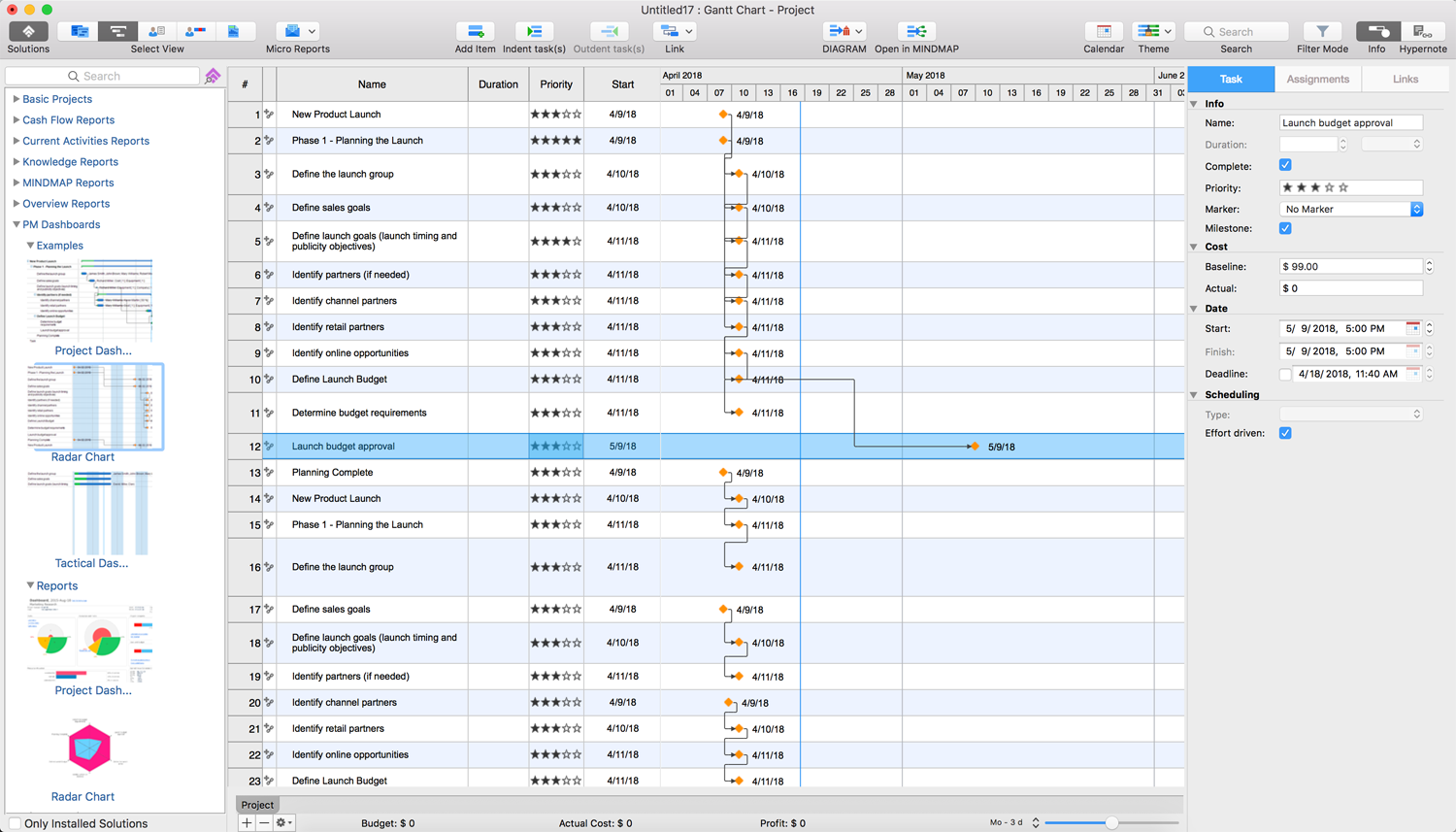
This project was developed in the ConceptDraw PROJECT software as an example demonstrating the application’s abilities in generating such project report type as Radar Chart that is applied to depict the degree of project completion. Looking at this project Gantt Chart, you can denote a lot of tasks, which are all marked as milestones and at the moment have different priorities, and varied complete values (100% or 0%). The axes on a Radar Chart will correspond to the chains of linked milestones.
Example 3: Tactical Dashboards
This example is not a complex project, but it is a good project example to try and generate the precise report in a form of Tactical Dashboards. This sample lets one see how easy it is to evaluate the project progress by comparison the current project’s indexes with expected progress in the ConceptDraw PROJECT software with the help of visual dashboards, and allows better understanding what result you will receive when generating the Tactical Dashboards report for your own projects.
