- Electric and Telecom Plans Free
- Fire and Emergency Plans Free
- Floor Plans Free
- Plant Layout Plans Free
- School and Training Plans Free
- Seating Plans Free
- Security and Access Plans Free
- Site Plans Free
- Sport Field Plans Free
- Business Process Diagrams Free
- Business Process Mapping Free
- Classic Business Process Modeling Free
- Cross-Functional Flowcharts Free
- Event-driven Process Chain Diagrams Free
- IDEF Business Process Diagrams Free
- Logistics Flow Charts Free
- Workflow Diagrams Free
- ConceptDraw Dashboard for Facebook Free
- Mind Map Exchange Free
- MindTweet Free
- Note Exchange Free
- Project Exchange Free
- Social Media Response Free
- Active Directory Diagrams Free
- AWS Architecture Diagrams Free
- Azure Architecture Free
- Cisco Network Diagrams Free
- Cisco Networking Free
- Cloud Computing Diagrams Free
- Computer Network Diagrams Free
- Google Cloud Platform Free
- Interactive Voice Response Diagrams Free
- Network Layout Floor Plans Free
- Network Security Diagrams Free
- Rack Diagrams Free
- Telecommunication Network Diagrams Free
- Vehicular Networking Free
- Wireless Networks Free
- Comparison Dashboard Free
- Composition Dashboard Free
- Correlation Dashboard Free
- Frequency Distribution Dashboard Free
- Meter Dashboard Free
- Spatial Dashboard Free
- Status Dashboard Free
- Time Series Dashboard Free
- Basic Circle-Spoke Diagrams Free
- Basic Circular Arrows Diagrams Free
- Basic Venn Diagrams Free
- Block Diagrams Free
- Concept Maps Free
- Family Tree Free
- Flowcharts Free
- Basic Area Charts Free
- Basic Bar Graphs Free
- Basic Divided Bar Diagrams Free
- Basic Histograms Free
- Basic Line Graphs Free
- Basic Picture Graphs Free
- Basic Pie Charts Free
- Basic Scatter Diagrams Free
- Aerospace and Transport Free
- Artwork Free
- Audio, Video, Media Free
- Business and Finance Free
- Computers and Communications Free
- Holiday Free
- Manufacturing and Maintenance Free
- Nature Free
- People Free
- Presentation Clipart Free
- Safety and Security Free
- Analog Electronics Free
- Audio and Video Connectors Free
- Basic Circuit Diagrams Free
- Chemical and Process Engineering Free
- Digital Electronics Free
- Electrical Engineering Free
- Electron Tube Circuits Free
- Electronic Block Diagrams Free
- Fault Tree Analysis Diagrams Free
- GHS Hazard Pictograms Free
- Home Automation and Wiring Free
- Mechanical Engineering Free
- One-line Diagrams Free
- Power Сircuits Free
- Specification and Description Language (SDL) Free
- Telecom and AV Circuits Free
- Transport Hazard Pictograms Free
- Data-driven Infographics Free
- Pictorial Infographics Free
- Spatial Infographics Free
- Typography Infographics Free
- Calendars Free
- Decision Making Free
- Enterprise Architecture Diagrams Free
- Fishbone Diagrams Free
- Organizational Charts Free
- Plan-Do-Check-Act (PDCA) Free
- Seven Management and Planning Tools Free
- SWOT and TOWS Matrix Diagrams Free
- Timeline Diagrams Free
- Australia Map Free
- Continent Maps Free
- Directional Maps Free
- Germany Map Free
- Metro Map Free
- UK Map Free
- USA Maps Free
- Customer Journey Mapping Free
- Marketing Diagrams Free
- Matrices Free
- Pyramid Diagrams Free
- Sales Dashboard Free
- Sales Flowcharts Free
- Target and Circular Diagrams Free
- Cash Flow Reports Free
- Current Activities Reports Free
- Custom Excel Report Free
- Knowledge Reports Free
- MINDMAP Reports Free
- Overview Reports Free
- PM Agile Free
- PM Dashboards Free
- PM Docs Free
- PM Easy Free
- PM Meetings Free
- PM Planning Free
- PM Presentations Free
- PM Response Free
- Resource Usage Reports Free
- Visual Reports Free
- House of Quality Free
- Quality Mind Map Free
- Total Quality Management TQM Diagrams Free
- Value Stream Mapping Free
- Astronomy Free
- Biology Free
- Chemistry Free
- Language Learning Free
- Mathematics Free
- Physics Free
- Piano Sheet Music Free
- Android User Interface Free
- Class Hierarchy Tree Free
- Data Flow Diagrams (DFD) Free
- DOM Tree Free
- Entity-Relationship Diagram (ERD) Free
- EXPRESS-G data Modeling Diagram Free
- IDEF0 Diagrams Free
- iPhone User Interface Free
- Jackson Structured Programming (JSP) Diagrams Free
- macOS User Interface Free
- Object-Role Modeling (ORM) Diagrams Free
- Rapid UML Free
- SYSML Free
- Website Wireframe Free
- Windows 10 User Interface Free
Visual Reports
The process of project implementation implies the execution of project tasks, the constant results tracking, terms and other indicators with the help of reports which are an integral part of project management. Moreover, along with the reports that display the accurate quantitative data in a table format, there are also quite popular reports which summarize the project data from a Gantt Chart and represent them in a graphical format allowing evaluating the project progress at a glance.
The Visual Reports solution extends abilities of ConceptDraw PROJECT by creating the illustrative and comprehensible reports on a project in a form of visual graphs and diagrams of common types, such as Bar Charts, Pie Charts, Line Charts, Divided Bar Charts, Timelines, Dial Dashboards. This solution allows generating the following types of reports: Actuals per Project Period, Resources Chart, Accumulative Budget Actuals, Tasks Status, Tasks Status Completion, Project Progress, Application of Project Budget Chart, Project Status, and All in One Indicators, which let one report about the tasks statuses, the project progress and degree of its completion, evaluate the project status, depict the project expenses by days and define the days that go beyond the budget, compare visually the actual expenses and expected ones at the project planning stage, generate the Resource chart depicting the utilization of project resources by days, and show other useful information. The set of tailor-made examples included to the Visual Reports solution enables testing the work of listed report types and designating advantages of each of them for the further use in your management work. So, the Visual Reports solution is a highly effective project management tool which helps project managers and other stakeholders to generate the informative, colourful, clear and successful reports during the project implementation.
-
Install this solution Free -
What I need to get started -
Solution Requirements - This solution requires the following products to be installed:
ConceptDraw PROJECT v15 ConceptDraw DIAGRAM v18 - This solution requires the following products to be installed:
-
Compatibility - Sonoma (14), Sonoma (15)
MS Windows 10, 11 - Sonoma (14), Sonoma (15)
-
Support for this Solution -
Helpdesk
Visual Reports — Accumulative Budget Actuals
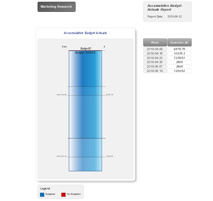
The "Accumulative Budget Actuals" report generated for your project reports includes the information about project’s accumulative budget actuals in a form of Divided Bar Chart. You can see the total amount of budget in a diagram and the table of project expenses by weeks. Moreover, this diagram lets visually compare the budgeted amounts due to the colouring the periods in red that go beyond the budget, while the budgeted periods are coloured in blue.
Visual Reports — Actuals per Project Period
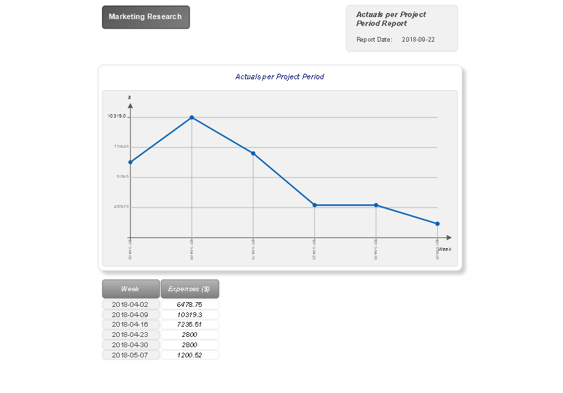
The "Actuals per Project Period" report created for your project illustrates the project's actuals per project report period using a visual form of Line Graph. The graph is divided by weeks and the key points represent the project expenses for each week within a reporting period. In addition, nearby you can observe the project expenses by weeks presented in the table.
Visual Reports — All in One Indicators
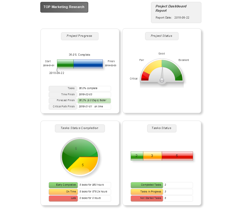
The "All in One Indicators" report formed for your project is a combination of four visual dashboards: Project Progress, Project Status, Tasks Status Completion, and Tasks Status. With the help of visual indicators, these dashboards give the multilateral and detailed overview of your project, its state, progress, results, and achievements.
Visual Reports — Application of Project Budget Chart
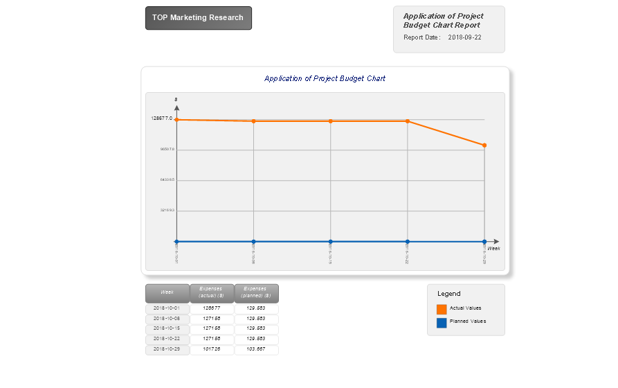
The "Application of Project Budget Chart" report generated for your project is a Line Chart, which depicts the project's planned values that are joined by a blue line and actual values connected by a red line. This visual difference allows comparing the values at a glance, making conclusions and correcting project implementation, if needed. The included table depicts the values of actual and planned project expenses by weeks within a reporting period.
Visual Reports — Project Progress
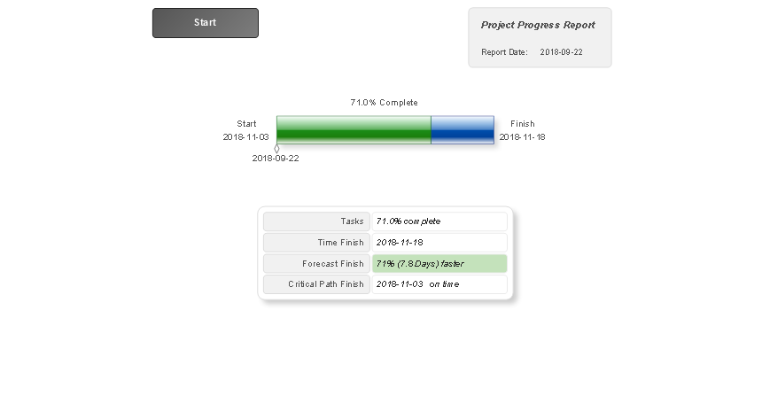
The "Project Progress" report formed for your project narrates about the project progress and degree of its completion using the Timeline Diagram, and also depicts the project numeral values in an accompanying table, such as degree of tasks completion in percent, the planned date of project finish, the forecasted finish date, and date of the critical path finish.
Visual Reports — Task Status
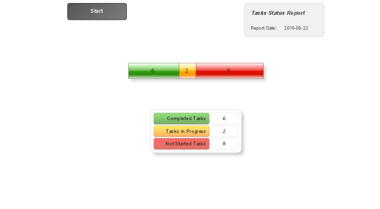
The "Tasks Status" report created for your project represents the Divided Bar Diagram reporting about the project tasks statuses and lets visually compare the number of completed tasks, the tasks in progress and not started tasks in your project. The part corresponding to the completed tasks is coloured green, the tasks in progress are depicted in yellow, and not started tasks in red.
Visual Reports — Task Status Completion
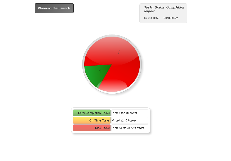
The "Tasks Status Completion" report generated for your project illustrates in a Pie Chart the number of project tasks that are "on time", the early completed tasks and late tasks. Each of these sectors is coloured in yellow, green and red colours correspondingly to be detected in one moment.
Visual Reports — Project Status
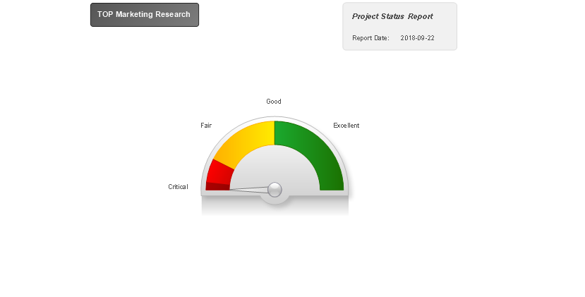
The "Project Status" report for your project illustrates the dashboard that summarizes the project data and evaluates the project status. Look at it to make sure your project is implemented well or it has a critical status, and so requires the immediate intervention and serious changes.
Visual Reports — Resources Chart
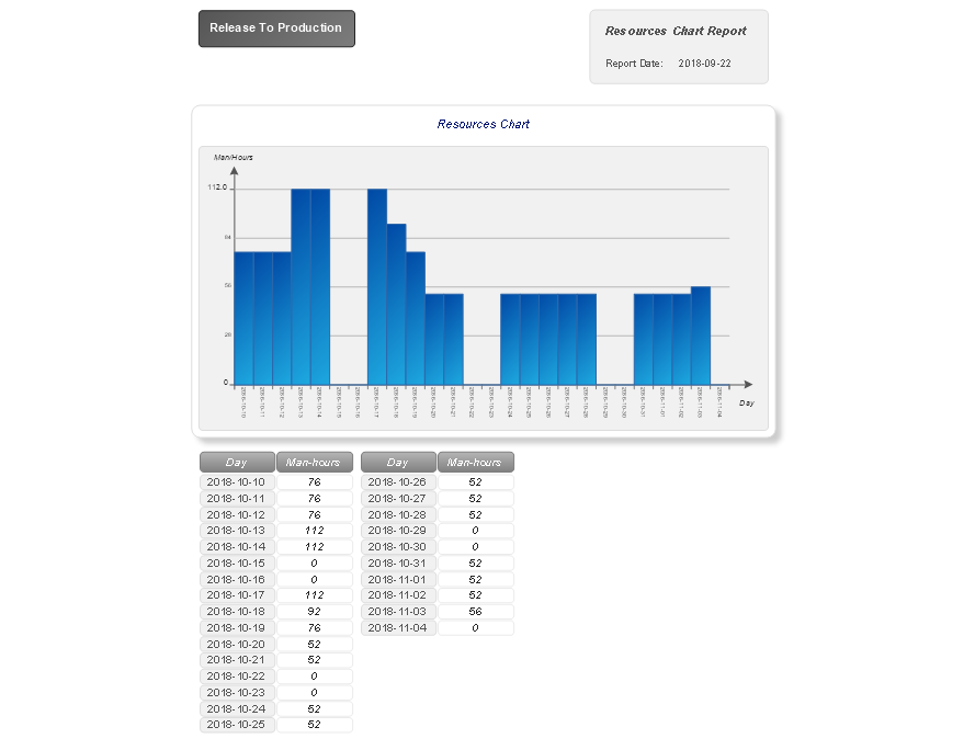
The "Resources Chart" report created for your project depicts in the table and in a Vertical Bar Chart the information about the resources utilization in your project by days, so you can see the number of man-hours per each day within a reporting period in the chart and in the table below the chart.
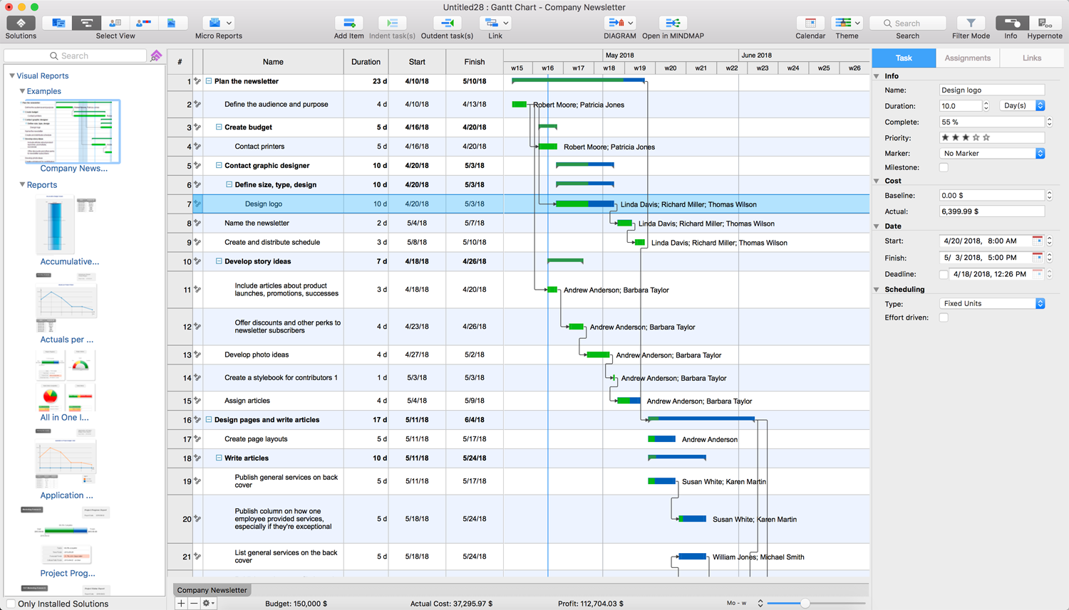
Example: Project — Company Newsletter
This project example is a project on creation of the company's newsletter, its design, editing, layout of articles and graphical information, which includes as well the stages of its publishing and distribution. It is a complex project with many phases and tasks but thanks to ConceptDraw PROJECT we have an ability to structure them neatly and precisely. This example lets you make sure that the projects of any duration and complexity can be easy planned and managed in the ConceptDraw PROJECT software. Besides, this example is the best one to learn more about other opportunities of reports included in the Visual Reports solution.
