LLNL Flow Charts
These flow charts help scientists analysts and other decision makers to visualize the complex interrelationships involved in managing our nation x2019.Energy Pyramid Diagram
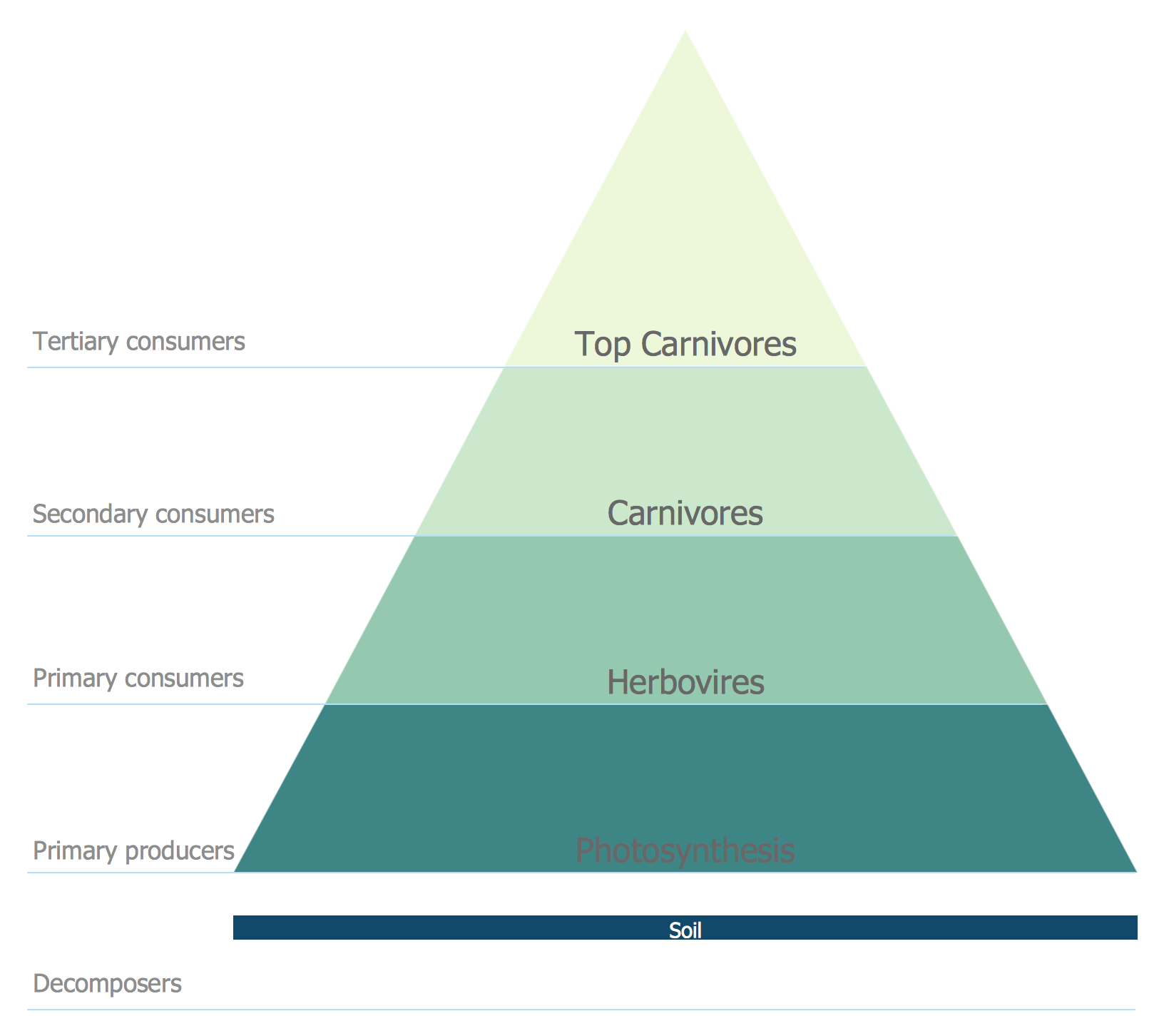
Energy Pyramid Diagram is a visual graphical representation of the biomass productivity on the each trophic level in a given ecosystem. Its designing in ConceptDraw PRO will not take much time thanks to the unique Pyramid Diagrams solution from the Marketing area of ConceptDraw Solution Park. Energy Pyramid Diagram begins from the producers (plants) and proceeds through a few trophic levels of consumers (herbivores which eat these plants, the carnivores which eat these herbivores, then carnivores which eat those carnivores, and so on) to the top of the food chain.Diagram of a Pyramid
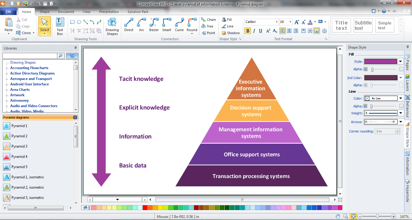
Pyramid diagram is a convenient way of representing data hierarchical structure and visualization relationships between hierarchy levels. You need create the diagram of a pyramid? ConceptDraw diagramming and vector drawing software supplied with Pyramid Diagrams Solution from the Marketing Area of ConceptDraw Solution Park is the best tool for drawing attractive and successful diagram of a pyramid.How to Create a Scatter Chart
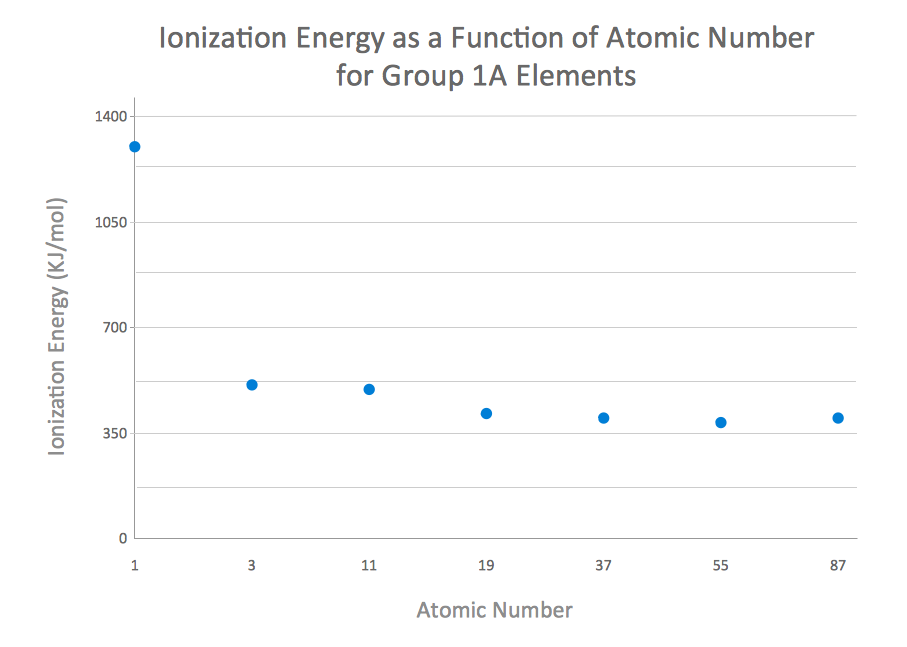
Simple tutorial help you learn how to draw a scatter chart and increase you possibilities of understanding and work more effective with our scatter chart software.This bubble diagram sample was designed on the base of the Wikimedia Commons file: Bubble diagram showing the share of global cumulative energy-related carbon dioxide emissions for major emitters between 1890-2007.svg.
"Major emitters are shown (percentage share in brackets): the United States (28%), the European Union (23%), Russia (11%), China (9%), other OECD countries (5%), Japan (4%), India (3%), and the rest of the world (18%). Data are from IEA (2009). ... The area and colouring of the circles is proportional to the share of emissions." [commons.wikimedia.org/ wiki/ File:Bubble_ diagram_ showing_ the_ share_ of_ global_ cumulative_ energy-related_ carbon_ dioxide_ emissions_ for_ major_ emitters_ between_ 1890-2007.svg]
The bubble diagram example "Global cumulative energy-related CO2 emissions" was created using the ConceptDraw PRO diagramming and vector drawing software extended with the Bubble Diagrams solution from the area "What is a Diagram" of ConceptDraw Solution Park.
 Target and Circular Diagrams
This solution extends ConceptDraw PRO software with samples, templates and library of design elements for drawing the Target and Circular Diagrams.
Pyramid Charts
ConceptDraw PRO extended with Pyramid Diagrams Solution from the Marketing Area of ConceptDraw Solution Park is a powerful Pyramid Charts making software. A Pyramid Chart has the form of triangle and hierarchically structures, organizes and help to analyze the information, data or ideas. Triangle is divided on the sections that usually have different widths. The width indicates the level of hierarchy among the topics.Pyramid Chart Maker
ConceptDraw PRO is a powerful diagramming and vector drawing software which offers the extensive drawing tools for creating various types of diagrams. Extended with Pyramid Diagrams Solution from the Marketing Area, it became the best Pyramid Chart Maker.Pyramid Diagram
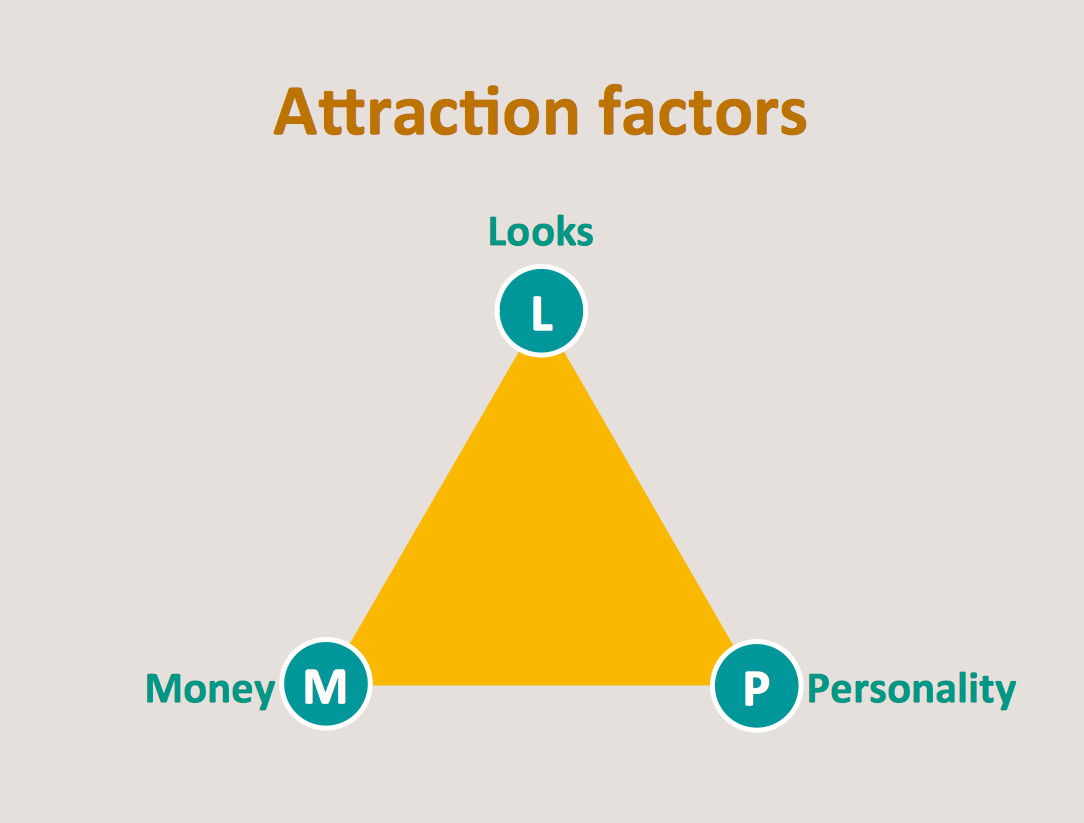
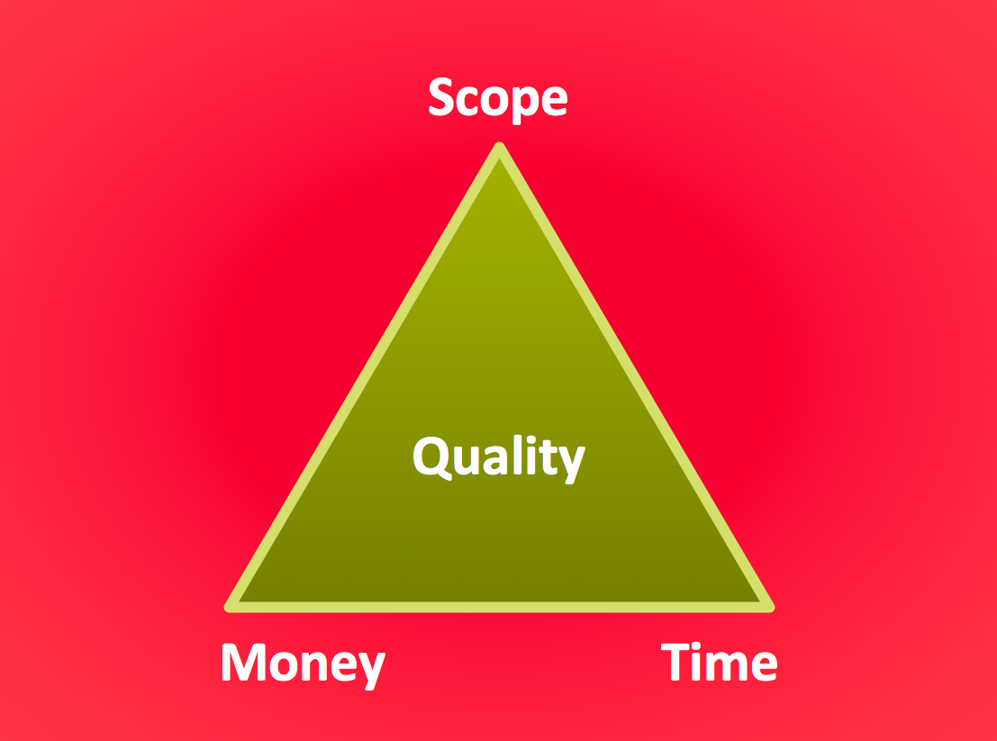
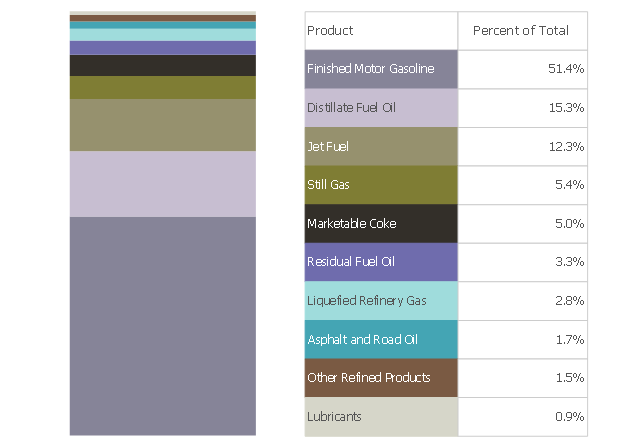
The Project Management Triangle Diagram depicts three main constraints of any project: scope, time and cost. Projects have to comply with the specified scope, projects should be finished in time and projects need to consume the budget. Each of the constraints represents one side of the triangle, and any change in budget or timing or scope affects the entire diagram. This diagram was made using ConceptDraw Office suite including best marketing project management software extended with collection of tools for creative project management software and project management reporting software symbols.This divided bar chart sample shows the petroleum products yielded from 1 barrel of crude oil in California in 2004. It was drawn using data from the chart on the California Energy Almanac website. [energyalmanac.ca.gov/ gasoline/ whats_ in_ barrel_ oil.html]
"Petroleum products are useful materials derived from crude oil (petroleum) as it is processed in oil refineries. Unlike petrochemicals, which are a collection of well-defined usually pure chemical compounds, petroleum products are complex mixtures. The majority of petroleum is converted to petroleum products, which includes several classes of fuels.
According to the composition of the crude oil and depending on the demands of the market, refineries can produce different shares of petroleum products. The largest share of oil products is used as "energy carriers", i.e. various grades of fuel oil and gasoline. These fuels include or can be blended to give gasoline, jet fuel, diesel fuel, heating oil, and heavier fuel oils. Heavier (less volatile) fractions can also be used to produce asphalt, tar, paraffin wax, lubricating and other heavy oils. Refineries also produce other chemicals, some of which are used in chemical processes to produce plastics and other useful materials. Since petroleum often contains a few percent sulfur-containing molecules, elemental sulfur is also often produced as a petroleum product. Carbon, in the form of petroleum coke, and hydrogen may also be produced as petroleum products. The hydrogen produced is often used as an intermediate product for other oil refinery processes such as hydrocracking and hydrodesulfurization." [Petroleum product. Wikipedia]
The chart example "Petroleum products yielded from one barrel of crude oil" was created using the ConceptDraw PRO diagramming and vector drawing software extended with the Divided Bar Diagrams solution from the Graphs and Charts area of ConceptDraw Solution Park.
Scatter Chart Examples
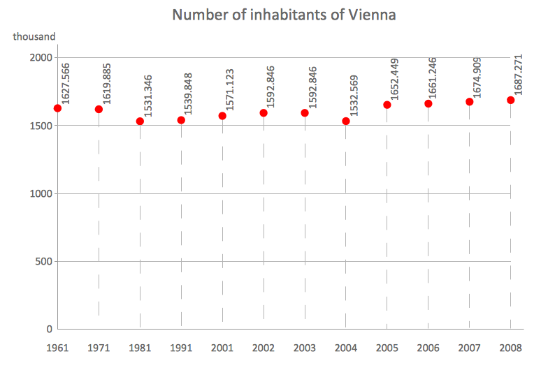
The Line Graphs solution from Graphs and Charts area of ConceptDraw Solution Park contains a set of examples, templates and design elements library of scatter charts. Use it to draw scatter graphs using ConceptDraw PRO diagramming and vector drawing software for illustrating your documents, presentations and websites.Chart Templates
Easy charting software comes with beautiful chart templates and examples. This makes it easy to create professional charts without prior experience.
 Pie Charts
Pie Charts are extensively used in statistics and business for explaining data and work results, in mass media for comparison (i.e. to visualize the percentage for the parts of one total), and in many other fields. The Pie Charts solution for ConceptDraw PRO v10 offers powerful drawing tools, varied templates, samples, and a library of vector stencils for simple construction and design of Pie Charts, Donut Chart, and Pie Graph Worksheets.
 Divided Bar Diagrams
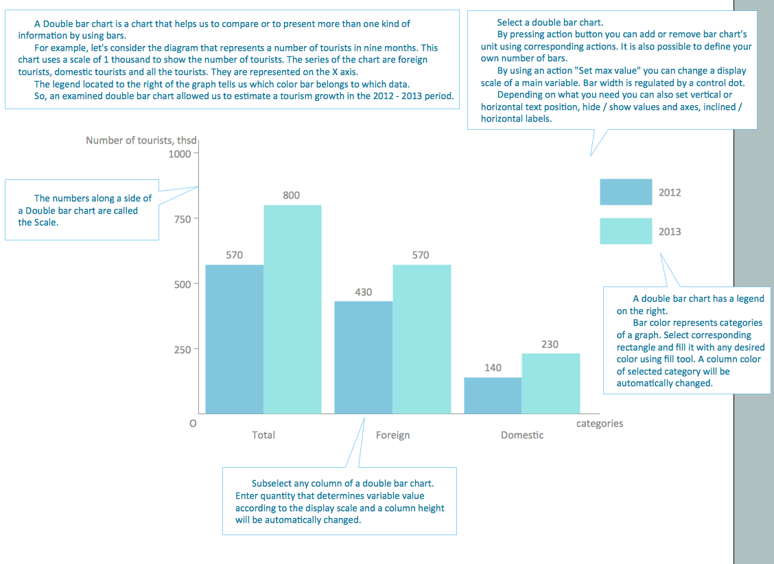
The Divided Bar Diagrams Solution extends the capabilities of ConceptDraw PRO v10 with templates, samples, and a library of vector stencils for drawing high impact and professional Divided Bar Diagrams and Graphs, Bar Diagram Math, and Stacked Graph.
Chart Examples
Easy charting software comes with beautiful chart templates and examples. This makes it easy to create professional charts without prior experience.- Pyramid Chart Examples | Pyramid Charts | Energy Pyramid ...
- Energy Pyramid Diagram | How to Create a Scatter Chart | U.S. ...
- Energy resources diagram | Manufacturing and Maintenance | Life ...
- The Energy Resources In Histogram Pie Chart And Bar Graph
- Energy Pyramid Diagram | Scatter Chart Examples | Chart Examples ...
- Energy Pyramid Diagram | Pyramid Chart Maker | Pyramid Charts ...
- Pyramid Chart Maker | Pyramid Charts | Energy Pyramid Diagram ...
- LLNL Flow Charts | Energy resources diagram | Pie Charts | Energy ...
- Energy Pyramid Diagram
- Pyramid Chart Examples | Energy Pyramid Diagram | Diagram of a ...
- Chart Examples | Pyramid Diagram | Pie Charts | Energy And Its ...
- Resources and energy - Vector stencils library | Energy resources ...
- Pyramid Chart Examples | Energy Pyramid Diagram | Diagram of a ...
- Circular Arrows Diagrams | Energy resources diagram | Chart ...
- SWOT and TOWS Matrix Diagrams | Pyramid Charts | LLNL Flow ...
- Energy Pyramid Diagram | Diagram of a Pyramid | Pyramid Charts ...
- Manufacturing and Maintenance | Energy resources diagram ...
- Chart Examples | Target and Circular Diagrams | Chart Templates ...
- Energy resources diagram | Pie Charts | Manufacturing and ...
- Electrical Symbols — Power Sources | LLNL Flow Charts | Energy ...
.jpg)
