- Electric and Telecom Plans Free
- Fire and Emergency Plans Free
- Floor Plans Free
- Plant Layout Plans Free
- School and Training Plans Free
- Seating Plans Free
- Security and Access Plans Free
- Site Plans Free
- Sport Field Plans Free
- Business Process Diagrams Free
- Business Process Mapping Free
- Classic Business Process Modeling Free
- Cross-Functional Flowcharts Free
- Event-driven Process Chain Diagrams Free
- IDEF Business Process Diagrams Free
- Logistics Flow Charts Free
- Workflow Diagrams Free
- ConceptDraw Dashboard for Facebook Free
- Mind Map Exchange Free
- MindTweet Free
- Note Exchange Free
- Project Exchange Free
- Social Media Response Free
- Active Directory Diagrams Free
- AWS Architecture Diagrams Free
- Azure Architecture Free
- Cisco Network Diagrams Free
- Cisco Networking Free
- Cloud Computing Diagrams Free
- Computer Network Diagrams Free
- Google Cloud Platform Free
- Interactive Voice Response Diagrams Free
- Network Layout Floor Plans Free
- Network Security Diagrams Free
- Rack Diagrams Free
- Telecommunication Network Diagrams Free
- Vehicular Networking Free
- Wireless Networks Free
- Comparison Dashboard Free
- Composition Dashboard Free
- Correlation Dashboard Free
- Frequency Distribution Dashboard Free
- Meter Dashboard Free
- Spatial Dashboard Free
- Status Dashboard Free
- Time Series Dashboard Free
- Basic Circle-Spoke Diagrams Free
- Basic Circular Arrows Diagrams Free
- Basic Venn Diagrams Free
- Block Diagrams Free
- Concept Maps Free
- Family Tree Free
- Flowcharts Free
- Basic Area Charts Free
- Basic Bar Graphs Free
- Basic Divided Bar Diagrams Free
- Basic Histograms Free
- Basic Line Graphs Free
- Basic Picture Graphs Free
- Basic Pie Charts Free
- Basic Scatter Diagrams Free
- Aerospace and Transport Free
- Artwork Free
- Audio, Video, Media Free
- Business and Finance Free
- Computers and Communications Free
- Holiday Free
- Manufacturing and Maintenance Free
- Nature Free
- People Free
- Presentation Clipart Free
- Safety and Security Free
- Analog Electronics Free
- Audio and Video Connectors Free
- Basic Circuit Diagrams Free
- Chemical and Process Engineering Free
- Digital Electronics Free
- Electrical Engineering Free
- Electron Tube Circuits Free
- Electronic Block Diagrams Free
- Fault Tree Analysis Diagrams Free
- GHS Hazard Pictograms Free
- Home Automation and Wiring Free
- Mechanical Engineering Free
- One-line Diagrams Free
- Power Сircuits Free
- Specification and Description Language (SDL) Free
- Telecom and AV Circuits Free
- Transport Hazard Pictograms Free
- Data-driven Infographics Free
- Pictorial Infographics Free
- Spatial Infographics Free
- Typography Infographics Free
- Calendars Free
- Decision Making Free
- Enterprise Architecture Diagrams Free
- Fishbone Diagrams Free
- Organizational Charts Free
- Plan-Do-Check-Act (PDCA) Free
- Seven Management and Planning Tools Free
- SWOT and TOWS Matrix Diagrams Free
- Timeline Diagrams Free
- Business Diagrams $49
- Australia Map Free
- Continent Maps Free
- Directional Maps Free
- Germany Map Free
- Metro Map Free
- UK Map Free
- USA Maps Free
- Customer Journey Mapping Free
- Marketing Diagrams Free
- Matrices Free
- Pyramid Diagrams Free
- Sales Dashboard Free
- Sales Flowcharts Free
- Target and Circular Diagrams Free
- Cash Flow Reports Free
- Current Activities Reports Free
- Custom Excel Report Free
- Knowledge Reports Free
- MINDMAP Reports Free
- Overview Reports Free
- PM Agile Free
- PM Dashboards Free
- PM Docs Free
- PM Easy Free
- PM Meetings Free
- PM Planning Free
- PM Presentations Free
- PM Response Free
- Resource Usage Reports Free
- Visual Reports Free
- House of Quality Free
- Quality Mind Map Free
- Total Quality Management TQM Diagrams Free
- Value Stream Mapping Free
- Astronomy Free
- Biology Free
- Chemistry Free
- Language Learning Free
- Mathematics Free
- Physics Free
- Piano Sheet Music Free
- Android User Interface Free
- Class Hierarchy Tree Free
- Data Flow Diagrams (DFD) Free
- DOM Tree Free
- Entity-Relationship Diagram (ERD) Free
- EXPRESS-G data Modeling Diagram Free
- IDEF0 Diagrams Free
- iPhone User Interface Free
- Jackson Structured Programming (JSP) Diagrams Free
- macOS User Interface Free
- Object-Role Modeling (ORM) Diagrams Free
- Rapid UML Free
- SYSML Free
- Website Wireframe Free
- Windows 10 User Interface Free
Business Diagrams
The business counts a huge number of areas, in which a lot of people around the world are involved today, in this regard, the number of business processes is also enormous. Over the past decades, many methods have been developed to describe and model business processes, solving business problems, as well as planning management tasks. Meanwhile, a form of displaying results is very important because the clearer it is, the easier the information and data will be perceived and analyzed by other people. The information in a form of a text or several tables is quite difficult to perceive but when it is visualized, turned into the colorful graphical objects, it is much easier to read, and more interesting to study and to analyze. The most obvious form of presenting information is diagrams, graphs, drawings, maps, and infographics. In each particular case, it is convenient to describe business processes graphically using a certain well-known type of diagram and its generally accepted graphic notation, which makes your business diagrams equally understandable and easily perceived by all stakeholders.
Business diagrams allow you to clearly and thoroughly describe business processes, build models of business processes, present the main conclusions of business plans, and identify patterns and dependencies. The visual processing of business documents using diagrams reflecting commercial indicators helps to clearly show the status of business projects, confirm or refute the correctness of the chosen commercial policy, and show investors and sponsors the rationality of using the investments made.
Among the most famous and commonly used business charts are the Bubble Diagrams or Spray Diagrams, Circle-Spoke Diagrams or Circular Hub Diagrams, Circular Arrows Diagrams or Segmented Cycle Diagrams, and Venn Diagrams. Business diagrams of these types clearly show the values of various business characteristics and economic indicators, their relationship and distribution, allow you to track changes in the company’s work, visualize and compare profit, efficiency, profitability, and risk indicators, track the development of a business project in dynamics. On the same diagram, there can be displayed same indicators in different time periods or diverse types of indicators, depending on your needs.
The Business Diagrams Solution extends ConceptDraw DIAGRAM with an extensive collection of professionally designed illustrative samples and a wide variety of vector stencils libraries, which are the real help for all business-related people, business analysts, business managers, business advisers, marketing experts, PR managers, knowledge workers, scientists, and other stakeholders allowing them to design the Bubble Diagrams, Circle-Spoke Diagrams, Circular Arrows Diagrams, and Venn Diagrams with different quantity of sets in just minutes. All of the listed business diagrams designed using the solution tools always look bright, neat, expressive and attractive, which makes it easy to use them in various documents, reports, statistical summaries when creating reliable and compelling presentations of any style. There are 4 libraries containing 67 vector shapes, 50 examples and templates in the Business Diagrams solution.
-
Buy this solution $49 -
Solution Requirements - This solution requires the following products to be installed:
ConceptDraw DIAGRAM v18 - This solution requires the following products to be installed:
-
Compatibility - Sonoma (14), Sonoma (15)
MS Windows 10, 11 - Sonoma (14), Sonoma (15)
-
Support for this Solution -
Helpdesk
There are 4 libraries containing 67 vector shapes, 50 examples and templates in the Business Diagrams solution.
Design Elements — Circular Arrows Diagrams

Design Elements — Bubble Diagrams

Design Elements — Circle-Spoke Diagrams

Design Elements — Venn Diagrams

Business Diagrams Examples
There are a few samples that you see on this page which were created in the ConceptDraw DIAGRAM application by using the Business Diagrams solution. Some of the solution's capabilities as well as the professional results which you can achieve are all demonstrated here on this page.
All source documents are vector graphic documents which are always available for modifying, reviewing and/or converting to many different formats, such as MS PowerPoint, PDF file, MS Visio, and many other graphic ones from the ConceptDraw Solution Park or ConceptDraw STORE. The Business Diagrams solution is available to all ConceptDraw DIAGRAM users to get installed and used while working in the ConceptDraw DIAGRAM diagramming and drawing software.
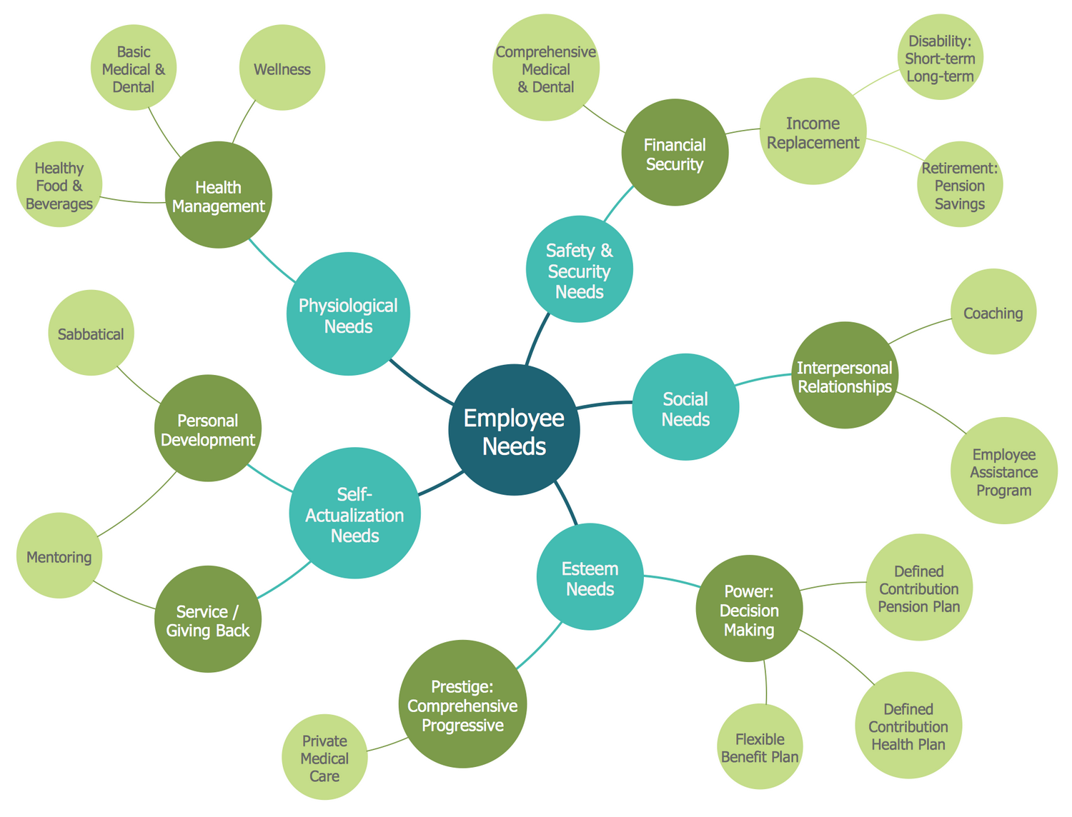
Example 1: Bubble Diagram — Employee Needs
This example was created in ConceptDraw DIAGRAM using the Bubble Diagrams library from the Business Diagrams solution. An experienced user spent 15 minutes creating this sample.
This Bubble Diagram sample demonstrates a potential structure of employee needs as the base of motivation management that is a complex of forces, needs, mechanisms, drives, and other factors directed on achievement personal and business goals. There is a lot of evidence for the importance of employees' motivation in business success and satisfaction of employee needs is one of them. Employers using motivation theory have great potential, gain an advantage in business, and achieve success more efficiently. Among the main employees needs are listed the physiological, social, safety and security, esteem, and self-actualization needs. The personal development, financial security, interpersonal relationships, and some others not less important are presented at the second level of this diagram. The third detalization level is also included. The importance of the needs is shown by using variable bubble sizing and color. As the distance to the main idea increases, the color intensity and size of the bubble are reduced.
Example 2: Bubble Diagram — Employer Objectives
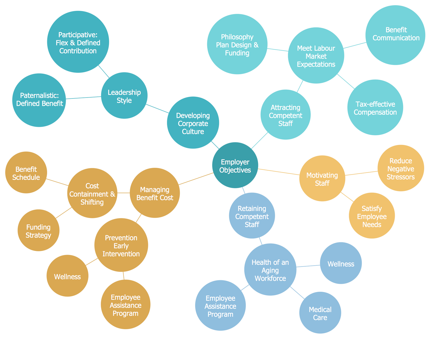
This diagram was created in ConceptDraw DIAGRAM using the Bubble Diagrams library from the Business Diagrams solution. An experienced user spent 20 minutes creating this sample.
This Bubble Chart sample shows the main employer objectives. Such objectives as the corporate culture development, benefit cost management, attracting competent staff, and required retaining competent staff are presented at the first level of this diagram. Each of these goals has the next level goals and further levels are also branched by the objectives of the same groups. The employer's clear definition of goals that need to be achieved by the employees is incredibly important for any business. This allows coordinating goals within the organization, makes them clear, allows defining and showing their significance for the business, facilitate decision-making, choosing directions for actions and effective methods to achieve the main goals. The ConceptDraw's connectors help you quickly create the Bubble charts, like this one showing a structured view of employer objectives. It’s useful and informative to visualize levels using different colors, to present data in an easily understood way.
Example 3: Bubble Diagram — Employment Policy Direction
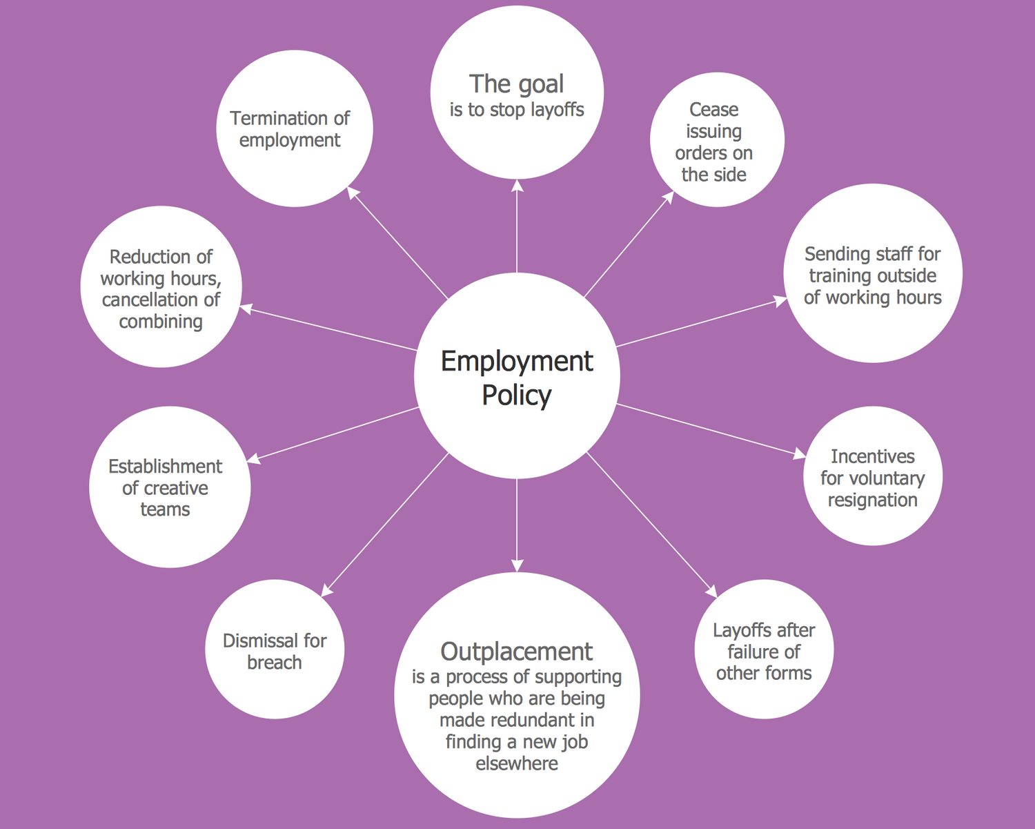
This diagram was created in ConceptDraw DIAGRAM using the Bubble Diagrams library from the Business Diagrams solution. An experienced user spent 10 minutes creating this sample.
This Bubble Diagram shows the main directions and components of an enterprise’s employment policy. Employment is a relationship between two parties, where one is the employer (profit or non-profit organization, corporation, firm, enterprise, company, etc.), and the other is an employee, while their relations are based on the contract and the work done by the employee is paid by the employer. The correct employment policy is an essential part of effective employee management. It supposes the development of the set of actions for all possible key issues, which may occur during the work and need to be solved. Typically, the key employment policies cover all the main human resources issues and may have a substantial legal impact, including data protection and equal opportunities policies. The components are organized in a wheel around the central idea in this chart. The value of each component is reflected by the size of the bubble.
Example 4: Bubble Diagram — McKinsey 7S Framework
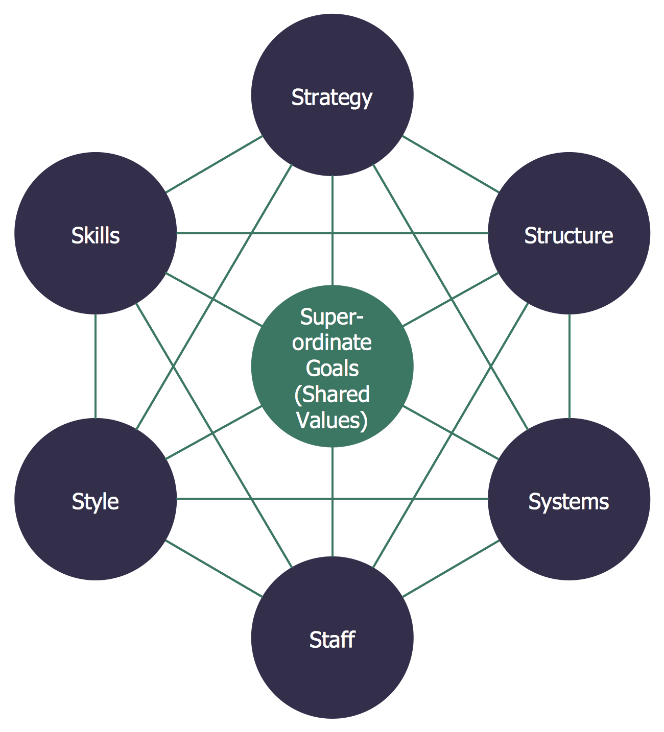
This diagram was created in ConceptDraw DIAGRAM using the Bubble Diagrams library from the Business Diagrams solution. An experienced user spent 5 minutes creating this sample.
This Bubble Diagram visualizes the management model McKinsey 7S framework. The sample was designed based on the Wikimedia Commons file "McKinsey 7S framework.svg". The McKinsey 7S framework is a management model popular from the 1980s when it was developed by the business consultants Robert H. Waterman, Jr. and Tom Peters. The 7S is decrypted as structure, strategy, systems, skills, style, staff, and shared values. McKinsey 7S framework is a strategic vision for different groups, such as teams, business units, etc. This model is effective when used as a tool to analyze a company's organizational design by considering 7 key internal elements, which need to be coordinated and reinforced. It is applied to monitor and evaluate changes in the organization's internal situation, or to define changes that need to be realized to improve performance. This Bubble Diagram sample can be used and changed to reflect business strategy based on the 7S elements.
Example 5: Bubble Diagram — Page Rank
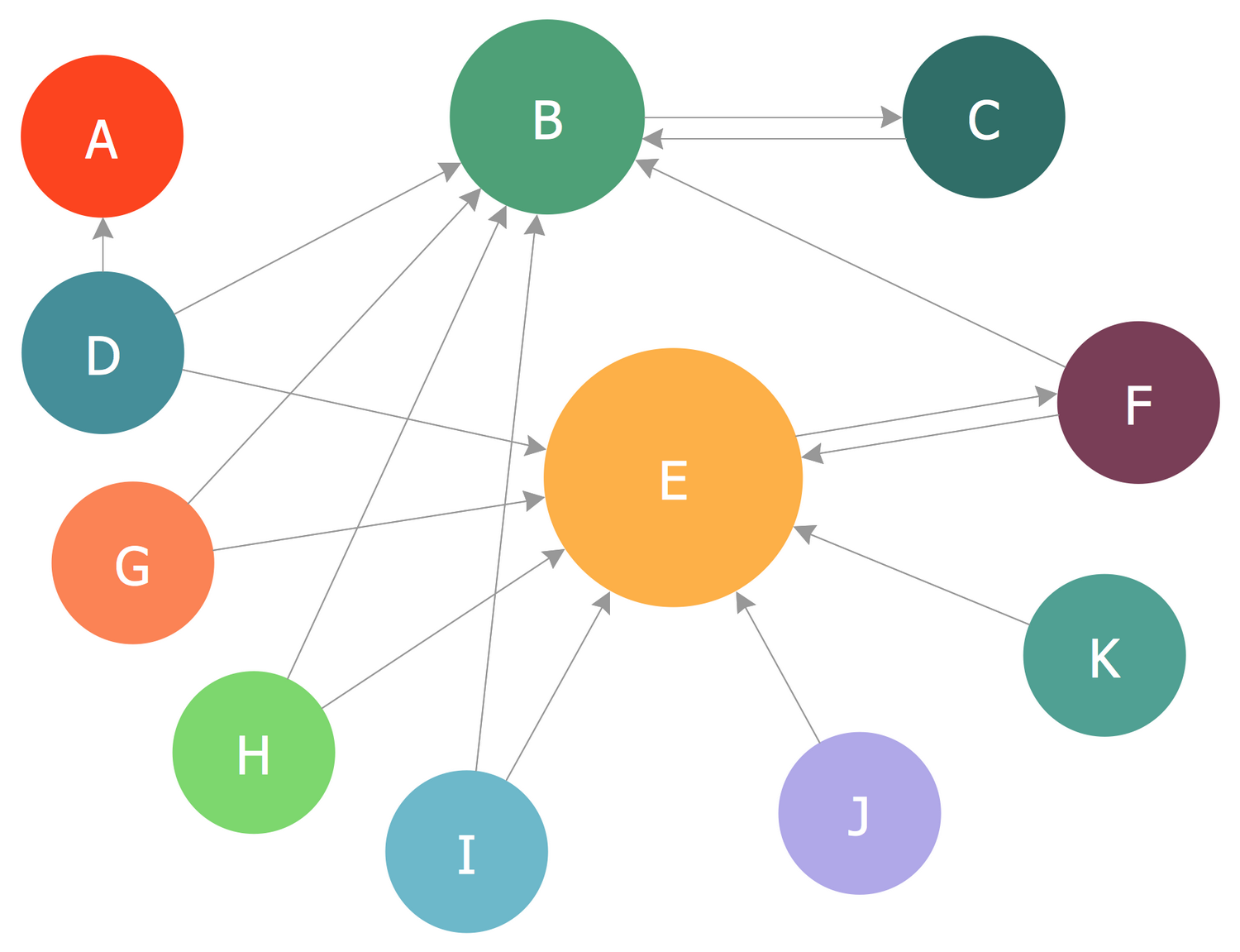
This diagram was created in ConceptDraw DIAGRAM using the Bubble Diagrams library from the Business Diagrams solution. An experienced user spent 5 minutes creating this sample.
This Bubble Diagram sample shows the PageRank (PR) algorithm that characterizes the importance of the websites. PageRank is the first algorithm invented by Google company to define the probability of navigating to the particular page at the random clicking the links. The algorithm outputs a probability distribution in this case. PageRank algorithm is used by the Google Search to rank websites in search engine results, to measure the importance of website pages. It counts the number and quality of links to a page and makes a rough estimate of website importance based on these measures because the greater quantity of links from other websites indicates the greater importance of a given website. Bubble Chart is a convenient tool to use in conjunction with Page Rank. One can visually compare anything based on different criteria by ordering bubbles by color, size, and proximity to the main idea. Based on the size of the circles, page E has the highest rate, page B has a lower page rate than page E, but higher than other pages.
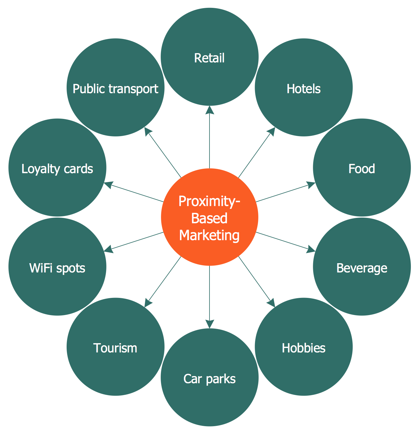
Example 6: Circle-spoke Diagram — Proximity Based Marketing
This diagram was created in ConceptDraw DIAGRAM using the Circle-Spoke Diagram library from the Business Diagrams solution. An experienced user spent 5 minutes creating this sample.
This sample illustrates a Circle-spoke Diagram that visualizes the application fields of proximity-based marketing. Proximity marketing presents a set of actions directed to the promotion and distribution of different kinds of advertising content, which have exceptionally wireless allocation. It can be targeted to specific groups within a given location. As a rule, proximity marketing is realized via a traditional localized broadcast or specific devices placed in a particular area determined by Bluetooth or WiFi device in a range of a transmitter, Internet devices with GPS, which are able to launch the localized content from internet servers, cellular and NFC enabled phones, which can read the RFID chips and launch localized content from the internet servers. This diagram lists the following proximity-based marketing fields: public transport, retail, hotels, hobbies, food, beverage, tourism, car parks, WiFi spots, loyalty cards. The bright orange color is applied to make the central topic stand out — you can tailor the shade according to your taste.
Example 7: Circle-spoke Diagram — Social Determinants of Health
This diagram was created in ConceptDraw DIAGRAM using the Circle-Spoke Diagram library from the Business Diagrams solution. An experienced user spent 10 minutes creating this sample.
This sample visualizes a list of social determinants of health in the form of a Circle-spoke Diagram. You can see all the economic and social conditions that affect the health status of the population, susceptibility to diseases, vulnerability to diseases and injuries, the risk of getting sick. Social determinants of health define the main economic and social conditions, which influence the differences in health state, and their distribution among the population. The distributions of social determinants are formed under the influence of public policies and political ideologies. The determinants of health are the risk factors found in living and working conditions, such as the distribution of income, wealth, influence, power. There are included the personal health practices and coping skills, health services, biology and genetic endowment, healthy child development, income and social status, physical environments, social support networks, employment and working conditions, education. This diagram is vibrant and attractive and can be professionally used, for example, in presentations, conferences or magazines.

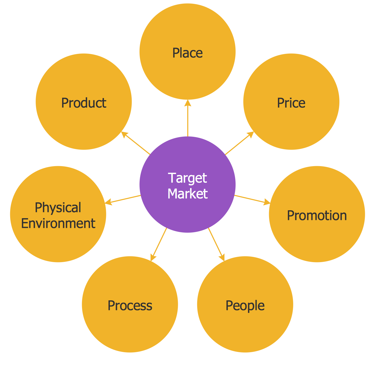
Example 8: Circle-spoke Diagram — Target Market
This diagram was created in ConceptDraw DIAGRAM using the Circle-Spoke Diagram library from the Business Diagrams solution. An experienced user spent 5 minutes creating this sample.
This Сircle-spoke Diagram illustrates the marketing basis, relationships, and interactions between the target market and the main components of the marketing strategy. A group of customers on which some business directs its goods or services, marketing program, advertising efforts is considered as a target market. A well-defined target market is a fundamental point of a marketing strategy. The following seven elements are included in the set of main elements of a marketing mix strategy and presented in this diagram: product, place, price, promotion, people, process, and physical environment. This model known as the 7Ps is an extended version of a worldwide popular 4Ps marketing mix model. Being successfully implemented these components allow satisfying the target market and presenting their consumers the products and services in a cost-efficient manner. It’s simple, convenient, and quick to create a professional-looking diagram using the Business Diagrams solution for ConceptDraw DIAGRAM.
Example 9: Circle-spoke Diagram — Leadership and Data
This diagram was created in ConceptDraw DIAGRAM using the Circle-Spoke Diagram library from the Business Diagrams solution. An experienced user spent 10 minutes creating this sample.
This Circle-spoke Diagram depicts the principles and components of asset management. Leadership and data assist the coordination of different functions presented in the asset management diagram. Asset management is a term used to define professional investment management, such as stocks, bonds, and other financial assets. It can be applied to tangible assets, such as real estate, equipment, physical objects, and intangible assets, such as intellectual property, human capital, etc. It is a systematic approach to the management and realization of the value of things. As a rule, it is a type of management applied by institutional and large private investors. A lot of asset management companies and investment banks offer asset management services. According to this diagram, the asset management includes human resources and processes of planning, design, construction, material testing, maintenance, inventory assessment, and training. Your diagram should naturally correspond to the overall presentation style, therefore the color scheme and arrangement are important.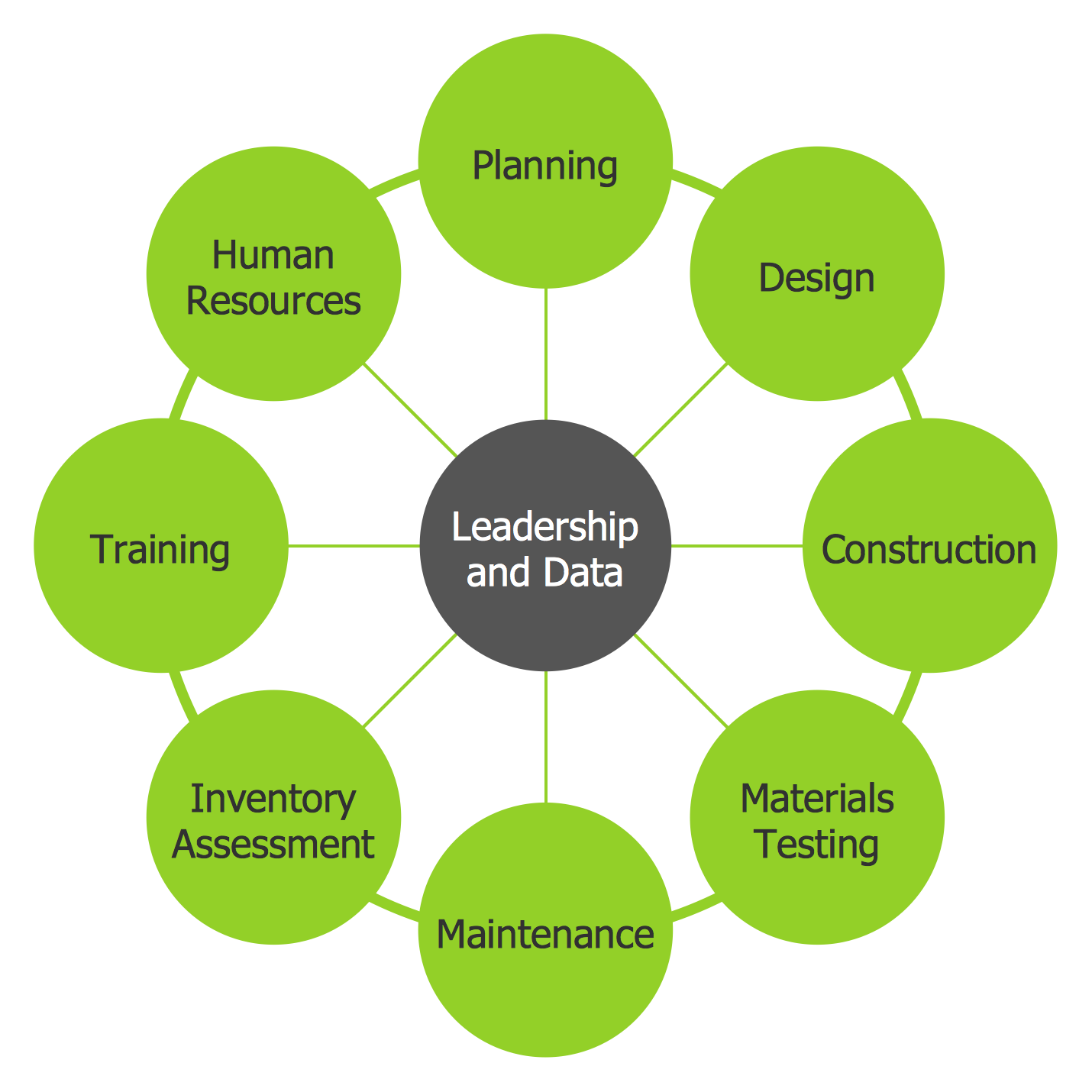
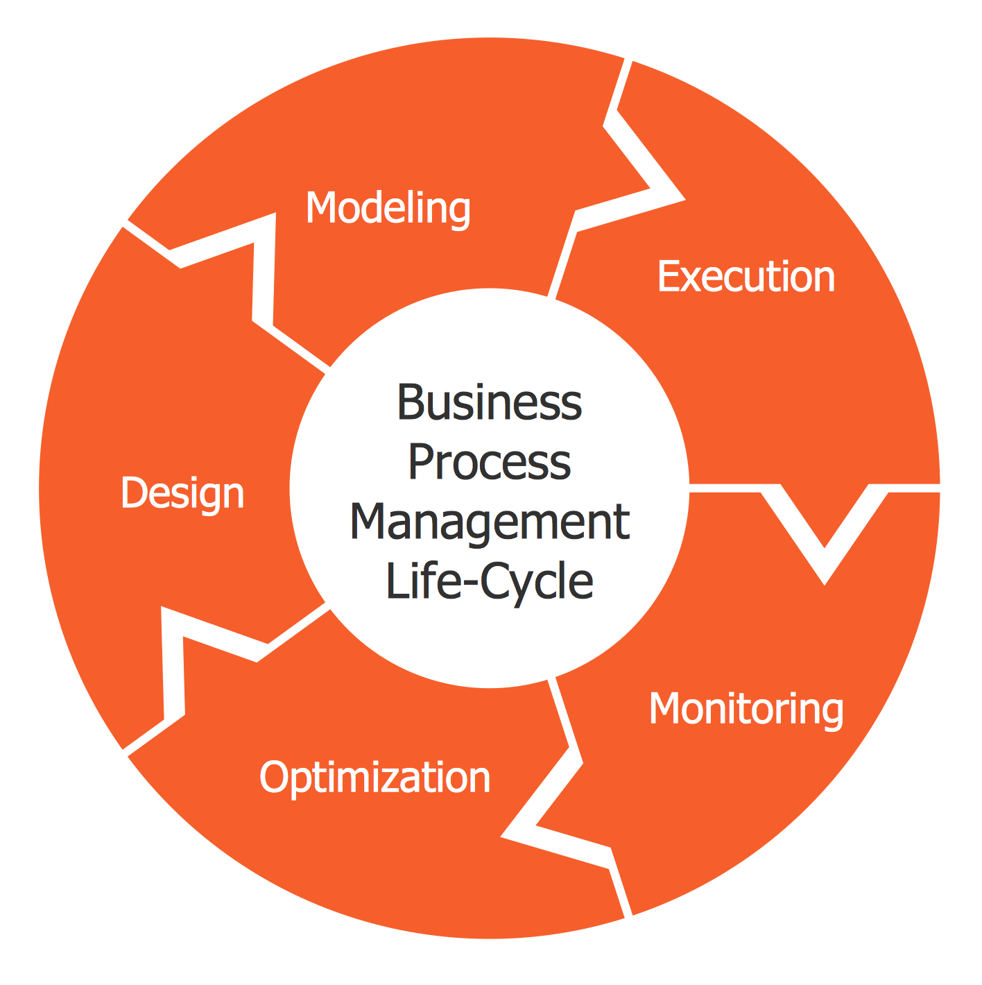
Example 10: Circular Arrows Diagram — BPM Life Cycle
This diagram was created in ConceptDraw DIAGRAM using the Circular Arrows Diagrams Library from the Business Diagrams Solution. An experienced user spent 10 minutes creating this sample.
This Circular Arrows Diagram sample represents the main stages of a business process management (BPM) life cycle and was designed based on the Wikimedia Commons file “Business Process Management Life-Cycle.svg”. Business process management is a systematic approach, a management concept that considers and combines the organization's strategy and goals with the expectations and needs of its customers. Organizations use business process management to improve all their business processes, because the success of an organization begins with a clear concept, understanding of customer needs and ends with their implementation. The diagram presents all BPM activities grouped into five main stages connected with each other: design, modeling, execution, monitoring, and optimization. These stages are mandatory for companies of any direction and location. And the last touch — add visibility and appeal to your diagram, simplify its memorization and highlight each stage with its own bright color.
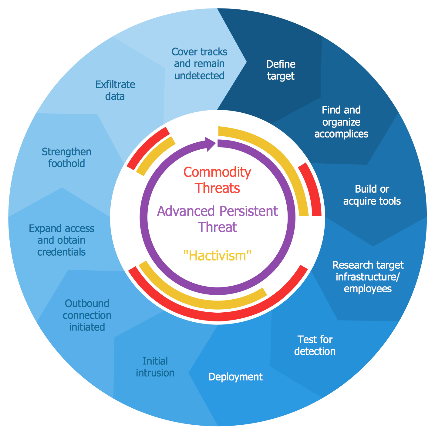
Example 11: Circular Arrows Diagram — Advanced Persistent Threat Lifecycle
This diagram was created in ConceptDraw DIAGRAM using the Circular Arrows Diagrams Library from the Business Diagrams Solution. An experienced user spent 15 minutes creating this sample.
This sample shows a Circular Arrows Diagram that describes an Advanced Persistent Threat (APT) lifecycle. Advanced Persistent Threat is a set of continuous processes that possess a high degree of covertness and are organized by a human as hacking actions targeting a particular entity, organization or nation for political or business reasons. The term is applied for cyber threats and attacks of different kinds, espionage, access to confidential information, gathering intelligence information. It commonly supposes the application of sophisticated techniques, malware, through the use of systems' vulnerabilities. The name ATP reflects three main processes: advanced, persistent, and threat, because usually ATP is implemented not by one person, but by organizations, groups of people who purposefully and continuously monitor and extract data from a specific target. You can see how the gradation of color works, the color intensity is reduced from stage to stage, emphasizing the importance and priority of the most intensely colored stages.
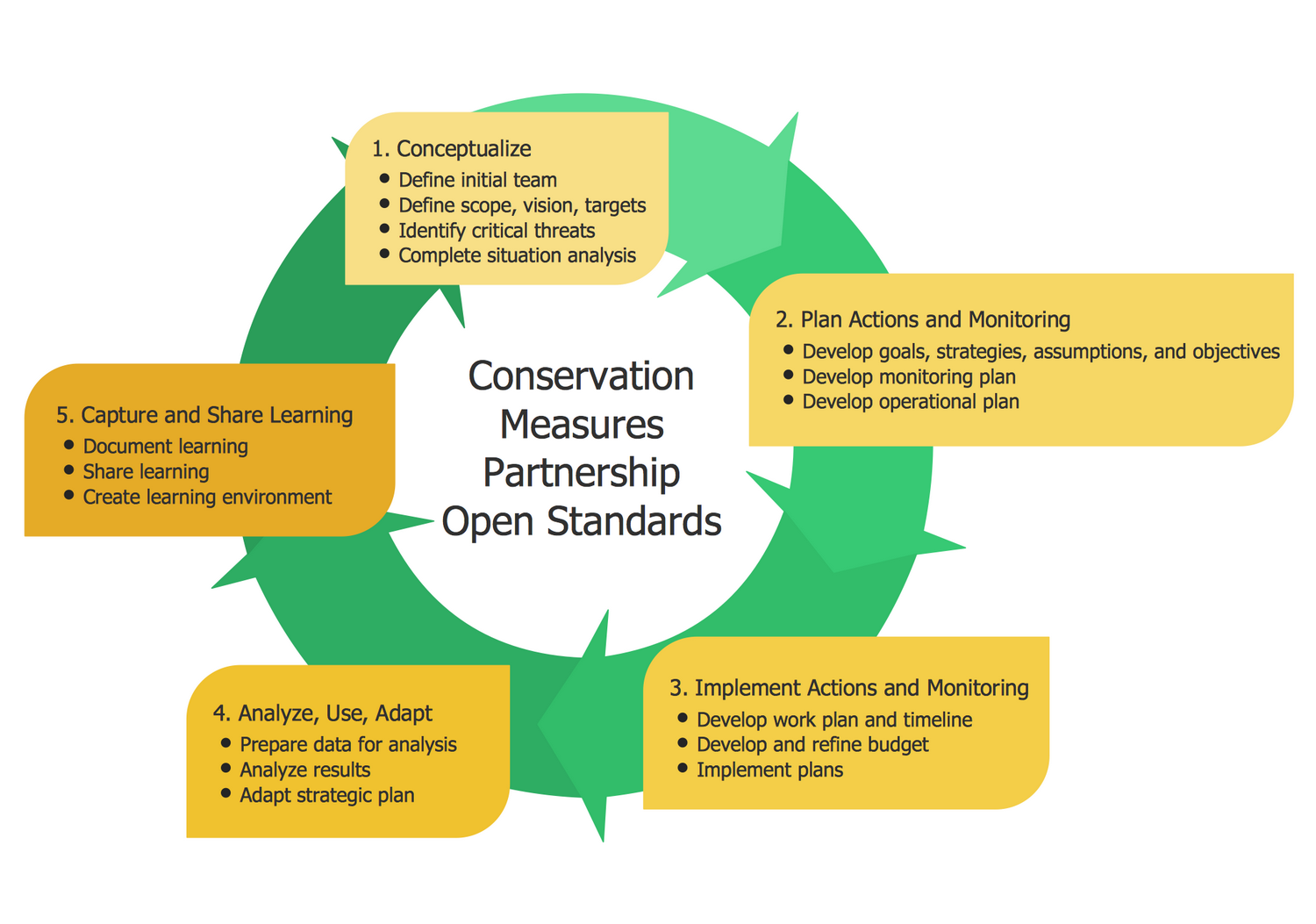
Example 12: Circular Arrows Diagram — Conservation Measures Partnership CMP Cycle
This diagram was created in ConceptDraw DIAGRAM using the Circular Arrows Diagrams Library from the Business Diagrams Solution. An experienced user spent 10 minutes creating this sample.
This sample shows the Circular Arrows Diagram of the Conservation Measures Partnership (CMP) adaptive management (AM) lifecycle. Adaptive resource management is an iterative structured process designed to make decisions in the face of unpredictability, helping to reduce unpredictability over time through system monitoring and finding effective methods for managing complex dynamic business systems. Thus, the decision-making under AM conditions meets not only the goals of resource management, but also allows you to accumulate information that can improve the management process; such accumulation can be implemented both passively and actively. Adaptive management allows learning system and changing it, as well as improving long-run management outcomes. That's why it is important to find the correct balance between gaining knowledge to improve management and achieve the best short-term outcome. Each stage has a detailed description in this complex chart that however was easily created with ConceptDraw DIAGRAM. By using the predesigned objects contained in the library one can draw a similar diagram in a few minutes.
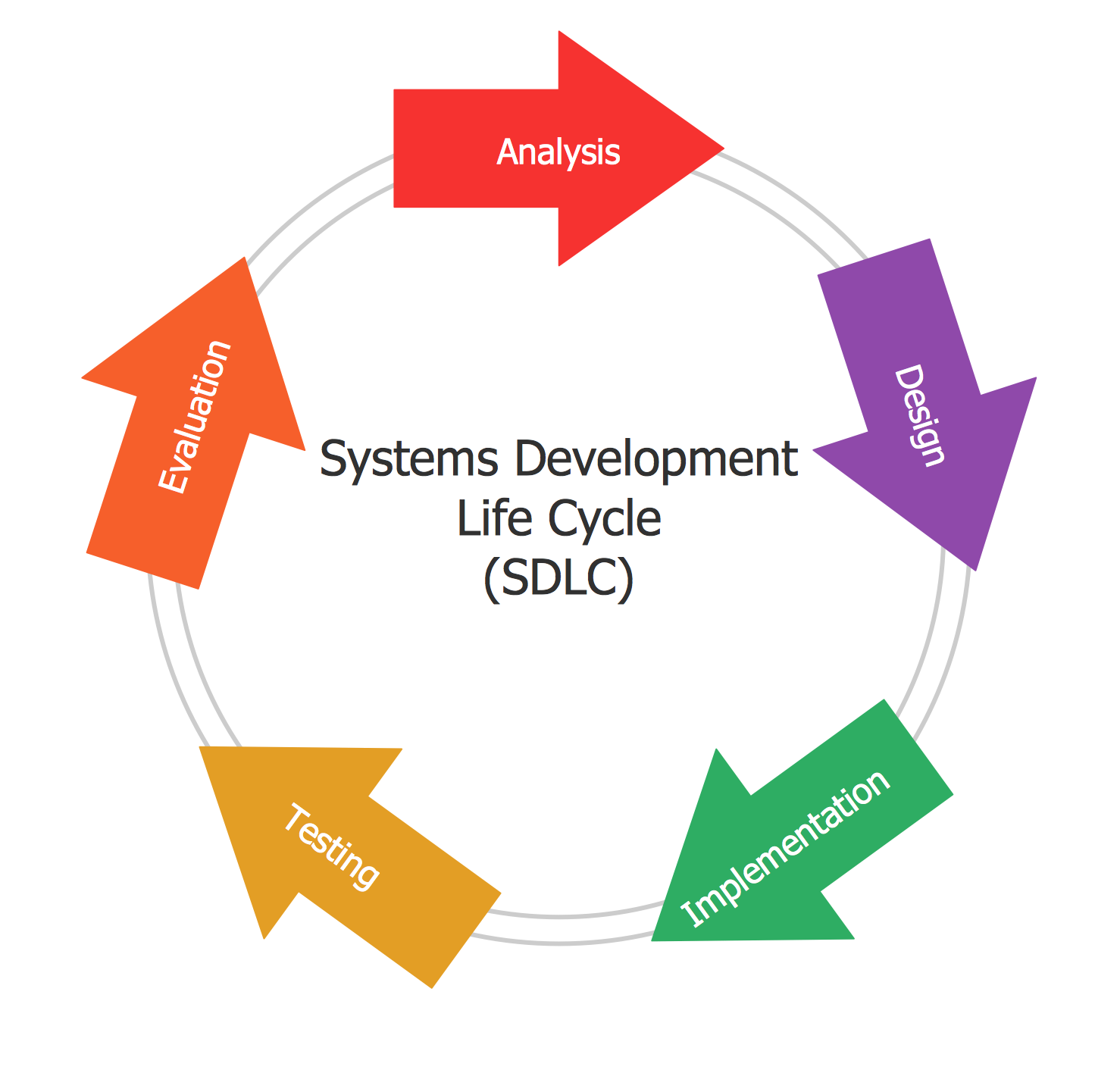
Example 13: Circular Arrows Diagram — Systems Development Life Cycle
This diagram was created in ConceptDraw DIAGRAM using the Circular Arrows Diagrams Library from the Business Diagrams Solution. An experienced user spent 5 minutes creating this sample.
This Circular Arrows Diagram shows the Systems Development Life Cycle (SDLC) applied in software engineering, systems engineering, information systems. SDLC is a period of time during which a product is developed; it starts from the moment a decision is made to develop a new product and ends with testing the finished product. This process includes five main clearly defined work phases: design, implementation, testing, evaluation, and analysis. The cycle may include some additional stages, such as planning, requirements analysis, documentation, evaluation, deployment of the information system. If they are present, you can display them in a diagram. The lifecycle model depends on the specifics, scale, complexity of the project, as well as on the specific conditions in which the system is created and operates. This diagram is clear, accurate, stylish, professional-looking and can be successfully used in different presentations, reports, conferences, reportages, reviews, etc. One can also highlight the stage which the product development is currently at.
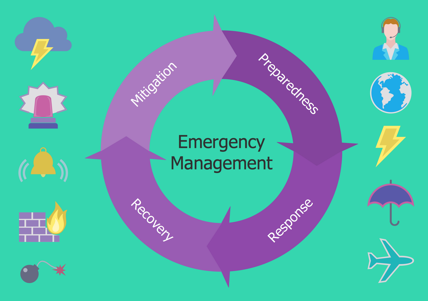
Example 14: Circular Arrows Diagram — Emergency Management Process
This diagram was created in ConceptDraw DIAGRAM using the Circular Arrows Diagrams Library from the Business Diagrams Solution. An experienced user spent 5 minutes creating this sample.
This Circular Arrows Diagram was designed based on the "Emergency Management" article and image published on the website of Downey City Hall, California, U.S. It illustrates the steps in the emergency management process to reduce vulnerability to hazards and deal with disasters if they occur. The process includes four phases: mitigation, preparedness, response, and recovery. The mitigation phase focuses on long-term measures for preventing hazards from developing into disasters, reducing effects, eliminating risks. The preparedness phase is dedicated to the development the plans of actions for when the disasters strike. The response phase includes all variety of emergency services, firefighters, police, EMS crews and first responders in the disaster areas. The recovery phase is designed to restore the affected area to its previous state, restore damaged property and other infrastructure, and re-employment. This diagram is designed based on a ready-made circular arrow object chosen from the variety offered by the Circular Arrows Diagrams solution. Bright colors and included clipart make this diagram exceptional.
Example 15: Circular Arrows Diagram — Emergency Management Exercise Cycle
This diagram was created in ConceptDraw DIAGRAM using the Circular Arrows Diagrams Library from the Circular Arrows Diagrams Solution. An experienced user spent 5 minutes creating this sample.
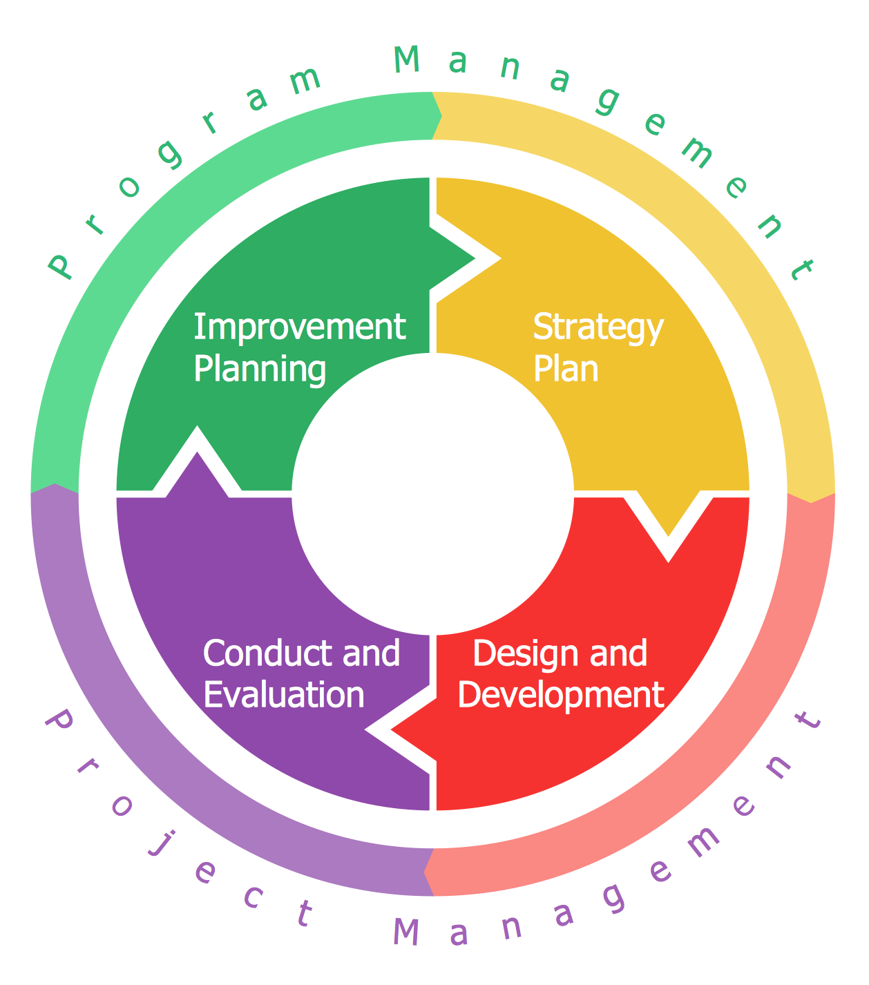
This Circular Arrows Diagram sample shows the emergency management exercise cycle stages. It was designed in ConceptDraw DIAGRAM based on the chart from the Emergency Management Institute training IS-120.b webpage placed on the website of the Federal Emergency Management Agency (FEMA) of the United States Department of Homeland Security. The exercises are realized by states, communities, and regions, and suppose the special tools and plans developed with an aim to prevent hazards and disasters of any nature, prepare for them, reduce vulnerability, effectively respond them, decrease the effect of disasters as possible, and recover all consequences. The emergency plan development requires special attention because any mistakes can entail the loss of people's lives, missing revenue, and significant assets damage as well. There are four stages included: 1) Strategy plan, 2) Improvement planning, 3) Design and development, 4) Conduct and evaluation. The first two stages refer to the program management, and the last ones — to the project management.
Example 16: Circular Arrows Diagram — Innovation Life Cycle
This diagram was created in ConceptDraw DIAGRAM using the Circular Arrows Diagrams Library from the Circular Arrows Diagrams Solution. An experienced user spent 5 minutes creating this sample.
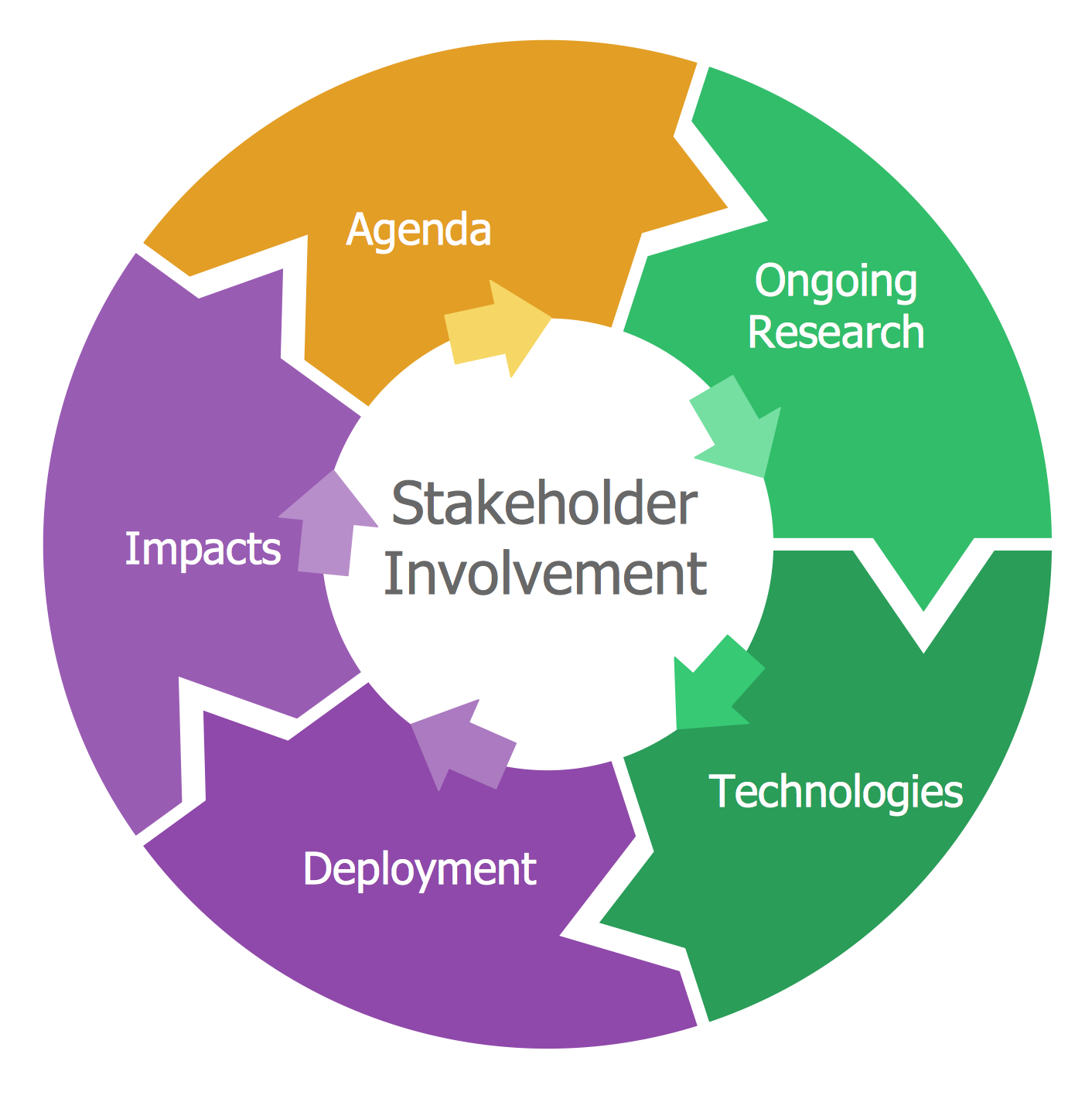
This Circular Arrows Diagram sample illustrates the innovation's life cycle stages. It was constructed based on the diagram from the website of the Federal Highway Administration (FHWA) of the U.S. Department of Transportation (DOT). The "innovation" term means the introduction of something new. The new method, device, or newest idea, better solution, are considered as the innovations and usually meet new requirements and existing market needs. This can be also the more effective process, service, or business model, more original product or technology having technical or scientific nature. Typically, the innovation "breaks into" the market and society, has a great impact on them and drives economic growth. The innovations can be found in economics, management science, IT, business, engineering, technology, sociology, history, as well as in many other fields. The social and economic innovations can occur spontaneously and can be predicted. A number of economic strategies, theories, mathematical formulas, and computerized business models are used to predict the innovations' impact.
Example 17: Circular Arrows Diagram — Performance and Power Modeling
This diagram was created in ConceptDraw DIAGRAM using the Circular Arrows Diagrams Library from the Circular Arrows Diagrams Solution. An experienced user spent 5 minutes creating this sample.
This Circular Arrows Diagram example is dedicated to performance and power modeling. It is a Performance and Architecture Laboratory (PAL) circle that includes five components: programming model, hardware, system software, runtime, and compiler. The sample was designed based on the diagram published on the U.S. Department of Energy website in the "Advanced Computing, Mathematics and Data Division Research Highlights" article from the Pacific Northwest National Laboratory (PNNL) section. PAL is a department in Pacific Northwest National Laboratory (PNNL), which focuses on the power and energy problems affecting high-performance computing (HPC) and achievement practical efficiency at the exascale. The algorithms and methods developed by PAL scientists use the accurate per-core proxy power sensor model to estimate the core's active power and provide the capability of workload-specific quantitative power modeling. The models record the workload phases, their impact on power consumption, as well as influence of the system architecture and processor clock speeds.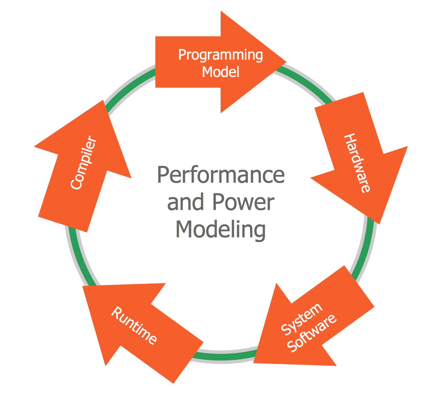
Example 18: Circular Arrows Diagram — Training and Exercise Process Wheel
This diagram was created in ConceptDraw DIAGRAM using the Circular Arrows Diagrams Library from the Circular Arrows Diagrams Solution. An experienced user spent 5 minutes creating this sample.
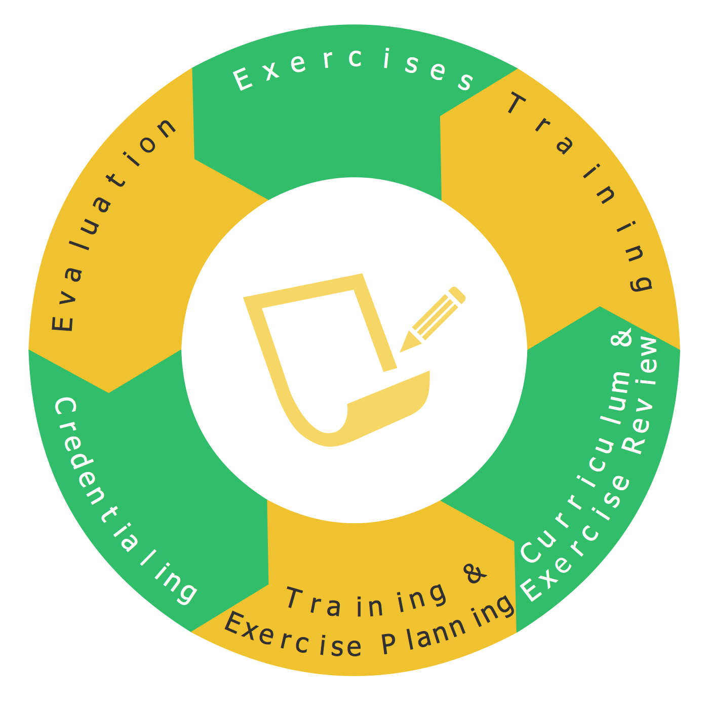
This Wheel diagram sample shows emergency preparedness training and exercise processes. It was designed based on the diagram from the "Public Health Preparedness Training and Exercise" webpage published on the FloridaHealth website of the Florida Department of Health. The diagram includes the following points: training and exercise planning, curriculum and exercise review, training, exercises, credentialing, and evaluation. The emergency preparedness term includes all steps needed to be taken to avoid emergencies, and natural or manmade disasters, to make sure the safety is ensured during and after, as well as actions for dealing. It involves the consideration and preparation of all variety of fast reaction methods in order to reduce the negative impact, mitigate and eliminate the consequences of emergencies and disasters. The organization of emergency management requires a collaborative work of all levels of government: local, state and federal, and all directions of the private sector, such as business, industry, public and voluntary organizations.
Example 19: Circular Arrows Diagram — Key Components of Performance Landscape
This diagram was created in ConceptDraw DIAGRAM using the Circular Arrows Diagrams Library from the Circular Arrows Diagrams Solution. An experienced user spent 5 minutes creating this sample.
This Circular Arrows Diagram sample was developed based on the chart from the "Performance Management — A Leadership Priority" webpage published on the US Department of State website. It shows the relationships between the key components of the performance landscape. Performance management (PM) is a system of management teams and individual employees ensuring the consistent and effective implementation of goals and achievement the maximal performance of the whole organization, as well as its separate departments and individual employees. It includes a set of effective activities aimed at common understanding the goals and approaches for organizing work and training employees and may contain a great number of tasks and special actions. This sample offers the key points and tools of performance management in a visual form of Circular Arrow Diagram: mission performance plan, bureau performance plan, department performance plan, mission performance report, department state, and USAID strategic plan.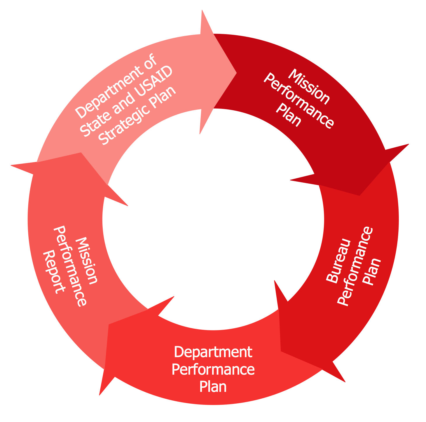
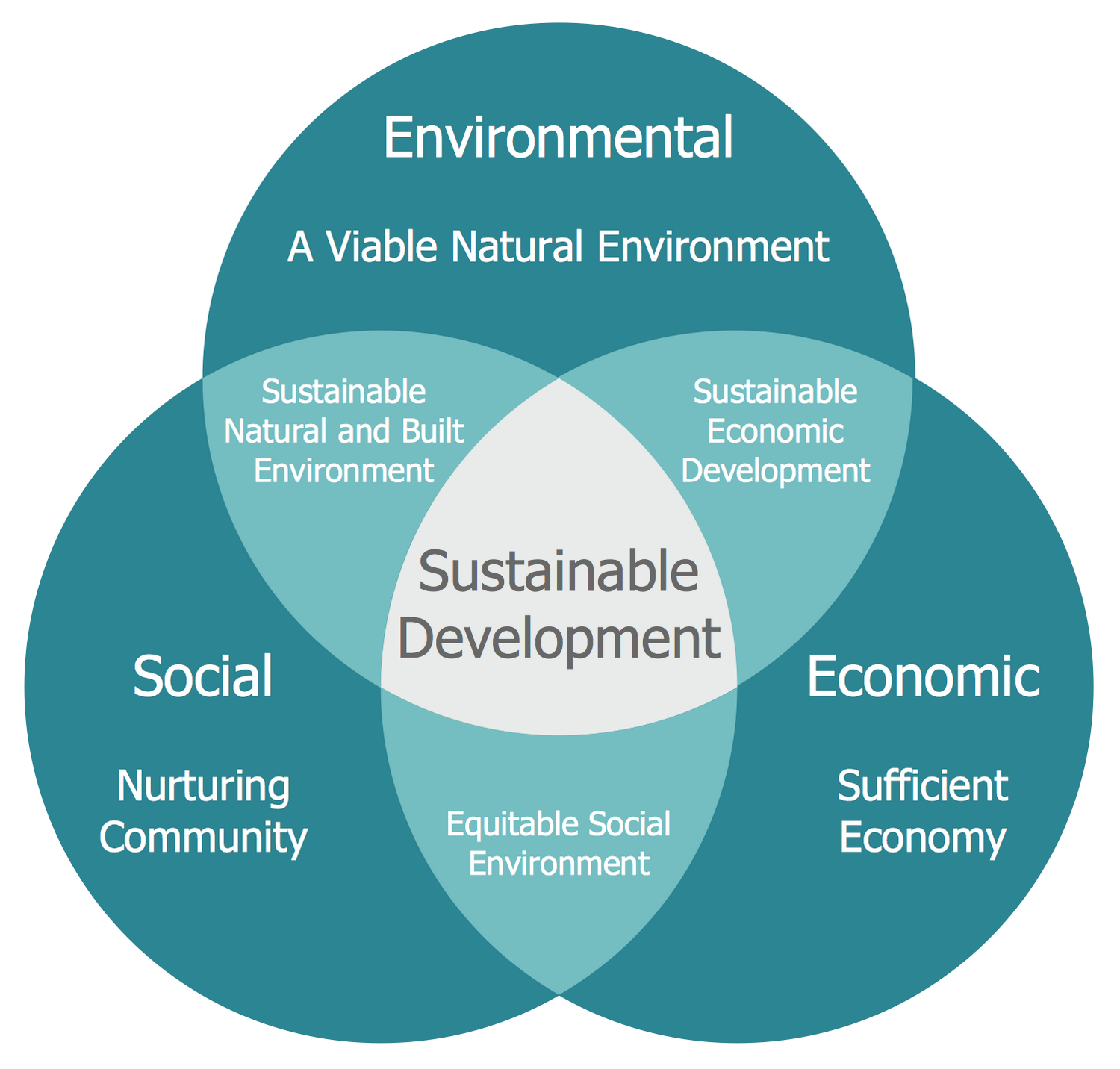
Example 20: Venn Diagram — Path to Sustainable Development
This diagram was created in ConceptDraw DIAGRAM using the Venn Diagrams Library from the Business Diagrams solution. An experienced user spent 10 minutes creating this sample.
This Venn Diagram presents the prerequisites for sustainable development, as it is influenced by economic, social, and environmental factors. It was designed based on "Sustainable development.svg" Wikimedia Commons file. Sustainable development is a synonym to harmonious and balanced development. It is a set of economic and social changes aimed at the use of natural resources in order to maintain the sustainability of natural systems and environment along with meeting the needs, aspirations and maintaining the quality of life of present and future generations. Thus, sustainable development is an organizing principle for human life on a limited territory of our planet. This development is continuing and self-sufficient, does not contradict the further existence of humanity, and contributes to its development in previous direction. Sustainable development diagram includes circles at the intersection of which a viable natural environment, a caring community, an adequate economy, a stable natural and artificial environment, sustainable economic development, and a fair social environment are represented.
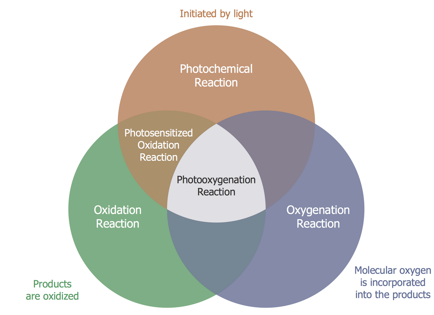
Example 21: Venn Diagram — Photooxygenation
This diagram was created in ConceptDraw DIAGRAM using the Venn Diagrams Library from the Business Diagrams solution. An experienced user spent 10 minutes creating this sample.
This Venn Diagram visually shows the attributes and components of a photooxygenation reaction, which is a light-induced oxidation reaction in the result of which molecular oxygen is incorporated into the products. The initial interest in these reactions was intended by observations of influencing light, oxygen, and photosensitizers on the cells, DNA and amino acids, and fixing their high toxic. The light is a key factor influencing the happened reaction, which has three mechanisms: oxygenation, photochemical, and oxidation. The combination of the last two calls the photosensitized oxidation reaction. Photooxygenation finds its application in organic synthesis and photodynamic therapy. This diagram is bright, attractive, professional-looking, and aptly differentiates photochemical and oxidation terminology, so it can be successfully used in presentations, reports, and scientific reviews. According to the intermediates, the photooxygenation reactions are classified by the type (I to III), at your request this and other additional information can be added as notes in the diagram.
More Examples and Templates

Conceptual Diagram

Cumulative CO2 Emissions, 1751-2012

CWF Smart Grid Bubbles

Deposit Energy Change, 1971-2010

Global Cumulative Energy related CO2 Emissions

Bubble Diagram Template

CEEBL Structure

Division of Thematic Maps

Factors Related to Pedestrian Safety and Morbidity

Porter Five Forces Model

TrialNet Clinical Center

Core Vocabulary

TrialNet Clinical Center

Circle-spoke Diagram Template

Emergency Management Exercise Cycle

Innovation Life Cycle

Performance and Power Modeling

Training and Exercise Process Wheel

Key Components of Performance Landscape

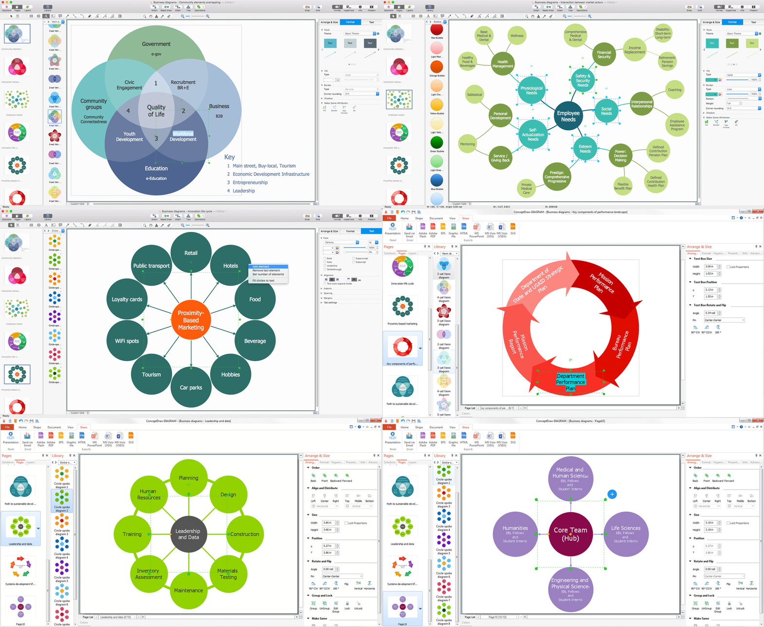
Venn Diagram — Community Elements Overlappin
Inside
What I Need to Get Started
After ConceptDraw DIAGRAM is installed, the Business Diagrams solution can be purchased either from the Management area of ConceptDraw STORE itself or from our online store. Thus, you will be able to use the Business Diagrams solution straight after.
How to install
First of all, make sure that both ConceptDraw STORE and ConceptDraw DIAGRAM applications are downloaded and installed on your computer. Next, install the Business Diagrams solution from the ConceptDraw STORE to use it in the ConceptDraw DIAGRAM application.
Start using
Start using the Business Diagrams solution to make the professionally looking business planning diagrams by adding the design elements taken from the stencil libraries and editing the pre-made examples that can be found there.
Venn Diagrams
A Venn diagram, sometimes referred to as a set diagram, is a diagramming style used to show all the possible logical relations between a finite number of sets. In mathematical terms, a set is a collection of distinct objects gathered together into a group, which can then itself be termed as a single object. Venn diagrams represent these objects on a page as circles or ellipses, and their placement in relation to each other describes the relationships between them.
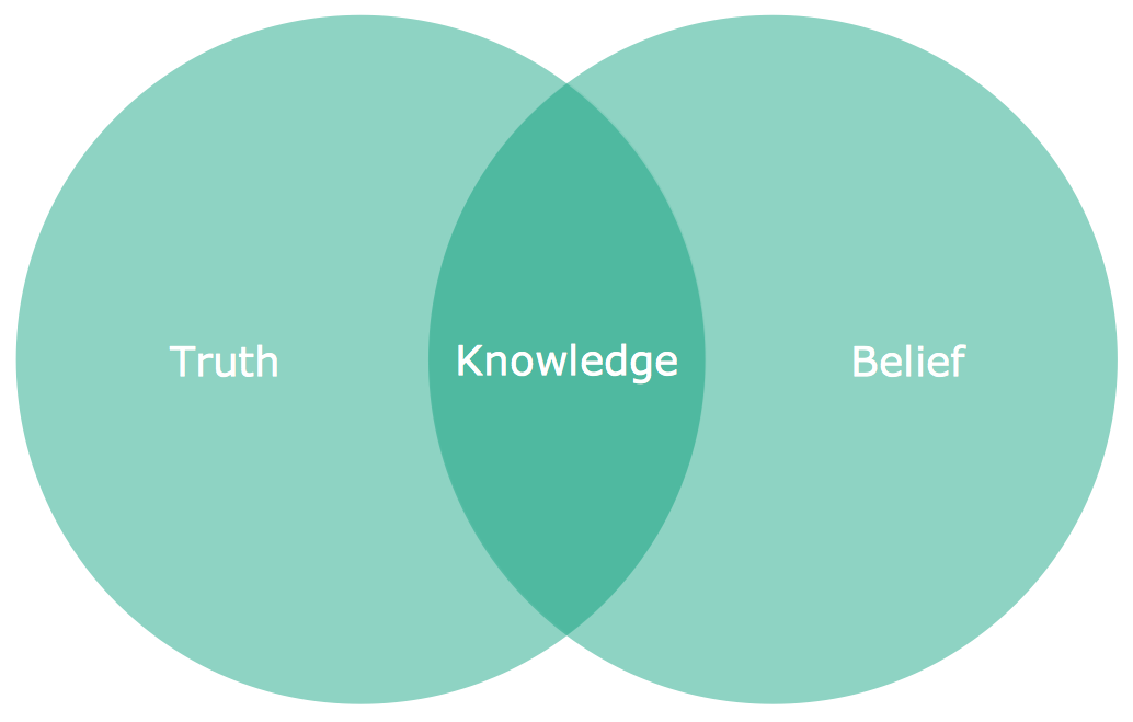
Simple Venn diagram showing two sets and their intersection made with ConceptDraw DIAGRAM
Commonly a Venn diagram will compare two sets with each other. In such a case, two circles will be used to represent the two sets, and they are placed on the page in such a way as that there is an overlap between them. This overlap, known as the intersection, represents the connection between sets — if for example the sets are 'mammals' and 'sea life', then the intersection will be 'marine mammals', e.g. dolphins or whales. Each set is taken to contain every instance possible of its class; everything outside the 'union' of sets (union is the term for the combined scope of all sets and intersections) is implicitly not any of those things — not a mammal, doesn't live underwater, etc.
The structure of this humble diagram was formally developed by the mathematician John Venn, but its roots go back as far as the 13th Century, and includes many stages of evolution dictated by a number of noted logicians and philosophers. The earliest indications of similar diagram theory came from the writer Ramon Llull, who's initial work would later inspire the German polymath Leibnez. Leibnez was exploring early ideas regarding computational sciences and diagrammatic reasoning, using a style of diagram that would eventually be formalized by another famous mathematician. This was Leonhard Euler, the creator of the Euler diagram.
Euler diagrams are similar to Venn diagrams, in that both compare distinct sets using logical connections. Where they differ is that a Venn diagram is bound to show every possible intersection between sets, whether objects fall into that class or not; a Euler diagram only shows actually possible intersections within the given context. Sets can exist entirely within another, termed as a subset, or as a separate circle on the page without any connections — this is known as a disjoint. Furthering the example outlined previously, if a new set was introduced — 'birds' — this would be shown as a circle entirely within the confines of the 'mammals' set (but not overlapping 'sea life'). A fourth set of 'trees' would be a disjoint — a circle without any connections or intersections.
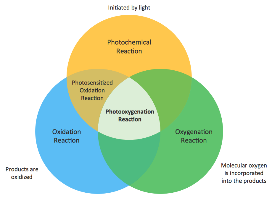
3-set Venn with 'empty' intersections, made using ConceptDraw DIAGRAM
Logician John Venn developed the Venn diagram in complement to Euler's concept. His diagram rules were more rigid than Euler's — each set must show its connection with all other sets within the union, even if no objects fall into this category. This is why Venn diagrams often contain only 2 or 3 sets, and the diagram may lose its symmetry and become overly complex. Venn made allowances for this by trading circles for ellipses and arcs, ensuring all connections are accounted for whilst maintaining the aesthetic of the diagram.
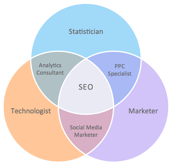
The ConceptDraw solution Venn Diagrams contains pre-made Venn templates
Usage for Venn diagrams has evolved somewhat since their inception. Both Euler and Venn diagrams were used to logically and visually frame a philosophical concept, taking phrases such as some of x is y, all of y is z and condensing that information into a diagram that can be summarized at a glance. They are used in, and indeed were formed as an extension of set theory — a branch of mathematical logic that can describe object's relations through algebraic equation.
Now the Venn diagram is so ubiquitous and well ingrained a concept that you can see its use far outside mathematical confines. The form is so recognizable that it can shown through mediums such as advertising or news broadcast and the meaning will immediately be understood. They are used extensively in teaching environments — their generic functionality can apply to any subject and focus on my aspect. Whether creating a business presentation, collating marketing data, or just visualizing a strategic concept, the Venn diagram is a quick, functional, and effective way of exploring logical relationships within a context.
As ever with any common (and not-so-common) diagramming technique, CS Odessa want to provide you with the tools needed to produce highly effective, professional diagrams, in the style that suits you. The Venn Diagrams solution for ConceptDraw DIAGRAM contains a library of 12 pre-built Venn diagrams, with options for 2, 3, 4 or 5 set variants, displayed using a range of color palettes. Just pick your style, fill in your text, and your work is almost done. From there you can choose to export your diagram into a presentation, open using other diagramming software, or use in conjunction with other services from the ConceptDraw Office suite. Help is on hand if you need it, from How-To guides, to video tutorials, not forgetting our huge online help desk.
For easy-to-make diagrams you'll use every day, take the Venn Diagrams solution for ConceptDraw DIAGRAM.
Circular Arrows Diagrams
The use of circular arrows as a simple diagram style is used by brainworkers to visually represent a circular, repeatable process or lifecycle. Steps in the process are shown as a segment of a ring, an arced section ending in an arrow that indicates the direction of process flow. In this way, the process forms a continuous loop; the last step of the process leading back to the first.
Circular arrows diagrams are used in many different business and educational settings, and can go under a number of different names depending on user preference. Here are a few alternate synonyms that may be used:
- Arrows cycle diagram
- Circle arrows diagram
- Circular chevron diagram
- Circular flow diagram
- Circular multi-arrows diagram
- Circular process diagram
- Cycle diagram
- Segmented cycle diagram
Each one essentially describes the same style. Through this basic premise, a large variety of physical processes and conceptual theories can be explored, presented and analyzed. In a business environment, circular arrows diagrams are used to distil company strategies into easily digestible and repeatable slogans that can form the basis of internal company policy. Their use is also widespread in marketing and sales — here the cycle can include point of sales and customer interactions, to give some feedback on processes that are external to the business. Product lifecycles, corporate standards, or a design process; all can be shown using circular arrows.
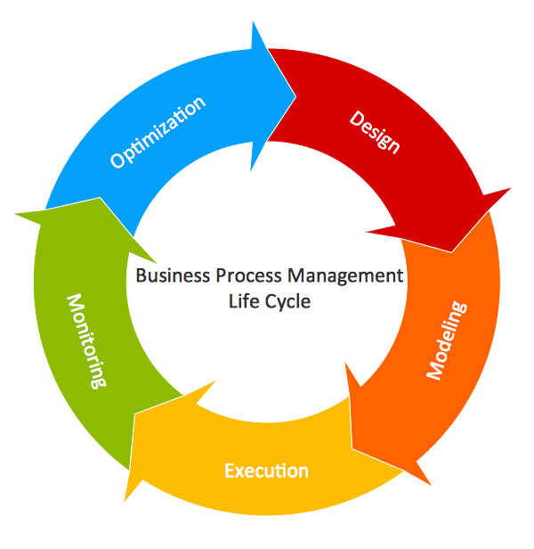
A basic circular arrows diagram, made using ConceptDraw DIAGRAM, with the central concept stated
With a neat, succinct form that can break any topic into inter-related points, circular arrows diagrams are an ideal method for sharing relatively complex ideas with a large audience, pointing to a central concept in a way that's easy for the viewer to follow — the idea of cyclic processes is an intuitive one, with each point leading directly to the next, and all in support of base subject. Due to this, it is common to find circular arrows diagrams in advertising, news media, infographics, and as an educational tool — often as a visual reference to a central theme, accompanied by supporting text or illustrations.
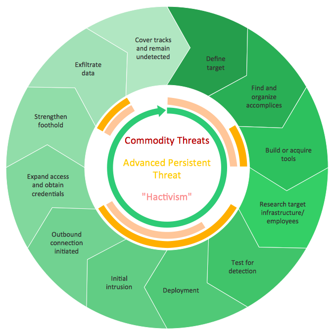
This diagram uses a color scheme for additional information — shades of green denote process start/end, while colored arcs reference the central text
ConceptDraw DIAGRAM can now be extended with the tools needed for those wishing to use this diagramming technique. The Circular Arrows Diagrams solution supplies knowledge workers with a full package of templates, vector graphic stencils, and help and learning materials to give users of any experience a helping hand with their diagramming.
The vector graphics within the solution library are professionally designed, especially for ConceptDraw DIAGRAM, with its powerful features and functionality that allow for full control and a variety of visual styles when creating your diagram. The solution is adaptable — segments can be added and taken away from the initial design with just a few clicks of a button, and a full range of color options let you give your diagram the aesthetic you need.
Circular arrows diagrams can be stand alone concepts, viewed directly as they were made through DIAGRAM. For those with wider needs for their diagram, ConceptDraw is on hand to help — a full range of exporting options and presentation facilities are offered, to ensure your diagram is seen by those who need to see it. As an integrated part of the ConceptDraw Office suite, diagrams made in DIAGRAM can be shared with other ConceptDraw products to improve project materials and facilitate teamwork.
The Circular Arrows Diagram for ConceptDraw DIAGRAM is another invaluable tool for business people, knowledge workers and educators.
Bubble and Circle-Spoke Diagrams
Throughout all stages of product or process design, in all forms of industry, a variety of diagrams are employed in order to model processes, explore improvements and solutions, and test design limits and parameters. From these, there are a particular set of diagrams used most commonly in the early, conceptual stages of design, that all follow a similar visual arrangement — that is, a central topic radiating lines that connect to several relevant sub-topics. Each topic is represented by a shape, and the connecting lines show the relationships between them.
Some of these types of diagram, such as brainstorm diagrams, concept maps, or mind maps, can be used a collaborative tool, where people share information and ideas and commit them to page as soon as they come to mind. The upshot of this method of diagramming is that you are left with a free-form map, full of relevant data but with little in the way of structure. Bubble and circle-spoke diagrams share the brainstorm aesthetic and are similar in creation, but differ in that they offer the designer a chance to show a certain level of hierarchy within a process.
Bubble diagrams
Bubble diagrams have a number of design features that set them apart slightly from diagrams mentioned previously. As the name suggests, each topic is framed on the page by a 'bubble' shape — the size of which is determined by the importance of the subject. Unlike a concept map, a bubble diagram can contain two or more central topics; position of the topic on the page initially isn't as relevant as the size of the bubble, and what other bubbles it links to.
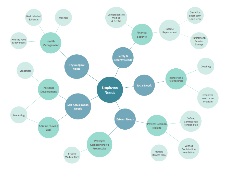
A bubble diagram designed using ConceptDraw DIAGRAM, that can be used for HR
Both physical structure and abstract theory can be modeled using a bubble diagram. They are widely used throughout landscaping and architecture to give a basic visual representation of space required for functions throughout a building or developed area. For instance, an architect tasked with constructing a museum would show 'Exhibits' as their biggest bubble. A smaller bubble would be 'Toilets', which would need to be connected strategically to the exhibits and the gift shop.
Conceptually, bubble diagrams make it possible to attach greater importance on certain topics or processes, using multiple central topics to represent sales, marketing, and production divisions within one company for example.
In both instance, bubble diagrams offer a 'quick-sketch' way of structuring concepts, whereby a designer can work fluidly, moving and reshaping topics as their relevance and relationship with other ideas becomes apparent. For the architect mentioned above, their diagram will eventually take the shape of a floor plan, showing the flow between bubbles/rooms. In other types of business, bubble diagrams can show where separate team strategies have a shared influence, using a more free-flowing logic to describe relationships.
Circle-spoke diagrams
A circle-spoke diagram can be looked at as a simpler, less detailed variant of the bubble diagram. It again deals with a central topic or concept, however only factors directly associated with it are listed — the topics place in a wider process is ignored at this point. Relevant factors are arranged around the centre in a wheel pattern, joined to the main topic by 'spokes'. The circles that contain each topic are of equal size, to denote their equal standing in regards to their influence.

Exploring all possibilities of healthy living, using a circle-spoke diagram created with ConceptDraw DIAGRAM
Sometimes called circular hub diagrams, they are used in business to determine a finite number of possible factors that affect a central theme — a marketing team might use one to list areas of product promotion; TV, social media, magazines and so on. A key design feature is that no judgment is made as to the strength of a particular factor, that the spokes are set out at equal distance. A good example for clarity would be a diagram with a schoolteacher as the central circle subject, and each of their students is represented by a spoke.
From concept to ConceptDraw
Since creating their powerful diagramming software, ConceptDraw DIAGRAM, CS Odessa have remained committed to extending its usability and functionality with a series of solutions designed for workers and students from many diverse fields of industry. The tools provided in Solution Park help everyone from software engineers to sales analysts; school teachers to scientists. ConceptDraw DIAGRAM can be used throughout the business to detail software systems, describe telecommunications, create business results dashboards, or depict management and sales processes.
With the Bubble Diagrams and Circle-Spoke Diagrams solutions for ConceptDraw DIAGRAM, you are given all the design elements needed to create bright, engaging diagrams that can be used effectively as learning materials, as part of a presentation, or simply as a method of visual thinking. Each solution comes complete with a library containing all the design elements needed to create a diagram of each type, and each solution page offers a series of samples to show the capabilities of the software. As always with ConceptDraw solutions, there is a wealth of learning material (FAQs and videos) to help any novice designer.
Used in conjunction with other solutions from CS Odessa, you can start to add bubble or circle-spoke diagrams to infographics, PowerPoint presentations, or as part of an educational resource. This unique cross functionality, both in terms of solutions and file export options, is what makes ConceptDraw DIAGRAM such a versatile diagramming tool — workers of all professions can find a solution that will make their life easier.


