Flowchart Design: Principles, Layout, Symbols and Best Practices
Flowchart design is the practice of structuring a process diagram so it is clear, readable, and easy to follow. It combines standardized symbols, logical layout, visual hierarchy, and consistent flow direction to make workflows easier to understand and apply in real processes.
This includes organizing workflow visualization, diagram layout, and process mapping so steps and decisions can be interpreted quickly and consistently.
Unlike a general flowchart overview or a symbol reference, this page focuses specifically on flowchart design principles — how diagram layout, symbol placement, and visual structure affect readability and decision clarity in real workflows.
For a complete overview of diagram concepts, symbols, and workflow structure, see our flowchart guide.
In short: effective diagram design combines clear structure, consistent symbols, and logical flow so complex workflows can be understood at a glance.
Flowchart design is also referred to as process diagram design or workflow diagram layout—terms used interchangeably to describe structuring visuals for clarity and usability.
This hero visual introduces the main principles of flowchart design: clear structure, standard symbols, logical direction, and readable branching.
The sections below explain the principles of flowchart design, common mistakes to avoid, and practical methods for creating clear process diagrams.
What Is Flowchart Design?
A strong flowchart design uses standard symbols, clear labels, balanced spacing, and a logical layout that supports a natural reading path.
Well-designed flowcharts are used to document processes, analyze workflows, communicate system logic, and reduce confusion in business and technical diagrams. These diagrams are widely used in business process modeling, systems analysis, and operational workflow documentation.
Why Good Flowchart Design Matters
Good flowchart design improves clarity and efficiency—it helps teams review logic faster, reduces misinterpretation, and makes complex workflows easier to explain.
When symbols, spacing, and decision paths are structured consistently, the diagram becomes a practical working document rather than just a visual summary. This creates a natural foundation for the design principles below.
In practice, flowchart design also involves decisions about scope, naming conventions, and level of detail, which determine whether a diagram is used for quick explanation, detailed analysis, or formal documentation.
Core Flowchart Design Principles
Before adjusting colors or formatting, it is important to understand the core flowchart design principles that ensure readability.
Logical Flow Direction
Most flowcharts should follow a top-to-bottom or left-to-right reading pattern. A predictable visual direction helps readers understand the sequence of actions without hesitation.
Consistent Use of Standard Symbols
Standard symbols such as process, decision, input/output, and terminator shapes make diagrams easier to interpret and reduce ambiguity.
Visual Hierarchy and Decision Emphasis
Decision points should stand out through spacing, placement, and restrained use of color so branching logic remains easy to follow.
Alignment, Spacing, and Line Control
Even alignment, balanced spacing, and minimal crossing lines improve legibility.
Using Color in Flowchart Design
Color should support structure, not distract. In most cases, two to four colors are enough to highlight key steps or decisions.
This visual explains how a clear main path, readable branching, and controlled feedback loops help maintain structure in complex flowcharts.
These principles become easier to apply when the diagram is viewed not only as a sequence of steps, but as a structured system with entry points, branches, merges, and exit paths.
This structural perspective leads directly to how flowcharts are organized at a diagram level.
Flowchart Structure and Diagram Architecture
A clear flowchart design depends on how symbols are arranged. Good diagram architecture helps readers understand the workflow quickly without tracing multiple lines or jumping between sections.
Primary Process Path
The main process flow should be visually dominant and easy to follow.
Decision Branches
Decision paths should be placed so that alternative outcomes remain easy to compare.
Return Paths and Loops
When processes include loops or feedback steps, these connections should be placed carefully to avoid confusion.
| Structure | Description |
|---|---|
| Sequence | A linear series of steps performed one after another. This is the most common and simplest flow structure. |
| Decision (Conditional) | A branching structure based on a condition, usually represented with a decision symbol (diamond) and labeled outcomes such as Yes/No. |
| Merge | A point where two or more branches return to a single path, helping the reader understand how the process continues after a decision. |
| Loop / Feedback | A return path that sends the flow back to an earlier step when the process must be reviewed, corrected, or repeated. |
These structures are often combined into layout types such as linear flowcharts, branching diagrams, and cross-functional (swimlane) diagrams that organize processes across roles or systems.
These layout types define how information is arranged visually and help determine how easily a process can be read and understood.
Choosing between these layout types depends on process complexity, number of decision points, and whether responsibilities must be separated across roles or systems.
In advanced diagrams, these structures may extend to cross-functional layouts, grouped areas, or multi-level diagrams separating high-level overviews from detailed subprocesses.
In process mapping and workflow diagrams, these choices determine how responsibilities, handoffs, and decision ownership are represented across roles or systems, including hierarchical structures and swimlanes for clarity at scale.
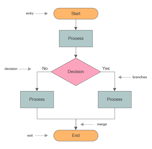
This flowchart structure visual shows how a process enters the diagram, branches at a decision point, merges again, and exits in a clear and readable way.
These structural choices become easier to evaluate when a clear and cluttered diagram are compared side by side. The next section shows how design quality affects readability in practice.
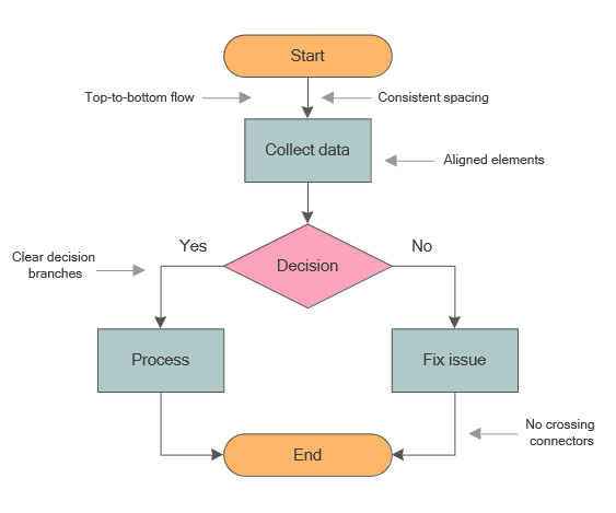
Good vs. Poor Flowchart Design
A clear flowchart is easier to read and review. Comparing strong and weak structures makes design rules easier to apply.
A well-designed flowchart uses consistent symbols, balanced spacing, and a predictable reading path. Poor flowchart design often includes crossing lines, uneven alignment, inconsistent shapes, and too many colors.
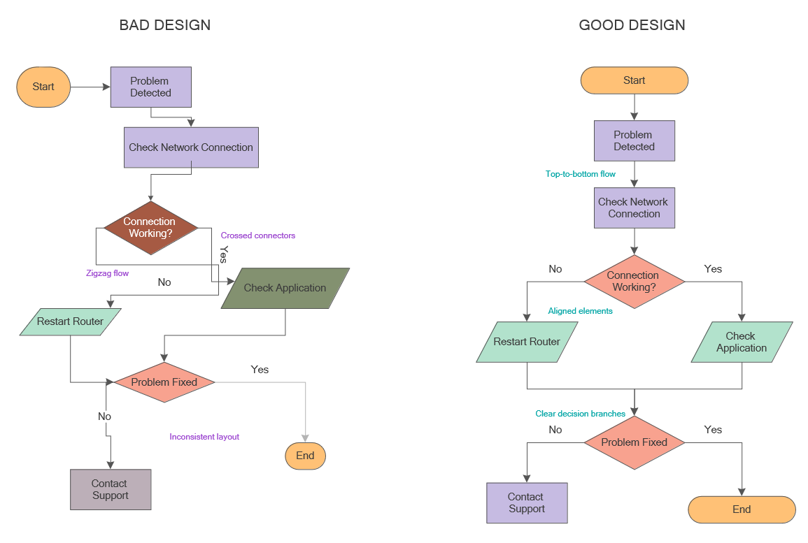
This comparison shows how aligned elements, clear decision branches, and a top-to-bottom reading path improve diagram readability.
This comparison is especially useful before moving on to practical best practices, because it shows how readability decisions affect the final diagram.
Flowchart Design Best Practices
Once the structure is defined, applying flowchart design best practices improves readability and consistency as diagrams grow more complex.
These best practices also apply to workflow and process diagrams, where consistent layout is essential for accurate interpretation.
They are especially important in workflow visualization and process mapping, where clarity directly affects how accurately a process is interpreted.
How to Keep a Flowchart Easy to Read
Use concise labels, keep the sequence direct, and avoid unnecessary branching so the flow can be followed without hesitation.
How to Avoid Layout and Structure Mistakes
Try to avoid crossing lines, inconsistent spacing, and overuse of specialized symbols. When the visual logic is unstable, even a correct process can become difficult to understand.
When to Split Large Flowcharts into Multiple Diagrams
If a diagram becomes too wide, too deep, or too crowded, it is better to divide it into smaller linked flowcharts. This preserves clarity while keeping the full process documented.
Before finalizing a diagram, review these practical points:
- Is the main path readable without tracing every connector?
- Are decision outcomes clearly labeled and visually separated?
- Do repeated loops or corrections stay understandable at a glance?
- Would splitting the diagram improve clarity more than keeping it on one page?
These checks help establish a strong baseline before reviewing the most common design mistakes in detail.
This layout rules visual highlights the structural choices that make a flowchart easier to read, including alignment, spacing, and clean connector paths.
Even with good practices, layout and structure mistakes can reduce readability. Understanding common mistakes helps prevent these issues.
Common Flowchart Design Mistakes
- Using too many specialized symbols
- Crossing connector lines
- Inconsistent spacing between steps
- Excessive branching in a single diagram
- Overusing color or formatting
Once common mistakes are avoided, the next step is verifying that the diagram is actually easy to understand. A simple readability check helps confirm that the flowchart communicates the process clearly.
This moves the review process from prevention to validation.
How to Test Flowchart Readability
After designing a diagram, test whether it can be understood quickly by someone unfamiliar with the process.
- Follow the process from start to end without reading the labels.
- Check whether decision paths are visually clear.
- Verify that no connector lines cross unnecessarily.
- Ensure that the diagram can be understood in a single reading pass.
| Check | What to confirm |
|---|---|
| Flow direction | The reader can follow the process from start to end without hesitation. |
| Decision clarity | Each decision branch is easy to distinguish and leads to a clear next step. |
| Connector logic | Lines do not cross unnecessarily or force the eye to jump around the page. |
| Label readability | Text is concise, legible, and consistent across the diagram. |
After confirming that the diagram structure is clear, it is useful to review the symbols and visual elements that form the foundation of most flowchart designs.
This helps ensure the diagram remains consistent with standard flowchart and workflow conventions.
Flowchart Symbols and Design Elements
Flowcharts use standardized shapes to represent steps, decisions, data, and connectors, shaping the visual logic of a workflow.
Because flowcharts rely on standardized symbols, consistency in shape choice and connector logic is essential for readability.
To learn more about the meaning of individual shapes, see our flowchart symbols reference and process flowchart symbols guide. Here, the focus is on how those symbols work together within an effective diagram layout.
Standard Flowchart Symbols
Process, decision, terminator, input/output, and connector symbols form the basis of most diagrams. Keeping these shapes recognizable is one of the simplest ways to improve diagram clarity.
| Symbol | Role in the Diagram |
|---|---|
| Terminator | Marks the start or end of the process and defines the boundaries of the flow. |
| Process | Represents an action or task within the workflow. |
| Decision | Introduces branching logic and determines the next path based on a condition. |
| Connector | Guides the reader from one step to the next and helps maintain the logic of the process flow. |
Once the design elements are clear, the next question is how to assemble them into a complete diagram step by step.
How to Design a Flowchart
How to design a flowchart starts with choosing a layout, placing symbols in sequence, and refining the diagram.
Start with a Template or Blank Layout
Begin with a predefined flowchart template when speed and consistency matter, or use a blank document when the process requires a custom structure.
In practice, selecting a template or layout should depend on whether the process is linear, decision-driven, or cross-functional.
Place Process and Decision Symbols
Arrange the main steps of the process first, then insert decision points where branching logic occurs. This creates the basic structure of the workflow before visual refinement begins.
Connect Steps with Clear Flow Direction
Use connectors and arrows to guide the reader through the sequence. The path should remain visually obvious even before labels are read in detail.
Align, Format, and Improve the Diagram
Adjust spacing, alignment, and style to make the diagram more readable. This stage is where design quality becomes visible and the flowchart begins to function as a polished communication tool.
Export and Share the Finished Flowchart
After refinement, the completed diagram can be shared, reviewed, and exported for presentation, documentation, or process improvement work.
When refining a diagram, it is also useful to review how steps are named, how decisions are labeled, and whether each connector clearly communicates the direction of flow. Consistent naming and labeling help ensure that the diagram remains understandable across teams and use cases.
Define a consistent naming style for steps and decisions so labels remain short, action-oriented, and aligned with the diagram’s purpose.
In real-world diagramming, consistent naming and structure are key indicators of a well-designed process that can be understood across teams.
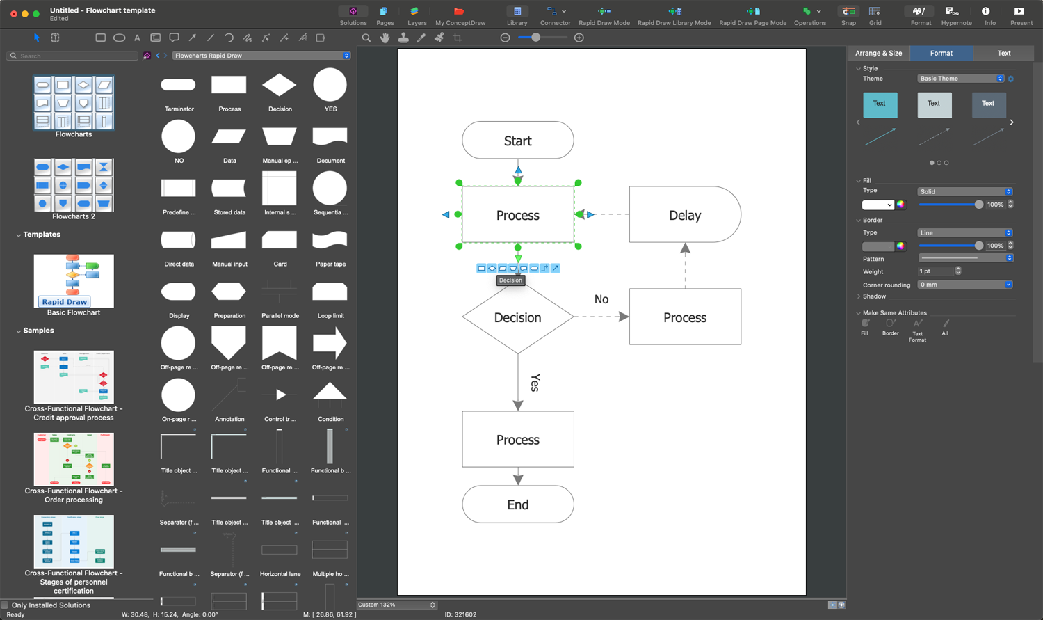
This interface example shows how a flowchart can be assembled and refined using standard symbols, connectors, and diagramming tools.
After the design process is clear, real examples help show how these principles work together in complete diagrams.
Flowchart Design Examples
Examples make flowchart design rules easier to understand by showing how layout, symbol choice, and process logic appear in finished diagrams. You can also explore more complete flowchart examples.
At this stage, examples are useful not as a catalog of industries, but as proof that design principles such as alignment, spacing, and readable branching work in real diagrams.
- Simple examples show how a clean primary path improves readability.
- Decision-based examples reveal whether branching logic stays easy to follow.
- Cross-functional examples test whether ownership and handoffs remain visually clear.
In practice, reviewing a complete example step by step helps reveal how layout, symbols, and flow direction work together and where refinement may be needed.
For example, a request approval flow can be expanded step by step from a simple linear sequence into a branching structure with decision outcomes, loops for revisions, and clearly defined entry and exit points.
Other examples, such as onboarding, support triage, or document review workflows, may require different levels of branching, ownership visibility, and detail.
When reviewing examples, it is useful to compare how different layouts handle complexity, including how they separate main flows from secondary paths and how clearly they represent ownership, decisions, and outcomes.
Different examples show how diagrams scale from simple linear flows to complex, multi-branch or cross-functional structures.
Creating and refining these diagrams effectively depends on the tools used to build them.
Flowchart Design Software
Professional flowchart software helps users apply design principles more efficiently by providing symbol libraries, alignment tools, layout controls, and export options. These features make it easier to create consistent process diagrams without starting from scratch each time.
On this page, software is presented as a practical tool that supports clear diagram design, not as a substitute for design thinking.
In addition to basic diagramming features, advanced tools may support alignment guides, automatic layout adjustments, and template systems that help maintain consistency across multiple diagrams and teams.
Some tools support collaboration, version control, and standardized templates, especially in larger teams working on shared process documentation.
These capabilities are particularly important when maintaining consistency across multiple diagrams or scaling process documentation within an organization.
Tool choice depends on whether the priority is fast template-based drafting, collaborative review, or long-term process documentation.
Summary
Effective flowchart design combines standardized symbols and logical structure to create readable diagrams.
In practice, strong flowchart design depends on more than the shapes themselves. It comes from applying clear principles, learning from examples, and using tools that support consistency rather than clutter.
In real-world workflows, these diagrams are often refined through iteration and team feedback to ensure clarity across different levels of expertise and to evolve alongside the processes they represent.
In summary: effective flowchart design relies on clear structure and consistent symbols to help readers understand processes quickly.
To continue learning about clear process-diagram design, the related guides below expand on standard symbols, real diagram examples, and software tools used to create professional process diagrams.
The questions below address practical points that often come up when applying flowchart design principles in real diagrams.
Flowchart Design FAQ
What are the main principles of flowchart design?
The main principles are clear flow direction, consistent symbol usage, balanced spacing, minimal crossing lines, and readable visual hierarchy.
What makes a flowchart easy to read?
A readable flowchart uses standard symbols, concise labels, even alignment, and a predictable path from one step to the next.
How many colors should a flowchart use?
In most cases, two to four colors are enough. Color should support the structure of the diagram rather than distract from it.
When should a flowchart be split into multiple diagrams?
If a process becomes too large, too complex, or difficult to follow on one page, it is better to divide it into smaller linked diagrams.
What symbols are most important in flowchart design?
The most commonly used symbols are terminator, process, decision, input/output, and connector shapes. These cover most standard workflow needs.
What is the best layout for a flowchart?
The best layout is usually top to bottom or left to right, with consistent spacing, clear decision branches, and minimal crossing lines. The right layout depends on the complexity of the process, but readability should always come first.
What software can be used to design flowcharts?
Diagramming tools with symbol libraries, alignment controls, and export options make it easier to create structured and readable flowcharts.
What is the difference between a flowchart and a workflow diagram?
A flowchart typically focuses on process logic and decision flow, while a workflow diagram may emphasize roles, responsibilities, and task ownership within a process.
How detailed should a flowchart be?
The level of detail depends on the purpose of the diagram. High-level flowcharts show the main process steps, while detailed diagrams include decision paths, exceptions, and supporting actions.
What is process mapping in relation to flowchart design?
Process mapping uses flowcharts and related diagrams to document, analyze, and improve workflows as part of broader workflow visualization and process optimization.
After understanding the principles and techniques of flowchart design, using professional tools can help apply these concepts more efficiently in real-world diagrams.
This connects design knowledge with practical implementation, enabling diagrams to be created, refined, and shared more efficiently.