HelpDesk
How to Create Data-driven Infographics
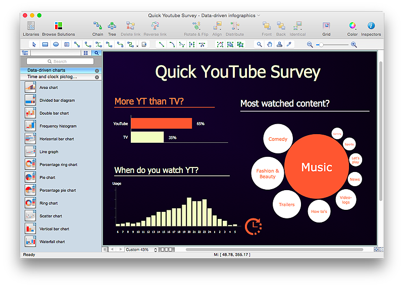
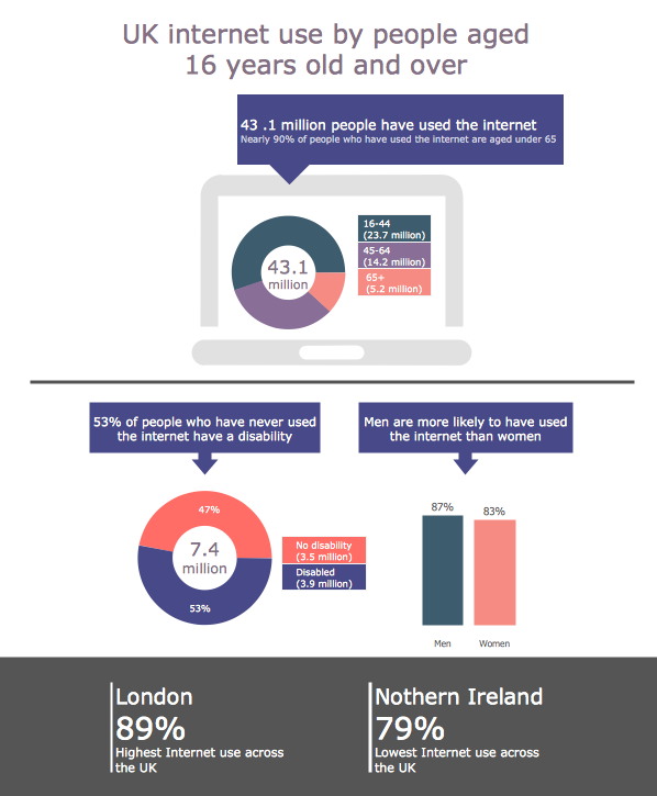
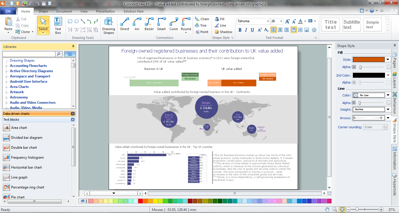
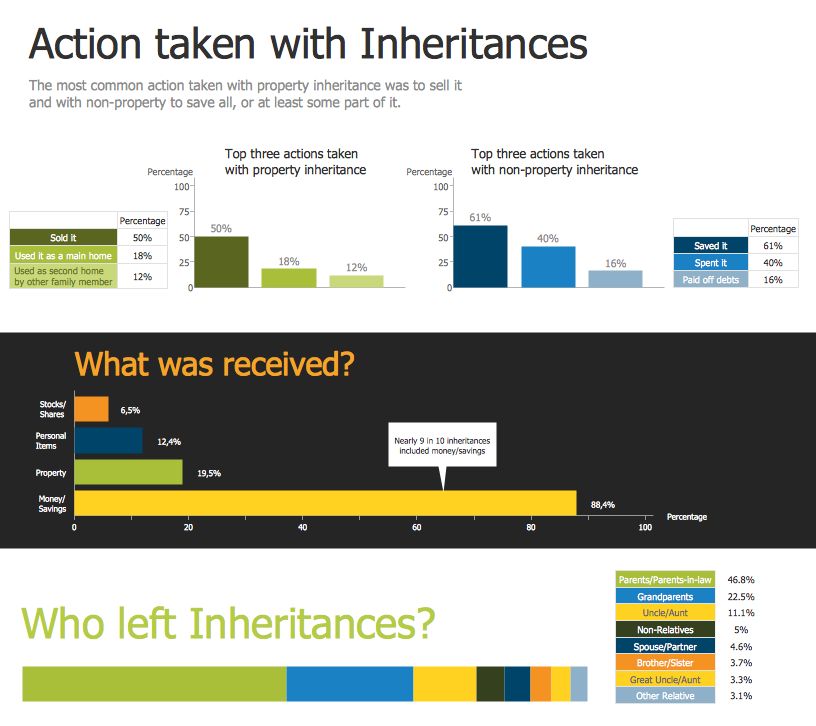
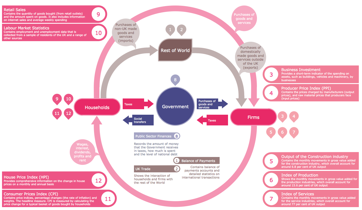
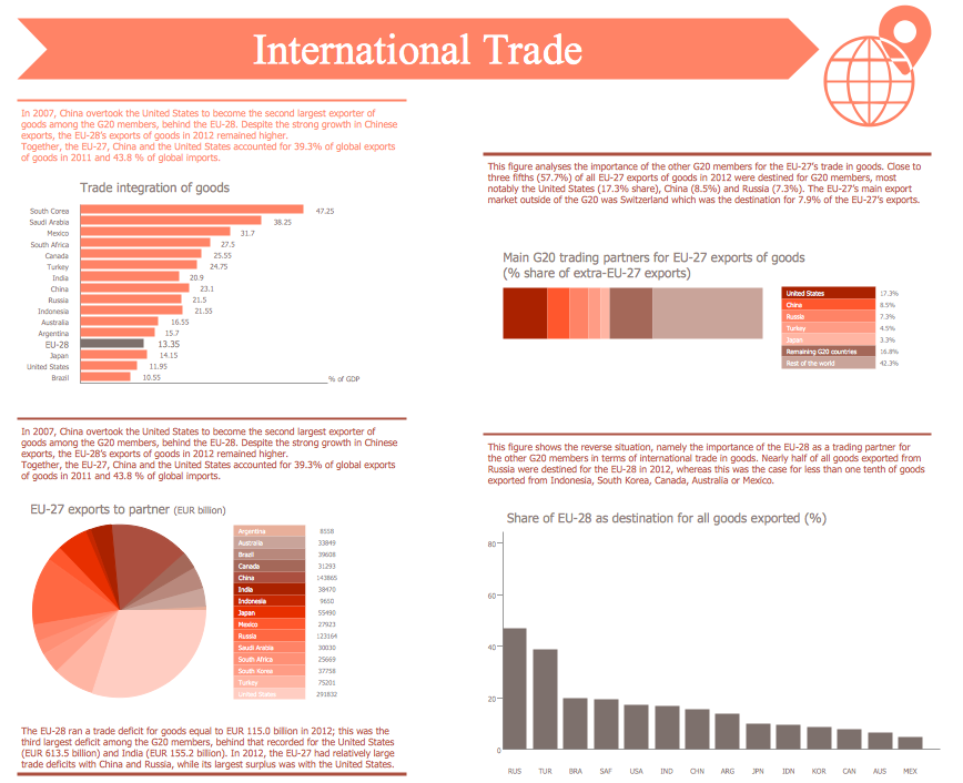
Data-driven infographics are used in wildly disparate areas of business and commerce. To make effective Data-driven infographics, it's useful to have a wide variety of graphical elements — icons, clipart, stencils, charts and graphs — to illustrate your diagram. ConceptDraw Data-driven Infographics solution provides all the tools you need to present data as described by this article — as well as the charts mentioned previously, you can find histograms, divided bar charts, ring charts, line graphs and area charts — meaning you can find the perfect medium for displaying a certain type of data. It allows you to draw data driven infographics quickly and easily using the special templates and vector stencils libraries.It can be used to quickly communicate a message, to simplify the presentation of large amounts of data, to see data patterns and relationships, and to monitor changes in variables over time.HelpDesk
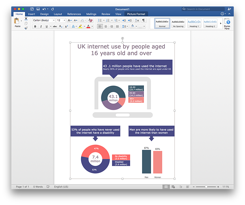
How to Add Data-driven Infographics to a MS Word Document Using ConceptDraw PRO
Infographics ae usually used as an effective way of showing a certain portion of information . There are a wide of range of subjects that can be represented in a such way. One of the most simple usage for the infographics, in business diagrams. Sales staff can use it as an effective method of sharing the sales results with the entire team and stakeholders. ConceptDraw Data-driven Infographics solution gives all the tools one need to present a certain type of data. ConceptDraw PRO allows you to easily create data-driven infographics and then insert them into a MS Word document.HelpDesk
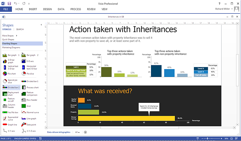
How To Create a MS Visio Data-driven Infographics Using ConceptDraw PRO
ConceptDraw PRO allows you to easily create data-driven infographics of any complexity and then make a MS Visio file from your diagram in a few simple steps.HelpDesk
How to Create PowerPoint Presentation from Data Driven Infographics Using ConceptDraw PRO
ConceptDraw PRO can be used as a tool for creating data-driven infographics. It allows you to draw data driven using the special templates and vector stencils libraries. ConceptDraw PRO allows you to make a MS PowerPoint Presentation from your Data-driven infographics in a few simple steps.HelpDesk
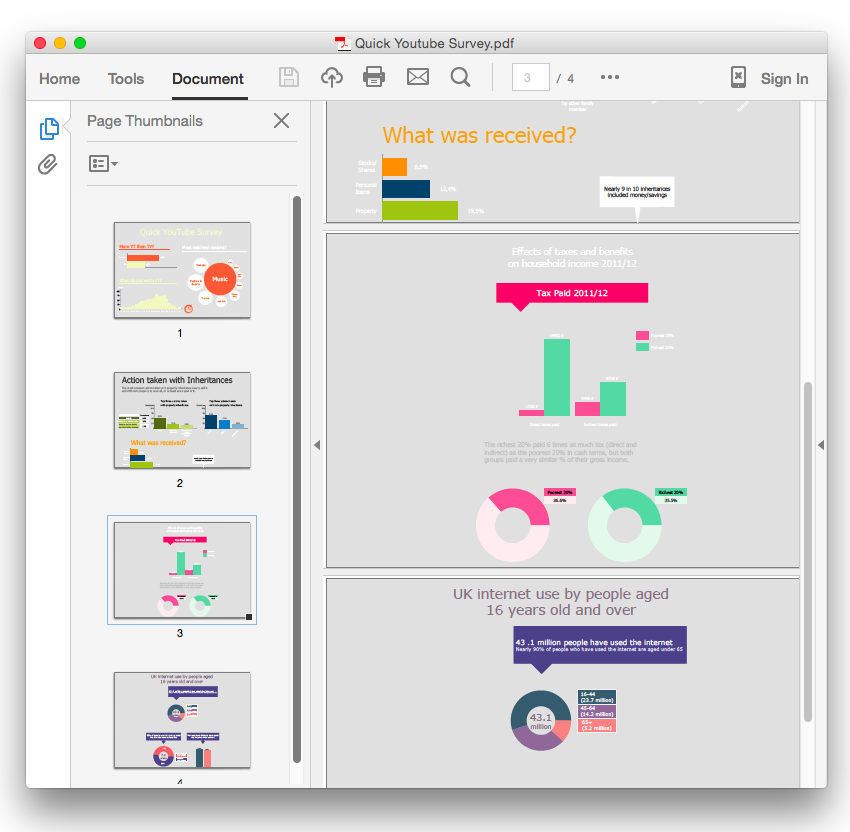
How To Convert Data-driven Infographics to Adobe PDF Using ConceptDraw PRO
ConceptDraw PRO allows you to easy share your business documentation between different computers with different operating systems and applications using it's export capabilities.You can get clear infographics in pdf format and avoid any problems while communicating it with stakeholders.Data Infographics
The popularity of visual Data Infographics grows day by day. So it would be nice to have effective software for their quick and easy creating. ConceptDraw PRO extended with Data-driven Infographics Solution from the “What are Infographics” Area of ConceptDraw Solution Park is exactly what you need.Infographic Tools
ConceptDraw PRO diagramming and vector drawing software offers the best infographic tools - Data-driven Infographics Solution from the “What are Infographics” Area of ConceptDraw Solution Park.Examples of Infographics
ConceptDraw PRO diagramming and vector drawing software offers the unique Data-driven Infographics Solution from the “What are Infographics” Area with variety of predesigned examples of infographics and data-driven infographic charts.Typography Infographic Examples
ConceptDraw PRO extended with Typography Infographics Solution from the “What are Infographics” Area is a powerful infographic software that offers you variety of infographics examples. Use of predesigned examples as the base for your own Typography Infographics is a timesaving and useful way. Simply open the desired example, change for your needs and then successfully use it in any field of your activity.
 ConceptDraw Solution Park
ConceptDraw Solution Park collects graphic extensions, examples and learning materials
Infographic Maker
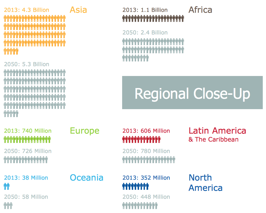
Infographic is a visual way of representing various information, data, knowledge in statistics, geography, journalism, education, and much more areas. ConceptDraw PRO supplied with Pictorial Infographics Solution from the “What are Infographics” Area, provides a set of powerful pictorial infographics tools. Thanks to them it is the best Infographic Maker.Geospatial Data
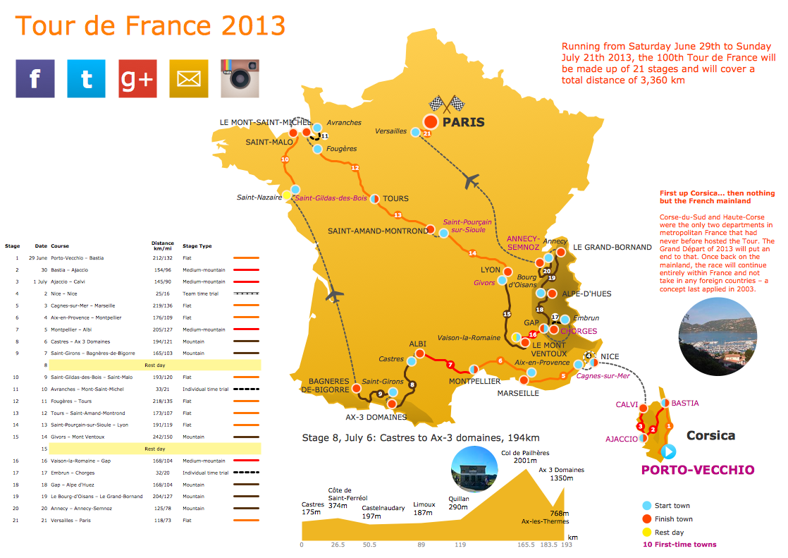
Effective spatial infographics design, easy geospatial data presenting, now it is reality thanks to the extensive drawing tools of the Spatial Infographics Solution included in “What are Infographics” Area of ConceptDraw Solution Park.Marketing Infographics
Marketing Infographics is a very popular tool that allows to represent the complex data, knowledge, and other marketing information in a simple, visual and attractive graphical form. But how to draw Marketing Infographics simply and quickly? ConceptDraw PRO diagramming and vector drawing software extended with unique Marketing Infographics Solution from the Business Infographics Area will help you design marketing infographics without efforts. This toolset included in ConceptDraw Office for small business project management, creating presentations using marketing infographics is critical part project management reporting software.Pictorial Chart
You want design Pictorial Chart or Infographic? And you need powerful infographic software? Then ConceptDraw PRO diagramming and vector drawing software extended with Pictorial Infographics Solution from the “What are Infographics” Area is exactly what you need.- How to Create Data - driven Infographics | How to Add Data - driven ...
- How to Create PowerPoint Presentation from Data Driven ...
- How To Create a MS Visio Data - driven Infographics Using ...
- How to Create Data - driven Infographics | ConceptDraw Solution ...
- Marketing Plan Infographic | How To Create a MS Visio Data - driven ...
- How to Add Data - driven Infographics to a MS Word Document Using ...
- Transportation Infographics | Design Pictorial Infographics . Design ...
- Design Pictorial Infographics . Design Infographics | Transportation ...
- How to Create Data - driven Infographics | Basic Diagramming | How ...
- Map Infographic Creator | Internet Marketing Infographic | How to ...
- How To Convert Data - driven Infographics to Adobe PDF Using ...
- Data Driven Strategies | Data Infographics | Examples of ...
- Transportation Infographics | Marketing Plan Infographic | How to ...
- How to Create Data - driven Infographics | Basic Flowchart Symbols ...
- Line Graphs | Online Collaboration via Skype | How to Create Data ...
- Cross-Functional Flowchart | Process Flowchart | How To Convert ...
- Flowcharts | Sales Flowcharts | How to Add Data - driven Infographics ...
- Business Diagram Software | How to Create Data - driven ...
- Active Directory Diagram | How To Create a MS Visio Data - driven ...
